Bootstrap 滾動監聽 <!DOCTYPE html> <html lang="en"> <head> <meta charset="UTF-8"> <title>demo1</title> <meta name="viewport" content="width=device-width, ...
Bootstrap 滾動監聽
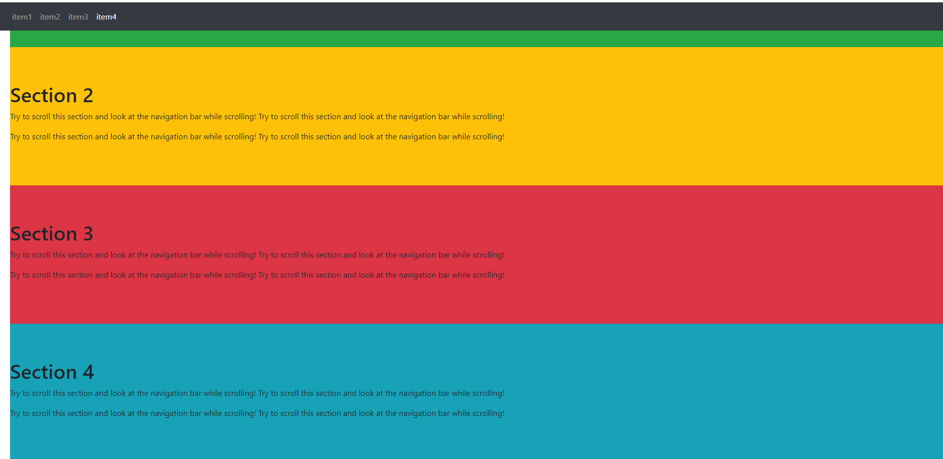
<!DOCTYPE html>
<html lang="en">
<head>
    <meta charset="UTF-8">
    <title>demo1</title>
    <meta name="viewport" content="width=device-width, initial-scale=1, shrink-to-fit=no">
    <link rel="stylesheet" href="https://cdn.staticfile.org/twitter-bootstrap/4.3.1/css/bootstrap.min.css">
    <script src="https://cdn.staticfile.org/jquery/3.2.1/jquery.min.js"></script>
    <script src="https://cdn.staticfile.org/popper.js/1.15.0/umd/popper.min.js"></script>
    <script src="https://cdn.staticfile.org/twitter-bootstrap/4.3.1/js/bootstrap.min.js"></script>
    <style>
        body{
            margin:10px;
            padding:10px;
        }
        .navbar-item{flex:1;}
    </style>
</head>
<body data-spy="scroll" data-target=".navbar" data-offset="50" style="position: relative;">
    <nav class="navbar navbar-expand-sm bg-dark navbar-dark fixed-top">
        <ul class="navbar-nav" style="width:100%;">
            <li class="nav-item">
                <a href="#item1" class="nav-link">item1</a>
            </li>
            <li class="nav-item">
                <a href="#item2" class="nav-link">item2</a>
            </li>
            <li class="nav-item">
                <a href="#item3" class="nav-link">item3</a>
            </li>
            <li class="nav-item">
                <a href="#item4" class="nav-link">item4</a>
            </li>
        </ul>
    </nav>

    <div id="item1" class="container-fluid bg-success" style="padding:70px 0">
        <h1>Section 1</h1>
        <p>Try to scroll this section and look at the navigation bar while scrolling! Try to scroll this section and look at the navigation bar while scrolling!</p>
        <p>Try to scroll this section and look at the navigation bar while scrolling! Try to scroll this section and look at the navigation bar while scrolling!</p>
    </div>
    <div id="item2" class="container-fluid bg-warning" style="padding:70px 0">
        <h1>Section 2</h1>
        <p>Try to scroll this section and look at the navigation bar while scrolling! Try to scroll this section and look at the navigation bar while scrolling!</p>
        <p>Try to scroll this section and look at the navigation bar while scrolling! Try to scroll this section and look at the navigation bar while scrolling!</p>
    </div>
    <div id="item3" class="container-fluid bg-danger" style="padding:70px 0">
        <h1>Section 3</h1>
        <p>Try to scroll this section and look at the navigation bar while scrolling! Try to scroll this section and look at the navigation bar while scrolling!</p>
        <p>Try to scroll this section and look at the navigation bar while scrolling! Try to scroll this section and look at the navigation bar while scrolling!</p>
    </div>
    <div id="item4" class="container-fluid bg-info" style="padding:70px 0">
        <h1>Section 4</h1>
        <p>Try to scroll this section and look at the navigation bar while scrolling! Try to scroll this section and look at the navigation bar while scrolling!</p>
        <p>Try to scroll this section and look at the navigation bar while scrolling! Try to scroll this section and look at the navigation bar while scrolling!</p>
    </div>


</body>
</html>
把滾動監聽加在body標簽上,是正常的
當我嘗試加在某個div上時,發現滾動監聽似乎無效了
各位有知道原因的麽
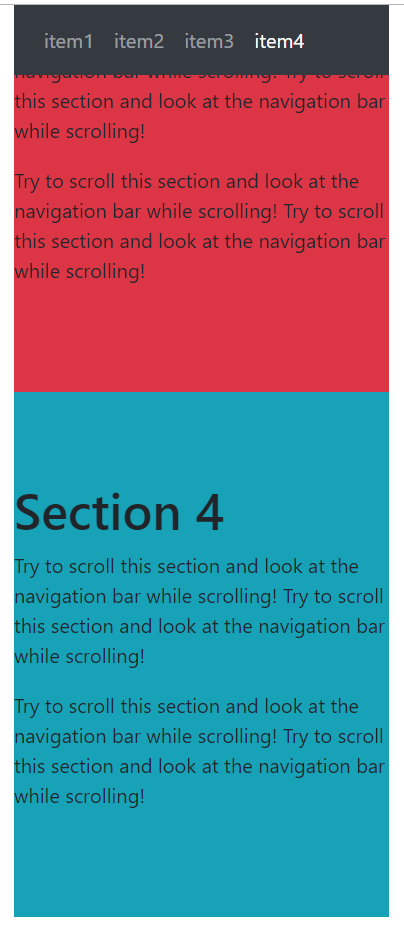
<!DOCTYPE html>
<html lang="en">
<head>
    <meta charset="UTF-8">
    <title>demo1</title>
    <meta name="viewport" content="width=device-width, initial-scale=1, shrink-to-fit=no">
    <link rel="stylesheet" href="https://cdn.staticfile.org/twitter-bootstrap/4.3.1/css/bootstrap.min.css">
    <script src="https://cdn.staticfile.org/jquery/3.2.1/jquery.min.js"></script>
    <script src="https://cdn.staticfile.org/popper.js/1.15.0/umd/popper.min.js"></script>
    <script src="https://cdn.staticfile.org/twitter-bootstrap/4.3.1/js/bootstrap.min.js"></script>
    <style>
        body{
            margin:10px;
            padding:10px;
        }
        .navbar-item{flex:1;}
    </style>
</head>
<body>

<div data-spy="scroll" data-target=".navbar" data-offset="50" style="width:300px;margin:0 auto;position: relative;">
    <nav class="navbar navbar-expand-sm bg-dark navbar-dark fixed-top" style="width:300px;margin:0 auto;">
        <ul class="navbar-nav" style="width:100%;">
            <li class="nav-item">
                <a href="#item1" class="nav-link">item1</a>
            </li>
            <li class="nav-item">
                <a href="#item2" class="nav-link">item2</a>
            </li>
            <li class="nav-item">
                <a href="#item3" class="nav-link">item3</a>
            </li>
            <li class="nav-item">
                <a href="#item4" class="nav-link">item4</a>
            </li>
        </ul>
    </nav>

    <div id="item1" class="container-fluid bg-success" style="padding:70px 0">
        <h1>Section 1</h1>
        <p>Try to scroll this section and look at the navigation bar while scrolling! Try to scroll this section and look at the navigation bar while scrolling!</p>
        <p>Try to scroll this section and look at the navigation bar while scrolling! Try to scroll this section and look at the navigation bar while scrolling!</p>
    </div>
    <div id="item2" class="container-fluid bg-warning" style="padding:70px 0">
        <h1>Section 2</h1>
        <p>Try to scroll this section and look at the navigation bar while scrolling! Try to scroll this section and look at the navigation bar while scrolling!</p>
        <p>Try to scroll this section and look at the navigation bar while scrolling! Try to scroll this section and look at the navigation bar while scrolling!</p>
    </div>
    <div id="item3" class="container-fluid bg-danger" style="padding:70px 0">
        <h1>Section 3</h1>
        <p>Try to scroll this section and look at the navigation bar while scrolling! Try to scroll this section and look at the navigation bar while scrolling!</p>
        <p>Try to scroll this section and look at the navigation bar while scrolling! Try to scroll this section and look at the navigation bar while scrolling!</p>
    </div>
    <div id="item4" class="container-fluid bg-info" style="padding:70px 0">
        <h1>Section 4</h1>
        <p>Try to scroll this section and look at the navigation bar while scrolling! Try to scroll this section and look at the navigation bar while scrolling!</p>
        <p>Try to scroll this section and look at the navigation bar while scrolling! Try to scroll this section and look at the navigation bar while scrolling!</p>
    </div>

</div>


</body>
</html>
垂直滾動監聽:
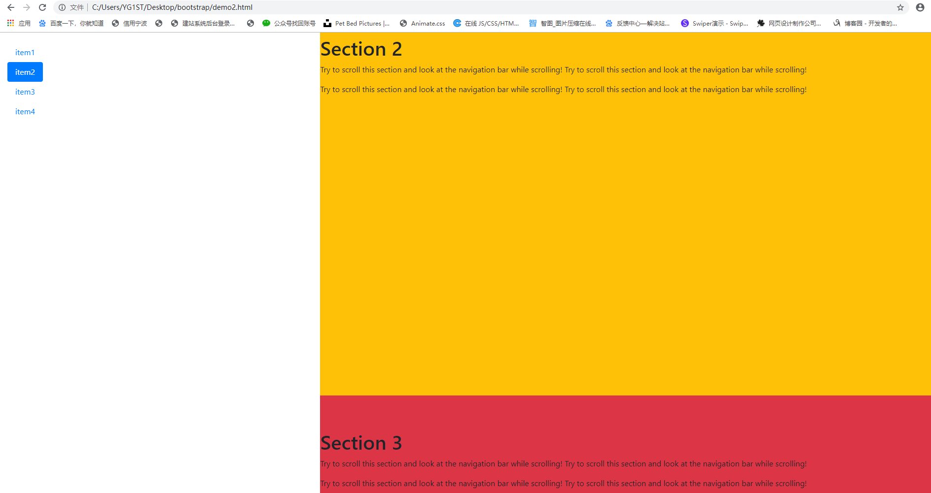
<!DOCTYPE html>
<html lang="en">
<head>
    <meta charset="UTF-8">
    <title>demo1</title>
    <meta name="viewport" content="width=device-width, initial-scale=1, shrink-to-fit=no">
    <link rel="stylesheet" href="https://cdn.staticfile.org/twitter-bootstrap/4.3.1/css/bootstrap.min.css">
    <script src="https://cdn.staticfile.org/jquery/3.2.1/jquery.min.js"></script>
    <script src="https://cdn.staticfile.org/popper.js/1.15.0/umd/popper.min.js"></script>
    <script src="https://cdn.staticfile.org/twitter-bootstrap/4.3.1/js/bootstrap.min.js"></script>
    <style>
        .nav-pills{
            position:fixed;
            top:20px;
        }
        .col-8 div{
            height:800px;
        }
    </style>
</head>
<body data-spy="scroll" data-target="#navbar" data-offset="1" style="position: relative;">
    <div class="container-fluid">
        <div class="row">
            <nav class="col-4" id="navbar">
                <ul class="nav nav-pills flex-column">
                    <li class="nav-item">
                        <a href="#item1" class="nav-link">item1</a>
                    </li>
                    <li class="nav-item">
                        <a href="#item2" class="nav-link">item2</a>
                    </li>
                    <li class="nav-item">
                        <a href="#item3" class="nav-link">item3</a>
                    </li>
                    <li class="nav-item">
                        <a href="#item4" class="nav-link">item4</a>
                    </li>
                </ul>
            </nav>

            <div class="col-8">
                <div id="item1" class="container-fluid bg-success" style="padding:70px 0">
                    <h1>Section 1</h1>
                    <p>Try to scroll this section and look at the navigation bar while scrolling! Try to scroll this section and look at the navigation bar while scrolling!</p>
                    <p>Try to scroll this section and look at the navigation bar while scrolling! Try to scroll this section and look at the navigation bar while scrolling!</p>
                </div>
                <div id="item2" class="container-fluid bg-warning" style="padding:70px 0">
                    <h1>Section 2</h1>
                    <p>Try to scroll this section and look at the navigation bar while scrolling! Try to scroll this section and look at the navigation bar while scrolling!</p>
                    <p>Try to scroll this section and look at the navigation bar while scrolling! Try to scroll this section and look at the navigation bar while scrolling!</p>
                </div>
                <div id="item3" class="container-fluid bg-danger" style="padding:70px 0">
                    <h1>Section 3</h1>
                    <p>Try to scroll this section and look at the navigation bar while scrolling! Try to scroll this section and look at the navigation bar while scrolling!</p>
                    <p>Try to scroll this section and look at the navigation bar while scrolling! Try to scroll this section and look at the navigation bar while scrolling!</p>
                </div>
                <div id="item4" class="container-fluid bg-info" style="padding:70px 0">
                    <h1>Section 4</h1>
                    <p>Try to scroll this section and look at the navigation bar while scrolling! Try to scroll this section and look at the navigation bar while scrolling!</p>
                    <p>Try to scroll this section and look at the navigation bar while scrolling! Try to scroll this section and look at the navigation bar while scrolling!</p>
                </div>
            </div>
        </div>
    </div>

</body>
</html>
Bootstrap4 小工具
使用 border 類可以添加或移除邊框:
<!DOCTYPE html>
<html lang="en">
<head>
    <meta charset="UTF-8">
    <title>demo1</title>
    <meta name="viewport" content="width=device-width, initial-scale=1, shrink-to-fit=no">
    <link rel="stylesheet" href="https://cdn.staticfile.org/twitter-bootstrap/4.3.1/css/bootstrap.min.css">
    <script src="https://cdn.staticfile.org/jquery/3.2.1/jquery.min.js"></script>
    <script src="https://cdn.staticfile.org/popper.js/1.15.0/umd/popper.min.js"></script>
    <script src="https://cdn.staticfile.org/twitter-bootstrap/4.3.1/js/bootstrap.min.js"></script>
    <style>
        div{
            display: inline-block;
            width:100px;
            height:100px;
            margin:20px;
        }
    </style>
</head>
<body>
    <div class="border"></div>
    <div class="border-0"></div>
    <div class="border border-top-0"></div>
    <div class="border border-right-0"></div>
    <div class="border border-bottom-0"></div>
    <div class="border border-left-0"></div>

</body>
</html>

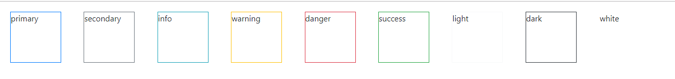
Bootstrap4 提供了一些類來設置邊框顏色:
<!DOCTYPE html>
<html lang="en">
<head>
    <meta charset="UTF-8">
    <title>demo1</title>
    <meta name="viewport" content="width=device-width, initial-scale=1, shrink-to-fit=no">
    <link rel="stylesheet" href="https://cdn.staticfile.org/twitter-bootstrap/4.3.1/css/bootstrap.min.css">
    <script src="https://cdn.staticfile.org/jquery/3.2.1/jquery.min.js"></script>
    <script src="https://cdn.staticfile.org/popper.js/1.15.0/umd/popper.min.js"></script>
    <script src="https://cdn.staticfile.org/twitter-bootstrap/4.3.1/js/bootstrap.min.js"></script>
    <style>
        div{
            display: inline-block;
            width:100px;
            height:100px;
            margin:20px;
        }
    </style>
</head>
<body>
    <div class="border border-primary">primary</div>
    <div class="border border-secondary">secondary</div>
    <div class="border border-info">info</div>
    <div class="border border-warning">warning</div>
    <div class="border border-danger">danger</div>
    <div class="border border-success">success</div>
    <div class="border border-light">light</div>
    <div class="border border-dark">dark</div>
    <div class="border border-white">white</div>

</body>
</html>
使用rounded 類可以添加圓角邊框:
<!DOCTYPE html>
<html lang="en">
<head>
    <