
一、前言 浮動元素以脫離標準流的方式來實現元素的向左或向右浮動。float浮動屬性的四個參數:left:元素向左浮動;right:元素向右浮動;none:預設值,元素不浮動;inherit:繼承父元素的float屬性值。 舉個慄子 父元素是否註意到自己有個浮動的子div呢? 從中我們可以發現,處於標 ...
一、前言
浮動元素以脫離標準流的方式來實現元素的向左或向右浮動。float浮動屬性的四個參數:left:元素向左浮動;right:元素向右浮動;none:預設值,元素不浮動;inherit:繼承父元素的float屬性值。
舉個慄子
父元素是否註意到自己有個浮動的子div呢?
<div style="width: 400px; height: auto; border: 2px solid black;">
    <div style="width: 50px; height: 100px; background-color: green; float: right;"></div>
    我才不知道有沒有浮動框,我只顯示文字的高度
</div>
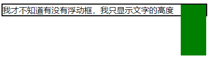
從中我們可以發現,處於標準流中的父div並不知道浮動元素的存在,而浮動元素卻知道它父元素的邊界,它一直向右浮動直到撞到了父框的右邊界為止。
下麵我們一起逐步學習CSS中的浮動屬性float。
二、浮動之於文本
CSS參考手冊上對float的說明:
float 屬性定義元素在哪個方向浮動。以往這個屬性總應用於圖像,使文本圍繞在圖像周圍,不過在 CSS 中,任何元素都可以浮動。浮動元素會生成一個塊級框,而不論它本身是何種元素。
如果浮動非替換元素,則要指定一個明確的寬度;否則,它們會儘可能地窄。
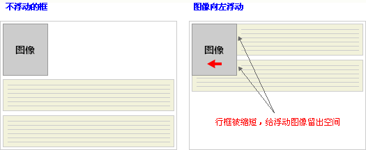
1.實現文本環繞圖像
浮動框雖然脫離了標準流,但標準流中的文本依舊會做相應的移動,為浮動框留出空間。浮動框旁邊的行框被縮短,從而給浮動框留出空間,行框圍繞浮動框。
因此,創建浮動框可以使文本圍繞圖像:
舉個小慄子
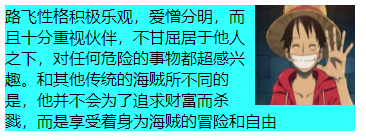
<div style="width: 350px; background-color: #33FFFF;">
    <img src="http://h5ip.cn/ge0w" style="width: 100px; height: 100px; float: right;">
    <span>
    路飛性格積極樂觀,愛憎分明,而且十分重視伙伴,不甘屈居於他人之下,對任何危險的事物都超感興趣。和其他傳統的海賊所不同的是,他並不會為了追求財富而殺戮,而是享受著身為海賊的冒險和自由
    </span>
</div>
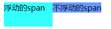
2.任何元素浮動後都將生成塊級框
首先應當註意塊級框不等同於塊狀元素,塊級元素會獨占一行而塊級框卻不會,浮動元素產生的效果類似於行內塊元素。對行內元素設置width和height是無效的,但生成浮動元素之後width和height將有效。
<span style="width: 100px; height: 50px; background-color: #6699FF;">
    不浮動的span
</span>
<span style="width: 100px; height: 50px; background-color: #33FFFF; float: left;">
    浮動的span
</span>
三、浮動之於塊
浮動的框可以向左或向右移動,直到它的外邊緣碰到包含框或另一個浮動框的邊框為止。由於浮動框不在文檔的普通流中,所以文檔的普通流中的塊框表現得就像浮動框不存在一樣。
不浮動的div為塊級元素,各自獨占一行
<!-- 不浮動 -->
<div style="width: 240px; height: auto; border: solid 1px black;">
    <div style="width: 80px; height: 80px; background-color: red;">
        框一
    </div>
    <div style="width: 80px; height: 80px; background-color: green;">
        框二
    </div>
    <div style="width: 80px; height: 80px; background-color: blue;">
        框三
    </div>
</div>

<!-- 框一右浮 -->
<div style="width: 240px; height: auto; border: solid 1px black;">
    <div style="width: 80px; height: 80px; background-color: red; float: right;">
        框一
    </div>
    <div style="width: 80px; height: 80px; background-color: green;">
        框二
    </div>
    <div style="width: 80px; height: 80px; background-color: blue;">
        框三
    </div>
</div>
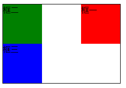
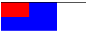
當框 1 向左浮動時,它脫離文檔流並且向左移動,直到它的左邊緣碰到包含框的左邊緣。因為它不再處於文檔流中,所以它不占據空間,實際上覆蓋住了框 2,使框 2 從視圖中消失。註意:浮動元素要先寫與覆蓋元素
<!-- 框一左浮,覆蓋框二 -->
<div style="width: 240px; height: auto; border: solid 1px black;">
    <div style="width: 80px; height: 80px; background-color: red; float: left;">
        框一
    </div>
    <div style="width: 80px; height: 80px; background-color: green;">
        框二
    </div>
    <div style="width: 80px; height: 80px; background-color: blue;">
        框三
    </div>
</div>

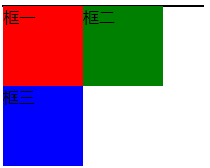
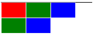
如果把所有三個框都向左移動,那麼框 1 向左浮動直到碰到包含框,另外兩個框向左浮動直到碰到前一個浮動框,這時父框的高度為0
<!-- 三框左浮 -->
<div style="width: 240px; height: auto; border: solid 1px black;">
    <div style="width: 80px; height: 80px; background-color: red; float: left;">
        框一
    </div>
    <div style="width: 80px; height: 80px; background-color: green; float: left;">
        框二
    </div>
    <div style="width: 80px; height: 80px; background-color: blue; float: left;">
        框三
    </div>
</div>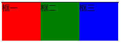
如果包含框太窄,無法容納水平排列的三個浮動元素,那麼其它浮動塊向下移動,直到有足夠的空間。
<!-- 三框左浮,父框太窄 -->
<div style="width: 200px; height: auto; border: solid 1px black;">
    <div style="width: 80px; height: 80px; background-color: red; float: left;">
        框一
    </div>
    <div style="width: 80px; height: 80px; background-color: green; float: left;">
        框二
    </div>
    <div style="width: 80px; height: 80px; background-color: blue; float: left;">
        框三
    </div>
</div>
如果浮動元素的高度不同,那麼當它們向下移動時可能被其它浮動元素“卡住”
<!-- 三框左浮,框一卡框三 -->
<div style="width: 200px; height: auto; border: solid 1px black;">
    <div style="width: 80px; height: 100px; background-color: red; float: left;">
        框一
    </div>
    <div style="width: 80px; height: 80px; background-color: green; float: left;">
        框二
    </div>
    <div style="width: 80px; height: 80px; background-color: blue; float: left;">
        框三
    </div>
</div>

四、浮動的副作用及處理
通過上面的介紹可以總結出浮動的兩個副作用:1.頁面塌陷,也就是子元素不能將父元素撐開;2.元素覆蓋,浮動元素不在標準流中因此可能會覆蓋標準流中的元素。四種解決方案如下:
1.手動給父元素添加高度
這種方法用來解決父元素的頁面塌陷問題,應當註意的是,為保證父框的高度等於最高浮動元素的高度應當充分考慮浮動元素的邊框以及內外邊距。
<!-- 對於有邊框的浮動子元素,父元素的height = 子元素的height + 2*子元素的邊框大小 -->
<div style="width: 300px; height: 52px; border: solid 1px black;">
    <div style="width: 80px; height: 50px; background-color: red; float: left; border: solid 1px #FFF;"></div>
    <div style="width: 80px; height: 50px; background-color: green; float: left; border: solid 1px #FFF;"></div>
    <div style="width: 80px; height: 50px; background-color: blue; float: left; border: solid 1px #FFF;"></div>
</div>
這種方式治標不治本,當浮動子元素增加時,頁面塌陷問題重現

2.通過clear屬性清除內部和外部浮動
clear 屬性規定元素的哪一側不允許其他浮動元素。clear屬性的四個參數:none(預設值)、left、right、both;如果聲明為左邊或右邊清除,會使元素的上外邊框邊界剛好在該邊上浮動元素的下外邊距邊界之下。
添加clear屬性之前
<!-- 如果後一個div未添加clear屬性,它將被紅色div覆蓋 -->
<div style="width: 300px; height: auto; border: solid 1px black; clear: both;">
    <div style="width: 80px; height: 50px; background-color: red; float: left; border: solid 1px #FFF;"></div>
    <div style="width: 80px; height: 50px; background-color: green; border: solid 1px #FFF; clear: left; "></div>
</div>

添加之後

添加clear前
<!-- 在最後增加一個具有clear屬性的空div -->
<div style="width: 300px; height: auto; border: solid 1px black; clear: both;">
    <div style="width: 80px; height: 50px; background-color: red; float: left; border: solid 1px #FFF;"></div>
    <div style="width: 80px; height: 50px; background-color: green; float: left; border: solid 1px #FFF;"></div>
    <div style="width: 80px; height: 50px; background-color: blue; float: left; border: solid 1px #FFF;"></div>
    <div style="width: 80px; height: 50px; background-color: green; float: left; border: solid 1px #FFF;"></div>
    <div style="width: 80px; height: 50px; background-color: blue; float: left; border: solid 1px #FFF;"></div>
    <div style=" clear: both;"></div>
</div>

添加之後

3.給父元素添加overflow屬性並結合zoom:1使用
<!-- 使用overfloat和zoom代替clear -->
<div style="width: 300px; height: auto; border: solid 1px black; clear: both; overflow: hidden; zoom: 1;">
    <div style="width: 80px; height: 50px; background-color: red; float: left; border: solid 1px #FFF;"></div>
    <div style="width: 80px; height: 50px; background-color: green; float: left; border: solid 1px #FFF;"></div>
    <div style="width: 80px; height: 50px; background-color: blue; float: left; border: solid 1px #FFF;"></div>
    <div style="width: 80px; height: 50px; background-color: green; float: left; border: solid 1px #FFF;"></div>
    <div style="width: 80px; height: 50px; background-color: blue; float: left; border: solid 1px #FFF;"></div>
</div>

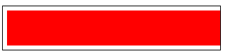
overflow屬性是用來修剪溢出的元素,所以使用此種方案會使溢出元素被截掉
使用overflow前
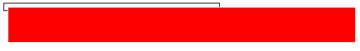
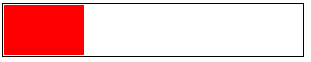
<div style="width: 300px; height: auto; border: solid 1px black; clear: both; padding: 5px; overflow: hidden;">
    <div style="width: 500px; height: 50px; background-color: red; border: solid 1px #FFF; float: left;"></div>
</div>
使用後
zoom是IE瀏覽器專用的屬性,通過子元素的高度來設置父元素的高度,添加該屬性用來相容IE瀏覽器
4.給父元素添加浮動
這是一種”以毒攻毒“的方法,因為父元素浮動後雖然消除了浮動子元素對其的影響,但父元素下麵的元素就可能就會受該浮動父元素的影響。
<div style="width: 300px; height: auto; border: solid 1px black; clear: both; float: left;">
  <div style="width: 100px; height: 50px; background-color: red; float: left;"></div>
</div>
<div style="width: 200px; height: 100px; background-color: blue;"></div>
這四種常用的清除浮動解決辦法可以根據實際情況進行使用,當然還有一些也比較好的解決辦法,例如使用before偽類清除浮動,等進一步學習之後再補充。
五、最後
感謝博主謙行的博客:CSS佈局 ——從display,position, float屬性談起以及W3School提供的學習資料!所學不深,如有錯誤或不足之處還望留言指出,十分感謝!


