本文介紹了CSS常見的表格、浮動、定位佈局等方式,也介紹了聖杯佈局和雙飛翼佈局高級佈局的實現方式。 ...
1.實現兩欄/三欄佈局的方法?
- 表格佈局
- float + margin佈局
- inline-block佈局
- flexbox佈局(相容性的問題)
1.1 基礎佈局
<style>
    * {
        margin: 0;
        padding: 0;
    }
    .layout {
        margin-top: 10px;
    }
    .layout div{
        min-height: 100px;
    }
</style>
<body>
  <!--1.浮動的方式來實現佈局-->
  <section class="layout float">
      <style>
          .layout.float .left {
              float: left;
              width: 300px;
              background-color: #48adff;
          }
          .layout.float .main {
              background-color: #ff4344;
          }
      </style>
      <article class="left-main">
          <div class="left"></div>
          <div class="main">
              <h1>浮動兩欄佈局</h1>
              <p>兩欄佈局的中間部分</p>
              <p>兩欄佈局的中間部分</p>
          </div>
      </article>
  </section>

  <!--2.定位的方式來實現佈局-->
  <section class="layout absolute">
      <style>
          .layout.absolute .left-main {
              width: 100%;
          }
          .layout.absolute .left {
              left : 0;
              width: 300px;
              background-color: #48adff;
              position: absolute;
          }
          .layout.absolute .main {
              /*預設是以正常文檔流的方式來展現的*/
              background-color: #ff4344;
              margin-left: 300px;
              right: 0;
          }
      </style>
      <article class="left-main">
          <div class="left"></div>
          <div class="main">
              <h1>絕對定位兩欄佈局</h1>
              <p>兩欄佈局的中間部分</p>
              <p>兩欄佈局的中間部分</p>
          </div>
      </article>
  </section>

  <!--3.flex佈局的實現-->
  <section class="layout flex">
      <style>
          .layout .left-main {
              display: flex;
          }
          .layout .left {
              width: 300px;
              background-color: #48adff;
          }
          .layout .main {
              flex: 1;
              background-color: #ff4344;
          }
      </style>
      <article class="left-main">
          <div class="left"></div>
          <div class="main">
              <h1>flex兩欄佈局</h1>
              <p>兩欄佈局的中間部分</p>
              <p>兩欄佈局的中間部分</p>
          </div>
      </article>
  </section>

  <!--4.table佈局的實現-->
  <section class="layout table">
      <style>
          .layout .left-main {
              display: table;
              width: 100%;
          }
          .layout .left {
              display : table-cell;
              width: 300px;
              background-color: #48adff;
          }
          .layout .main {
              background-color: #ff255f;
          }
      </style>
      <article class="left-main">
          <div class="left"></div>
          <div class="main">
              <h1>table兩欄佈局</h1>
              <p>兩欄佈局的中間部分</p>
              <p>兩欄佈局的中間部分</p>
          </div>
      </article>
  </section>

  <!--5.grid佈局-->
  <section class="layout grid">
      <style>
          .layout.grid .left-main {
              display: grid;
          }
          .layout.grid .left-main {
              grid-template-rows : 100px;
              /*按照順序指定盒子的寬度*/
              grid-template-columns : 300px  auto;
          }
          .layout.grid .left {
              background-color: #48adff;
          }
          .layout.grid .main {
              background-color: #ff4344;
          }
      </style>
      <article class="left-main">
          <div class="left"></div>
          <div class="main">
              <h1>grid兩欄佈局</h1>
              <p>兩欄佈局的中間部分</p>
              <p>兩欄佈局的中間部分</p>
          </div>
      </article>
  </section>
</body>
1.2 聖杯佈局
<!DOCTYPE html>
<html>
  <head>
    <meta charset="utf-8" />
    <title>實現三欄水平佈局之聖杯佈局</title>
    <style type="text/css">
      /*基本樣式*/
      .left, .right, .main {
        min-height: 300px;
      }
      .left {
        width: 200px;
        background-color:thistle;
      }
      .main {
        background-color: #999;
      }
      .right {
        width: 300px;
        background-color: violet;
      }
      /* 聖杯佈局關鍵代碼 */
      .left, .main, .right {
        float: left;
        position: relative;
      }
      .main {
        width: 100%;
      }
      .container {
        padding-left: 200px;
        padding-right: 300px;
      }
      .left {
        margin-left: -100%;
        left: -200px;
      }
      .right {
        margin-left: -300px;
        right: -300px;
      }
    </style>
  </head>
  <body>
    <div class="container">
      <div class="main">main</div>
      <div class="left">left</div>
      <div class="right">right</div>
    </div>
  </body>
</html>
1.3 雙飛翼佈局
<!DOCTYPE html>
<html lang="en">
  <head>
    <meta charset="UTF-8" />
    <meta name="viewport" content="width=device-width, initial-scale=1.0" />
    <meta http-equiv="X-UA-Compatible" content="ie=edge" />
    <title>雙飛翼佈局</title>
    <style>
      .left,
      .right,
      .main {
        min-height: 200px;
      }
      .left {
        width: 200px;
        background-color: thistle;
      }
      .main {
        background: #999;
      }
      .right {
        width: 300px;
        background-color: violet;
      }
      /* 雙飛翼佈局重點 */
      .left,
      .main,
      .right {
        float: left;
      }
      .main {
        width: 100%;
      }
      .main-inner {
        margin-left: 200px;
        margin-right: 300px;
      }
      .left {
        margin-left: -100%;
      }
      .right {
        margin-left: -300px;
      }
    </style>
  </head>
  <body>
    <div class="main"><div class="main-inner">中心區</div></div>
    <div class="left">left</div>
    <div class="right">right</div>
  </body>
</html>
2.absolute/fixed/static/sticky定位?
- 前者相對於最近的absolute/relative
- 後者相對於屏幕進行定位
- fixed是相對於屏幕的可視區域的,也會直接脫離於文檔流獨立存在的
- 元素未滾動,在當前可視區域他的top值不生效,只有margin生效,滾動起來後margin失效,top值生效
<style type="text/css">
  p{
  font-size:11pt;
  color:#363636;
  text-indent:2em;
  }
  .parent{
  width:500px;
  height:150px;
  margin-top:20px;
  margin-left:20px;
  border:solid 1px #555555;
  background:#aaaaaa;
  }
  .parent div{
  width:100px;
  height:80px;
  float:left;
  background:#708090;
  border:dashed 1px #008B8B;
  font-size:12pt;
  font-weight:bold;
  color:#104E8B;
  }
</style>
</head>
<body>
  <!--相對定位!-->
  <h2>relative</h2>
  <p>相對定位是一個非常容易掌握的概念。如果對一個元素進行相對定位,它將出現在它所在的位置上。然後,可以通過設置垂直或水平位置,讓這個元素“相對於”它的起點進行移動。</p>
  <div class="parent">
  <div>child 1</div>
  <div style="position:relative;left:20px;top:20px;">child 2</div>
  <div>child 3</div>
  </div>

<!--絕對定位!-->
<h2>absolute</h2>
<p>絕對定位的元素的位置相對於最近的已定位祖先元素,如果元素沒有已定位的祖先元素,那麼它的位置相對於最初的包含塊。
對於定位的主要問題是要記住每種定位的意義。</p>
<p>絕對定位是“相對於”最近的已定位祖先元素,如果不存在已定位的祖先元素,那麼“相對於”最初的包含塊。所以如果要設定元素與其父元素的絕對位置定位就必須設定父元素的定位。</p>
<p>註釋:根據用戶代理的不同,最初的包含塊可能是畫布或 HTML 元素。</p>
<div class="parent" style="position:relative;"<!--如果該處不定位,那麼child5框的定位是相對於最初的包含塊!-->>
<div>child 4</div>
<div style="position:absolute;left:20px;top:20px;">child 5</div>
<div>child 6</div>
</div>

<!--相對定位!-->
<h2>fixed</h2>
<p>元素框的表現類似於將 position 設置為 absolute,不過其包含塊是視窗本身。</p>
<div class="parent">
<div>child 7</div>
<div style="position:fixed;right:20px;top:20px;">child 8</div>
<div>child 9</div>
</div>

<!--相對定位!-->
<h2>static</h2>
<p>元素框正常生成。塊級元素生成一個矩形框,作為文檔流的一部分,行內元素則會創建一個或多個行框,置於其父元素中。</p>
<div class="parent">
<div>child 10</div>
<div style="position:static;right:20px;top:20px;">child 11</div>
<div>child 12</div>
</div>
</body>
3.什麼是層疊上下文?如何形層疊上下文?層疊順序是怎樣的?
<style>
    .father-green {
        width:500px;
        height:300px;
        background-color:green;
    }
    .son-red {
        width:200px;
        height:100px;
        background-color:red;
        display:inline-block;
    }
    .subson-yellow {
        height:50px;
        width:200px;
        background-color: yellow;

    }
    .son-purple {
        width: 200px;
        height:100px;
        background-color:purple;
        display:inline-block;
        margin-left:-50px;
    }
    .mather-pink {
        width: 300px;
        height:100px;
        background-color:pink;
    }
    .daughter-blue {
        width:100px;
        height:50px;
        background-color:blue;
        margin-top:-20px;
    }
</style>
<body>
    <div class="father-green">
        <div class="son-red">
            <div class="subson-yellow">
                我是孫子輩的我是孫子輩的我是孫子輩的
            </div>
        </div>

        <div class="son-purple">
            我是第二個子元素
        </div>
    </div>
    <div class="mather-pink"><div class="daughter-blue">daughter-blue</div>
    </div>
</body> 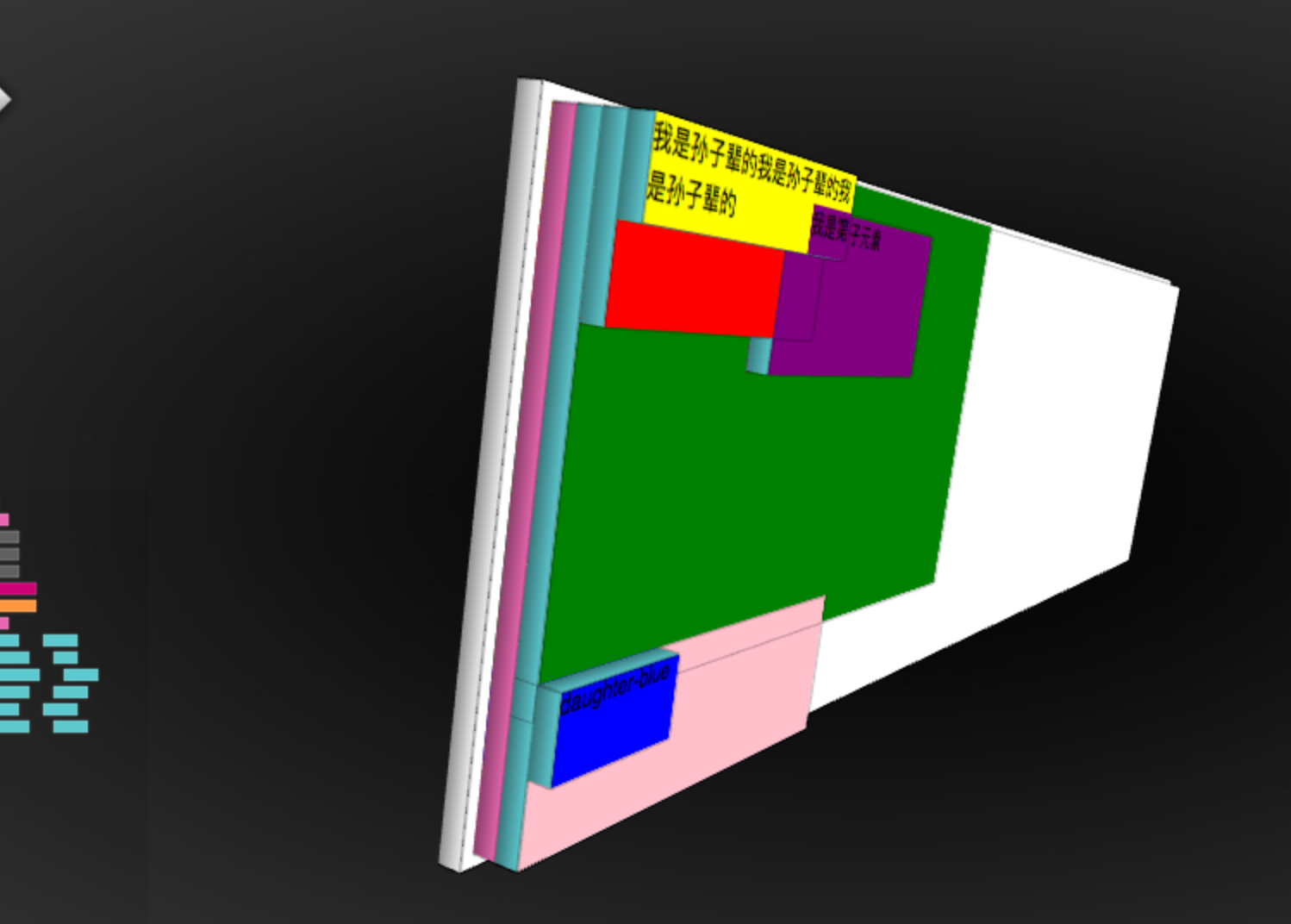
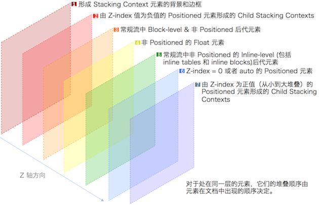
3.1 形成層疊上下文的方法?
- 根元素
- position值為 absolute|relative,且 z-index值不為 auto
- position 值為 fixed|sticky
- z-index 值不為 auto 的flex元素,即:父元素 display:flex|inline-flex
- opacity 屬性值小於 1 的元素
- transform 屬性值不為 none的元素
- mix-blend-mode 屬性值不為 normal 的元素
- filter、 perspective、 clip-path、 mask、 mask-image、 mask-border、 motion-path 值不為none 的元素
- perspective 值不為 none 的元素
- isolation 屬性被設置為 isolate 的元素
- will-change 中指定了任意 CSS 屬性,即便你沒有直接指定這些屬性的值
- -webkit-overflow-scrolling 屬性被設置 touch的元素
[!NOTE]
- 層疊上下文可以包含在其他層疊上下文中,並且一起組建了一個有層級的層疊上下文
- 每個層疊上下文完全獨立於它的兄弟元素,當處理層疊時只考慮子元素,這裡類似於BFC
- 每個層疊上下文是自包含的:當元素的內容發生層疊後,整個該元素將會在父級疊上下文中按順序進行層疊
3.2 CSS層疊上下優先順序
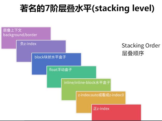
- 1.形成堆疊上下文環境的元素的背景與邊框
- 2.擁有負 z-index 的子堆疊上下文元素 (負的越高越堆疊層級越低)
- 3.正常流式佈局,非 inline-block,無 position 定位(static除外)的子元素
- 4.無 position 定位(static除外)的 float 浮動元素
- 5.正常流式佈局, inline-block元素,無 position 定位(static除外)的子元素(包括 display:table 和 display:inline )
- 6.擁有 z-index:0 的子堆疊上下文元素
- 7.擁有正 z-index: 的子堆疊上下文元素(正的越低越堆疊層級越低)
3.3 層疊上下文的堆疊順序?
[!NOTE]
總結:層疊上下文(border/background)< 負z-index < block塊狀盒子 < 浮動的盒子 < inline/inline-block水平盒子 < z-index:auto 或者 z-index:0 < 正z-index(定位並設定了正的z-index值,z-index值越大 層級越高)
4.如何解決inline-block 的間隙問題?
4.1 字元間距問題
<style>
*{
        margin: 0;
        padding: 0;
    }
    ul{
        list-style: none;
    }
    li{
        display: inline-block;
        width: 100px;
        height: 100px;
        background: red;
    }
</style>
<ul>
    <li>111</li>
    <li>222</li>
    <li>333</li>


    <li>444</li>
    <li>555</li>
</ul>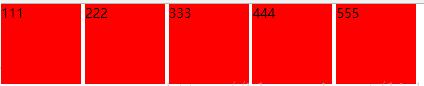
4.2 解決方法
- 1.解決方法1:直接刪除換行符(IE1像素殘留)
- 2.設置父元素的font-size為0,在子元素重新設置字體大小(低版本safari 相容性)
- 3.父元素 設置font-size:0 ;letter-spacing:-3px ,子元素重新設置font-size(推薦方案)
5.BFC是什麼?如何清除浮動?
BFC:浮動元素和絕對定位元素,非塊級盒子的塊級容器(例如 inline-blocks, table-cells, 和 table-captions),以及overflow值不為“visiable”的塊級盒子,都會為他們的內容創建新的BFC(塊級格式上下文)。它是指一個獨立的塊級渲染區域,只有Block-level BOX參與,該區域擁有一套渲染規則來約束塊級盒子的佈局,且與區域外部無關
5.1 如何觸發BFC?
- float的值不為none
- overflow的值不為visible
- display的值為inline-block、table-cell、table-caption
- position的值為absolute或fixed
5.2 BFC佈局規則
- 內部的Box會在垂直方向,一個接一個地放置。
- Box垂直方向的距離由margin決定。屬於同一個BFC的兩個相鄰Box的margin會發生重疊(高頻考點)
- 每個元素的margin box的左邊, 與包含塊border box的左邊相接觸(對於從左往右的格式化,否則相反)。即使存在浮動也是如此。
- BFC的區域不會與float box重疊。
- BFC就是頁面上的一個隔離的獨立容器,容器裡面的子元素不會影響到外面的元素。反之也如此。
- 計算BFC的高度時,浮動元素也參與計算
5.3 如何清除浮動?
- 原因:浮動的元素不會占據父元素的佈局空間(父元素佈局不會管浮動元素)
- 清除方式: 讓盒子負責自己的佈局:
5.3.1 添加額外標簽
<div class="main left">.main{float:left;}</div>
<div class="side left">.side{float:right;}</div>
<div style="clear:both;"></div>
</div>
<div class="footer">.footer</div>
5.3.2 父元素設置 overflow:hidden
<div class="wrap" id="float3" style="overflow:hidden; *zoom:1;">
<h2>3)父元素設置 overflow </h2>
<div class="main left">.main{float:left;}</div>
<div class="side left">.side{float:right;}</div>
</div>
<div class="footer">.footer</div>
5.3.3 使用:after 偽元素
<style type="text/css">
 .clearfix:after {
   content: ".";
    display: block;
    height: 0;
    clear: both;
    visibility: hidden;
    }
.clearfix {
  display: inline-block;
  *zoom:1;
  }  /* for IE/Mac */
</style>
<!--[if IE]>
 <style type="text/css">
 .clearfix {zoom: 1;/* triggers hasLayout */  display: block;/* resets display for IE/Win */} </style>
<![endif]-->
5.3.4 雙偽元素清除法(推薦)
.clearfix:before,.clearfix:after{
   content:"";
   display:table;
}
.clearfix:after{
  clear:both;
}
.clearfix{
  *zoom:1;
}
6.如何適配移動端?
6.1 viewport進行縮放
<meta name="viewport" content="width=device-width,initial-scale=1">6.2 使用rem
rem是什麼(CSS3新增),初始值:1rem=16px?
rem(font size of the root element)是指相對於根元素的字體大小的單位。簡單的說它就是一個相對單位
[!NOTE]
rem(1rem = 16px) / viewport(固定寬度) / media query(屏幕大小自適應)
6.3 設計上(響應式方法)
隱藏(移動端隱藏元素) 折行(橫排變縱排) 自適應(留下自適應的空間)(media query)
6.4 固定寬度做法
定寬佈局(版心)
7.em和rem的區別?
- rem 單位翻譯為像素值是由 html 元素的字體大小決定的。 此字體大小會被瀏覽器中字體大小的設置影響,除非顯式重寫一個具體單位。
- em 單位轉為像素值,取決於他們使用的字體大小。 此字體大小受從父元素繼承過來的字體大小,除非顯式重寫與一個具體單位
8.垂直居中的6中實現方式?
8.1 方法一:基於視口的垂直居中
<!DOCTYPE html>
<html lang="en">
  <head>
    <meta charset="UTF-8" />
    <meta name="viewport" content="width=device-width, initial-scale=1.0" />
    <meta http-equiv="X-UA-Compatible" content="ie=edge" />
    <title>垂直居中</title>
  </head>
  <style>
    .wrapper {
      overflow: hidden;
      width: 1000px;
      height: 500px;
      background: #999;
    }
    .center {
      width: 18em;
      height: 10em;
      text-align: center;
      background-color: orange;
      color: #fff;


      /* 1vh = 1% * 視口高度 */
      margin: 50vh auto;
      transform: translateY(-50%);
    }

  </style>
  <body>
    <div class="wrapper">
      <div class="center">
        基於視口的垂直居中<br />
        不要求原生有固定的寬高。<br />
        但是這種居中是在整個頁面視窗內居中,不是基於父元素<br />

      </div>
    </div>
  </body>
</html>
8.2 方法二:定寬居中
<!DOCTYPE html>
<html lang="en">
  <head>
    <meta charset="UTF-8" />
    <meta name="viewport" content="width=device-width, initial-scale=1.0" />
    <meta http-equiv="X-UA-Compatible" content="ie=edge" />
    <title>垂直居中</title>
  </head>
  <style>
    .center {
      width: 18em;
      height: 10em;
      text-align: center;
      background-color: orange;
      color: #fff;

      position: absolute;
      top: 50%;
      left: 50%;
      margin-left: -9rem;
      margin-top: -5rem;
    }
  </style>
  <body>
    <div class="center">
        要求原生有固定的寬高。<br/>
        position: absolute;<br/>
        top和left 為 50%;<br/>
        margin上為高的一半<br/>
        margin左為寬的一半<br/>
    </div>

  </body>
</html>
8.3 方法三:calc居中
<!DOCTYPE html>
<html lang="en">
  <head>
    <meta charset="UTF-8" />
    <meta name="viewport" content="width=device-width, initial-scale=1.0" />
    <meta http-equiv="X-UA-Compatible" content="ie=edge" />
    <title>垂直居中</title>
  </head>
  <style>
    .center {
      width: 18em;
      height: 10em;
      text-align: center;
      background-color: orange;
      color: #fff;

      position: absolute;
      top: calc(50% - 5em);
      left: calc(50% - 9em);
    }
  </style>
  <body>
    <div class="center">
        要求原生有固定的寬高。<br/>
        position: absolute;<br/>
        top 為 calc(50% 剪 一半高)
        left 為 calc(50% 剪 一半寬)
    </div>

  </body>
</html>
8.4 方法四:transform居中
<!DOCTYPE html>
<html lang="en">
  <head>
    <meta charset="UTF-8" />
    <meta name="viewport" content="width=device-width, initial-scale=1.0" />
    <meta http-equiv="X-UA-Compatible" content="ie=edge" />
    <title>垂直居中</title>
  </head>
  <style>
    .center {
      width: 18em;
      height: 10em;
      text-align: center;
      background-color: orange;
      color: #fff;

      position: absolute;
      top: 50%;
      left: 50%;
      transform: translate(-50%, -50%);
    }
  </style>
  <body>
    <div class="center">
        不要求原生有固定的寬高。<br/>
        position: absolute;<br/>
        top和left 為 50%;<br/>
        transform: translate(-50%, -50%);
    </div>

  </body>
</html>
8.5 方法五:flex居中方法1
<!DOCTYPE html>
<html lang="en">
  <head>
    <meta charset="UTF-8" />
    <meta name="viewport" content="width=device-width, initial-scale=1.0" />
    <meta http-equiv="X-UA-Compatible" content="ie=edge" />
    <title>垂直居中</title>
  </head>
  <style>
    .wrapper {
      width: 1000px;
      height: 600px;
      background: #999;

      display: flex;
    }
    .center {
      width: 18em;
      height: 10em;
      text-align: center;
      background-color: orange;
      color: #fff;

      margin: auto;
    }
  </style>
  <body>
    <div class="wrapper">
      <div class="center">
        使用flex居中<br/>
        父元素 display: flex; <br/>
        居中塊: margin: auto;
      </div>
    </div>
  </body>
</html>
8.6 方法六: flex居中方法2
<!DOCTYPE html>
<html lang="en">
  <head>
    <meta charset="UTF-8" />
    <meta name="viewport" content="width=device-width, initial-scale=1.0" />
    <meta http-equiv="X-UA-Compatible" content="ie=edge" />
    <title>垂直居中</title>
  </head>
  <style>
    .wrapper {
      width: 1000px;
      height: 600px;
      background: #999;

      display: flex;
      /* 盒子橫軸的對齊方式 */
      justify-content: center;
      /* 盒子縱軸的對齊方式 */
      align-items: center;
    }
    .center {
      width: 18em;
      height: 10em;
      text-align: center;
      background-color: orange;
      color: #fff;
    }
  </style>
  <body>
    <div class="wrapper">
      <div class="center">
        使用flex居中<br/>
        父元素 display: flex; <br/>
        justify-content: center;<br/>
        align-items: center;<br/>
      </div>
    </div>
  </body>
</html>
9.水平居中的4種實現方式?
9.1 方法一:text-align的center屬性
<!DOCTYPE html>
<html lang="en">
  <head>
    <meta charset="UTF-8" />
    <meta name="viewport" content="width=device-width, initial-scale=1.0" />
    <meta http-equiv="X-UA-Compatible" content="ie=edge" />
    <title>水平元素居中</title>
  </head>
  <style>
    .wrapper {
      text-align: center;
      height: 1000px;
    }
    .center {
      display: inline-block;
      width: 500px;
      height: 200px;

      background: orange;
    }
  </style>
  <body>
    <div class="wrapper">
      <div class="center">如果需要居中的元素為常規流中 inline / inline-block 元素,為父元素設置 text-align: center;</div>
    </div>
  </body>
</html>
9.2 方法二:margin的auto屬性
<!DOCTYPE html>
<html lang="en">
  <head>
    <meta charset="UTF-8" />
    <meta name="viewport" content="width=device-width, initial-scale=1.0" />
    <meta http-equiv="X-UA-Compatible" content="ie=edge" />
    <title>水平元素居中</title>
  </head>
  <style>
    .wrapper {
      width: 100%;
      height: 500px;

      text-align: center; /* 3 */
    }
    .center {
      width: 500px;
      text-align: left;
      margin: 0 auto;

      background-color: orange;
    }
  </style>
  <body>
    <div class="wrapper">
      <div class="center">
          父元素上設置 text-align: center;<br />
          居中元素上margin 為 auto。
      </div>
    </div>
  </body>
</html>
9.3 方法三:絕對定位
<!DOCTYPE html>
<html lang="en">
  <head>
    <meta charset="UTF-8" />
    <meta name="viewport" content="width=device-width, initial-scale=1.0" />
    <meta http-equiv="X-UA-Compatible" content="ie=edge" />
    <title>水平元素居中</title>
  </head>
  <style>
    .wrapper {
      width: 80%;
      height: 500px;
      background: #888;

      position: relative;
    }
    .center {
      width: 500px;
      position: absolute;
      left: 50%;
      margin-left: -250px;

      background-color: orange;
    }
  </style>
  <body>
    <div class="wrapper">
      <div class="center">如果元素positon: absolute; 那麼 0)設置父元素postion: relative 1)為元素設置寬度,2)偏移量設置為 50%,3)偏移方向外邊距設置為元素寬度一半乘以-1</div>
    </div>
  </body>
</html>
9.4 方法四:相對定位
<!DOCTYPE html>
<html lang="en">
  <head>
    <meta charset="UTF-8" />
    <meta name="viewport" content="width=device-width, initial-scale=1.0" />
    <meta http-equiv="X-UA-Compatible" content="ie=edge" />
    <title>水平元素居中</title>
  </head>
  <style>
    .wrapper {
      width: 80%;
      height: 500px;
      background: #888;
    }
    .center {
      width: 500px;
      position: relative;
      left: 50%;
      margin-left: -250px;

      background-color: orange;
    }
  </style>
  <body>
    <div class="wrapper">
      <div class="center">如果元素positon: relative。 那麼 1)為元素設置寬度,2)偏移量設置為 50%,3)偏移方向外邊距設置為元素寬度一半乘以-1</div>
    </div>
  </body>
</html>
10 居中問題要點總結
10.1 被居中元素寬高固定
10.1.1 絕對定位+margin
top和left 為 50%, margin的left和top為自身寬高一半
.center {
  position: absolute;
  top: 50%;
  left: 50%;
  margin-left: -9rem;
  margin-top: -5rem;
}
10.1.2 絕對定位+calc
top和lefe為父元素一半剪自身一半
.center {
  position: absolute;
  top: calc(50% - 5em);
  left: calc(50% - 9em);
}
10.2 被居中元素寬高不定
10.2.1 transform變換
使用CSS3 的 transform將位置在中心點平移自身寬高一半
.center {
  position: absolute;
  top: 50%;
  left: 50%;
  transform: translate(-50%, -50%);
}
10.2.2 flex佈局+auto
.wrapper {
  display: flex;
}
.center {
  margin: auto;
}
10.2.3 flex佈局+align
父元素指定子元素居中。
.wrapper {
  display: flex;
  align-items: center;
  justify-content: center;
}
10.3 在瀏覽器視窗中居中
10.3.1 基於視口的垂直居中
不要求原生有固定的寬高,但是這種居中是在整個頁面視窗內居中,不是基於父元素
.center{
  margin: 50vh auto;
  transform: translateY(-50%);
}