本篇文章將介頁面佈局中的自適應佈局,常見的自適應佈局有以下2種:左列固定右列自適應、左右兩列固定中間自適應。 ...
前言
本篇文章將介頁面佈局中的自適應佈局,常見的自適應佈局有以下2種:左列固定右列自適應、左右兩列固定中間自適應。
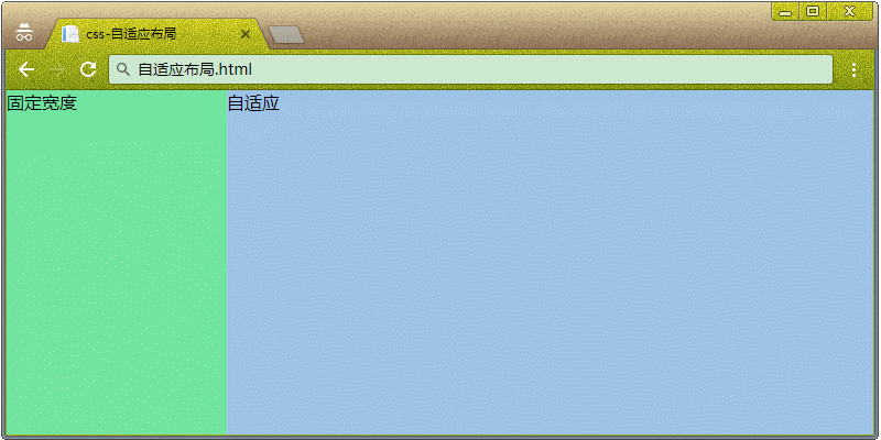
1. 左列固定右列自適應佈局方案
說明:左列固定右列自適應,也可以為右列固定左列自適應,常見於中台管理界面、移動端Web的列表展示等等。
<div class="container">
    <div class="left">固定寬度</div>
    <div class="right">自適應</div>
</div>
1.1 子元素 float:left
說明:左邊的固定列設置為 float:left,右邊的自適應列設置為 float:none。
CSS:
* { margin: 0;padding: 0 }

.container {
    position: absolute;
    width: 100%;
    height: 100%;
}
.left {
    float: left;
    width: 200px;
    height: 100%;
    background-color: #72e4a0;
}

.right {
    float: none;
    width: 100%;
    height: 100%;
    background-color: #9dc3e6;
}
1.2 子元素 width:calc()
說明:自適應列的width根據calc()自動計算,如:父容器width - 固定列width。
瀏覽器支持:IE 9+。
CSS:
* { margin: 0;padding: 0 }

.container {
    position: absolute;
    width: 100%;
    height: 100%;
}

.left {
    float: left;
    width: 200px;
    height: 100%;
    background-color: #72e4a0;
}

.right {
    float: left;
    width: calc(100% - 200px);
    height: 100%;
    background-color: #9dc3e6;
}
1.3 父元素 display: table
說明:父容器採用display: table和table-layout: fixed時,子容器會平分父容器的寬度,這時候固定某列的width,其餘的列會繼續平分剩下的寬度。
瀏覽器支持:IE 8+。
CSS:
* { margin: 0;padding: 0 }

.container {
    position: absolute;
    display: table;
    width: 100%;
    height: 100%;
    table-layout: fixed;
}

.left {
    display: table-cell;
    width: 200px;
    height: 100%;
    background-color: #72e4a0;
}

.right {
    display: table-cell;
    width: 100%;
    height: 100%;
    background-color: #9dc3e6;
}
1.4 父元素 display: flex
瀏覽器支持:IE 10+。
CSS:
* { margin: 0;padding: 0 }

.container {
    position: absolute;
    display: flex;
    width: 100%;
    height: 100%;
}

.left {
    width: 200px;
    height: 100%;
    background-color: #72e4a0;
}

.right {
    flex: 1;
    height: 100%;
    background-color: #9dc3e6;
}
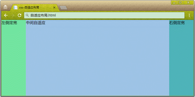
2. 左右2列固定,中間自適應
<div class="container">
    <div class="left">左側定寬</div>
    <div class="mid">中間自適應</div>
    <div class="right">右側定寬</div>
</div>
2.1 子元素 width:calc()
說明:自適應列的width根據calc()自動計算,如:父容器width - 固定列width。
瀏覽器支持:IE 9+。
CSS:
* { margin: 0;padding: 0 }

.container {
    position: absolute;
    width: 100%;
    height: 100%;
}

.left {
    float: left;
    width: 100px;
    height: 100%;
    background-color: #72e4a0;
}

.mid {
    float: left;
    width: calc(100% - 100px - 100px);
    height: 100%;
    background-color: #9dc3e6;
}

.right {
    float: left;
    width: 100px;
    height: 100%;
    background-color: #4eb3b9;
}
2.2 父元素 display: flex
說明:在父元素設置display為flex時,其中一列的flex為1,其餘列都設置固定width。
瀏覽器支持:IE 10+。
CSS:
* { margin: 0;padding: 0 }

.container {
    position: absolute;
    display: flex;
    width: 100%;
    height: 100%;
}

.left {
    float: left;
    width: 100px;
    height: 100%;
    background-color: #72e4a0;
}

.mid {
    float: left;
    height: 100%;
    flex: 1;
    background-color: #9dc3e6;
}

.right {
    float: left;
    width: 100px;
    height: 100%;
    background-color: #4eb3b9;
}
End Web開發之路系列文章 菜單載入中...