本文介紹了CSS繪製三角形、CSS高級動畫等知識,並對Transition和Transform的使用進行了對比。 ...
CSS效果
1.使用div繪製圖形(三角形)?
<!DOCTYPE html>
<html lang="en">
<head>
    <meta charset="UTF-8">
    <title>Title</title>
    <style>
        .triangle-top {
            width: 0;
            height: 0;
            border-width: 0 40px 40px;
            border-style: solid;
            border-color: transparent transparent red;
        }

        .triangle-bottom {
            width: 0;
            height: 0;
            border-style: solid;
            border-width: 40px 40px 0 40px;
            border-color: blueviolet transparent transparent transparent;
        }

        .triangle-left {
            width: 0;
            height: 0;
            border-style: solid;
            border-width: 40px 0 40px 40px;
            border-color: transparent transparent transparent #89ff56;
        }

        .triangle-right {
            width: 0;
            height: 0;
            border-style: solid;
            border-width: 40px 40px 40px 0;
            border-color: transparent yellowgreen transparent;
        }


        /*缺口的三角形*/
        .box{
            position: absolute;
            left: 0;
            top: 0;
            width: 0;
            height:0;
            border: 6px solid transparent;
        }
        .b1{
            /*底層的盒子三角形相當於全部是黑色的*/
            border-bottom-color:#000 ;
        }
        .b2{
            /*上層的為白色覆蓋*/
            border-bottom-color:#fff ;
        }
    </style>
</head>
<body>

<div class="triangle-top"></div>
<div class="triangle-bottom"></div>
<div class="triangle-left"></div>
<div class="triangle-right"></div>

<div class="box b1"></div>
<div class="box b2"></div>
</body>
</html>
2.如何產生一個不占空間的邊框?( box-sizing屬性)?
[!NOTE]
知識點:IE和標準盒子模型的異同點
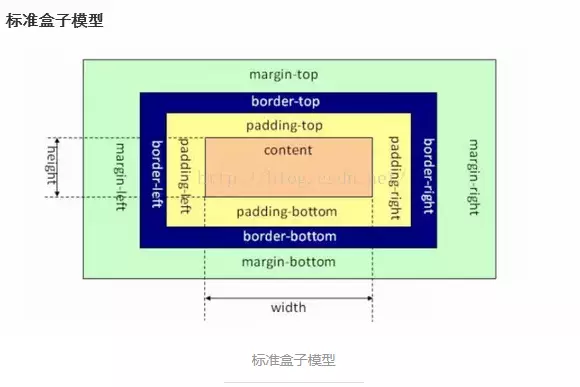
- 標準盒子模型:元素的width或height=content的width或height;
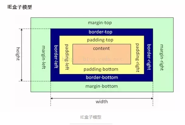
- IE盒子模型:元素的width或height=content的width或height+padding2+border2;
    /*IE盒子模型:width_sum = margin + width*/
    .border-box-use {
        box-sizing : border-box;
        /*通過IE的盒子模型設置出來之後,這個盒子內容區域的寬度實際只有180px
            這裡指定的width 實際上是包含了border的寬度的
        */
        width: 200px;
        height: 200px;

        border: 10px solid #89ff56;
    }

    /*標準盒子模型:width_sum = margin + width + padding + width*/
    .border-content-box-use {
        /*設置為標準的盒子模型,預設值*/
        box-sizing: content-box;

        width: 200px;
        height: 200px;

        padding: 1px;
        border: 10px solid #ff255f;
    }

    .parent-box-inhrit {
        /*設置當前的盒子模型是從父級盒子中繼承,這裡相當於是繼承了IE的盒子模型*/
        box-sizing: inherit;
        width: 50px;
        height: 50px;
        background-color: #48adff;

        border: 1px solid #000;

        /*對一個元素自身設置padding,相當於是把盒子撐大了*/
        padding: 5px;
    }
2.1 使用box-shadow實現
/*box-shadow 製作邊框*/
.box-shadow-border {
    width: 200px;
    height: 200px;
    /*設置外陰影:x y 模糊區域 擴展區域*/
    box-shadow: 0 0 0 10px red , 0 0 0 10px blue;
}
2.2 使用outline實現
在元素邊框邊緣的外圍繪製一條包圍元素的線,包括outline-color、outline-style、outline-width三個子屬性的設置,可預設,無固定順序。輪廓不占據頁面空間,也不一定是矩形。即不會增加額外的width或者height。
.borner-no-space {
    width: 200px;
    height: 200px;
    outline: 10px solid red;
}
3.如何實現IOS圖標的圓角?
/*clip-path的使用
            1. 對容器進行裁剪
            2. 常見集合圖形
            3. 自定義路徑
*/
.container-clippath {
    width: 400px;
    height: 300px;
    border: 1px solid #000;
    background-image: url("bg.jpg");
    background-size: contain;
    background-repeat: no-repeat;
    background-position: center center;

    /*開始進行區域裁剪*/
    /*clip-path: circle(50px at 100px 100px);*/
    /*clip-path: inset(100px 50px);*/
    clip-path: polygon(50% 0%, 100% 50%, 50% 100%, 0% 50%);
    /*同時,也是支持svg矢量圖的裁剪*/
}

.container-clippath:hover {
    clip-path: circle(80px at 100px 100px);
}
5.說下背景圖的居中顯示/重覆/改變大小?
background-position: 背景圖片相對容器原點的起始位置
background-repeat
background-size : cover/contain(設置大小)
/* 一個值: 這個值指定圖片的寬度,那麼第二個值為auto */
background-size: auto
background-size: 50%
background-size: 3em
background-size: 12px

/* 兩個值: 第一個值指定圖片的寬度,第二個值指定圖片的高度 */
background-size: 50% auto
background-size: 3em 25%
background-size: auto 6px
background-size: auto auto
/*多重背景,請用逗號隔開,在CSS語法中凡語法後跟*或者#,都是可以無限重覆的,但是必須用逗號隔開。 */
background-size: auto, auto     /* 不要跟background-size: auto auto混淆了 */
background-size: 50%, 25%, 25%
background-size: 6px, auto, contain

background-size: inherit
6.如何平移/放大一個元素?如何實現0.5px的邊框?
[!NOTE]
知識點:transform的靈活使用
<style>
.custom-border{
    width:200px;
    margin:10px auto;
    height:100px;
    border:1px solid #333;
    background-color:#eee;
    padding:10px;
}
.scale-border{
    margin:10px auto;
    height:100px;
    position:relative;
    padding:10px;
    width: 200px;
}
.border{
    -webkit-transform:scale(0.5);
    transform:scale(0.5);
    position:absolute;
    border:1px solid #333;
    top:-50%;
    right:-50%;
    bottom:-50%;
    left:-50%;
    background-color:#eee;
}
.content{
    position:relative;
    z-index:2;
}
</style>

<body>
    <div class="custom-border border-color">邊框寬度1px</div>
    <div class="scale-border">
        <div class="content">邊框寬度0.5px</div>
        <div class="border border-color"></div>
    </div>
</body>
</html>
7.如何實現3D效果(旋轉的硬幣)?
/* 1. 設置一個透視變換,相機距離圖像的距離 */
/* perspective : 500px */
/* 2. 設置視覺查看的樣式 */
/* transform-style : perspective-3d */
/* 3. 變換圖像 */
/* transform : translate rotate */


/*旋轉的硬幣效果*/
.money {
    width: 100px;
    height: 100px;
    border-radius: 50px;
    background-color: #48adff;
    border: 2px solid #000;

    /*開啟3D效果*/

    perspective: 500px;
    transform-style: preserve-3d;
    /*transform : rotateY(180deg);*/
    animation : rotate 2s linear infinite;
}

@keyframes rotate {
    from {
        transform : rotateY(0deg);
    }
    to {
        transform : rotateY(360deg);
    }
}