
1. 為什麼需要設計一個狀態按鈕 "OnePomodoro" 應用里有個按鈕用來控制計時器的啟動/停止,本來這應該是一個包含“已啟動”和“已停止”兩種狀態的按鈕,但我以前在WPF和UWP上做過太多StateButton、ProgressButton之類的東西,已經厭倦了這種控制項,所以我在 應用里只是 ...
1. 為什麼需要設計一個狀態按鈕
OnePomodoro應用里有個按鈕用來控制計時器的啟動/停止,本來這應該是一個包含“已啟動”和“已停止”兩種狀態的按鈕,但我以前在WPF和UWP上做過太多StateButton、ProgressButton之類的東西,已經厭倦了這種控制項,所以我在OnePomodoro應用里只是簡單地使用兩個按鈕來實現這個功能:
<Button Content=""
Visibility="{x:Bind ViewModel.IsTimerInProgress,Converter={StaticResource NegationBoolToVisibilityConverter}}"
Command="{Binding StartTimerCommand}" />
<Button Content=""
Visibility="{x:Bind ViewModel.IsTimerInProgress,Converter={StaticResource BoolToVisibilityConverter}}"
Command="{Binding StopTimerCommand}" />
頗有花花公子玩膩了找個良家結婚的意味。但兩個按鈕實際用起來很不順手,手感也不好,尤其狀態切換時會有種撕裂的感覺,越用越不爽,最後還是花時間又做了一個狀態按鈕PomodoroStateButton。這個按鈕目標是要低調又炫麗,可以匹配OnePomodoro的多個主題。期間試玩了很多種技術,最後留下了這個成果:
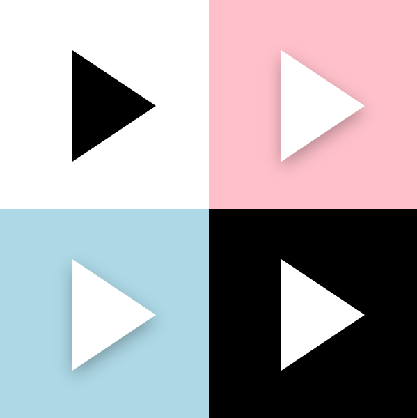
看起來簡直就是平平無奇。

下麵說說實現細節。
2. 按鈕狀態
我做自定義控制項一定會先寫代碼部分,然後再寫XAML部分,功能和外觀要做到解耦,寫起來也不會亂。
PomodoroStateButton 繼承自Button,除了Button本身的CommonStates,PomodoroStateButton還包含以下兩組VisualState:
- ProgressStates:Idle為番茄鐘計時器正在計時,Busy為番茄鐘停止的狀態。
- PromodoroStates:Inwork為正處於工作狀態,Break為休息狀態。
雖然是一個放飛自我的控制項,但基本的規則還是要遵守的,VisualState對應的TemplateVisualState不能省:
[TemplateVisualState(GroupName = ProgressStatesName, Name = IdleStateName)]
[TemplateVisualState(GroupName = ProgressStatesName, Name = BusyStateName)]
[TemplateVisualState(GroupName = PromodoroStatesName, Name = InworkStateName)]
[TemplateVisualState(GroupName = PromodoroStatesName, Name = BreakStateName)]

public class PomodoroStateButton : Button
{
    private const string ProgressStatesName = "ProgressStates";
    private const string IdleStateName = "Idle";
    private const string BusyStateName = "Busy";

    private const string PromodoroStatesName = "PromodoroStates";
    private const string InworkStateName = "Inwork";
    private const string BreakStateName = "Break";

    protected virtual void UpdateVisualStates(bool useTransitions)
    {
        VisualStateManager.GoToState(this, IsInPomodoro ? InworkStateName : BreakStateName, useTransitions);
        VisualStateManager.GoToState(this, IsTimerInProgress ? BusyStateName : IdleStateName, useTransitions);
    }
有了這些按鈕基本就滿足番茄鐘的需求了。
3. ICommand
需要支持Start和Stop兩個Command。要實現ICommand支持,控制項中要執行如下步驟:
- 定義Command和CommandParameter屬性。
- 監視Command的CanExecuteChanged事件。
在CanExecuteChanged的事件處理函數及CommandParameter的PropertyChangedCallback中,根據Command.CanExecute(CommandParameter)的結果設置控制項的IsEnabled屬性。
在某個事件(Click或者ValueChanged)中執行Command。
這篇文章里有詳細介紹:瞭解模板化控制項(7):支持Command
因為從需求來說這個按鈕不需要CommandParameter,也不需要監視CanExecuteChanged事件,所以實現得簡單些:
public ICommand StartCommand
{
    get => (ICommand)GetValue(StartCommandProperty);
    set => SetValue(StartCommandProperty, value);
}

public ICommand StopCommand
{
    get => (ICommand)GetValue(StopCommandProperty);
    set => SetValue(StopCommandProperty, value);
}

private void OnClick(object sender, RoutedEventArgs e)
{
    if (IsTimerInProgress)
    {
        if (StopCommand != null && StopCommand.CanExecute(this))
            StopCommand.Execute(this);
    }
    else
    {
        if (StartCommand != null && StartCommand.CanExecute(this))
            StartCommand.Execute(this);
    }
}
4. 變形
寫完代碼部分才開始寫XAML部分。
PomodoroStateButton的ControlTempalte中最核心的是一個Polygon,在計時器啟動和停止之間按鈕圖標需要改變它的形狀,本來是三角形,需要被用戶變成正方形的形狀。這部分的操縱在ProgressStates里做。如果只是簡單地隱藏/顯示或者更換Points會很無聊,這裡我使用了以前介紹過的ProgressToPointCollectionBridge,具體可以見 用Shape做動畫(2) 使用與擴展PointAnimation 這篇文章。為了讓變形流暢些我讓三角形先變成圓形再變形到正方形,還加入了旋轉動畫:
<VisualTransition From="Idle" To="Busy">
    <Storyboard >
        <DoubleAnimation Storyboard.TargetName="ProgressToPointCollectionBridge" Storyboard.TargetProperty="Progress" To="1" EnableDependentAnimation="True" Duration="0:0:0.3">
            <DoubleAnimation.EasingFunction>
                <CubicEase EasingMode="EaseOut"/>
            </DoubleAnimation.EasingFunction>
        </DoubleAnimation>
        <DoubleAnimation Storyboard.TargetName="ShapeCompositeTransform" Storyboard.TargetProperty="Rotation" To="180" EnableDependentAnimation="True" Duration="0:0:0.3">
            <DoubleAnimation.EasingFunction>
                <CubicEase EasingMode="EaseOut"/>
            </DoubleAnimation.EasingFunction>
        </DoubleAnimation>

    </Storyboard>
</VisualTransition>

<Border.Resources>
    <controls:ProgressToPointCollectionBridge x:Name="ProgressToPointCollectionBridge"
                   Progress="0">
        <PointCollection>三角形的點</PointCollection>
        <PointCollection>圓型的點</PointCollection>
        <PointCollection>正方形的點</PointCollection>
    </controls:ProgressToPointCollectionBridge>
</Border.Resources>

<Polygon Points="{Binding Source={StaticResource ProgressToPointCollectionBridge},Path=Points}"/>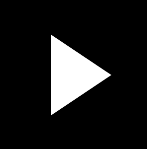
順便提一下其它的變形方案。
HandyControl提供了GeometryAnimation,可以像使用其它線性動畫那樣使用變形動畫:
<hc:GeometryAnimationUsingKeyFrames Storyboard.TargetProperty="Data" Storyboard.TargetName="PathDemo">
    <hc:DiscreteGeometryKeyFrame KeyTime="0:0:0.7" Value="{StaticResource FaceBookGeometry}"/>
    <hc:EasingGeometryKeyFrame KeyTime="0:0:1.2" Value="{StaticResource TwitterGeometry}">
        <hc:EasingGeometryKeyFrame.EasingFunction>
            <QuarticEase EasingMode="EaseInOut"/>
        </hc:EasingGeometryKeyFrame.EasingFunction>
    </hc:EasingGeometryKeyFrame>
</hc:GeometryAnimationUsingKeyFrames>
也可以使用MorphSVG,或類似的SVG變形庫:
5. 傳遞AlphaMask
我在使用GetAlphaMask製作陰影這篇文章里介紹瞭如何使用GetAlphaMask函數獲取元素的AlphaMask,在 PomodoroStateButton里我也使用這個函數獲取了ControlTemplate中的Polygon(就是上面變形的部分)的AlphaMask,並使用這個AlphaMask創建陰影、處理MouseEnter/MouseLeave的動畫、Pressed的狀態變換、還有Inwork/Break狀態切換的動畫。這還真是累壞它了,而要在一個元素上處理這個多動畫我也會累,所以我沒有使用DropShadowPanel那種ContentControl的方案,因為那樣只能由ContentControl自己擁有Polygon的AlphaMask。而是創建了多個ButtonDecorator控制項,讓它們都用RelativeElement="{Binding ElementName=Shape}"的方式關聯Polygon,然後再通過GetAlphaMask函數獲取Polygon的AlphaMask,做到人手一份Polygon的AlphaMask,然後各自進行動畫,這樣避免了動畫太過複雜。XML大致這樣:
<controls:ButtonDecorator  x:Name="Shadow"
                           RelativeElement="{Binding ElementName=Shape}"
                           Style="{StaticResource Shadow}"/>
<controls:ButtonDecorator RelativeElement="{Binding ElementName=Shape}"
                          x:Name="Outline"
                          Style="{StaticResource Outline}"/>
<controls:ButtonDecorator RelativeElement="{Binding ElementName=Shape}"
                          Style="{StaticResource Glow}"
                          IsInPomodoro="{TemplateBinding IsInPomodoro}"/>
<Polygon Points="{Binding Source={StaticResource ProgressToPointCollectionBridge},Path=Points}"
         StrokeThickness="4"
         Stretch="None"
         StrokeEndLineCap="Round"
         x:Name="Shape"/>
6. 傳遞ButtonState
<VisualState x:Name="Pressed">
    <VisualState.Setters>
        <Setter Target="RootGrid.(RevealBrush.State)" Value="Pressed" />
        <Setter Target="RootGrid.Background" Value="{ThemeResource ButtonRevealBackgroundPressed}" />
        <Setter Target="ContentPresenter.BorderBrush" Value="{ThemeResource ButtonRevealBorderBrushPressed}" />
        <Setter Target="ContentPresenter.Foreground" Value="{ThemeResource ButtonForegroundPressed}" />
    </VisualState.Setters>

    <Storyboard>
        <PointerDownThemeAnimation Storyboard.TargetName="RootGrid" />
    </Storyboard>
</VisualState>上面是是ButtonRevealStyle的部分XAML,應用了ButtonRevealStyle樣式的按鈕有很複雜的外觀,但它的Style寫得倒很簡潔,這是因為它把狀態傳遞給RevealBrush由它去處理動畫(還有PointerDownThemeAnimation之類的),這樣分解了複雜的XAML。我也為ButtonDecorator添加了State屬性,它是一個ButtonState枚舉類型的屬性:
public enum ButtonState
{
    //
    // 摘要:
    //     元素處於其預設狀態。
    Normal = 0,
    //
    // 摘要:
    //     指針在元素上。
    PointerOver = 1,
    //
    // 摘要:
    //     已按下元素。
    Pressed = 2
}
PomodoroStateButton在CommonStates的個狀態間轉變時會做輪廓的Outward和Inward動畫,陰影也會變顏色,但因為通過傳遞ButtonState分離了複雜的XAML,所以CommonStates的XAML倒是寫得很簡單:
<VisualState x:Name="Normal" >
    <VisualState.Setters>
        <Setter Target="Outline.State" Value="Normal"/>
        <Setter Target="Shadow.State" Value="Normal"/>
    </VisualState.Setters>
</VisualState>
<VisualState x:Name="PointerOver">
    <VisualState.Setters>
        <Setter Target="Outline.State" Value="PointerOver"/>
        <Setter Target="Shadow.State" Value="PointerOver"/>
    </VisualState.Setters>
</VisualState>
<VisualState x:Name="Pressed">
    <VisualState.Setters>
        <Setter Target="Outline.State" Value="Pressed"/>
        <Setter Target="Shadow.State" Value="Pressed"/>
        <Setter Target="Shape.Opacity" Value="0.7"/>
    </VisualState.Setters>
</VisualState>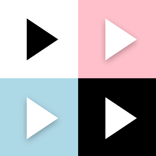
7. 圓周動畫
PomodoroStateButton在Inwork和Break之間切換的時候讓左右兩邊的藍色和紅色陰影做半圈圓周運動交換位置,雖然也可以將就些,但當時太閑了就講究起來了。
之前 介紹ProgressRing的文章 里說過怎麼做圓周運動,簡單來說就是把元素放到一個大的容器里,對整個容器做旋轉。
<Page.Resources>
    <Storyboard RepeatBehavior="Forever" x:Key="Sb" >
        <DoubleAnimation Storyboard.TargetName="E1R" BeginTime="0" Storyboard.TargetProperty="Angle" Duration="0:0:4" To="360"/>
    </Storyboard>
</Page.Resources>
<Grid Background="White">
    <Canvas RenderTransformOrigin=".5,.5" Height="100" Width="100">
        <Canvas.RenderTransform>
            <RotateTransform x:Name="E1R" />
        </Canvas.RenderTransform>
        <Rectangle  Width="20"  Height="20"  Fill="MediumPurple"  />
    </Canvas>
</Grid>
但是這樣的話裡面的元素也會跟著旋轉,其中一種解決方法是裡面的元素用同樣的速度向著反方向做旋轉,抵消外層的旋轉。但那時我太閑用了另一種方法,也就是平移:
<Page.Resources>
    <Storyboard RepeatBehavior="Forever" x:Key="Sb" >
        <DoubleAnimationUsingKeyFrames Storyboard.TargetName="Translate1" Storyboard.TargetProperty="X" EnableDependentAnimation="True">
            <EasingDoubleKeyFrame KeyTime="0:0:4" Value="120">
                <EasingDoubleKeyFrame.EasingFunction>
                    <QuadraticEase EasingMode="EaseInOut"/>
                </EasingDoubleKeyFrame.EasingFunction>
            </EasingDoubleKeyFrame>
            <EasingDoubleKeyFrame KeyTime="0:0:8" Value="0">
                <EasingDoubleKeyFrame.EasingFunction>
                    <QuadraticEase EasingMode="EaseInOut"/>
                </EasingDoubleKeyFrame.EasingFunction>
            </EasingDoubleKeyFrame>
        </DoubleAnimationUsingKeyFrames>

        <DoubleAnimationUsingKeyFrames Storyboard.TargetName="Translate1" Storyboard.TargetProperty="Y" EnableDependentAnimation="True">
            <EasingDoubleKeyFrame KeyTime="0:0:2" Value="60">
                <EasingDoubleKeyFrame.EasingFunction>
                    <QuadraticEase EasingMode="EaseOut"/>
                </EasingDoubleKeyFrame.EasingFunction>
            </EasingDoubleKeyFrame>
            <EasingDoubleKeyFrame KeyTime="0:0:4" Value="0">
                <EasingDoubleKeyFrame.EasingFunction>
                    <QuadraticEase EasingMode="EaseIn"/>
                </EasingDoubleKeyFrame.EasingFunction>
            </EasingDoubleKeyFrame>
            <EasingDoubleKeyFrame KeyTime="0:0:6" Value="-60">
                <EasingDoubleKeyFrame.EasingFunction>
                    <QuadraticEase EasingMode="EaseOut"/>
                </EasingDoubleKeyFrame.EasingFunction>
            </EasingDoubleKeyFrame>
            <EasingDoubleKeyFrame KeyTime="0:0:8" Value="0">
                <EasingDoubleKeyFrame.EasingFunction>
                    <QuadraticEase EasingMode="EaseIn"/>
                </EasingDoubleKeyFrame.EasingFunction>
            </EasingDoubleKeyFrame>
        </DoubleAnimationUsingKeyFrames>
    </Storyboard>
</Page.Resources>
<Grid Background="White">
    <Grid Height="100" Width="100">
        <Rectangle Width="20" Height="20" Fill="MediumPurple"  RenderTransformOrigin=".5,.5"  HorizontalAlignment="Left" VerticalAlignment="Center">
            <Rectangle.RenderTransform>
                <TranslateTransform x:Name="Translate1" X="0" Y="0" />
            </Rectangle.RenderTransform>
        </Rectangle>
    </Grid>
</Grid>
選擇QuadraticEase,搭配得宜的話可以做到漂亮的圓周運動,效果如下:

當然實際上我使用了CircleEase,效果更調皮些,PomodoroStateButton在Inwork和Break之間切換後的效果如下:

(雖然搞這麼複雜也沒什麼意義。)
8. 結語
這樣一個手感還不錯,看上去很收斂實際上用了一大堆代碼的狀態按鈕就完成了,使用了兩個月下來感覺手感還算好,而且很容易和各種主題的番茄鐘搭配。
可以安裝我的番茄鐘應用試玩一下,安裝地址:
9. 源碼
OnePomodoro_Controls at master


