CSS水平垂直居中 1 絕對定位 + 轉換 2 彈性模型 3 單元格方式 ...
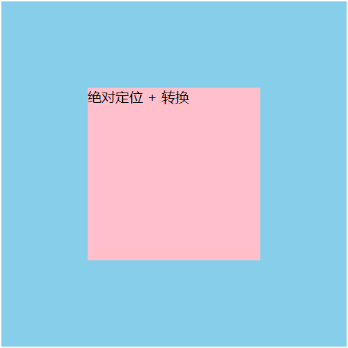
1 絕對定位 + 轉換
<div class="parent">
  <div class="child">絕對定位 + 轉換</div>
</div>
.parent {
position: relative;
width: 400px;
height: 400px;
background: skyblue;
}
.child {
position: absolute;
left: 50%;
top: 50%;
transform: translate(-50%, -50%);
width: 200px;
height: 200px;
background: pink;
}
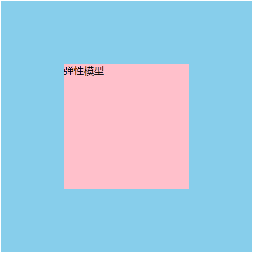
2 彈性模型
<div class="parent">
  <div class="child">彈性模型</div>
</div>
.parent {
display: flex;
justify-content: center;
align-items: center;
width: 400px;
height: 400px;
background: skyblue;
}
.child {
width: 200px;
height: 200px;
background: pink;
} 
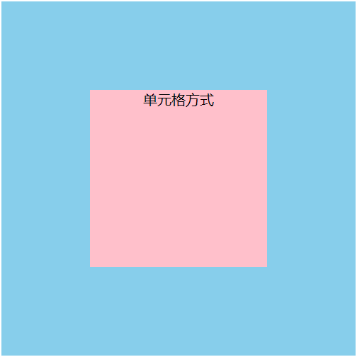
3 單元格方式
<div class="parent">
  <div class="child">單元格方式</div>
</div>
.parent {
display: table-cell;
text-align: center;
vertical-align: middle;
width: 400px;
height: 400px;
background: skyblue;
}
.child {
display: inline-block;
width: 200px;
height: 200px;
background: pink;
}