個人很喜歡谷歌的material design,很喜歡但是沒有動手弄過,今天想動手操作一下Floating Action Button菜單,網上有很多種:圓形、扇形、射線、直線等。我想在一個例子中用到這幾種展現形式,觸發按鈕在不同的位置,菜單用不同的方式展示…… 基於這種需求,開始著手準備,此時遇到 ...
個人很喜歡谷歌的material design,很喜歡但是沒有動手弄過,今天想動手操作一下Floating Action Button菜單,網上有很多種:圓形、扇形、射線、直線等。我想在一個例子中用到這幾種展現形式,觸發按鈕在不同的位置,菜單用不同的方式展示……
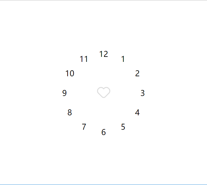
基於這種需求,開始著手準備,此時遇到一個問題,就是計算彈出按鈕的位置,開始的時候也沒有多想就開始一個一個的計算位置了,在計算的過程中發現有的坐標是一樣的(這裡採用彈出四個菜單),在計算對應的圓形、扇形、半圓形菜單的位置時感覺還好是有一定規律的,畫了幾個圖之後發現這不就是鐘錶上12個數字的位置嗎???哎!!!所以才有了這一篇前傳,先弄一個表盤。
在用css畫一個表盤的時候,也遇到了一些問題,因為中心原點和12個數字都是用的div,他們都是有大小的(這裡記作:中心圓半徑為28px,即div的寬高都是28px;數字圓的半徑為20px,即div的寬高都是20px)。開始的時候,以中心圓圓心為圓心,已某一值為半徑(暫記作100px)畫圓,之後12個數字的div的圓心都在前面的圓上。以這種方式,來計算相對位置,即12個數字圓的left和top,很麻煩,因為存在著坐標平移……後來一想為什麼不能將兩個坐標系的中心重合,之後再去計算位置簡單多了(不存在坐標平移)。實現方式就是12個數字圓放在一個div中,這個div的高度和寬度都是0,位置放在中心圓的圓心位置,單個數字圓的實現方式類似……
方式定了之後就是具體的位置計算了,這裡用的是三角函數,因為這裡沒有使用js,要想在css中實現三角函數就只能less或者其他了(就是用過他,他的沒有研究,據說scss沒有內置,還得自己寫……),上一張圖,說明一下12個數字圓對應在坐標系中的位置,該用什麼度數計算三角函數值:
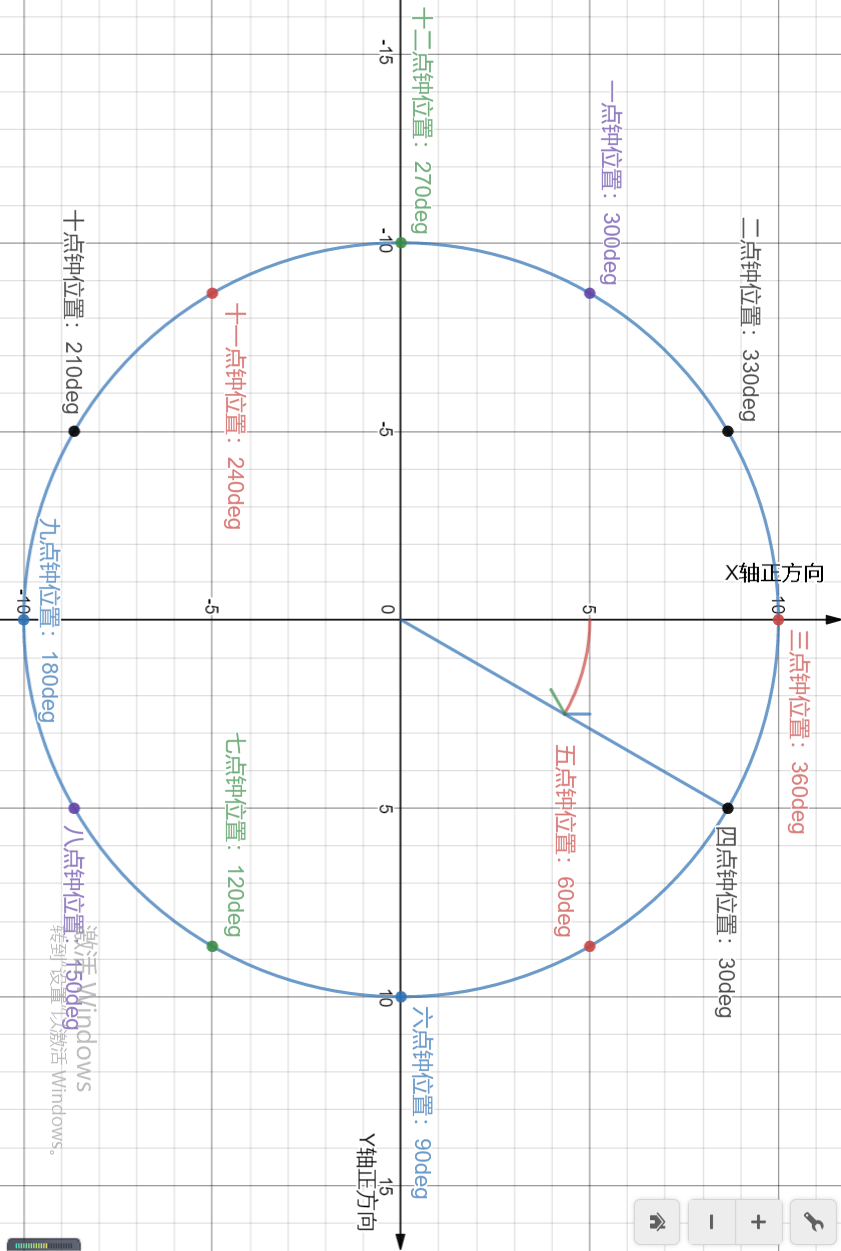
三點鐘方向算是0度,四點鐘為30度,順時針旋轉,依此類推……畫這個圖太費勁了,關鍵是不知道哪裡有這樣的工具,這裡是在一個線上網站上畫的,畫完之後是可以分享的,分享一下鏈接地址:https://www.desmos.com/calculator/a9sdt0or3s
下麵貼一下代碼:


<!DOCTYPE html>
<html lang="en">

<head>
    <meta charset="UTF-8">
    <meta name="viewport" content="width=device-width, initial-scale=1.0">
    <meta http-equiv="X-UA-Compatible" content="ie=edge">
    <title>fab 菜單實現之前傳-鐘錶表盤</title>
    <link rel="stylesheet" href="./index.css">
</head>

<body>
    <div class="page-container">
        <div class="fab-menu-container">
            <div class="fab-trigger"><i class="icon icon-heart"></i></div>
            <div class="fab-action-container">
                <div class="action">
                    <div class="action-content">1</div>
                </div>
                <div class="action">
                    <div class="action-content">2</div>
                </div>
                <div class="action">
                    <div class="action-content">3</div>
                </div>
                <div class="action">
                    <div class="action-content">4</div>
                </div>
                <div class="action">
                    <div class="action-content">5</div>
                </div>
                <div class="action">
                    <div class="action-content">6</div>
                </div>
                <div class="action">
                    <div class="action-content">7</div>
                </div>
                <div class="action">
                    <div class="action-content">8</div>
                </div>
                <div class="action">
                    <div class="action-content">9</div>
                </div>
                <div class="action">
                    <div class="action-content">10</div>
                </div>
                <div class="action">
                    <div class="action-content">11</div>
                </div>
                <div class="action">
                    <div class="action-content">12</div>
                </div>
            </div>
        </div>
    </div>

</body>

</html>
html代碼
// 1、 純CSS圖標 ********開始********

// 圖標通用樣式
.icon {
    display: inline-block;
    vertical-align: middle;
    position: relative;
    font-style: normal;
    color: #ddd;
    text-align: left;
    text-indent: -9999px;
    direction: ltr;
}

.icon::after,
.icon::before {
    content: '';
    pointer-events: none;
}

// 加號圖標
.icon-plus {
    width: 30px;
    height: 30px;
}

.icon-plus::before {
    width: 20px;
    height: 2px;
    position: absolute;
    left: 50%;
    top: 50%;
    transform: translate(-50%, -50%);
    box-shadow: inset 0 0 0 32px;
}

.icon-plus::after {
    height: 20px;
    width: 2px;
    position: absolute;
    left: 50%;
    top: 50%;
    transform: translate(-50%, -50%);
    box-shadow: inset 0 0 0 32px;
}

// 心型圖標
.icon-heart {
    width: 20px;
    height: 20px;
    border-top-color: transparent;
    border-left-color: transparent;
    transform: rotate(45deg);
    border-radius: 7px 0;
    margin: 9px 7px 5px;
    border-bottom: 2px solid;
    border-right: 2px solid;
}

.icon-heart::before {
    width: 12px;
    height: 20px;
    position: absolute;
    left: -10px;
    bottom: -2px;
    border-radius: 20px 0 0 20px;
    border: 2px solid;
    border-right: none;
}

.icon-heart::after {
    width: 20px;
    height: 12px;
    right: -2px;
    top: -10px;
    border-radius: 20px 20px 0 0;
    position: absolute;
    border: 2px solid;
    border-bottom: none;
}

// 純CSS圖標 ********結束********

@fabTriggerRadius: 28px;
@fabActionRadius: 20px;
@distanceBetweenCircleCenter: 100px;
@fabActionCounter: 12;

*,
*::after,
*::before {
    box-sizing: border-box;
}

html,
body {
    height: 100%;
    width: 100%;
    margin: 0;
    overflow: hidden;
}

.page-container {
    height: 100%;
    width: 100%;
    display: flex;
    align-items: center;
    justify-content: center;
}

.fab-menu-container {
    width: 2 * @fabTriggerRadius;
    height: 2 * @fabTriggerRadius;
    position: fixed;

    >.fab-trigger {
        height: 100%;
        width: 100%;
        //background-color: #06C;
        color: #FFF;
        //box-shadow: 0 2px 5px 0 rgba(0, 0, 0, 0.11);
        display: flex;
        align-items: center;
        justify-content: center;
    }

    >.fab-action-container {
        height: 0;
        width: 0;
        // background-color: red;
        position: absolute;
        top: @fabTriggerRadius;
        left: @fabTriggerRadius;

        >.action {
            height: 0;
            width: 0;
            position: absolute;

            .for(@i) when (@i <=@fabActionCounter) {

                &:nth-child(@{i}) {
                    left: @distanceBetweenCircleCenter * cos((@i - 3)*30deg);
                    top: @distanceBetweenCircleCenter * sin((@i - 3)*30deg);
                }

                .for((@i + 1));
            }

            .for(1);

            >.action-content {
                width: 2 * @fabActionRadius;
                height: 2 * @fabActionRadius;
                position: absolute;
                top: -@fabActionRadius;
                left: -@fabActionRadius;
                display: flex;
                align-items: center;
                justify-content: center;
                // background-color: red;
            }
        }
    }
}
less代碼
至此,這篇文章就結束了。這裡在記錄幾個網址:
1、35 Cool Floating Action Button Animations
以下為純CSS圖標:
5、https://codepen.io/stiffi/pen/ysbCd
6、https://codepen.io/tidusxujun/pen/GgNxxP
7、https://codepen.io/airpwn/pen/hgdBc