由於近期的項目中出現了不規則的邊框和圖形, 所以重新溫習一下CSS3的圖形繪製。。。樣式繪製的圖形比圖片的性能要好,體驗更佳,關鍵一點是更加有趣! 以下幾個例子主要是運用了css3中border、bordr-radius、transform、偽元素等屬性來完成的,我們先瞭解下它們的基本原理。 bor ...
由於近期的項目中出現了不規則的邊框和圖形, 所以重新溫習一下CSS3的圖形繪製。。。樣式繪製的圖形比圖片的性能要好,體驗更佳,關鍵一點是更加有趣!
以下幾個例子主要是運用了css3中border、bordr-radius、transform、偽元素等屬性來完成的,我們先瞭解下它們的基本原理。
border:簡單的來說border語法主要包含(border-width、border-style、border-color)三個屬性。
-
- border-top(上邊框):border-width border-style border-color
- border-right(右邊框):border-width border-style border-color
- border-bottom(下邊框):border-width border-style border-color
- border-left(左邊框):border-width border-style border-color
border-radius:border-radius 的語法比我們想像中靈活得多。你可能會驚訝地發現 border-radius 原來是一個簡寫屬性。它所對應的各個展開式屬性:
-
- border-top-left-radius(左上圓角半徑)
- border-top-right-radius (右上圓角半徑)
- border-bottom-right-radius (右下圓角半徑)
- border-bottom-left-radius(左下圓角半徑)
border-image:共有三個屬性,分別是圖片(border-image-source)、剪裁位置(border-image-slice)、重覆性(border-image-repeat)。
圖片:使用URL調用
剪裁位置:共有1~4個參數,沒有單位(預設是像素),也可以用百分比
-
- 第一個參數a:距離上邊相應長度進行裁剪
- 第二個參數b:距離右邊相應長度進行裁剪
- 第三個參數c:距離下邊相應長度進行裁剪
- 第四個參數d:距離左邊相應長度進行裁剪
重覆性:有三個參數 stretch(預設值),round,repeat
-
- 預設值是stretch,拉伸的意思,可以看到上面的效果圖中,“2”是垂直拉伸的,“>”是水平拉伸的,而中間的格子是水平垂直一起拉伸的。
- round是平鋪
- repeat是重覆
話不多說,來直接看下效果:
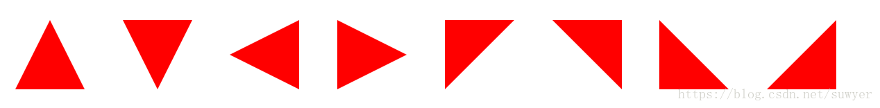
1、三角形系列(三角形、倒三角、左三角、右三角、左上三角、右上三角、左下三角、右下三角)
主要用到的是:寬度高度設置為0, border的各個邊的設置(各個邊的透明或不透明);
 .triangle-up {
			/* 三角形 */
			width: 0;
			height: 0;
			border-left: 50px solid transparent;
    		        border-right: 50px solid transparent;
        	        border-bottom: 100px solid #f00;
		}
		.triangle-down {
			/* 倒三角 */
			width: 0;
			height: 0;
			border-left: 50px solid transparent;
    		        border-right: 50px solid transparent;
        	        border-top: 100px solid #f00;
		}
		.triangle-left {
			/* 左三角 */
			width: 0;
			height: 0;
			border-top: 50px solid transparent;
    		        border-bottom: 50px solid transparent;
        	        border-right: 100px solid #f00;
		}
		.triangle-right {
			/* 右三角 */
			width: 0;
			height: 0;
			border-top: 50px solid transparent;
    		        border-bottom: 50px solid transparent;
        	        border-left: 100px solid #f00;
		}
		.triangle-topleft {
			/* 左上三角 */
			width: 0;
			height: 0;
    		        border-right: 100px solid transparent;
        	        border-top: 100px solid #f00;
		}
		.triangle-topright {
			/* 右上三角 */
			width: 0;
			height: 0;
			border-left: 100px solid transparent;
        	        border-top: 100px solid #f00;
		}
		.triangle-downleft {
			/* 左下三角 */
			width: 0;
			height: 0;
    		        border-right: 100px solid transparent;
        	        border-bottom: 100px solid #f00;
		}
		.triangle-downright {
			/* 右下三角 */
			width: 0;
			height: 0;
			border-left: 100px solid transparent;
        	        border-bottom: 100px solid #f00;
		}
2、梯形(三角形的變體,設置左右兩條邊相等,並且給它設置一個寬度)

       .Trapezium {
                    height: 0;
                    width: 100px;
                    border-bottom: 100px solid #dc2500;
                    border-left: 50px solid transparent;
                    border-right: 50px solid transparent;
                  }
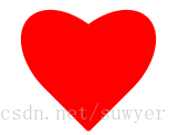
2、愛心(心形的製作是非常複雜的,可以使用偽元素來製作,分別將偽元素旋轉不同的角度,並修改transform-origin屬性來元素的旋轉中心點)
                .love {
			/* 愛心 */
			position: relative;
		}
		.love:before {
			content: "";
			width: 70px;
			height: 110px;
			background: #f00;
			position: absolute;
			border-top-left-radius: 50%;
			border-top-right-radius: 50%;
			transform: rotate(45deg);
		}
		.love:after {
			content: "";
			width: 70px;
			height: 110px;
			background: #f00;
			position: absolute;
			border-top-left-radius: 50%;
			border-top-right-radius: 50%;
			transform: rotate(-45deg);
			left: -30px;
		}
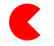
3、 食人豆(吃豆人的製作方法是先在一個圓形裡面製作一個透明的三角形)
                .pacman {
			/* 食人豆 */
			width: 0;
		        height: 0;
		        border: 60px solid #f00;
		        border-right: 60px solid transparent;
		        border-radius: 100%;
		}
4、對話框(消息提示框可以先製作一個圓角矩形,然後在需要的地方放置一個三角形)

               .alertDialog {
			/* 對話框:一個圓角矩形和一個小三角形 */
			width: 150px;
			height: 100px;
			background: #f00;
			border-radius: 10px;
			position: relative;
		}
		.alertDialog:before {
			content: "";
			width: 0;
			height: 0;
			position: absolute;
		        left: -20px;
		        top: 40px;
			border-top: 10px solid transparent;
		        border-bottom: 10px solid transparent;
		        border-right: 20px solid #f00;
		}
5、鑽石(首先畫一個直角梯形,再通過偽類元素在其下方畫一個三角形)
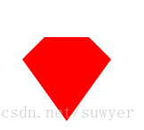
               .diamond {
			/* 鑽石:梯形和三角形組成 */
			width: 50px;
			height: 0;
			position: relative;
			border-bottom: 25px solid #f00;
			border-left: 25px solid transparent;
			border-right: 25px solid transparent;
		}
		.diamond:before {
			content: "";
			width: 0;
			height: 0;
			position: absolute;
		        border-left: 50px solid transparent;
		        border-right: 50px solid transparent;
		        border-top: 70px solid #f00;
		        left: -25px;
		        top: 25px;
		}
6、五角星(星形的實現方式比較複雜,主要是使用transform屬性來旋轉不同的邊)
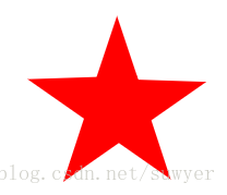
                .starFive {
			/* 五角星: */
			width: 0;
			height: 0;
			position: relative;
			border-left: 80px solid transparent;
			border-right: 80px solid transparent;
			border-bottom: 60px solid #f00;
			transform: rotate(35deg);
		}
		.starFive:before {
			content: "";
			position: absolute;
			width: 0;
			height: 0;
			border-left: 80px solid transparent;
			border-right: 80px solid transparent;
			border-bottom: 60px solid #f00;
			transform: rotate(-70deg);
			top: 3px;
			left: -80px;
		}
		.starFive:after {
			content: "";
			position: absolute;
			width: 0;
			height: 0;
			border-bottom: 60px solid #f00;
			border-right: 20px solid transparent;
			border-left: 20px solid transparent;
			transform: rotate(-35deg);
		        top: -40px;
		        left: -49px;
		}
7、菜單(結合::before和::after兩個偽元素)

.btn-hamburger i {
    /* position: relative; */
    display: -moz-inline-stack;
    display: inline-block;
    zoom: 1;
    width: 22px;
    height: 3px;
    color: #fff;
    font: bold .24rem/0.4 Helvetica;
    text-transform: uppercase;
    text-indent: -55px;
    background: #fff;
    transition: all 0.2s ease-out;
}
.btn-hamburger i::before, .btn-hamburger i::after {
    content: '';
    width: 22px;
    height: 3px;
    background: #fff;
    position: absolute;
    left: 0;
    transition: 0.2s;
}
.btn-hamburger i::before {
    top: -7px;
}
.btn-hamburger i::after {
    bottom: -7px;
}