WPF相對於Winform而言,在WPF中是用不同的容器安排佈局。每個容器都有各自的佈局邏輯,有的以堆棧方式佈置有的以單元格排列元素。這也是WPF中比較有意思的,更容易入門。通過瞭解WPF佈局之後能有個大概的WPF樂趣之處。 1 - 理解WPF中佈局 區別於Winform而言,Winform中使用刻 ...
WPF相對於Winform而言,在WPF中是用不同的容器安排佈局。每個容器都有各自的佈局邏輯,有的以堆棧方式佈置有的以單元格排列元素。這也是WPF中比較有意思的,更容易入門。通過瞭解WPF佈局之後能有個大概的WPF樂趣之處。
1 - 理解WPF中佈局
區別於Winform而言,Winform中使用刻板的基於坐標的佈局將控制項放到正確位置。在WPF中,使用流佈局(flow)。能創建與顯示解析度和視窗大小無關的,在不同顯示器正確縮放。
1.1 - WPF 佈局原則
WPF視窗只能包含單個元素。在視窗放置一個容器,然後在該容器中添加其他元素。
WPF中,需要遵循以下幾條重要原則:
- 不應顯式設定元素尺寸。
- 不應使用屏幕坐標指定元素位置。
- 佈局容器的子元素共用可用空間
- 可嵌套的佈局容器
WPF應該遵循這些原則,如果不遵循這些原則,最終將得到不是很適合WPF的並且難以維護的用戶界面。
1.2 - 佈局過程
包含兩個階段:測量和排列。
測量階段:容器遍歷所有子元素,並詢問子元素他們所期望的尺寸。
排列階段:容器在合適的位置放置子元素。
1.3 - 佈局容器
所有WPF佈局容器都派生於System.Windows.Controls.Panel抽象類的面板
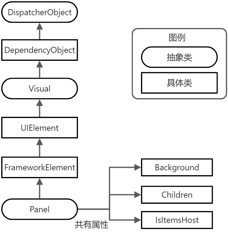
WPF中提供了大量繼承於Panel的類。這些類都位於System.Windows.Controls命名空間中
|
名 稱 |
說 明 |
|
StackPanel |
在水平或垂直的堆棧中放置元素。通常用於更大、更複雜視窗中的一些小區域。 |
|
WrapPanel |
在一系列中可換行的行中放置元素 |
|
DockPanel |
根據元素的整個邊界調整元素 |
|
Grid |
根據不可見的表格在行列中排列元素,也是最靈活最常用的容器之一 |
|
UniformGrid |
在不可見但是強制所在單元格具有相同尺寸放置元素,不常見 |
|
Canvas |
使用固定坐標絕對定位元素與Winform相似,沒有提供錨定或停靠功能。 |
除了這些容器外,還有幾個更專業的面板。如TabPanel面板、ToolbarPanel面板和VirtualizingStackPanel面板、InkCanvas控制項等等。
2 - 使用StackPanel面板進行簡單佈局
StackPanel面板是嘴賤的佈局容器之一。在單行或者單列中以堆棧方式放置其子元素。
<Window x:Class="Demo_Layout.MainWindow"
xmlns="http://schemas.microsoft.com/winfx/2006/xaml/presentation"
xmlns:x="http://schemas.microsoft.com/winfx/2006/xaml"
xmlns:d="http://schemas.microsoft.com/expression/blend/2008"
xmlns:mc="http://schemas.openxmlformats.org/markup-compatibility/2006"
xmlns:local="clr-namespace:Demo_Layout"
mc:Ignorable="d"
Title="MainWindow" Height="150" Width="200">
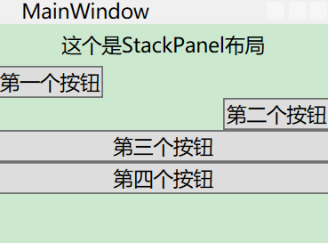
<StackPanel>
<Label Content="這個是StackPanel佈局"/>
<Button Content="第一個按鈕"/>
<Button Content="第二個按鈕"/>
<Button Content="第三個按鈕"/>
<Button Content="第四個按鈕"/>
</StackPanel>
</Window>界面如下
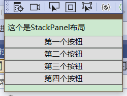
預設情況下,StackPanel面板按照自上而下順序排列元素,使每個元素的高度適合它的內容。在上個Demo中,所有元素都被拉伸到整個程式的寬度,如果加寬從視窗,StackPanel也會變寬,裡邊對應的元素也會拉伸自身。
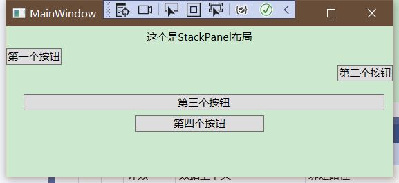
Orientation屬性:可以使面板水平排列元素
<StackPanel Orientation="Horizontal">界面如下
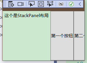
根據視窗的當前大小可能導致一些元素不適應、
2.1 - 佈局屬性
|
名 稱 |
說 明 |
|
HorizontalAlignment |
水平方向有額外空間時,該屬性決定了子元素在佈局容器中如何定位,可選有Center Left Right Stretch等屬性 |
|
VerticalAlignment |
垂直方向有額外空間時,該屬性決定了子元素在佈局容器中如何定位,可選有Center Left Right Stretch等屬性 |
|
Margin |
設置對應邊距,順序分別為左上右下,如果兩個的話為左右、上下 |
|
MinWidth和MinHeight |
設置元素的最小尺寸 |
|
MaxWidth和MaxHeight |
設置元素的最大尺寸 |
|
Width和Height |
設置元素的尺寸,寬度和高度,不能超過設置的最大值和最小值 |
所有的屬性都從FrameworkElement基類繼承而來。所以在WPF視窗中所使用的的所有圖形小組件都支持這些屬性。
2.2 - 對齊方式
對齊方式可以通過下述代碼來實現,對齊方式可以分為Left Right Center Stretch
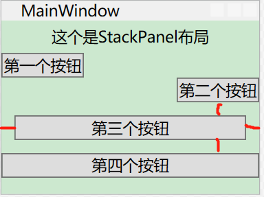
<StackPanel>
    <Label HorizontalAlignment="Center" Content="這個是StackPanel佈局"/>
    <Button HorizontalAlignment="Left" Content="第一個按鈕"/>
    <Button HorizontalAlignment="Right" Content="第二個按鈕"/>
    <Button Content="第三個按鈕"/>
    <Button Content="第四個按鈕"/>
</StackPanel>
界面如下
可以看到第一個元素居中,第二個元素居左,第三個元素居右。
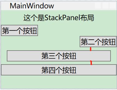
2.3 - 邊距(Margin)
當我們設置對應第四個元素的Margin屬性時,可以看到對應邊距
<Button Margin="10" Content="第三個按鈕"/>上下左右邊距分別為10個元素
當設置為10,5時
<Button Margin="10,5" Content="第三個按鈕"/>界面如下
當設置為四個元素時
<Button Margin="20,15,10,5" Content="第三個按鈕"/>界面如下
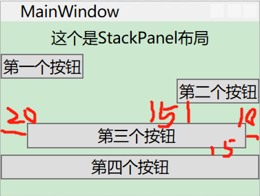
綜上所述,當我們這隻對應邊距(Margin)時,可以分別設置為1,2,4時分別為:
一個時:上下左右分別為對應間距
兩個時:左右為第一個、上下為第二個
四個時:分別為左上右下
2.4 - 最小尺寸、最大尺寸以及顯式設置尺寸
最小尺寸設置為100時,最大尺寸設置為150時,代碼和界面
<Button MinWidth="100" MaxWidth="150" Content="第四個按鈕"/>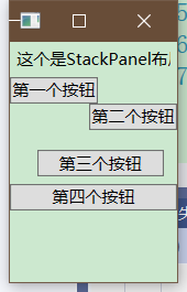
最小尺寸為每個按鈕的尺寸始終不能小於最小尺寸
最大尺寸為不能超過最大尺寸
如果最小寬度大於容器寬度時,按鈕一部分將被裁剪掉。否則不允許按鈕比Panel面板更寬
3 - WrapPanel和DockPanel面板
3.1 - WrapPanel 面板
WrapPanel面板以一次一行或者一列方式部署控制項。預設情況下,WrapPanel的Orientation屬性為Horizontal,控制項從左向右進行排列,再在下一行中排列。將其屬性設置為Vertical,從而在多個列中放置元素。
代碼和界面
<Window x:Class="Demo_Layout.MainWindow"
        xmlns="http://schemas.microsoft.com/winfx/2006/xaml/presentation"
        xmlns:x="http://schemas.microsoft.com/winfx/2006/xaml"
        xmlns:d="http://schemas.microsoft.com/expression/blend/2008"
        xmlns:mc="http://schemas.openxmlformats.org/markup-compatibility/2006"
        xmlns:local="clr-namespace:Demo_Layout"
        mc:Ignorable="d"
        Title="MainWindow" Height="250" Width="400">
    <WrapPanel Margin="3">
        <Button VerticalAlignment="Top" Content="第一個按鈕"/>
        <Button MinHeight="50" Content="第二個按鈕"/>
        <Button VerticalAlignment="Bottom" Content="第三個按鈕"/>
        <Button Content="第四個按鈕"/>
        <Button VerticalAlignment="Center" Content="第五個按鈕"/>
    </WrapPanel>
</Window>
界面如下
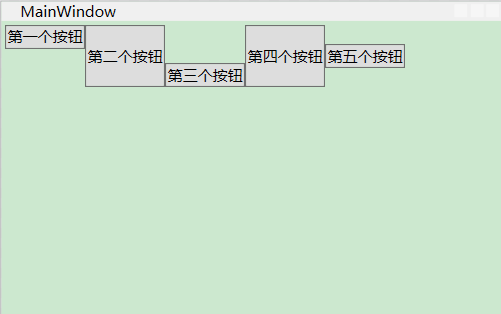
WrapPanel是唯一一個不能通過靈活使用Grid面板代替的容器
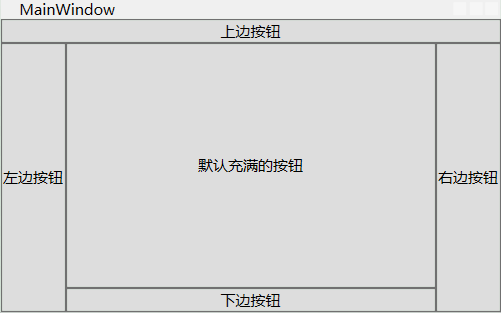
3.2 - DockPanel面板
DockPanel沿著一條外邊緣來拉伸所包含的控制項。通過對應的附加屬性選擇靠邊,可將對應屬性設置為Left,Right,Top,和Bottom。放在DockPanel面板的每個元素都會自動獲取該屬性。
代碼和界面如下
<Window x:Class="Demo_Layout.MainWindow"
        xmlns="http://schemas.microsoft.com/winfx/2006/xaml/presentation"
        xmlns:x="http://schemas.microsoft.com/winfx/2006/xaml"
        xmlns:d="http://schemas.microsoft.com/expression/blend/2008"
        xmlns:mc="http://schemas.openxmlformats.org/markup-compatibility/2006"
        xmlns:local="clr-namespace:Demo_Layout"
        mc:Ignorable="d"
        Title="MainWindow" Height="250" Width="400">
    <DockPanel>
        <Button DockPanel.Dock="Top" Content="上邊按鈕"/>
        <Button DockPanel.Dock="Left" Content="左邊按鈕"/>
        <Button DockPanel.Dock="Right" Content="右邊按鈕"/>
        <Button DockPanel.Dock="Bottom" Content="下邊按鈕"/>
        <Button Content="預設充滿的按鈕"/>
    </DockPanel>
</Window>
界面如下
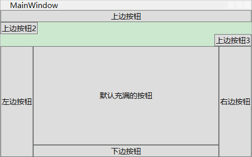
如果說對應一個裡邊包含了多個元素可以分別設置
<Window x:Class="Demo_Layout.MainWindow"
        xmlns="http://schemas.microsoft.com/winfx/2006/xaml/presentation"
        xmlns:x="http://schemas.microsoft.com/winfx/2006/xaml"
        xmlns:d="http://schemas.microsoft.com/expression/blend/2008"
        xmlns:mc="http://schemas.openxmlformats.org/markup-compatibility/2006"
        xmlns:local="clr-namespace:Demo_Layout"
        mc:Ignorable="d"
        Title="MainWindow" Height="250" Width="400">
    <DockPanel>
        <StackPanel DockPanel.Dock="Top">
            <Button  Content="上邊按鈕"/>
            <Button HorizontalAlignment="Left" Content="上邊按鈕2"/>
            <Button HorizontalAlignment="Right" Content="上邊按鈕3"/>
        </StackPanel>
        <Button DockPanel.Dock="Left" Content="左邊按鈕"/>
        <Button DockPanel.Dock="Right" Content="右邊按鈕"/>
        <Button DockPanel.Dock="Bottom" Content="下邊按鈕"/>
        <Button Content="預設充滿的按鈕"/>
    </DockPanel>
</Window>
界面如下
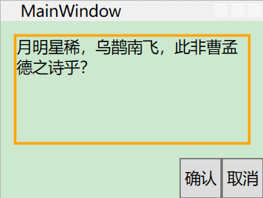
3.3 - 嵌套佈局容器
佈局容器也是可以嵌套的。如創建一個標準對話框,右下角為確認和返回按鈕,併在剩餘部分創建對應文字說明。
1 - 創建StackPanel,將亮哥按鈕放置一塊
2 - 在DockPanel放置StackPanel 並停靠下邊
3 - 將DockPanel的LastChildFill設置為True
4 - 設置邊距屬性,提供一定的空白空間
如下代碼
<Window x:Class="Demo_Layout.MainWindow"
        xmlns="http://schemas.microsoft.com/winfx/2006/xaml/presentation"
        xmlns:x="http://schemas.microsoft.com/winfx/2006/xaml"
        xmlns:d="http://schemas.microsoft.com/expression/blend/2008"
        xmlns:mc="http://schemas.openxmlformats.org/markup-compatibility/2006"
        xmlns:local="clr-namespace:Demo_Layout"
        mc:Ignorable="d"
        Title="MainWindow" Height="150" Width="200">
    <DockPanel LastChildFill="True">
        <Border  Margin="10" DockPanel.Dock="Top" BorderBrush="Orange" BorderThickness="2" >
            <TextBlock TextWrapping="Wrap" Height="80"  Text="月明星稀,烏鵲南飛,此非曹孟德之詩乎?"/>
        </Border>
        <StackPanel DockPanel.Dock="Bottom" HorizontalAlignment="Right" Orientation="Horizontal">
            <Button Padding="3" Content="確認"/>
            <Button Padding="3" Content="取消"/>
        </StackPanel>
    </DockPanel>
</Window>
界面如下
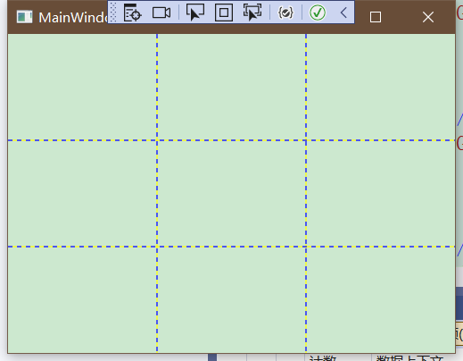
3.4 - Grid面板
Grid是WPF中最強大的佈局容器。很多使用其他完成的用Grid都可以完成。Grid是可以將面板分為幾行幾列的網格。Grid雖然不可見但是可以將Grid.ShowGridLines屬性設置為True。方便調試。
創建Grid需要設置對應的行列,隨後填充對應內容。
<Window x:Class="Demo_Layout.MainWindow"
        xmlns="http://schemas.microsoft.com/winfx/2006/xaml/presentation"
        xmlns:x="http://schemas.microsoft.com/winfx/2006/xaml"
        xmlns:d="http://schemas.microsoft.com/expression/blend/2008"
        xmlns:mc="http://schemas.openxmlformats.org/markup-compatibility/2006"
        xmlns:local="clr-namespace:Demo_Layout"
        mc:Ignorable="d"
        Title="MainWindow" Height="150" Width="200">
    <Grid ShowGridLines="True">
        <Grid.RowDefinitions>
            <RowDefinition/>
            <RowDefinition/>
            <RowDefinition/>
        </Grid.RowDefinitions>
        <Grid.ColumnDefinitions>
            <ColumnDefinition/>
            <ColumnDefinition/>
            <ColumnDefinition/>
        </Grid.ColumnDefinitions>
    </Grid>
</Window>
界面如下
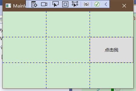
這是Grid的佈局,此時我們可以開始向Grid中填充元素。比如我們向第二行第三列中添加一個顯示內容為"點擊我"的按鈕
<Button Content="點擊我" Grid.Column="2" Grid.Row="1"/>界面如下
調整行和列
Grid面板支持三種設置尺寸的方式:
- 絕對設置尺寸方式 如:Width=“100”
- 自動設置尺寸方式 如:Width=“Auto”
- 按照比例設置尺寸方式 如:Width=“*”
<Grid.RowDefinitions>
    <RowDefinition Height="*"/>
    <RowDefinition Height="1.5*"/>
    <RowDefinition Height="2.5*"/>
</Grid.RowDefinitions>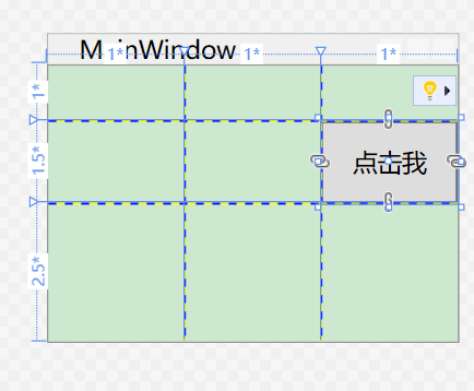
自動設置
<Window x:Class="Demo_Layout.MainWindow"
xmlns="http://schemas.microsoft.com/winfx/2006/xaml/presentation"
xmlns:x="http://schemas.microsoft.com/winfx/2006/xaml"
xmlns:d="http://schemas.microsoft.com/expression/blend/2008"
xmlns:mc="http://schemas.openxmlformats.org/markup-compatibility/2006"
xmlns:local="clr-namespace:Demo_Layout"
mc:Ignorable="d"
Title="MainWindow" Height="150" Width="200">
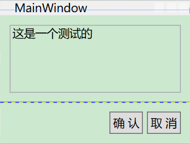
<Grid ShowGridLines="True">
<Grid.RowDefinitions>
<RowDefinition Height="*"/>
<RowDefinition Height="Auto"/>
</Grid.RowDefinitions>
<TextBox Margin="10" Grid.Row="0" Text="這是一個測試的"/>
<StackPanel Grid.Row="1" HorizontalAlignment="Right" Orientation="Horizontal">
<Button Margin="10,10,2,10" Padding="3" Content="確 認"/>
<Button Margin="2,10,10,10" Padding="3" Content="取 消"/>
</StackPanel>
</Grid>
</Window>界面如下
3.5 - UniformGrid 和 Canvas面板
3.5.1 - UniformGrid面板
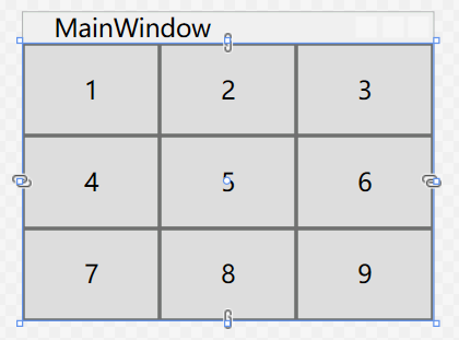
UniformGrid不同於Grid 不需要設置對應行列,設置簡單Rows和Columns來設置尺寸即可。
比如:
<Window x:Class="Demo_Layout.MainWindow"
        xmlns="http://schemas.microsoft.com/winfx/2006/xaml/presentation"
        xmlns:x="http://schemas.microsoft.com/winfx/2006/xaml"
        xmlns:d="http://schemas.microsoft.com/expression/blend/2008"
        xmlns:mc="http://schemas.openxmlformats.org/markup-compatibility/2006"
        xmlns:local="clr-namespace:Demo_Layout"
        mc:Ignorable="d"
        Title="MainWindow" Height="150" Width="200">
    <UniformGrid Rows="3" Columns="3">
        <Button Content="1"/>
        <Button Content="2"/>
        <Button Content="3"/>
        <Button Content="4"/>
        <Button Content="5"/>
        <Button Content="6"/>
        <Button Content="7"/>
        <Button Content="8"/>
        <Button Content="9"/>
    </UniformGrid>
</Window>
界面如下
3.5.2 - Canvas 面板
Canvas面板允許使用精確的坐標放置元素。需要設置Canvas.Left和Canvas.Top附加屬性,Left屬性設置元素左邊和Canvas面板左邊之間的單位數。從左上角(0,0)開始到右下角分別為X,Y。
如下代碼:
<Window x:Class="Demo_Layout.MainWindow"
        xmlns="http://schemas.microsoft.com/winfx/2006/xaml/presentation"
        xmlns:x="http://schemas.microsoft.com/winfx/2006/xaml"
        xmlns:d="http://schemas.microsoft.com/expression/blend/2008"
        xmlns:mc="http://schemas.openxmlformats.org/markup-compatibility/2006"
        xmlns:local="clr-namespace:Demo_Layout"
        mc:Ignorable="d"
        Title="MainWindow" Height="150" Width="240">
    <Canvas>
        <Button Canvas.Left="10" Canvas.Top="10" Content="(10,10)"/>
        <Button Canvas.Left="40" Canvas.Top="60" Content="(40,60)"/>
        <Button Canvas.Left="100" Canvas.Top="20" Content="(100,20)"/>
        <Button Canvas.Left="140" Canvas.Top="90" Content="(140,90)"/>
    </Canvas>
</Window>
界面如下:
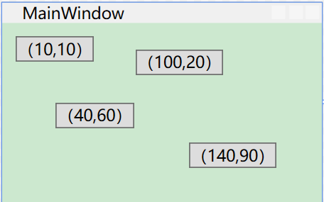
按照畫布的坐標點佈局。
其中Z順序
<Button Canvas.Left="10" Panel.ZIndex="0" Canvas.Top="10" Content="(10,10)1"/>
<Button Canvas.Left="10" Panel.ZIndex="1" Canvas.Top="10" Content="(10,10)2"/>
同樣的坐標體系,當ZIndex較大時,才會顯示在最頂層。當設置第一個元素的ZIndex為2時,界面顯示的名稱是“(10,10)1”
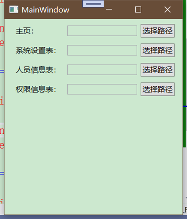
3.6 - 佈局Demo
行列設置:
<Window x:Class="Demo_Layout.MainWindow"
        xmlns="http://schemas.microsoft.com/winfx/2006/xaml/presentation"
        xmlns:x="http://schemas.microsoft.com/winfx/2006/xaml"
        xmlns:d="http://schemas.microsoft.com/expression/blend/2008"
        xmlns:mc="http://schemas.openxmlformats.org/markup-compatibility/2006"
        xmlns:local="clr-namespace:Demo_Layout"
        mc:Ignorable="d"
        Title="MainWindow" Height="350" Width="300">
    <Grid Margin="10,3,10,10">
        <Grid.RowDefinitions>
            <RowDefinition Height="Auto"/>
            <RowDefinition Height="Auto"/>
            <RowDefinition Height="Auto"/>
            <RowDefinition Height="Auto"/>
        </Grid.RowDefinitions>
        <Grid.ColumnDefinitions>
            <ColumnDefinition Width="Auto"/>
            <ColumnDefinition Width="*"/>
            <ColumnDefinition Width="Auto"/>
        </Grid.ColumnDefinitions>
        <!--第一行-->
        <Label Grid.Row="0" Grid.Column="0" Margin="3" Content="主頁:" VerticalAlignment="Center"/>
        <TextBox Grid.Row="0" Grid.Column="1" Margin="3" Height="Auto" VerticalAlignment="Center"/>
        <Button Grid.Column="2" Grid.Row="0" Content="選擇路徑" Margin="3" Padding="2" Height="Auto" VerticalAlignment="Center"/>
        <!--第二行-->
        <Label Grid.Row="1" Grid.Column="0" Margin="3" Content="系統設置表:" VerticalAlignment="Center"/>
        <TextBox Grid.Row="1" Grid.Column="1" Margin="3" Height="Auto" VerticalAlignment="Center"/>
        <Button Grid.Column="2" Grid.Row="1" Content="選擇路徑" Margin="3" Padding="2" Height="Auto" VerticalAlignment="Center"/>
        <!--第三行-->
        <Label Grid.Row="2" Grid.Column="0" Margin="3" Content="人員信息表:" VerticalAlignment="Center"/>
        <TextBox Grid.Row="2" Grid.Column="1" Margin="3" Height="Auto" VerticalAlignment="Center"/>
        <Button Grid.Column="2" Grid.Row="2" Content="選擇路徑" Margin="3" Padding="2" Height="Auto" VerticalAlignment="Center"/>
        <!--第四行-->
        <Label Grid.Row="3" Grid.Column="0" Margin="3" Content="許可權信息表:" VerticalAlignment="Center"/>
        <TextBox Grid.Row="3" Grid.Column="1" Margin="3" Height="Auto" VerticalAlignment="Center"/>
        <Button Grid.Column="2" Grid.Row="3" Content="選擇路徑" Margin="3" Padding="2" Height="Auto" VerticalAlignment="Center"/>
    </Grid>
</Window>
界面如下:
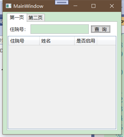
Demo2
<Window x:Class="Demo_Layout.MainWindow"
        xmlns="http://schemas.microsoft.com/winfx/2006/xaml/presentation"
        xmlns:x="http://schemas.microsoft.com/winfx/2006/xaml"
        xmlns:d="http://schemas.microsoft.com/expression/blend/2008"
        xmlns:mc="http://schemas.openxmlformats.org/markup-compatibility/2006"
        xmlns:local="clr-namespace:Demo_Layout"
        mc:Ignorable="d"
        Title="MainWindow" Height="350" Width="300">
    <Grid Margin="10,3,10,10">
        <TabControl>
            <TabItem Header="第一頁">
                <Grid>
                    <Grid.RowDefinitions>
                        <RowDefinition Height="*"/>
                        <RowDefinition Height="7*"/>
                    </Grid.RowDefinitions>
                    <StackPanel Orientation="Horizontal" Grid.Row="0">
                        <Label Content="住院號:" VerticalAlignment="Center"/>
                        <TextBox Height="Auto" HorizontalAlignment="Center" Width="150" Margin="0,5"/>
                        <Button VerticalAlignment="Center" Content="查  詢" Height="Auto" Margin="5,5" Width="50"/>
                    </StackPanel>
                    <DataGrid Grid.Row="1">
                        <DataGrid.Columns>
                            <DataGridTextColumn Header="住院號" Width="80"/>
                            <DataGridTextColumn Header="姓名" Width="90"/>
                            <DataGridTextColumn Header="是否啟用" Width="Auto"/>
                        </DataGrid.Columns>
                    </DataGrid>
                </Grid>
            </TabItem>
            <TabItem Header="第二頁"/>
        </TabControl>
    </Grid>
</Window>
界面