摘要 在Prism中彈出一個對話框,預設是一個Windows預設樣式的視窗,會與自己所開發的項目完全不搭配,例如下麵這樣子 如果為了迎合軟體主體風格,可以做出類似這樣效果 其實原理也很簡單,Prism也考慮到了這一點,所以特意設計一個供用戶自定義的介面 編寫組件樣式 1、新建一個Window視圖 註 ...
摘要
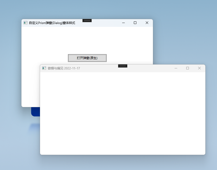
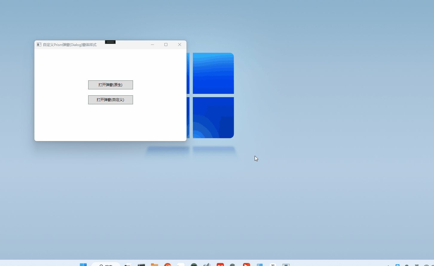
在Prism中彈出一個對話框,預設是一個Windows預設樣式的視窗,會與自己所開發的項目完全不搭配,例如下麵這樣子
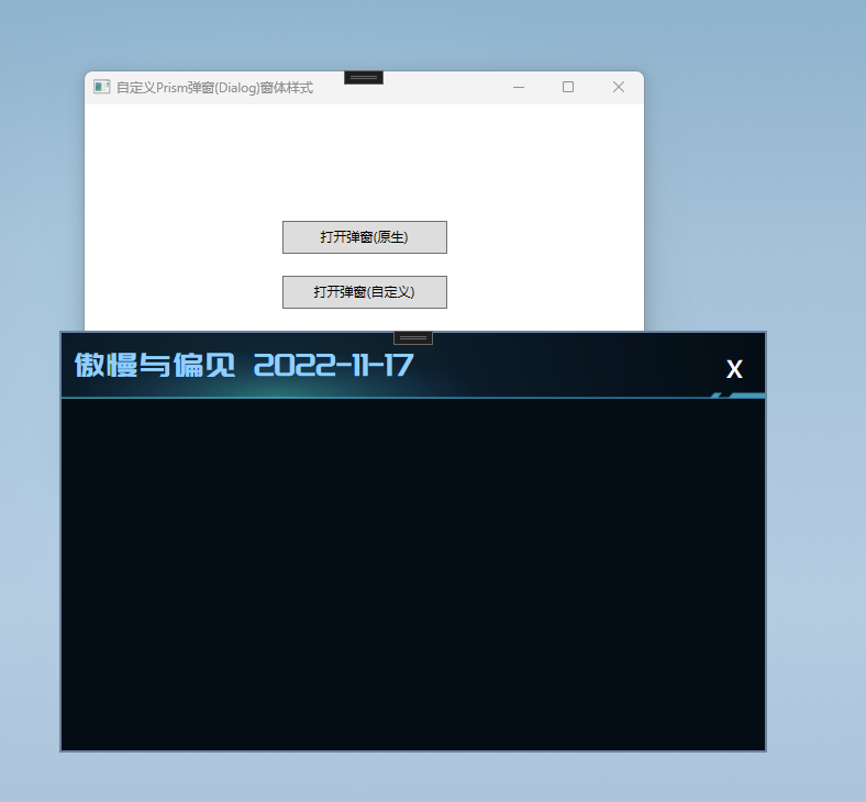
如果為了迎合軟體主體風格,可以做出類似這樣效果
其實原理也很簡單,Prism也考慮到了這一點,所以特意設計一個供用戶自定義的介面
編寫組件樣式
1、新建一個Window視圖
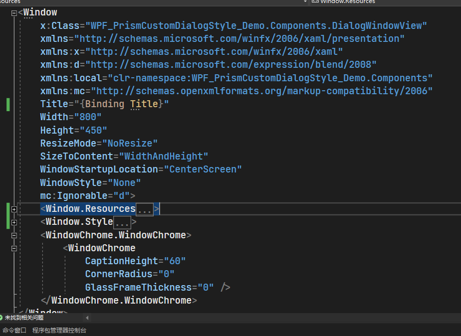
註意Window里的一些必要屬性記得設置一下,比如SizeToContent ShowInTaskbar等等實現無邊框還是使用常規WindowChrome做法
<WindowChrome.WindowChrome>
        <WindowChrome
            CaptionHeight="60"
            CornerRadius="0"
            GlassFrameThickness="0" />
    </WindowChrome.WindowChrome>
其中CaptionHeight表示可以拖拽的高度,這裡一般建議與自己所設計的高度一致,關於WindowChrome相關用法和介紹就不過多贅述,具體可前往MSDN文檔:WindowChrome 類
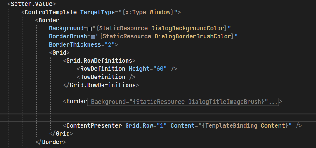
2、根據自己需求或設計圖重寫該窗體樣式,XAML太多就不一一介紹了,直接上代碼
<Window
    x:Class="WPF_PrismCustomDialogStyle_Demo.Components.DialogWindowView"
    xmlns="http://schemas.microsoft.com/winfx/2006/xaml/presentation"
    xmlns:x="http://schemas.microsoft.com/winfx/2006/xaml"
    xmlns:d="http://schemas.microsoft.com/expression/blend/2008"
    xmlns:local="clr-namespace:WPF_PrismCustomDialogStyle_Demo.Components"
    xmlns:mc="http://schemas.openxmlformats.org/markup-compatibility/2006"
    Title="{Binding Title}"
    Width="800"
    Height="450"
    ResizeMode="NoResize"
    SizeToContent="WidthAndHeight"
    WindowStartupLocation="CenterScreen"
    WindowStyle="None"
    mc:Ignorable="d">
    <Window.Resources>
        <!--  畫刷  -->
        <SolidColorBrush x:Key="DialogBackgroundColor" Color="#040D14" />
        <SolidColorBrush x:Key="DialogBorderBrushColor" Color="#6C83A4" />
        <SolidColorBrush x:Key="DialogTitleColor" Color="#90CFFF" />
        <ImageBrush x:Key="DialogTitleImageBrush" ImageSource="/WPF_PrismCustomDialogStyle_Demo;component/Assets/Images/dialog_heder_bg.png" />
        <LinearGradientBrush x:Key="TitleTextGradientColor" StartPoint="0,0" EndPoint="0,1">
            <GradientStop Offset="1" Color="#A5BCF3" />
            <GradientStop Offset="0" Color="White" />
        </LinearGradientBrush>

        <!--  字體  -->
        <FontFamily x:Key="TitleFontFamily">/WPF_PrismCustomDialogStyle_Demo;component/Assets/Fonts/#龐門正道標題體3.0</FontFamily>

        <!--  對話框標題樣式  -->
        <Style x:Key="SystemTitleStyle" TargetType="{x:Type TextBlock}">
            <Setter Property="VerticalAlignment" Value="Center" />
            <Setter Property="HorizontalAlignment" Value="Center" />
            <Setter Property="TextAlignment" Value="Center" />
            <Setter Property="FontSize" Value="15" />
            <Setter Property="FontFamily" Value="{StaticResource TitleFontFamily}" />
            <Setter Property="FontSize" Value="30" />
            <Setter Property="Foreground" Value="{StaticResource TitleTextGradientColor}" />
        </Style>

        <!--  按鈕樣式  -->
        <Style x:Key="IconButtonBaseStyle" TargetType="Button">
            <Setter Property="Cursor" Value="Hand" />
            <Setter Property="Template">
                <Setter.Value>
                    <ControlTemplate TargetType="Button">
                        <TextBlock
                            x:Name="icon"
                            HorizontalAlignment="Center"
                            VerticalAlignment="Center"
                            FontSize="{TemplateBinding FontSize}"
                            Foreground="{TemplateBinding Foreground}"
                            Text="{TemplateBinding Content}" />
                        <ControlTemplate.Triggers>
                            <Trigger Property="IsMouseOver" Value="True">
                                <Setter TargetName="icon" Property="Foreground" Value="#90CFFF" />
                            </Trigger>
                        </ControlTemplate.Triggers>
                    </ControlTemplate>
                </Setter.Value>
            </Setter>
        </Style>
    </Window.Resources>
    <Window.Style>
        <Style TargetType="{x:Type Window}">
            <Setter Property="ShowInTaskbar" Value="False" />
            <Setter Property="Template">
                <Setter.Value>
                    <ControlTemplate TargetType="{x:Type Window}">
                        <Border
                            Background="{StaticResource DialogBackgroundColor}"
                            BorderBrush="{StaticResource DialogBorderBrushColor}"
                            BorderThickness="2">
                            <Grid>
                                <Grid.RowDefinitions>
                                    <RowDefinition Height="60" />
                                    <RowDefinition />
                                </Grid.RowDefinitions>

                                <Border Background="{StaticResource DialogTitleImageBrush}">
                                    <Grid>
                                        <Grid.ColumnDefinitions>
                                            <ColumnDefinition />
                                            <ColumnDefinition />
                                        </Grid.ColumnDefinitions>
                                        <TextBlock
                                            Margin="10,0,0,0"
                                            HorizontalAlignment="Left"
                                            Foreground="{StaticResource DialogTitleColor}"
                                            Style="{StaticResource SystemTitleStyle}"
                                            Text="{TemplateBinding Title}" />
                                        <StackPanel
                                            Grid.Column="2"
                                            HorizontalAlignment="Right"
                                            VerticalAlignment="Center"
                                            Orientation="Horizontal"
                                            WindowChrome.IsHitTestVisibleInChrome="True">
                                            <Button
                                                Margin="0,0,20,0"
                                                Command="ApplicationCommands.Close"
                                                Content="x"
                                                Cursor="Hand"
                                                FontSize="30"
                                                FontWeight="Medium"
                                                Foreground="White"
                                                Style="{StaticResource IconButtonBaseStyle}" />
                                        </StackPanel>
                                    </Grid>
                                </Border>


                                <ContentPresenter Grid.Row="1" Content="{TemplateBinding Content}" />
                            </Grid>
                        </Border>
                    </ControlTemplate>
                </Setter.Value>
            </Setter>
        </Style>
    </Window.Style>
    <WindowChrome.WindowChrome>
        <WindowChrome
            CaptionHeight="60"
            CornerRadius="0"
            GlassFrameThickness="0" />
    </WindowChrome.WindowChrome>
</Window>
Tips:因為一般對話框分為標題欄和主體部分,所以我們可以使用Grid分為兩行,第一行是標題,第二行是內容,使用ContentPresenter來承載要顯示的用戶控制項
使用組件
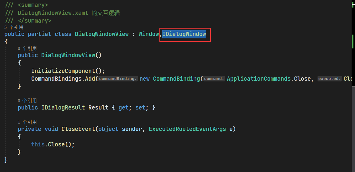
1、將自定義的樣式組件註入到IOC容器
protected override void RegisterTypes(IContainerRegistry containerRegistry)
        {
            containerRegistry.Register<IDialogWindow, DialogWindowView>(nameof(DialogWindowView));
        }
2、使用DialogService彈出對話框
private void CustomOpenDialog()
        {
            DialogParameters dialogParameters = new DialogParameters()
            {
                {"Title",$"傲慢與偏見 {DateTime.Now:yyyy-MM-dd}" }
            };
            dialogService.Show(nameof(TestDialogView), dialogParameters, result =>
            {

            }, nameof(DialogWindowView));
        }
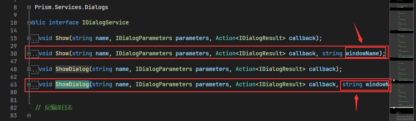
這段與傳統打開彈框是差不多,唯一不同的就是使用到了一個可傳入WindowName的重載函數,Tips:我們自定義的這個組件(DialogWindowView)是一定需要註入到IOC容器的,不然拿不到這個實例就會拋出異常,另外還有一個點就是該組件還需繼承自IDialogWindow
效果
源碼
若Github被牆不方便下載,可留下郵箱發給你