
前言 這是疫情可視化最開始的文章,有需要瞭解的可前往查看:https://www.cnblogs.com/xi12/p/16690119.html。 本來說有時間就把這個項目完結了的,結果後面一直有事拖著,直到現在十一月份了才搞完。老樣子,先看成果。 瀏覽鏈接:https://xi1213.gite ...
前言
這是疫情可視化最開始的文章,有需要瞭解的可前往查看:https://www.cnblogs.com/xi12/p/16690119.html。 本來說有時間就把這個項目完結了的,結果後面一直有事拖著,直到現在十一月份了才搞完。老樣子,先看成果。
- 瀏覽鏈接:https://xi1213.gitee.io/covid19-visualization
- 項目鏈接(歡迎各位大哥star):https://gitee.com/xi1213/covid19-visualization
修改與添加
後面可能審美疲勞了,越看越醜,就乾脆直接用dataV(這可不是阿裡的那個dataV)修飾頁面了。這是項目改動後的樣子:


主要做瞭如下改動:
- 添加首頁的3d粒子球體。
- 完成“省內分析”模塊。
- 完成當地疫情報告生成與下載。
- 使用dataV修飾頁面。
粒子球體
粒子球體也是用three.js完成的,放大仔細看會發現其實是有三層構成的:內層透明球體,中間點狀球體,外層病毒球體。

具體實現過程是這樣的:
- 先繪製一個內層透明球體,記得將球體材質的transparent設為true,然後設置不透明度opacity值。
//創建斑點球體
async function createSpotSphere() {
  let globeBufferGeometry = new THREE.SphereGeometry(earthSize - 1, 50, 50);//球體幾何體
  let globeInnerMaterial = new THREE.MeshBasicMaterial({
    color: new THREE.Color(dvColor[0]),//顏色
    // blending: THREE.AdditiveBlending,//紋理融合的疊加方式
    // side: THREE.FrontSide,//前面顯示
    transparent: true,//透明
    // depthWrite: false,//深度寫入
    // depthTest: false,//黑洞效果
    opacity: .3,//不透明度
  });
  let globeInnerMesh = new THREE.Mesh(
    globeBufferGeometry,
    globeInnerMaterial
  );
  earthGroup.add(globeInnerMesh); //將網格放入地球組
  cre
- 創建點狀球體。這裡需要使用一張黑白的世界地圖。
let img = new Image();
img.src = earthGrayscale; //黑白地圖
將圖片使用onload載入到項目中後,利用canvas繪製一遍該圖,再使用getImageData獲取到像素點數據canData。
let canvas = document.createElement("canvas");
    canvas.width = img.width; //使得canvas尺寸與圖片尺寸相同
    canvas.height = img.height;
    (canvas.getContext("2d") as any).drawImage(img, 0, 0, img.width, img.height);//canvas繪製圖片
    let canData = (canvas.getContext("2d") as any).getImageData(0, 0, canvas.width, canvas.height);//獲取畫布像素數據
利用canData .data中的rgba信息生成緩衝幾何頂點數組globeCloudVerticesArray。
let globeCloudBufferGeometry = new THREE.BufferGeometry(); //設置緩衝幾何體
    let globeCloudVerticesArray = []; //地球雲緩衝幾何體頂點
    let o = null; //數組處理時的計數
    for (o = 0; o < canData.data.length; o += 4) {
      let r = (o / 4) % canvas.width,
        i = (o / 4 - r) / canvas.width;
      if ((o / 4) % 2 == 1 && i % 2 == 1)
        if (0 === canData.data[o]) {
          let n = r,
            longitude = (i / (canvas.height / 180) - 90) / -1, //經度
            latitude = n / (canvas.width / 360) - 180; //維度
          let s = latLongToVector3(longitude, latitude, earthSize, .1); //經緯度變換
          globeCloudVerticesArray.push(s); //將變換後的頂點放入數組
        }
    }
然後再使用three中的BufferAttribute生成屬性position與color。
let l = new Float32Array(3 * globeCloudVerticesArray.length); //創建頂點數組長度
    for (o = 0; o < globeCloudVerticesArray.length; o++) {
      l[3 * o] = globeCloudVerticesArray[o].x;//設置頂點數組數據
      l[3 * o + 1] = globeCloudVerticesArray[o].y;
      l[3 * o + 2] = globeCloudVerticesArray[o].z;
    }
    let positionVal = new THREE.BufferAttribute(l, 3); //設置緩衝區屬性值
    globeCloudBufferGeometry.setAttribute("position", positionVal); //給緩衝幾何體添加位置屬性
    let globeCloudMaterial = new THREE.PointsMaterial({
      color: new THREE.Color(dvColor[1]),//顏色
      fog: true,
      size: 1,
    });//球面斑點材質
    let d = new Float32Array(3 * globeCloudVerticesArray.length), c = [];
    for (o = 0; o < globeCloudVerticesArray.length; o++) {
      c[o] = new THREE.Color(dvColor[1]);//球面斑點顏色
      d[3 * o] = c[o].r;//設置地球雲數組rgb顏色
      d[3 * o + 1] = c[o].g;
      d[3 * o + 2] = c[o].b;
    }
    let color_val = new THREE.BufferAttribute(d, 3);
    globeCloudBufferGeometry.setAttribute("color", color_val);//給緩衝幾何體添加顏色屬性,修改顏色直接修改globeCloudBufferGeometry的setAttribute
最後再使用THREE.Points創建球面的點,將position與color屬性添加到點的幾何體BufferGeometry中。
let globeCloud = new THREE.Points(//球面的象素點
      globeCloudBufferGeometry,
      globeCloudMaterial
    );
這是需要用到的坐標轉換方法:
//經緯度坐標變換(傳入e:緯度、a經度、t球半徑、o球額外距離)
function latLongToVector3(e: any, a: any, t: any, o: any) {
  var r = (e * Math.PI) / 180,
    i = ((a - 180) * Math.PI) / 180,
    n = -(t + o) * Math.cos(r) * Math.cos(i),
    s = (t + o) * Math.sin(r),
    l = (t + o) * Math.cos(r) * Math.sin(i);
  return new THREE.Vector3(n, s, l); //計算三維向量
};
- 創建最外層的病毒球體。每一個病毒都是一個THREE.Sprite,材質是THREE.SpriteMaterial,利用Sprite.position.set設置具體坐標位置,最後將Sprite添加到球體組中。病毒的顏色是由當前點確診值決定的,顏色值在colors數組中取出。
//創建病毒
function createVirus(data: any, earthSize: any) {
  let colors = [
    new THREE.Color(0xf9b8b8),
    new THREE.Color(0xfe4242),
    new THREE.Color(0xff0000),
  ]; //病毒顏色列表
  let virSize = 4; //病毒大小
  let list = JSON.parse(JSON.stringify(data));
  list.forEach((e: { value: number; color: any; position: any[]; }) => {
    e.value >= 10000000 && (e.color = colors[2]); //根據病毒數賦予不同顏色
    e.value >= 500000 && e.value < 10000000 && (e.color = colors[1]);
    e.value < 500000 && (e.color = colors[0]);
    if (e.position) {
      let virusMaterial = new THREE.SpriteMaterial({
        color: e.color,
        map: new THREE.TextureLoader().load(virusImg),
        side: THREE.FrontSide, //只顯示前面
      }); //病毒材質
      let Sprite = new THREE.Sprite(virusMaterial); //點精靈材質
      Sprite.scale.set(virSize, virSize, 1); //點大小
      let lat = e.position[1]; //緯度
      let lon = e.position[0]; //經度
      let s = latLongToVector3(lat, lon, earthSize, 1); //坐標轉換
      Sprite.position.set(s.x, s.y, s.z); //設置點的位置
      Sprite.dotData = e; //將點的數據添加到dotData屬性中
      Sprite.name = "病毒";
      earthGroup.add(Sprite); //將病毒添加進球體組中
    }
  });
};
省內分析
- 省內數據概況。

該數值在載入時是有增加動畫的,是利用vue響應式原理完成的,在上一篇文章中有提到。 - 省內各地疫情柱狀圖。
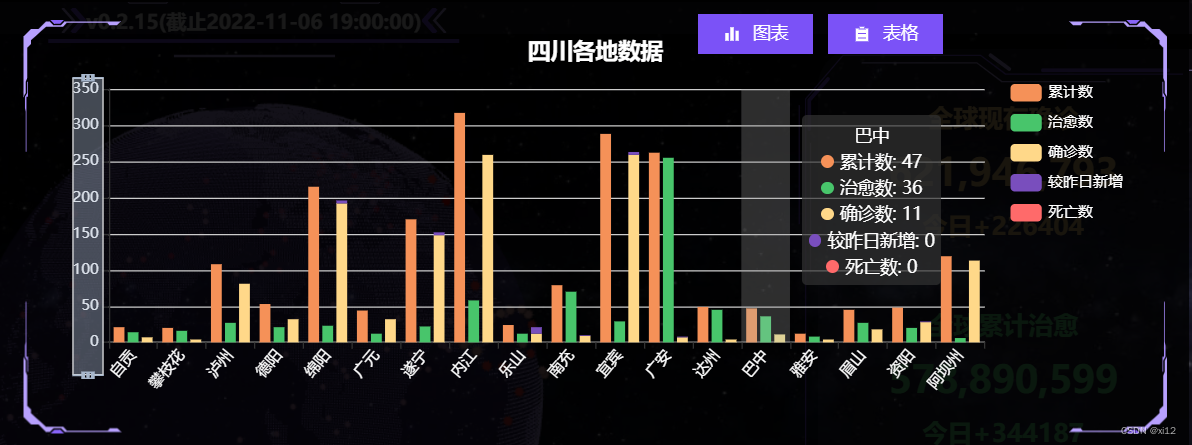
這是具體的echart配置:
let option = {
        title: {
            text: provinceBaseData.value.province + "各地數據",
            left: "center",
            top: '5%',
            textStyle: {
                color: "#fff",
            },
        },
        tooltip: {
            trigger: 'axis',
            axisPointer: {
                type: 'shadow'
            }
        },
        dataZoom: [
            {
                type: 'inside',
            },
            {
                show: true,
                yAxisIndex: 0,
                filterMode: 'empty',
                width: 25,
                height: '70%',
                showDataShadow: false,
                left: '3%',
                top: "center"
            }
        ],
        legend: {
            data: ['累計數', '治愈數', '確診數', '較昨日新增', '死亡數'],
            orient: "vertical",
            top: "15%",
            right: "2%",
            textStyle: {
                color: "#fff"
            },
        },
        grid: {
            left: '3%',
            right: '15%',
            bottom: '10%',
            containLabel: true
        },
        xAxis: {
            type: 'category',
            data: echartData.cityName,
            axisLabel: {
                interval: 0,
                rotate: 50,
                color: "#fff"
            },
        },
        yAxis: {
            type: 'value',
            axisLabel: {
                color: "#fff",
            },
        },
        series: [
            {
                name: '累計數',
                type: 'bar',
                emphasis: {
                    focus: 'series'
                },
                itemStyle: {
                    color: '#f59158'
                },
                data: echartData.conNum
            },
            {
                name: '治愈數',
                type: 'bar',
                emphasis: {
                    focus: 'series'
                },
                itemStyle: {
                    color: '#48c56b'
                },
                data: echartData.cureNum
            },
            {
                name: '確診數',
                type: 'bar',
                stack: 'total',
                emphasis: {
                    focus: 'series'
                },
                itemStyle: {
                    color: '#ffd889'
                },
                data: echartData.econNum
            },
            {
                name: '較昨日新增',
                type: 'bar',
                stack: 'total',
                emphasis: {
                    focus: 'series'
                },
                itemStyle: {
                    color: '#794ebd'
                },
                data: echartData.asymptomNum
            },
            {
                name: '死亡數',
                type: 'bar',
                stack: 'total',
                emphasis: {
                    focus: 'series'
                },
                itemStyle: {
                    color: '#ff6a6a'
                },
                data: echartData.deathNum
            },
        ]
    };
- 省份歷史疫情數據圖表。
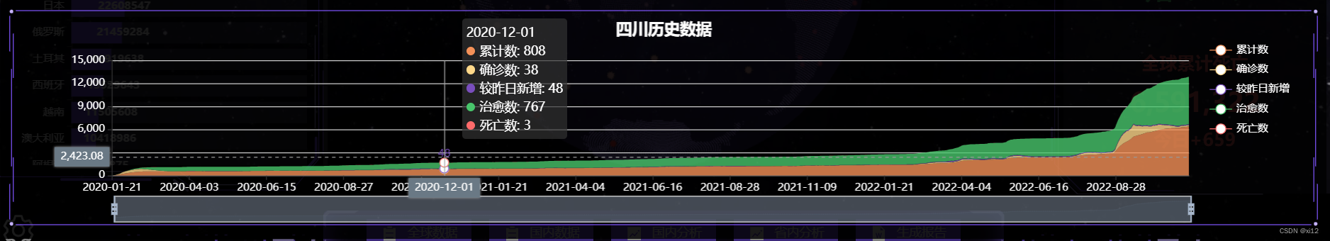
這是該圖表配置:
let option = {
        title: {
            text: provinceBaseData.value.province + "歷史數據",
            left: "center",
            top: '5%',
            textStyle: {
                color: "#fff",
            },
        },
        tooltip: {
            trigger: 'axis',
            axisPointer: {
                type: 'cross',
                label: {
                    backgroundColor: '#6a7985'
                }
            }
        },
        legend: {
            data: ['累計數', '確診數', '較昨日新增', '治愈數', '死亡數'],
            orient: "vertical",
            top: "15%",
            right: "2%",
            textStyle: {
                color: "#fff"
            },
        },
        grid: {
            left: '8%',
        },
        xAxis: [
            {
                type: 'category',
                boundaryGap: false,
                axisLabel: {
                    color: "#fff",
                },
                data: echatrData.time
            }
        ],
        yAxis: [
            {
                type: 'value',
                axisLabel: {
                    color: "#fff",
                },
            }

        ],
        dataZoom: [
            {
                startValue: ''
            },
            {
                type: 'inside'
            }
        ],
        series: [
            {
                name: '累計數',
                type: 'line',
                stack: 'Total',
                smooth: true,
                lineStyle: {
                    width: 0
                },
                showSymbol: false,
                areaStyle: {
                    opacity: 0.8,
                    color: "#f59158"
                },
                emphasis: {
                    focus: 'series'
                },
                itemStyle: {
                    color: '#f59158'
                },
                data: echatrData.conNum
            },
            {
                name: '確診數',
                type: 'line',
                stack: 'Total',
                smooth: true,
                lineStyle: {
                    width: 0
                },
                showSymbol: false,
                areaStyle: {
                    opacity: 0.8,
                    color: "#ffd889"
                },
                itemStyle: {
                    color: '#ffd889'
                },
                emphasis: {
                    focus: 'series'
                },
                data: echatrData.econNum
            },
            {
                name: '較昨日新增',
                type: 'line',
                stack: 'Total',
                smooth: true,
                lineStyle: {
                    width: 0
                },
                showSymbol: false,
                label: {
                    show: true,
                    position: 'top'
                },
                areaStyle: {
                    opacity: 0.8,
                    color: "#794ebd"
                },
                itemStyle: {
                    color: '#794ebd'
                },
                emphasis: {
                    focus: 'series'
                },
                data: echatrData.asymptomNum
            },
            {
                name: '治愈數',
                type: 'line',
                stack: 'Total',
                smooth: true,
                lineStyle: {
                    width: 0
                },
                showSymbol: false,
                areaStyle: {
                    opacity: 0.8,
                    color: "#48c56b"
                },
                itemStyle: {
                    color: '#48c56b'
                },
                emphasis: {
                    focus: 'series'
                },
                data: echatrData.cureNum
            },
            {
                name: '死亡數',
                type: 'line',
                stack: 'Total',
                smooth: true,
                lineStyle: {
                    width: 0
                },
                showSymbol: false,
                areaStyle: {
                    opacity: 0.8,
                    color: "#ff6a6a"
                },
                itemStyle: {
                    color: '#ff6a6a'
                },
                emphasis: {
                    focus: 'series'
                },
                data: echatrData.deathNum
            },
        ]
    };
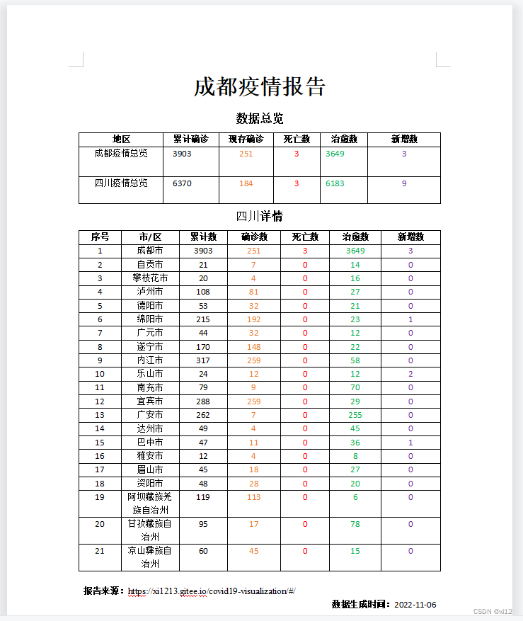
報告生成與下載
報告生成利用的是docxtemplater,這是前端生成word比較方便的一個插件,具體使用方法可以看這裡:https://www.cnblogs.com/xi12/p/16863383.html。
- 這是生成的word報告示例:
dataV修飾
- dataV是一個大屏可視化組件庫,這是使用文檔:http://datav.jiaminghi.com/guide/。
- dataV是vue2開始的,vue3使用的話會報錯,需要做一點修改,具體看這裡:https://www.cnblogs.com/xi12/p/16859415.html。
- 我只用了dataV中的一些邊框與裝飾,你在頁面中看到的紫色線框和一些動畫的裝飾就是dataV的,還是蠻漂亮的。
結語
- 最後我發現人的審美真的變化太快了。
- 項目剛搞完:嗯不錯!真漂亮!
- 過去一周後:什麼玩意!醜得一批!
- 如果還有後續的話,我可能就要考慮添加自定義主題配色了。