Bootstrap Bootstrap是Twitter推出的一個用於前端開發的開源工具包。它由Twitter的設計師Mark Otto和Jacob Thornton合作開發,是一個CSS/HTML框架。目前,Bootstrap最新版本為4.4。 註意,Bootstrap有三個大版本分別是 v2、v3 ...
Bootstrap
Bootstrap是Twitter推出的一個用於前端開發的開源工具包。它由Twitter的設計師Mark Otto和Jacob Thornton合作開發,是一個CSS/HTML框架。目前,Bootstrap最新版本為4.4。 註意,Bootstrap有三個大版本分別是 v2、v3和v4,我們這裡學習最常用的v3。
使用Bootstrap的好處:
Bootstrap簡單靈活,可用於架構流行的用戶界面,具有 友好的學習曲線,卓越的相容性,響應式設計,12列柵格系統,樣式嚮導文檔,自定義JQuery插件,完整的類庫,基於Less等特性。
下載
- bootstap英文官方: https://getbootstrap.com/
- bootstrap中文官網:http://www.bootcss.com/
- 下載地址: http://v3.bootcss.com/getting-started/#download
註意: Bootstrap提供了三種不同的方式供我們下載,我們不需要使用Bootstrap的源碼 和 sass項目,只需要下載生產環境的Bootstrap即可。
常用格式-柵格系統
柵格參數
通過下表可以詳細查看 Bootstrap 的柵格系統是如何在多種屏幕設備上工作的。
| 超小屏幕 手機 (<768px) | 小屏幕 平板 (≥768px) | 中等屏幕 桌面顯示器 (≥992px) | 大屏幕 大桌面顯示器 (≥1200px) | |
|---|---|---|---|---|
| 柵格系統行為 | 總是水平排列 | 開始是堆疊在一起的,當大於這些閾值時將變為水平排列C | ||
.container 最大寬度 |
None (自動) | 750px | 970px | 1170px |
| 類首碼 | .col-xs- |
.col-sm- |
.col-md- |
.col-lg- |
| 列(column)數 | 12 | |||
| 最大列(column)寬 | 自動 | ~62px | ~81px | ~97px |
| 槽(gutter)寬 | 30px (每列左右均有 15px) | |||
| 可嵌套 | 是 | |||
| 偏移(Offsets) | 是 |
<div class="container-fluid">
  <div class="row">

    <div class="col-md-1">col-md-1</div>
    <div class="col-md-1">col-md-1</div>
    <div class="col-md-1">col-md-1</div>
    <div class="col-md-1">col-md-1</div>
    <div class="col-md-1">col-md-1</div>
    <div class="col-md-1">col-md-1</div>
    <div class="col-md-1">col-md-1</div>
    <div class="col-md-1">col-md-1</div>
    <div class="col-md-1">col-md-1</div>
    <div class="col-md-1">col-md-1</div>
    <div class="col-md-1">col-md-1</div>
    <div class="col-md-1">col-md-1</div>

  </div>
</div>

<div class="row">
  <div class="col-md-6">col-md-6</div>
  <div class="col-md-6">col-md-6</div>
</div>
<div class="row">
  <div class="col-md-9">col-md-9</div>
  <div class="col-md-3">col-md-3</div>
</div>
<div class="row">
  <div class="col-md-6 col-sm-9">col-md-6 col-sm-9</div>
  <div class="col-md-6 col-sm-3">col-md-6 col-sm-3</div>
</div>

列偏移
<h3>列偏移</h3>
<div class="row">
  <div class="col-md-4 col-md-offset-2">col-md-4 col-md-offset-2</div>
  <div class="col-md-5 col-md-offset-3">col-md-5 col-md-offset-3</div>
  <div class="col-md-6 col-md-offset-1">col-md-4 col-md-offset-1</div>
</div>

列嵌套
<h3>列嵌套</h3>
  <div class="row">
    <div class="col-md-3">
      <div class="row">
        <div class="col-md-6">col-md-6</div>
        <div class="col-md-6">col-md-6</div>
      </div>
    </div>
  </div>
  <hr>
  <div class="row">
    <div class="col-md-5">
      <div class="row">
        <div class="col-md-6">col-md-6</div>
        <div class="col-md-6">col-md-6</div>
      </div>
    </div>
  </div>

列排序
<h3>列排序</h3>

<div class="row">
  <div class="col-md-4 col-md-push-2">col-md-4</div>
</div>

<div class="row">
  <div class="col-md-4 col-md-push-4">col-md-4</div>
  <div class="col-md-4 col-md-pull-4">col-md-4(2)</div>
</div>

<div class="row">
  <div class="col-md-4 pull-right col-md-pull-2">col-md-4</div>
</div>

其他常用格式
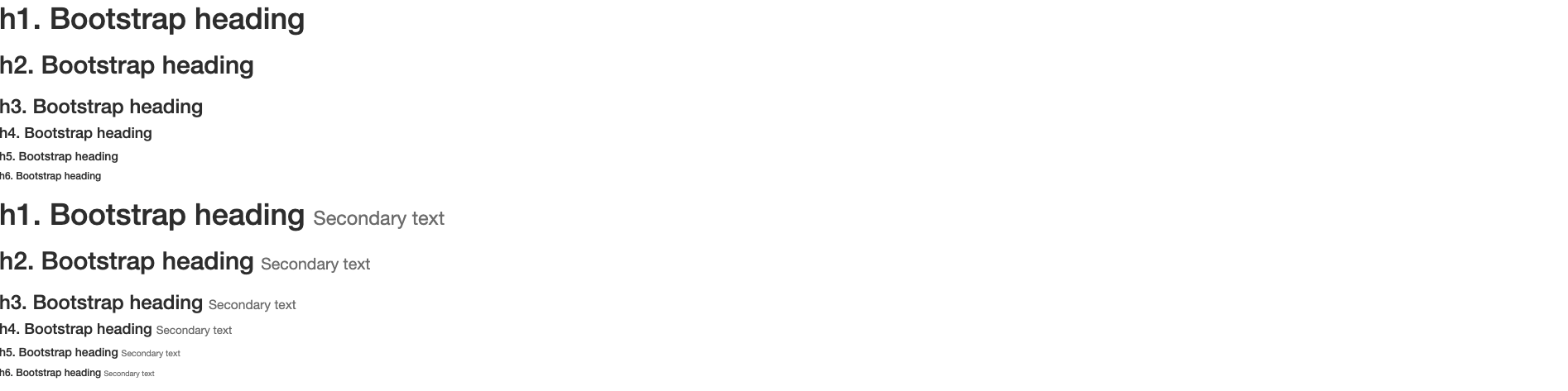
標題排版
<h1>h1. Bootstrap heading</h1>
<h2>h2. Bootstrap heading</h2>
<h3>h3. Bootstrap heading</h3>
<h4>h4. Bootstrap heading</h4>
<h5>h5. Bootstrap heading</h5>
<h6>h6. Bootstrap heading</h6>
在標題內還可以包含 <small> 標簽或賦予 .small 類的元素,可以用來標記副標題。
<h1>h1. Bootstrap heading <small>Secondary text</small></h1>
<h2>h2. Bootstrap heading <small>Secondary text</small></h2>
<h3>h3. Bootstrap heading <small>Secondary text</small></h3>
<h4>h4. Bootstrap heading <small>Secondary text</small></h4>
<h5>h5. Bootstrap heading <small>Secondary text</small></h5>
<h6>h6. Bootstrap heading <small>Secondary text</small></h6>
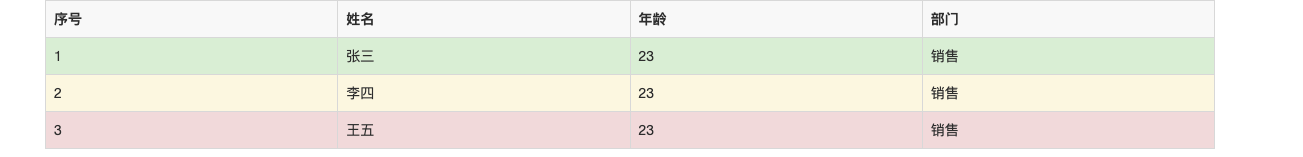
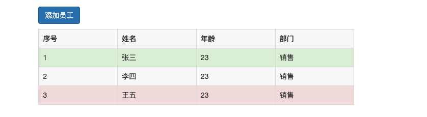
表格
通過 .table-striped 類可以給 <tbody> 之內的每一行增加斑馬條紋樣式。
添加 .table-bordered 類為表格和其中的每個單元格增加邊框。
通過添加 .table-hover 類可以讓 <tbody> 中的每一行對滑鼠懸停狀態作出響應。
通過添加 .table-condensed 類可以讓表格更加緊湊,單元格中的內補(padding)均會減半。
通過這些狀態類可以為行或單元格設置顏色。
| Class | 描述 |
|---|---|
.active |
滑鼠懸停在行或單元格上時所設置的顏色 |
.success |
標識成功或積極的動作 |
.info |
標識普通的提示信息或動作 |
.warning |
標識警告或需要用戶註意 |
.danger |
標識危險或潛在的帶來負面影響的動作 |
<div class="container">
  <div class="row">
    <div >
      <table border="1" class="table table-striped table-hover table-bordered">
        <tr>
          <th>序號</th>
          <th>姓名</th>
          <th>年齡</th>
          <th>部門</th>
        </tr>

        <tr class="success">
          <td>1</td>
          <td>張三</td>
          <td>23</td>
          <td>銷售</td>
        </tr>
        <tr class="warning">
          <td>2</td>
          <td>李四</td>
          <td>23</td>
          <td>銷售</td>
        </tr>
        <tr class="danger">
          <td>3</td>
          <td>王五</td>
          <td>23</td>
          <td>銷售</td>
        </tr>
      </table>
    </div>
  </div>
</div>
表單
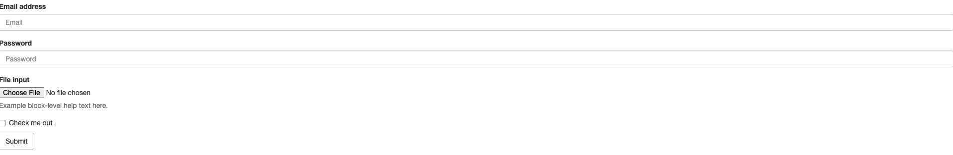
單獨的表單控制項會被自動賦予一些全局樣式。所有設置了 .form-control 類的 <input>、<textarea> 和 <select> 元素都將被預設設置寬度屬性為 width: 100%;。 將 label 元素和前面提到的控制項包裹在 .form-group 中可以獲得最好的排列。
<form>
  <div class="form-group">
    <label for="exampleInputEmail1">Email address</label>
    <input type="email" class="form-control" id="exampleInputEmail1" placeholder="Email">
  </div>
  <div class="form-group">
    <label for="exampleInputPassword1">Password</label>
    <input type="password" class="form-control" id="exampleInputPassword1" placeholder="Password">
  </div>
  <div class="form-group">
    <label for="exampleInputFile">File input</label>
    <input type="file" id="exampleInputFile">
    <p class="help-block">Example block-level help text here.</p>
  </div>
  <div class="checkbox">
    <label>
      <input type="checkbox"> Check me out
    </label>
  </div>
  <button type="submit" class="btn btn-default">Submit</button>
</form>
將bootstrap的渲染去掉可以進行對比:

<hr>
<form action="">
    <div class="form-group">

        <label for="user">用戶名</label>
        <input type="text" class="form-control" id="user">
    </div>
    <div class="form-group">
        <label for="pwd">密碼</label>
        <input type="password" class="form-control" id="pwd">
    </div>
    <div class="form-group">

        <div class="row">
            <div class="col-md-6">

                <select class="form-control">
                    <option>1</option>
                    <option>2</option>
                    <option>3</option>
                    <option>4</option>
                    <option>5</option>
                </select>
            </div>
        </div>
    </div>

    <div class="row">
        <div class="col-md-2 pull-right"><input type="submit" class="form-control"></div>
    </div>
</form>

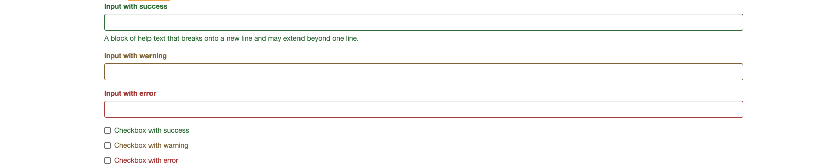
校驗狀態
Bootstrap 對錶單控制項的校驗狀態,如 error、warning 和 success 狀態,都定義了樣式。使用時,添加 .has-warning、.has-error 或 .has-success 類到這些控制項的父元素即可。任何包含在此元素之內的 .control-label、.form-control 和 .help-block 元素都將接受這些校驗狀態的樣式。
使用這些校驗樣式只是為表單控制項提供一個可視的、基於色彩的提示,但是並不能將這種提示信息傳達給使用輔助設備的用戶 - 例如屏幕閱讀器 - 或者色盲用戶。
為了確保所有用戶都能獲取正確信息,Bootstrap 還提供了另一種提示方式。例如,你可以在表單控制項的 <label> 標簽上以文本的形式顯示提示信息(就像下麵代碼中所展示的);包含一個 Glyphicon 字體圖標 (還有賦予 .sr-only 類的文本信息 - 參考Glyphicon 字體圖標實例);或者提供一個額外的 輔助信息 塊。另外,對於使用輔助設備的用戶,無效的表單控制項還可以賦予一個 aria-invalid="true" 屬性。
<div class="form-group has-success">
  <label class="control-label" for="inputSuccess1">Input with success</label>
  <input type="text" class="form-control" id="inputSuccess1" aria-describedby="helpBlock2">
  <span id="helpBlock2" class="help-block">A block of help text that breaks onto a new line and may extend beyond one line.</span>
</div>
<div class="form-group has-warning">
  <label class="control-label" for="inputWarning1">Input with warning</label>
  <input type="text" class="form-control" id="inputWarning1">
</div>
<div class="form-group has-error">
  <label class="control-label" for="inputError1">Input with error</label>
  <input type="text" class="form-control" id="inputError1">
</div>
<div class="has-success">
  <div class="checkbox">
    <label>
      <input type="checkbox" id="checkboxSuccess" value="option1">
      Checkbox with success
    </label>
  </div>
</div>
<div class="has-warning">
  <div class="checkbox">
    <label>
      <input type="checkbox" id="checkboxWarning" value="option1">
      Checkbox with warning
    </label>
  </div>
</div>
<div class="has-error">
  <div class="checkbox">
    <label>
      <input type="checkbox" id="checkboxError" value="option1">
      Checkbox with error
    </label>
  </div>
</div>
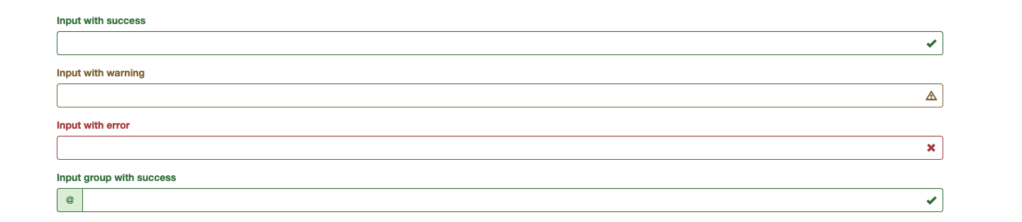
添加圖標
你還可以針對校驗狀態為輸入框添加額外的圖標。只需設置相應的 .has-feedback 類並添加正確的圖標即可。
反饋圖標(feedback icon)只能使用在文本輸入框 <input class="form-control"> 元素上。
對於不帶有 label 標簽的輸入框以及右側帶有附加組件的輸入框組,需要手動為其放置反饋圖標。為了讓所有用戶都能訪問你的網站,我們強烈建議為所有輸入框添加 label 標簽。如果你不希望將 label 標簽展示出來,可以通過添加 .sr-only 類將其隱藏。如果的確不能添加 label 標簽,請調整反饋圖標的 top 值。對於輸入框組,請根據附加組件的實際情況調整 right 值。
為了確保輔助技術- 如屏幕閱讀器 - 正確傳達一個圖標的含義,額外的隱藏的文本應包含在 .sr-only 類中,並明確關聯使用了 aria-describedby 的表單控制項。或者,以某些其他形式(例如,文本輸入欄位有一個特定的警告信息)傳達含義,例如改變與表單控制項實際相關聯的 <label> 的文本。
雖然下麵的例子已經提到各自表單控制項本身的 <label> 文本的驗證狀態,上述技術(使用 .sr-only 文本 和 aria-describedby) )已經包括了需要說明的目的。
<div class="form-group has-success has-feedback">
  <label class="control-label" for="inputSuccess2">Input with success</label>
  <input type="text" class="form-control" id="inputSuccess2" aria-describedby="inputSuccess2Status">
  <span class="glyphicon glyphicon-ok form-control-feedback" aria-hidden="true"></span>
  <span id="inputSuccess2Status" class="sr-only">(success)</span>
</div>
<div class="form-group has-warning has-feedback">
  <label class="control-label" for="inputWarning2">Input with warning</label>
  <input type="text" class="form-control" id="inputWarning2" aria-describedby="inputWarning2Status">
  <span class="glyphicon glyphicon-warning-sign form-control-feedback" aria-hidden="true"></span>
  <span id="inputWarning2Status" class="sr-only">(warning)</span>
</div>
<div class="form-group has-error has-feedback">
  <label class="control-label" for="inputError2">Input with error</label>
  <input type="text" class="form-control" id="inputError2" aria-describedby="inputError2Status">
  <span class="glyphicon glyphicon-remove form-control-feedback" aria-hidden="true"></span>
  <span id="inputError2Status" class="sr-only">(error)</span>
</div>
<div class="form-group has-success has-feedback">
  <label class="control-label" for="inputGroupSuccess1">Input group with success</label>
  <div class="input-group">
    <span class="input-group-addon">@</span>
    <input type="text" class="form-control" id="inputGroupSuccess1" aria-describedby="inputGroupSuccess1Status">
  </div>
  <span class="glyphicon glyphicon-ok form-control-feedback" aria-hidden="true"></span>
  <span id="inputGroupSuccess1Status" class="sr-only">(success)</span>
</div>
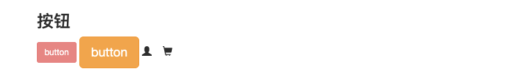
按鈕
需要讓按鈕具有不同尺寸嗎?使用 .btn-lg、.btn-sm 或 .btn-xs 就可以獲得不同尺寸的按鈕。
通過給按鈕添加 .btn-block 類可以將其拉伸至父元素100%的寬度,而且按鈕也變為了塊級(block)元素。
當按鈕處於激活狀態時,其表現為被按壓下去(底色更深、邊框夜色更深、向內投射陰影)。對於 <button> 元素,是通過 :active 狀態實現的。對於 <a> 元素,是通過 .active 類實現的。然而,你還可以將 .active 應用到 <button> 上(包含 aria-pressed="true" 屬性)),並通過編程的方式使其處於激活狀態。
可以為基於 <a> 元素創建的按鈕添加 .active 類。
通過為按鈕的背景設置 opacity 屬性就可以呈現出無法點擊的效果。
<div class="col-md-8 col-md-offset-2">
<div class="row">
<h3>按鈕</h3>
<button class="btn btn-danger btn-sm" disabled="disabled">button</button>
<input class="btn btn-warning btn-lg" type="button" value="button">
<span class="glyphicon glyphicon-user"></span>
<span class="glyphicon glyphicon-shopping-cart"></span>
</div>
</div>
查看所有組件圖標
應用頁面
首先引入外部插件
<link rel="stylesheet" href="bootstrap/dist/css/bootstrap.css">
  <script src="jquery3.6.js"></script>
  <script src="bootstrap/dist/js/bootstrap.js"></script>
導航條
<nav class="navbar navbar-default">
    <div class="container-fluid">
        <!-- Brand and toggle get grouped for better mobile display -->
        <div class="navbar-header">
            <button type="button" class="navbar-toggle collapsed" data-toggle="collapse"
                    data-target="#bs-example-navbar-collapse-1" aria-expanded="false">
                <span class="sr-only">Toggle navigation</span>
                <span class="icon-bar"></span>
                <span class="icon-bar"></span>
                <span class="icon-bar"></span>
            </button>
            <a class="navbar-brand" href="#">ivanlee</a>
        </div>

        <!-- Collect the nav links, forms, and other content for toggling -->
        <div class="collapse navbar-collapse" id="bs-example-navbar-collapse-1">
            <ul class="nav navbar-nav">
                <li class="active"><a href="#">Link <span class="sr-only">(current)</span></a></li>
                <li><a href="#">Link</a></li>
                <li class="dropdown">
                    <a href="#" class="dropdown-toggle" data-toggle="dropdown" role="button" aria-haspopup="true"
                       aria-expanded="false">Dropdown <span class="caret"></span></a>
                    <ul class="dropdown-menu">
                        <li><a href="#">Action</a></li>
                        <li><a href="#">Another action</a></li>
                        <li><a href="#">Something else here</a></li>
                        <li role="separator" class="divider"></li>
                        <li><a href="#">Separated link</a></li>
                        <li role="separator" class="divider"></li>
                        <li><a href="#">One more separated link</a></li>
                    </ul>
                </li>
            </ul>
            <form class="navbar-form navbar-left">
                <div class="form-group">
                    <input type="text" class="form-control" placeholder="Search">
                </div>
                <button type="submit" class="btn btn-default">Submit</button>
            </form>
            <ul class="nav navbar-nav navbar-right">
                <li><a href="#">Link</a></li>
                <li class="dropdown">
                    <a href="#" class="dropdown-toggle" data-toggle="dropdown" role="button" aria-haspopup="true"
                       aria-expanded="false">Dropdown <span class="caret"></span></a>
                    <ul class="dropdown-menu">
                        <li><a href="#">Action</a></li>
                        <li><a href="#">Another action</a></li>
                        <li><a href="#">Something else here</a></li>
                        <li role="separator" class="divider"></li>
                        <li><a href="#">Separated link</a></li>
                    </ul>
                </li>
            </ul>
        </div><!-- /.navbar-collapse -->
    </div><!-- /.container-fluid -->
</nav>

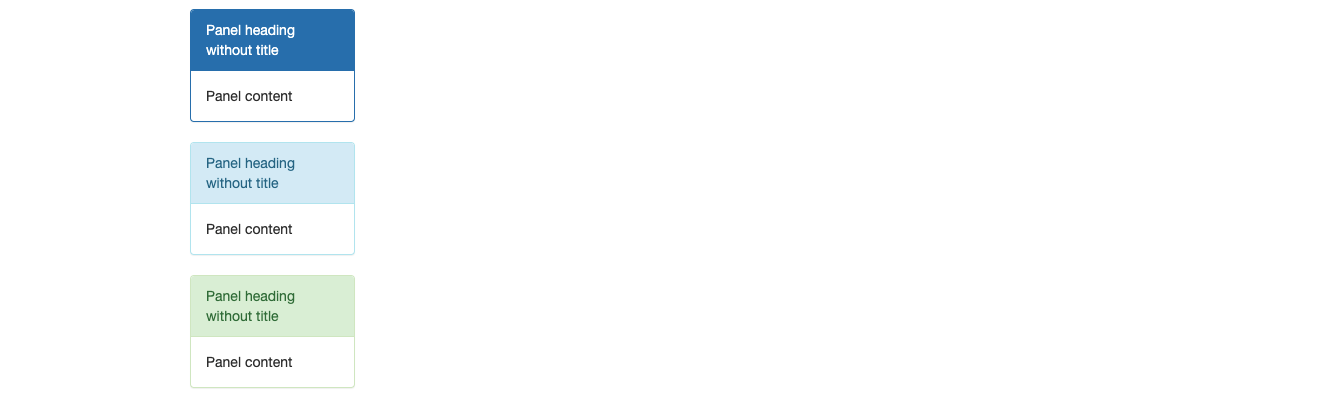
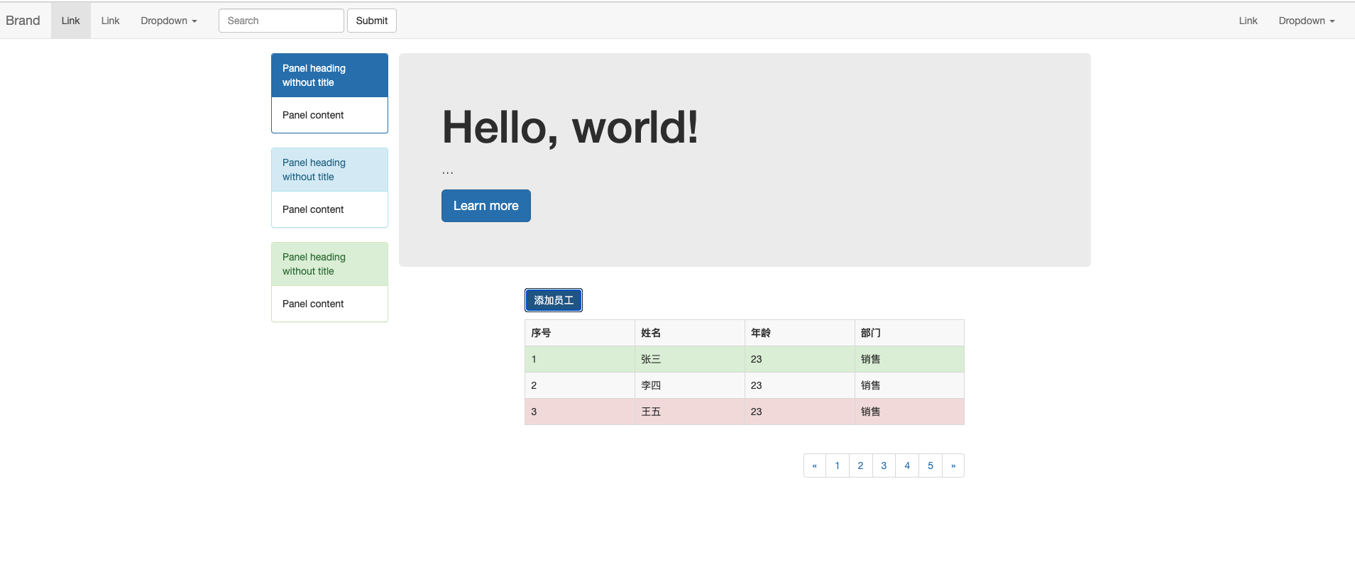
Panel
<div class="col-md-2">
    <div class="panel panel-primary">
        <div class="panel-heading">Panel heading without title</div>
        <div class="panel-body">
            Panel content
        </div>
    </div>

    <div class="panel panel-info">
        <div class="panel-heading">Panel heading without title</div>
        <div class="panel-body">
            Panel content
        </div>
    </div>

    <div class="panel panel-success">
        <div class="panel-heading">Panel heading without title</div>
        <div class="panel-body">
            Panel content
        </div>
    </div>
</div>
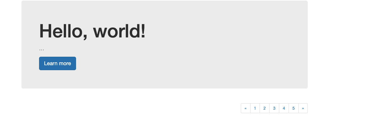
巨幕
<div class="jumbotron">
    <h1>Hello, world!</h1>
    <p>...</p>
    <p><a class="btn btn-primary btn-lg" href="#" role="button">Learn more</a></p>
</div>
表格
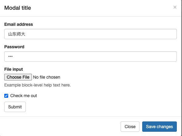
模態框
<div class="modal fade" id="myModal" tabindex="-1" role="dialog" aria-labelledby="myModalLabel">
<div class="modal-dialog" role="document">
<div class="modal-content">
<div class="modal-header">
<button type="button" class="close" data-dismiss="modal" aria-label="Close"><span
aria-hidden="true">×</span></button>
<h4 class="modal-title" id="myModalLabel">Modal title</h4>
</div>
<div class="modal-body">
<form>
<div class="form-group">
<label for="exampleInputEmail1">Email address</label>
<input type="email" class="form-control" id="exampleInputEmail1"
placeholder="Email">
</div>
<div class="form-group">
<label for="exampleInputPassword1">Password</label>
<input type="password" class="form-control" id="exampleInputPassword1"
placeholder="Password">
</div>
<div class="form-group">
<label for="exampleInputFile">File input</label>
<input type="file" id="exampleInputFile">
<p class="help-block">Example block-level help text here.</p>
</div>
<div class="checkbox">
<label>
<input type="checkbox"> Check me out
</label>
</div>
<button type="submit" class="btn btn-default">Submit</button>
</form>
</div>
<div class="modal-footer">
<button type="button" class="btn btn-default" data-dismiss="modal">Close</button>
<button type="button" class="btn btn-primary save">Save changes</button>
</div>
</div>
</div>
</div>
分頁
<nav aria-label="Page navigation">
<ul class="pagination">
<li>
<a href="#" aria-label="Previous">
<span aria-hidden="true">«</span>
</a>
</li>
<li><a href="#">1</a></li>
<li><a href="#">2</a></li>
<li><a href="#">3</a></li>
<li><a href="#">4</a></li>
<li><a href="#">5</a></li>
<li>
<a href="#" aria-label="Next">
<span aria-hidden="true">»</span>
</a>
</li>
</ul>
</nav>

本文來自博客園,作者:ivanlee717,轉載請註明原文鏈接:https://www.cnblogs.com/ivanlee717/p/16331192.html