
前言 1 一列佈局 一列佈局: HTML部分 <!DOCTYPE html> <html> <head> <meta charset="utf-8" /> <title>一列佈局</title> </head> <body> <div class="head">head</div> <div cla ...
前言
- 一列佈局
- 二列佈局
- 三列佈局
1 一列佈局
- 一列佈局:
HTML部分
<!DOCTYPE html>
<html>
<head>
<meta charset="utf-8" />
<title>一列佈局</title>
</head>
<body>
<div class="head">head</div>
<div class="main">main</div>
<div class="foot">foot</div>
</body>
</html>


CSS部分
div{text-align: center;}
.head{height: 60px;background-color:#fae1e1;}
.main{margin: 0 auto;height:300px;background-color:#e6686a;}
.foot{margin: 0 auto;background-color:red;}
- 效果圖如下:

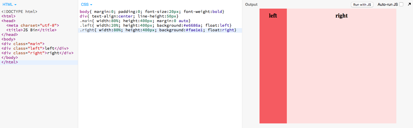
2 二列佈局
- 二列佈局代碼如下(即左右佈局),二列佈局有多種方法,float+margin(一側定寬,一側自動)、position+margin(一側定寬,一側自動)、float+負margin(一側定寬,一側自動)等,本篇用的是設定兩欄的寬度的百分比,隨寬度自適應變化代碼如下:
HTML部分
<!DOCTYPE html>
<html>
<head>
<title>二列佈局</title>
</head>
<body>
<div class="main">
<div class="left">left</div>
<div class="right">right</div>
</div>
</body>
</html

CSS部分
body{ margin:0; padding:0; font-size:20px; font-weight:bold}
div{ text-align:center; line-height:50px}
.main{ width:80%; height:400px; margin:0 auto}
.left{ width:20%; height:400px; background:#e6686a; float:left}
.right{ width:80%; height:400px; background:#fae1e1; float:right}
-
效果圖如下:
3 三列佈局
- 三列佈局(即左中右佈局),三列佈局有多種方法,float+margin(兩側定寬,中間自適應)、position+margin(兩側定寬,中間自適應)、float+負margin(兩側定寬,中間自適應)、float+position+margin(兩側自動,中間定寬)、position+margin(兩側自動,中間定寬),本篇用的是float+margin(兩側定寬,中間自適應),代碼如下:
HTML部分
<!DOCTYPE html>
<html>
<head>
  <meta charset="utf-8">
  <title>JS Bin</title>
</head>
<body>
<div class="left">left</div>
<div class="center">main</div>
<div class="right">right</div>
</body>
</html>

CSS部分
body{ margin:0; padding:0; font-weight:bold}
div{ line-height:40px}
.left{height:400px; width:200px; position: absolute; left:0; top:0;background:#fae1e1;}
.right{ height:400px; width:200px; position:absolute; top:0;right:0;; background:#fae1e1}
.center{ height:400px; margin:0 200px; background:#e6686a}
- 效果圖如下:


