一、Expander的用法 在WPF中,Expander是一個很實用的複合控制項,可以很方便的實現下拉菜單和導航欄等功能。先介紹簡單的用法,而後分析他的控制項模板。 可以看到Expander主要分為頭部和內容兩部分,展開時才顯示內容,而內容部分可以存放豐富的內容 效果圖: 二、控制項模板 如何獲取控制項本身 ...
一、Expander的用法
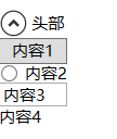
在WPF中,Expander是一個很實用的複合控制項,可以很方便的實現下拉菜單和導航欄等功能。先介紹簡單的用法,而後分析他的控制項模板。
<Window.Resources>
        <ResourceDictionary>
            <Style x:Key="Expander.StackPanel.Style" TargetType="FrameworkElement">
                <Setter Property="MaxWidth" Value="80"></Setter>
                <Setter Property="MinWidth" Value="50"></Setter>
                <Setter Property="HorizontalAlignment" Value="Left"></Setter>
            </Style>
        </ResourceDictionary>
    </Window.Resources>
    <Grid>

        <Expander Style="{DynamicResource ExpanderStyle}" Header="頭部">
            <StackPanel>
                <Button Style="{StaticResource Expander.StackPanel.Style}">內容1</Button>
                <RadioButton Style="{StaticResource Expander.StackPanel.Style}">內容2</RadioButton>
                <TextBox Style="{StaticResource Expander.StackPanel.Style}">內容3</TextBox>
                <TextBlock Style="{StaticResource Expander.StackPanel.Style}">內容4</TextBlock>
            </StackPanel>
        </Expander>
    </Grid>
可以看到Expander主要分為頭部和內容兩部分,展開時才顯示內容,而內容部分可以存放豐富的內容
效果圖:
二、控制項模板
如何獲取控制項本身預設的控制項模板請看我的另一篇文章:https://www.cnblogs.com/xiaomengshan/p/11446436.html
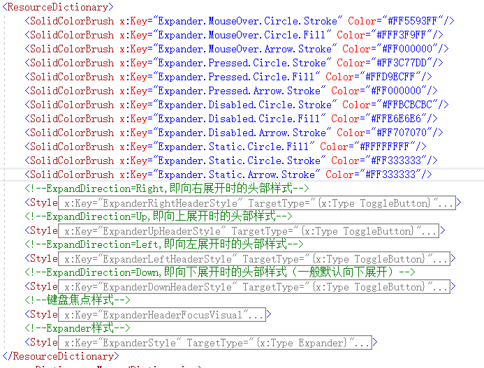
因為控制項模板比較複雜,先看大概的構成:
再看看主樣式部分(ExpanderSytle)的構成:

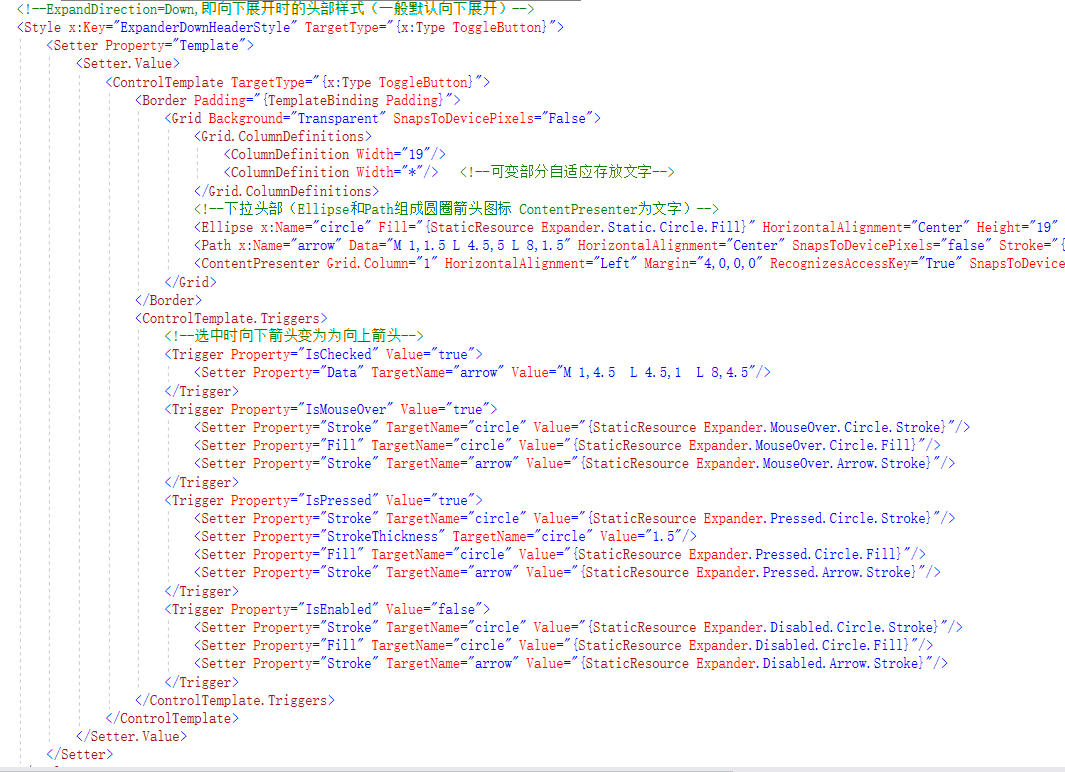
再看向下展開時頭部的樣式構成:
如下為我標註了註釋的完整控制項模板代碼:
<SolidColorBrush x:Key="Expander.MouseOver.Circle.Stroke" Color="#FF5593FF"/> <SolidColorBrush x:Key="Expander.MouseOver.Circle.Fill" Color="#FFF3F9FF"/> <SolidColorBrush x:Key="Expander.MouseOver.Arrow.Stroke" Color="#FF000000"/> <SolidColorBrush x:Key="Expander.Pressed.Circle.Stroke" Color="#FF3C77DD"/> <SolidColorBrush x:Key="Expander.Pressed.Circle.Fill" Color="#FFD9ECFF"/> <SolidColorBrush x:Key="Expander.Pressed.Arrow.Stroke" Color="#FF000000"/> <SolidColorBrush x:Key="Expander.Disabled.Circle.Stroke" Color="#FFBCBCBC"/> <SolidColorBrush x:Key="Expander.Disabled.Circle.Fill" Color="#FFE6E6E6"/> <SolidColorBrush x:Key="Expander.Disabled.Arrow.Stroke" Color="#FF707070"/> <SolidColorBrush x:Key="Expander.Static.Circle.Fill" Color="#FFFFFFFF"/> <SolidColorBrush x:Key="Expander.Static.Circle.Stroke" Color="#FF333333"/> <SolidColorBrush x:Key="Expander.Static.Arrow.Stroke" Color="#FF333333"/> <!--ExpandDirection=Right,即向右展開時的頭部樣式--> <Style x:Key="ExpanderRightHeaderStyle" TargetType="{x:Type ToggleButton}"> <Setter Property="Template"> <Setter.Value> <ControlTemplate TargetType="{x:Type ToggleButton}"> <Border Padding="{TemplateBinding Padding}"> <Grid Background="Transparent" SnapsToDevicePixels="False"> <Grid.RowDefinitions> <RowDefinition Height="19"/> <RowDefinition Height="*"/> </Grid.RowDefinitions> <Grid> <Grid.LayoutTransform> <TransformGroup> <TransformGroup.Children> <TransformCollection> <RotateTransform Angle="-90"/> </TransformCollection> </TransformGroup.Children> </TransformGroup> </Grid.LayoutTransform> <Ellipse x:Name="circle" Fill="Yellow" HorizontalAlignment="Center" Height="19" Stroke="Yellow" VerticalAlignment="Center" Width="19"/> <Path x:Name="arrow" Data="M 1,1.5 L 4.5,5 L 8,1.5" HorizontalAlignment="Center" SnapsToDevicePixels="false" Stroke="{StaticResource Expander.Static.Arrow.Stroke}" StrokeThickness="2" VerticalAlignment="Center"/> </Grid> <ContentPresenter HorizontalAlignment="Center" Margin="0,4,0,0" Grid.Row="1" RecognizesAccessKey="True" SnapsToDevicePixels="True" VerticalAlignment="Top"/> </Grid> </Border> <ControlTemplate.Triggers> <Trigger Property="IsChecked" Value="true"> <Setter Property="Data" TargetName="arrow" Value="M 1,4.5 L 4.5,1 L 8,4.5"/> </Trigger> <Trigger Property="IsMouseOver" Value="true"> <Setter Property="Stroke" TargetName="circle" Value="{StaticResource Expander.MouseOver.Circle.Stroke}"/> <Setter Property="Fill" TargetName="circle" Value="{StaticResource Expander.MouseOver.Circle.Fill}"/> <Setter Property="Stroke" TargetName="arrow" Value="{StaticResource Expander.MouseOver.Arrow.Stroke}"/> </Trigger> <Trigger Property="IsPressed" Value="true"> <Setter Property="Stroke" TargetName="circle" Value="{StaticResource Expander.Pressed.Circle.Stroke}"/> <Setter Property="StrokeThickness" TargetName="circle" Value="1.5"/> <Setter Property="Fill" TargetName="circle" Value="{StaticResource Expander.Pressed.Circle.Fill}"/> <Setter Property="Stroke" TargetName="arrow" Value="{StaticResource Expander.Pressed.Arrow.Stroke}"/> </Trigger> <Trigger Property="IsEnabled" Value="false"> <Setter Property="Stroke" TargetName="circle" Value="{StaticResource Expander.Disabled.Circle.Stroke}"/> <Setter Property="Fill" TargetName="circle" Value="{StaticResource Expander.Disabled.Circle.Fill}"/> <Setter Property="Stroke" TargetName="arrow" Value="{StaticResource Expander.Disabled.Arrow.Stroke}"/> </Trigger> </ControlTemplate.Triggers> </ControlTemplate> </Setter.Value> </Setter> </Style> <!--ExpandDirection=Up,即向上展開時的頭部樣式--> <Style x:Key="ExpanderUpHeaderStyle" TargetType="{x:Type ToggleButton}"> <Setter Property="Template"> <Setter.Value> <ControlTemplate TargetType="{x:Type ToggleButton}"> <Border Padding="{TemplateBinding Padding}"> <Grid Background="Transparent" SnapsToDevicePixels="False"> <Grid.ColumnDefinitions> <ColumnDefinition Width="19"/> <ColumnDefinition Width="*"/> </Grid.ColumnDefinitions> <Grid> <Grid.LayoutTransform> <TransformGroup> <TransformGroup.Children> <TransformCollection> <RotateTransform Angle="180"/> </TransformCollection> </TransformGroup.Children> </TransformGroup> </Grid.LayoutTransform> <Ellipse x:Name="circle" Fill="{StaticResource Expander.Static.Circle.Fill}" HorizontalAlignment="Center" Height="19" Stroke="{StaticResource Expander.Static.Circle.Stroke}" VerticalAlignment="Center" Width="19"/> <Path x:Name="arrow" Data="M 1,1.5 L 4.5,5 L 8,1.5" HorizontalAlignment="Center" SnapsToDevicePixels="false" Stroke="{StaticResource Expander.Static.Arrow.Stroke}" StrokeThickness="2" VerticalAlignment="Center"/> </Grid> <ContentPresenter Grid.Column="1" HorizontalAlignment="Left" Margin="4,0,0,0" RecognizesAccessKey="True" SnapsToDevicePixels="True" VerticalAlignment="Center"/> </Grid> </Border> <ControlTemplate.Triggers> <Trigger Property="IsChecked" Value="true"> <Setter Property="Data" TargetName="arrow" Value="M 1,4.5 L 4.5,1 L 8,4.5"/> </Trigger> <Trigger Property="IsMouseOver" Value="true"> <Setter Property="Stroke" TargetName="circle" Value="{StaticResource Expander.MouseOver.Circle.Stroke}"/> <Setter Property="Fill" TargetName="circle" Value="{StaticResource Expander.MouseOver.Circle.Fill}"/> <Setter Property="Stroke" TargetName="arrow" Value="{StaticResource Expander.MouseOver.Arrow.Stroke}"/> </Trigger> <Trigger Property="IsPressed" Value="true"> <Setter Property="Stroke" TargetName="circle" Value="{StaticResource Expander.Pressed.Circle.Stroke}"/> <Setter Property="StrokeThickness" TargetName="circle" Value="1.5"/> <Setter Property="Fill" TargetName="circle" Value="{StaticResource Expander.Pressed.Circle.Fill}"/> <Setter Property="Stroke" TargetName="arrow" Value="{StaticResource Expander.Pressed.Arrow.Stroke}"/> </Trigger> <Trigger Property="IsEnabled" Value="false"> <Setter Property="Stroke" TargetName="circle" Value="{StaticResource Expander.Disabled.Circle.Stroke}"/> <Setter Property="Fill" TargetName="circle" Value="{StaticResource Expander.Disabled.Circle.Fill}"/> <Setter Property="Stroke" TargetName="arrow" Value="{StaticResource Expander.Disabled.Arrow.Stroke}"/> </Trigger> </ControlTemplate.Triggers> </ControlTemplate> </Setter.Value> </Setter> </Style> <!--ExpandDirection=Left,即向左展開時的頭部樣式--> <Style x:Key="ExpanderLeftHeaderStyle" TargetType="{x:Type ToggleButton}"> <Setter Property="Template"> <Setter.Value> <ControlTemplate TargetType="{x:Type ToggleButton}"> <Border Padding="{TemplateBinding Padding}"> <Grid Background="Transparent" SnapsToDevicePixels="False"> <Grid.RowDefinitions> <RowDefinition Height="19"/> <RowDefinition Height="*"/> </Grid.RowDefinitions> <Grid> <Grid.LayoutTransform> <TransformGroup> <TransformGroup.Children> <TransformCollection> <RotateTransform Angle="90"/> </TransformCollection> </TransformGroup.Children> </TransformGroup> </Grid.LayoutTransform> <Ellipse x:Name="circle" Fill="{StaticResource Expander.Static.Circle.Fill}" HorizontalAlignment="Center" Height="19" Stroke="{StaticResource Expander.Static.Circle.Stroke}" VerticalAlignment="Center" Width="19"/> <Path x:Name="arrow" Data="M 1,1.5 L 4.5,5 L 8,1.5" HorizontalAlignment="Center" SnapsToDevicePixels="false" Stroke="{StaticResource Expander.Static.Arrow.Stroke}" StrokeThickness="2" VerticalAlignment="Center"/> </Grid> <ContentPresenter HorizontalAlignment="Center" Margin="0,4,0,0" Grid.Row="1" RecognizesAccessKey="True" SnapsToDevicePixels="True" VerticalAlignment="Top"/> </Grid> </Border> <ControlTemplate.Triggers> <Trigger Property="IsChecked" Value="true"> <Setter Property="Data" TargetName="arrow" Value="M 1,4.5 L 4.5,1 L 8,4.5"/> </Trigger> <Trigger Property="IsMouseOver" Value="true"> <Setter Property="Stroke" TargetName="circle" Value="{StaticResource Expander.MouseOver.Circle.Stroke}"/> <Setter Property="Fill" TargetName="circle" Value="{StaticResource Expander.MouseOver.Circle.Fill}"/> <Setter Property="Stroke" TargetName="arrow" Value="{StaticResource Expander.MouseOver.Arrow.Stroke}"/> </Trigger> <Trigger Property="IsPressed" Value="true"> <Setter Property="Stroke" TargetName="circle" Value="{StaticResource Expander.Pressed.Circle.Stroke}"/> <Setter Property="StrokeThickness" TargetName="circle" Value="1.5"/> <Setter Property="Fill" TargetName="circle" Value="{StaticResource Expander.Pressed.Circle.Fill}"/> <Setter Property="Stroke" TargetName="arrow" Value="{StaticResource Expander.Pressed.Arrow.Stroke}"/> </Trigger> <Trigger Property="IsEnabled" Value="false"> <Setter Property="Stroke" TargetName="circle" Value="{StaticResource Expander.Disabled.Circle.Stroke}"/> <Setter Property="Fill" TargetName="circle" Value="{StaticResource Expander.Disabled.Circle.Fill}"/> <Setter Property="Stroke" TargetName="arrow" Value="{StaticResource Expander.Disabled.Arrow.Stroke}"/> </Trigger> </ControlTemplate.Triggers> </ControlTemplate> </Setter.Value> </Setter> </Style> <!--ExpandDirection=Down,即向下展開時的頭部樣式(一般預設向下展開)--> <Style x:Key="ExpanderDownHeaderStyle" TargetType="{x:Type ToggleButton}"> <Setter Property="Template"> <Setter.Value> <ControlTemplate TargetType="{x:Type ToggleButton}"> <Border Padding="{TemplateBinding Padding}"> <Grid Background="Transparent" SnapsToDevicePixels="False"> <Grid.ColumnDefinitions> <ColumnDefinition Width="19"/> <ColumnDefinition Width="*"/> <!--可變部分自適應存放文字--> </Grid.ColumnDefinitions> <!--下拉頭部(Ellipse和Path組成圓圈箭頭圖標 ContentPresenter為文字)--> <Ellipse x:Name="circle" Fill="{StaticResource Expander.Static.Circle.Fill}" HorizontalAlignment="Center" Height="19" Stroke="{StaticResource Expander.Static.Circle.Stroke}" VerticalAlignment="Center" Width="19"/> <Path x:Name="arrow" Data="M 1,1.5 L 4.5,5 L 8,1.5" HorizontalAlignment="Center" SnapsToDevicePixels="false" Stroke="{StaticResource Expander.Static.Arrow.Stroke}" StrokeThickness="2" VerticalAlignment="Center"/> <ContentPresenter Grid.Column="1" HorizontalAlignment="Left" Margin="4,0,0,0" RecognizesAccessKey="True" SnapsToDevicePixels="True" VerticalAlignment="Center"/> </Grid> </Border> <ControlTemplate.Triggers> <!--選中時向下箭頭變為為向上箭頭--> <Trigger Property="IsChecked" Value="true"> <Setter Property="Data" TargetName="arrow" Value="M 1,4.5 L 4.5,1 L 8,4.5"/> </Trigger> <Trigger Property="IsMouseOver" Value="true"> <Setter Property="Stroke" TargetName="circle" Value="{StaticResource Expander.MouseOver.Circle.Stroke}"/> <Setter Property="Fill" TargetName="circle" Value="{StaticResource Expander.MouseOver.Circle.Fill}"/> <Setter Property="Stroke" TargetName="arrow" Value="{StaticResource Expander.MouseOver.Arrow.Stroke}"/> </Trigger> <Trigger Property="IsPressed" Value="true"> <Setter Property="Stroke" TargetName="circle" Value="{StaticResource Expander.Pressed.Circle.Stroke}"/> <Setter Property="StrokeThickness" TargetName="circle" Value="1.5"/> <Setter Property="Fill" TargetName="circle" Value="{StaticResource Expander.Pressed.Circle.Fill}"/> <Setter Property="Stroke" TargetName="arrow" Value="{StaticResource Expander.Pressed.Arrow.Stroke}"/> </Trigger> <Trigger Property="IsEnabled" Value="false"> <Setter Property="Stroke" TargetName="circle" Value="{StaticResource Expander.Disabled.Circle.Stroke}"/> <Setter Property="Fill" TargetName="circle" Value="{StaticResource Expander.Disabled.Circle.Fill}"/> <Setter Property="Stroke" TargetName="arrow" Value="{StaticResource Expander.Disabled.Arrow.Stroke}"/> </Trigger> </ControlTemplate.Triggers> </ControlTemplate> </Setter.Value> </Setter> </Style> <!--鍵盤焦點樣式--> <Style x:Key="ExpanderHeaderFocusVisual"> <Setter Property="Control.Template"> <Setter.Value> <ControlTemplate> <Border> <Rectangle Margin="0" SnapsToDevicePixels="true" Stroke="Black" StrokeThickness="1" StrokeDashArray="1 2"/> </Border> </ControlTemplate> </Setter.Value> </Setter> </Style> <!--Expander樣式--> <Style x:Key="ExpanderStyle" TargetType="{x:Type Expander}"> <Setter Property="Foreground" Value="{DynamicResource {x:Static SystemColors.ControlTextBrushKey}}"/> <Setter Property="Background" Value="Transparent"/> <Setter Property="HorizontalContentAlignment" Value="Stretch"/> <Setter Property="VerticalContentAlignment" Value="Stretch"/> <Setter Property="BorderBrush" Value="Transparent"/> <Setter Property="BorderThickness" Value="1"/> <Setter Property="Template"> <Setter.Value> <!--控制項模板--> <ControlTemplate TargetType="{x:Type Expander}"> <Border BorderBrush="{TemplateBinding BorderBrush}" BorderThickness="{TemplateBinding BorderThickness}" Background="{TemplateBinding Background}" CornerRadius="3" SnapsToDevicePixels="true"> <DockPanel> <!--頭部標題--> <ToggleButton x:Name="HeaderSite" ContentTemplate="{TemplateBinding HeaderTemplate}" ContentTemplateSelector="{TemplateBinding HeaderTemplateSelector}" Content="{TemplateBinding Header}" DockPanel.Dock="Top" Foreground="{TemplateBinding Foreground}" FontWeight="{TemplateBinding FontWeight}" FocusVisualStyle="{StaticResource ExpanderHeaderFocusVisual}" FontStyle="{TemplateBinding FontStyle}" FontStretch="{TemplateBinding FontStretch}" FontSize="{TemplateBinding FontSize}" FontFamily="{TemplateBinding FontFamily}" HorizontalContentAlignment="{TemplateBinding HorizontalContentAlignment}" IsChecked="{Binding IsExpanded, Mode=TwoWay, RelativeSource={RelativeSource TemplatedParent}}" Margin="1" MinWidth="0" MinHeight="