
有一天看到css3旋轉這個屬性,突發奇想的寫了一個鐘錶(沒做瀏覽器相容),來一起看看是怎麼寫的吧! 先給個成品圖,最終結果是個樣子的(動態的). 首先,思考了一下頁面的佈局,大致需要4層div,最底層是一個表盤的背景圖,然後其餘3層分別是時針,分針,秒針的圖層. html代碼如下 ↓ 變數名是隨便起 ...
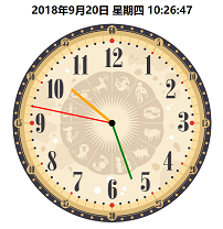
有一天看到css3旋轉這個屬性,突發奇想的寫了一個鐘錶(沒做瀏覽器相容),來一起看看是怎麼寫的吧!
先給個成品圖,最終結果是個樣子的(動態的).
首先,思考了一下頁面的佈局,大致需要4層div,最底層是一個表盤的背景圖,然後其餘3層分別是時針,分針,秒針的圖層.
html代碼如下 ↓
<div class="dial">
</div>
<div class="bigdiv bigdiv1" id="secondHand">
    <div class="secondHand"></div>
</div>
<div class="bigdiv bigdiv2" id="minuteHand">
    <div class="minuteHand"></div>
</div>
<div class="bigdiv bigdiv3" id="hourHand">
    <div class="center"></div>
    <div class="hourHand"></div>
</div>
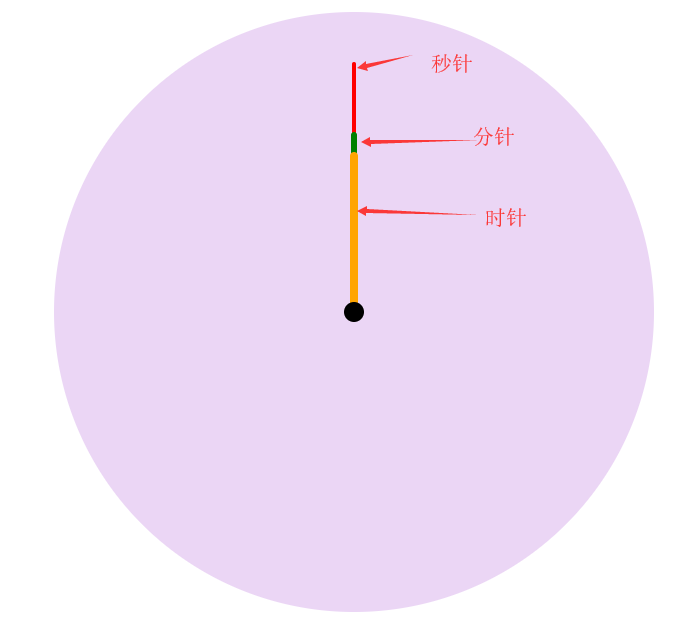
變數名是隨便起的,不要介意; class=center的這個div是表中心那個小黑點.
時針是60*60*60s轉一圈, 分針是60*60s轉一圈, 秒針是60s轉一圈, 所以css代碼如下 ↓
.dial{
    width:600px;
    height:600px;
    margin:0 auto;
    position: absolute;
    border-radius: 50%;
    overflow: hidden;
    background-color: rgba(153,50,204,0.2);
    background-image: url(img/表盤.jpg);
    background-size: 100% 100%;
}
.bigdiv{
    width:600px;
    height:600px;
    margin:0 auto;
    position: absolute;
    border-radius: 50%;
    overflow: hidden;
}
.bigdiv>div{
    position: absolute;
    left:298px;
    border-radius: 100px;
}
.bigdiv1{
    animation: moves 60s steps(60) infinite;
}
.bigdiv1 .secondHand{
    width:4px;
    height:250px;
    background-color: red;
    top:50px;
    left:298px;
}
.bigdiv2{
    animation: moves 3600s steps(3600) infinite;
}
.bigdiv2 .minuteHand{
    width:6px;
    height:180px;
    background-color: green;
    top:120px;
    left:297px;
}
.bigdiv3{
    animation: moves 216000s steps(216000) infinite;
}
.bigdiv3 .hourHand{
    width:8px;
    height:160px;
    background-color: orange;
    top:140px;
    left:296px;
    border-radius: 100px;
}
.bigdiv .center{
    top:290px;
    left:290px;
    width:20px;
    height:20px;
    background-color: black;
    z-index: 2;
}
@keyframes moves{
    from{ transform: rotateZ(0deg); }
    to{ transform: rotateZ(360deg); }
}
這一步做完後效果圖是這個樣子的:
然後用js計算當前時間,
var date = new Date();
var hours = date.getHours();
var minutes = date.getMinutes();
var seconds = date.getSeconds();
然後計算當前每個針的旋轉角度
var secondAngle = seconds;
var minuteAngle = minutes * 60 + seconds;
var hourAngle = (60/12) * ((hours%12) * 3600 + minuteAngle);
現在的思路就是:每個針會按照自己定的時間轉一圈,初始角度也能知道,怎麼組成一個顯示當前時間的動態鐘錶呢?
剛開始的想法是讓這3層div旋轉對應的角度,然後再開始,後來一想不行,因為它還是固定的時間旋轉一周,指針指向會有偏差,
現在需要的是頁面進來的第一圈旋轉固定角度,其餘的按照原來固定的時間旋轉一周就行了,
css3裡面有一個animation-delay屬性,它表示的意思是動畫延遲,負數就表示提前開始(比如-5s就表示動畫從第5s的時間開始),
剛好可以用到,讓這幾個指針提前開始對應的角度.
js代碼如下↓
hourHand.style.cssText = "animation-delay: -"+ hourAngle +"s";
minuteHand.style.cssText = "animation-delay: -"+ minuteAngle +"s";
secondHand.style.cssText = "animation-delay: -"+ secondAngle +"s";
最後自己再加了個動態時間在鐘錶的上面展示
下麵是整理後的完整代碼,複製粘貼即可使用 ↓
css


body,html{
    margin:0;
}
.location{
    position: relative;
    width:600px;
    height:600px;
    left: calc(50% - 300px);
}
.dial{
    width:600px;
    height:600px;
    margin:0 auto;
    position: absolute;
    border-radius: 50%;
    overflow: hidden;
    background-color: rgba(153,50,204,0.2);
    background-image: url(img/表盤.jpg);
    background-size: 100% 100%;
}
.bigdiv{
    width:600px;
    height:600px;
    margin:0 auto;
    position: absolute;
    border-radius: 50%;
    overflow: hidden;
}
.bigdiv>div{
    position: absolute;
    left:298px;
    border-radius: 100px;
}
.bigdiv1{
    animation: moves 60s steps(60) infinite;
}
.bigdiv1 .secondHand{
    width:4px;
    height:250px;
    background-color: red;
    top:50px;
    left:298px;
}
.bigdiv2{
    animation: moves 3600s steps(3600) infinite;
}
.bigdiv2 .minuteHand{
    width:6px;
    height:180px;
    background-color: green;
    top:120px;
    left:297px;
}
.bigdiv3{
    animation: moves 216000s steps(216000) infinite;
}
.bigdiv3 .hourHand{
    width:8px;
    height:160px;
    background-color: orange;
    top:140px;
    left:296px;
    border-radius: 100px;
}
.bigdiv .center{
    top:290px;
    left:290px;
    width:20px;
    height:20px;
    background-color: black;
    z-index: 2;
}
@keyframes moves{
    from{ transform: rotateZ(0deg); }
    to{ transform: rotateZ(360deg); }
}
#dateshow{
    text-align: center;
}
css代碼
html代碼
<h1 id="dateshow"></h1>
<div class="location">
<div class="dial">
</div>
<div class="bigdiv bigdiv1" id="secondHand">
    <div class="secondHand"></div>
</div>
<div class="bigdiv bigdiv2" id="minuteHand">
    <div class="minuteHand"></div>
</div>
<div class="bigdiv bigdiv3" id="hourHand">
    <div class="center"></div>
    <div class="hourHand"></div>
</div>
</div>
html代碼
js代碼
var dateshow = document.getElementById("dateshow");
var clock = {
    weeks : ["一","二","三","四","五","六","日"],
    getDate:function(){
        date = new Date();
        year = date.getFullYear();
        month = date.getMonth()+1;
        day = date.getDate();
        hours = date.getHours();
        minutes = date.getMinutes();
        seconds = date.getSeconds();
        week = date.getDay();    // 星期
        dateText = year+"年"+month+"月"+clock.format(day)+"日 星期"+clock.formatnum(week)+" "+
            clock.format(hours)+":"+clock.format(minutes)+":"+clock.format(seconds);
        return dateText;
    },
    format:function (data){
        if(data.toString().length == 1){
            data = "0" + data;
        };
        return data;
    },
    formatnum:function (num){
        return clock.weeks[num-1];
    },
    showdate:function (){
        dateshow.innerText = clock.getDate();
    },
    go:function (){
        var secondHand = document.getElementById("secondHand");
        var minuteHand = document.getElementById("minuteHand");
        var hourHand = document.getElementById("hourHand");
        date = new Date();
        hours = date.getHours();
        minutes = date.getMinutes();
        seconds = date.getSeconds();
        var secondAngle = seconds;
        var minuteAngle = minutes * 60 + seconds;
        var hourAngle = (60/12) * ((hours%12) * 3600 + minuteAngle);
        hourHand.style.cssText = "animation-delay: -"+ hourAngle +"s";
        minuteHand.style.cssText = "animation-delay: -"+ minuteAngle +"s";
        secondHand.style.cssText = "animation-delay: -"+ secondAngle +"s";
    }

}
clock.go();
clock.showdate();
setInterval("clock.showdate()",1000);
js代碼
第一次寫東西,不喜勿噴.

