基本概念 "MDN" 上的解釋是這樣的 CSS Grid Layout excels at dividing a page into major regions or defining the relationship in terms of size, position, and layer, b ...
基本概念
MDN上的解釋是這樣的
CSS Grid Layout excels at dividing a page into major regions or defining the relationship in terms of size, position, and layer, between parts of a control built from HTML primitives.
另外,下麵一段話摘自A Complete Guide to Grid,對於CSS Grid會有更加清楚地釋義
CSS Grid Layout (aka "Grid"), is a two-dimensional grid-based layout system that aims to do nothing less than completely change the way we design grid-based user interfaces.
總結來說:
- CSS Grid 是一個二維的佈局系統
- CSS Grid 相比傳統佈局在頁面整體劃分佈局上更加出色
- CSS Grid 並不是只能單獨使用,依然可以搭配
Flexbox以及傳統定位佈局一起使用
相容性
摘自Can I Use中對CSS Grid的相容性分析。
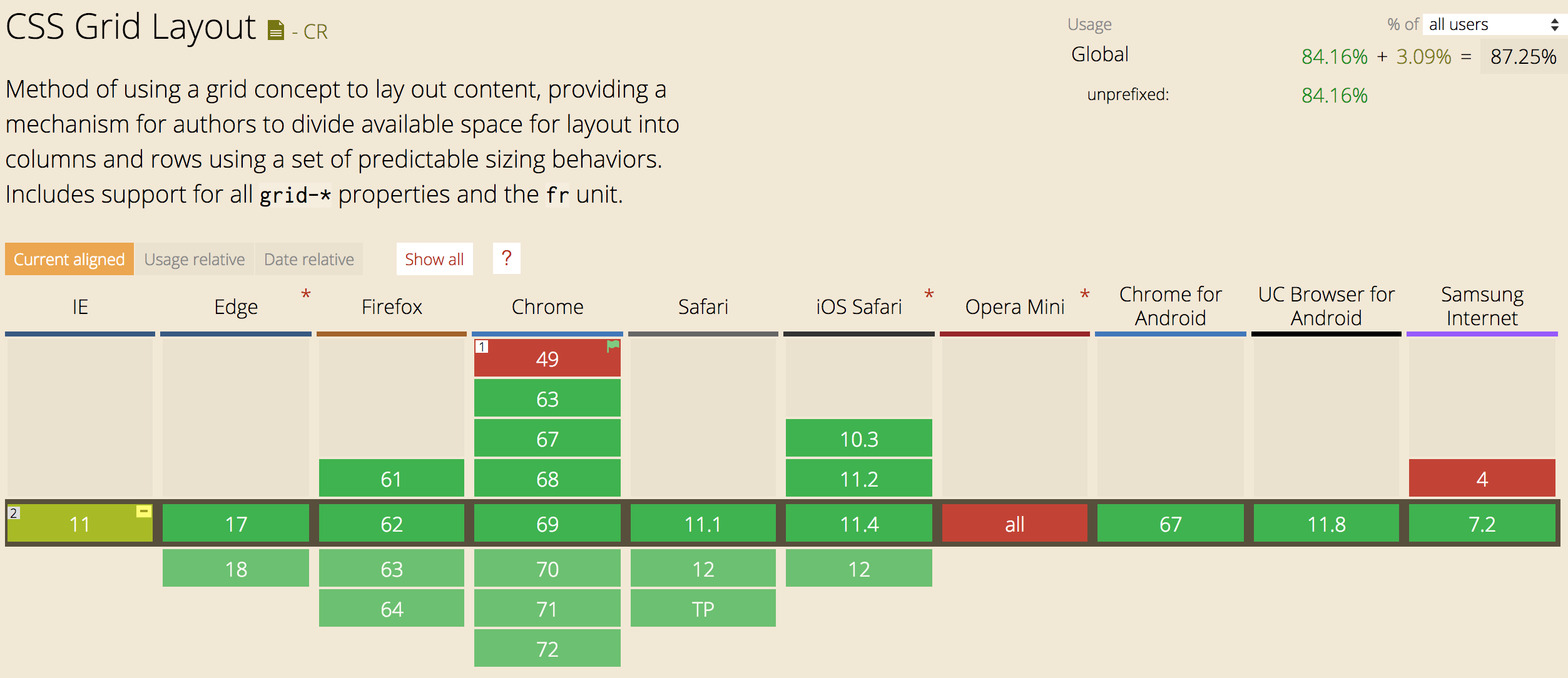
從圖中可以看出瀏覽器的相容率整體達到84.16%,並且都是無需帶首碼的。
基本概念
網格是一組相交的水平線和垂直線,它定義了網格的列和行。我們可以將網格元素放置在與這些行和列相關的位置上。
Grid Container (網格容器)
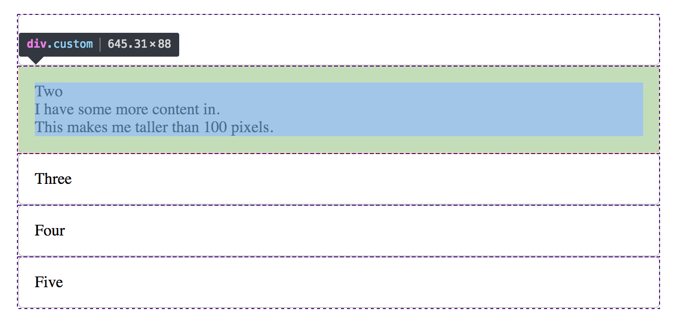
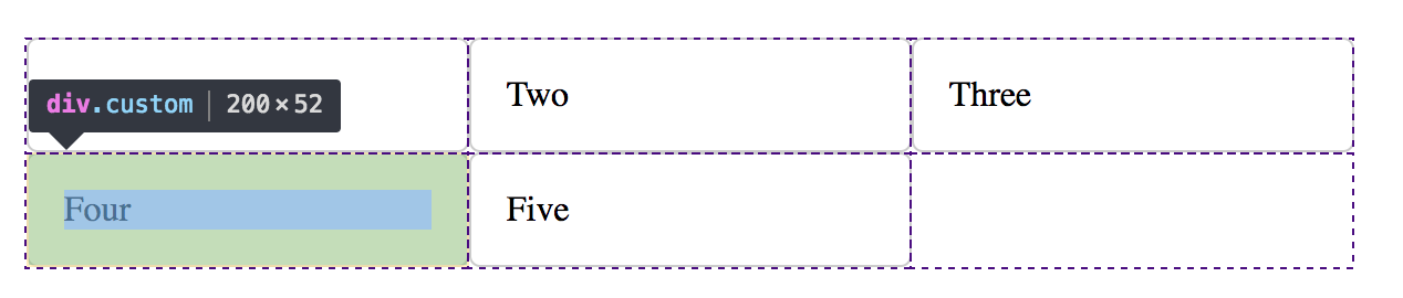
在一個元素上應用了display: grid;或者display: inline-grid;那麼就創建了一個網格容器,它下麵的直接子元素都會成為網格元素,例如:
<style>
.wrapper {
  display: grid;
}
</style>

<div class="wrapper">
  <div class="custom">One</div>
  <div class="custom">Two
    <p>I have some more content in.</p>
    <p>This makes me taller than 100 pixels.</p>
  </div>
  <div class="custom">Three</div>
  <div class="custom">Four</div>
  <div class="custom">Five</div>
</div>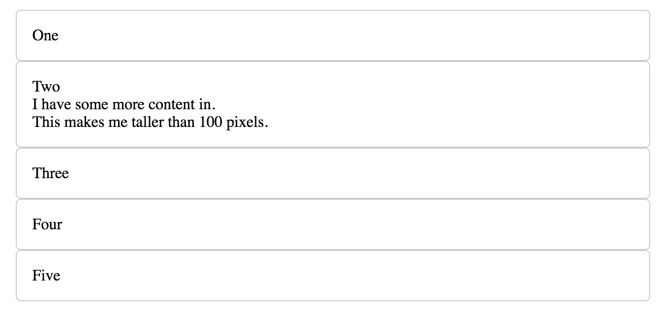
從網頁的基本表現看,和平常的佈局沒有什麼差別,Mac OSX 【alt + command + I】,Windows 【F11】打開網頁檢查器即可看出網格佈局。
Grid Tracks (網格軌跡)
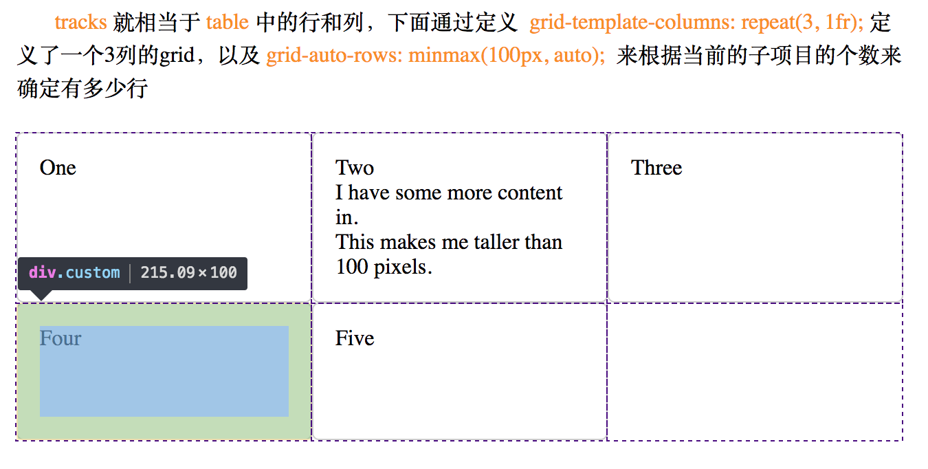
從字面上的意譯來看還是比較繞口,但是我換一種說法你可能就會明白了。可以把tracks看做是table中的行和列就好了。

定義一個網格中的行和列的數量分別使用grid-template-rows和grid-template-columns來確定這個表格會有多少行以及多少列。例如:
.container {
  display: grid;
  grid-template-rows: 100px 50px 100px;
  grid-template-columns: 100px 100px 100px;
}上面的代碼寫出了一個3 x 3的網格
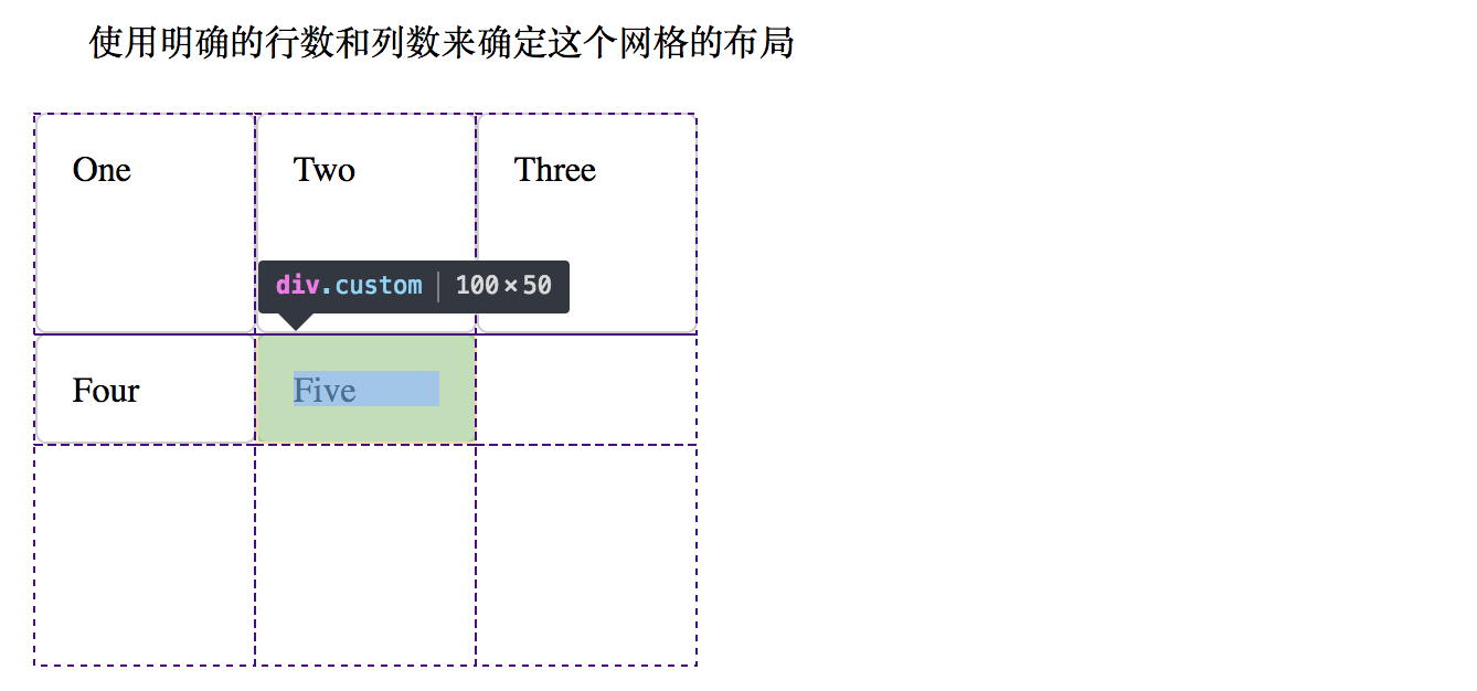
在圖中可以看出網格的數量,其中的子元素會根據這些網格的數量自動填充。如果事先不知道要劃分多少行,可以使用只使用grid-template-columns來確定多少列,行數會根據有多少子item來自動計算,例如下麵的:
.container {
  display: grid;
  grid-template-columns: 200px 200px 200px;
}
5個元素如果是劃分3列,那麼就應該會有兩行。
fr
如果想要均分容器的寬度,那麼可以使用新引入的單位fr,新的fr單位代表網格容器中可用空間的一等份。例如:
.container {
  display: grid;
  grid-template-columns: 1fr 1fr 1fr;
}
repeat()
可以使用repeat()函數來標記軌道重覆使用的部分,例如上面的樣式就可以寫成:
.container {
  display: grid;
  grid-template-columns: repeat(3, 1fr);
}
每行高度
如果想確定使用每行高度,可以使用grid-auto-rows: 100px;來確定每行只有100px
minmax()
如果想讓每行的高度隨著內容自動填充,那麼可以使用minmax()來確定最小值與最大值,例如:
.container {
  display: grid;
  grid-template-columns: repeat(3, 1fr);
  grid-auto-rows: minmax(100px, auto);
}
上面的樣式規定了一個3列佈局,每行的高度最少為100px的網格。
Grid Line (網格線)
網格線用來構建整個網格,包括水平的和豎直的

當一個網格被構建出來,網格線就會被預設地有一個標識,看下圖:
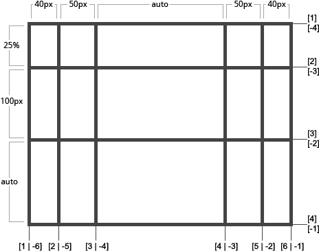
標識的線可以是正向也可以是逆向的,例如第一行的線的標識就是[1|-4],那麼線標識有什麼用?線標識主要用來確定一個子元素要占有的面積,也成為Grid Area,例如下麵的代碼:
.one {
  grid-column-start: 1;
  grid-column-end: 4;
  grid-row-start: 1;
  grid-row-end: 3;
}
給線命名
預設的線的標識都是用數字來表示的,當然也可以給線來命名,具體如下:
.container {
  grid-template-columns: [first] 40px [line2] 50px [line3] auto [col4-start] 50px [five] 40px [end];
  grid-template-rows: [row1-start] 25% [row1-end] 100px [third-line] auto [last-line];
}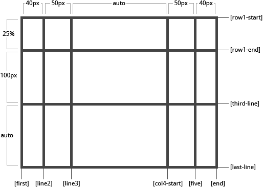
從圖中可以看出,第一列的第一根線被命名成了first,那麼我們就可以將之前的寫法稍微改一下了:
.one {
  grid-column-start: first;
  grid-column-end: col4-start;
  grid-row-start: 1;
  grid-row-end: 3;
}關於更多的線的命名使用方法,可以參看Naming lines when defining a grid,這裡只是簡單的介紹
Grid Cell (網格單元)
可以簡單理解為一個table中的一個單元格

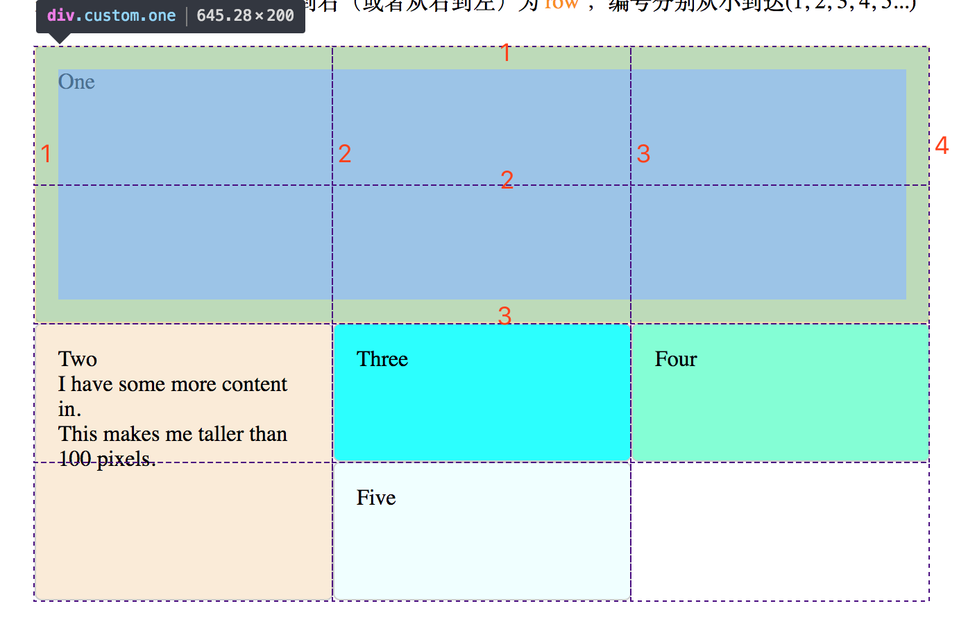
Grid Area (網格面積)
可以通過規定一個item的起始行和起始列來規定一個area,註意:area必須為一個 規則的舉行,而不能為一個類似於L形狀的圖形
通過行和列標識來確定一個面積,例如:
.container {
  display: grid;
  grid-template-columns: repeat(3, 1fr);
  grid-auto-rows: minmax(100px, auto);
}
.one {
  grid-column-start: 1;
  grid-column-end: 3;
  grid-row-start: 1;
  grid-row-end: 3;
}
上面的代碼就劃定了一個兩行兩列的區域,上面的寫法可以簡寫為:
.one {
  grid-column: 1 / 3;
  grid-row: 1 / 3;

  /* 這種寫法對應: */
  grid-column: [grid-column-start] / [grid-column-end];
  grid-row: [grid-row-start] / [grid-row-end];
}或者使用grid-area,
.one {
  grid-area: 1 / 1 / 3 / 3;

  /* 這種寫法分別對應: */
  grid-area: [grid-row-start] / [grid-column-start] / [grid-row-end] / [grid-column-end];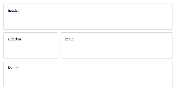
}還可以配合grid-template-areas來提前劃分區域,例如:
.container {
  display: grid;
  grid-template-columns: repeat(3, 1fr);
  grid-auto-rows: minmax(100px, auto);
  grid-template-areas:
   "header header header"
   "siderbar main main"
   "footer footer footer"
}上面的樣式中,規定了一個3 x 3的網格,並且劃分了區域,第一行為header,第二行為左側為siderbar,右側為main,第三行為footer,那麼剩餘的工作就是制定子元素對應的區域即可,例如:
.header {
  grid-area: header;
}
.siderbar {
  grid-area: siderbar;
}
.main {
  grid-area: main;
}
.footer {
  grid-area: footer;
}
對應的網頁文件為:
<div class="container">
  <div class="custom header">header</div>
  <div class="custom siderbar">siderbar</div>
  <div class="custom main">main</div>
  <div class="custom footer">footer</div>
</div>
最終的效果為:
Grid Gutters (網格間距)
分為行間距和列間距,類似於table中的colspan和rowspan,具體例子如下:
.grid {
  display: grid;
  grid-template-columns: repeat(3, 1fr);
  grid-auto-rows: minmax(100px, auto);
  grid-gap: 10px;

  /* 這裡的grid-gap相當於: */
  grid-column-gap: 10px;
  grid-row-gap: 10px;
}從上一個例子中,我也設置了10px的間距,可以從圖中看出來。
Grid z-index
類似於position: absolute;絕對定位之後的層級,後面渲染的item會覆蓋前面的,因此下例中的item為Two的會覆蓋在One上
.z-index-1 {
  grid-column: 1 / 3;
  grid-row: 1;
  background-color: aliceblue;
}
.z-index-2 {
  grid-column: 2 / 4;
  grid-row: 1 / 3;
  background-color: antiquewhite;
}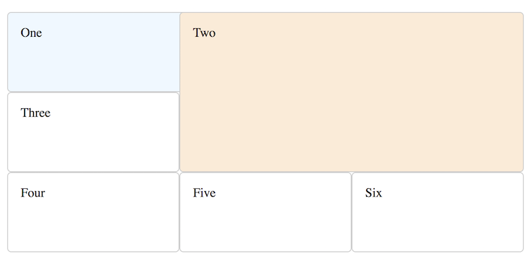
調整item1的index之後z-index: 2;,會看到item1會覆蓋在item2上面
<div class="custom z-index-1" style="z-index: 2;">One</div>
<div class="custom z-index-2" style="z-index: 1;">Two</div>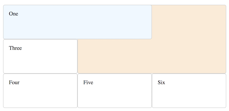
網格佈局中的對齊
如果熟悉flex,那麼一定會知道flex中的佈局,相同的,在grid佈局中也有相應的佈局
網格佈局的兩條軸線
When working with grid layout you have two axes available to align things against –
the block axisandthe inline axis. The block axis is the axis upon which blocks are laid out in block layout. If you have two paragraphs on your page they display one below the other, so it is this direction we describe as the block axis.
- 塊方向的列軸
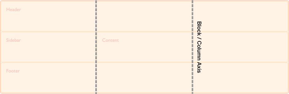
- 文字方向的行軸
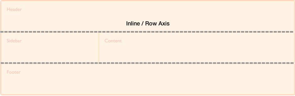
以上的文字以及圖片均摘自MDN
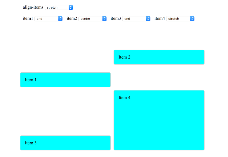
對齊列項目
對齊列項目主要的CSS聲明有兩個:align-items以及align-self,align-items用於所有item的設置,align-self可以單獨進行自定義。這兩個聲明可取的屬性值有以下幾種:
- auto
- normal
- start
- end
- center
- stretch
- baseline
- first baseline
- last baseline
下麵我們用一個慄子分別說明如下(慄子摘自MDN):
<style>
.wrapper {
  display: grid;
  grid-template-columns: repeat(8, 1fr);
  grid-gap: 10px;
  grid-auto-rows: 100px;
  grid-template-areas:
    "a a a a b b b b"
    "a a a a b b b b"
    "c c c c d d d d"
    "c c c c d d d d";
}
.item1 {
  grid-area: a;
  background-color: aqua;
}
.item2 {
  grid-area: b;
  background-color: aqua;
}
.item3 {
  grid-area: c;
  background-color: aqua;
}
.item4 {
  grid-area: d;
  background-color: aqua;
}
</style>

<div class="wrapper">
  <div class="custom item1">Item 1</div>
  <div class="custom item2">Item 2</div>
  <div class="custom item3">Item 3</div>
  <div class="custom item4">Item 4</div>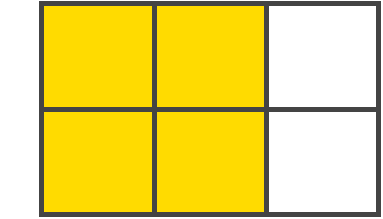
</div>定義了一個8 x 4列的網格,其中劃分為均勻的四個區域,分別用item[1,2,3,4]來進行填充,預設的對齊方式為stretch
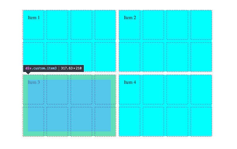
可以通過幾個select來控制對齊方式,分別通過控制整體和單個item的對齊
相對於容器的列對齊
使用align-content這個屬性聲明來決定整個網格在容器中的列方向的佈局,可選的值如下:
- normal
- start
- end
- center
- stretch
- space-around
- space-between
- space-evenly
- baseline
- first baseline
- last baseline
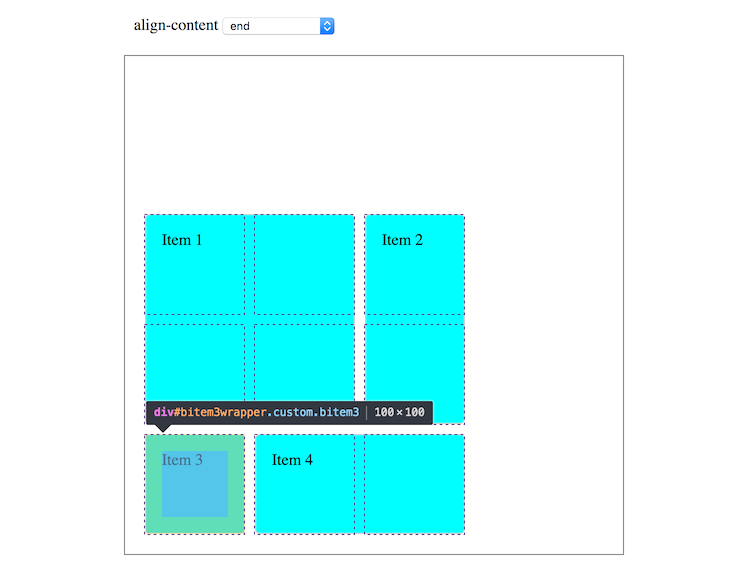
可以看到圖中,當選擇了align-content: end的時候,整個網格就會在容器的下方對齊。
更多內容請參看MDN CSS_Grid_Layout
Grid 佈局和其他佈局的關係
Grid 和 Flex
The basic difference between CSS Grid Layout and CSS Flexbox Layout is that flexbox was designed for layout in one dimension - either a row or a column. Grid was designed for two-dimensional layout - rows, and columns at the same time.
Grid佈局和Flex佈局最大的不同點就是:Grid佈局是二維佈局,針對行和列的佈局,而Flex佈局為一維佈局,只針對行和列的當行佈局。
Tips: 這兩種佈局並不衝突,可以搭配使用。可以在整體佈局上採用grid佈局,而細節處理可以使用flex
下麵看一個慄子,來看看這兩種佈局之間有什麼不同(慄子來源MDN):
編寫一個自動換行適應的佈局
- Flex方式
<style>
  .flex-wrapper {
    display: flex;
    flex-wrap: wrap;
  }
  .flex-wrapper > div {
    flex: 1 1 200px;
  }
</style>

<div class="flex-wrapper">
  <div>One</div>
  <div>Two</div>
  <div>Three</div>
  <div>Four</div>
  <div>Five</div>
</div>- Grid 方式
<style>
  .grid-wrapper {
    display: grid;
    grid-template-columns: repeat(auto-fill, minmax(200px, 1fr));
  }
</style>使用flex-wrap: wrap;來限定如果一行不足就自動換行。使用auto-fill來根據容器寬度決定會有多少列,並且使用minmax()函數來確定最小為200px,最大為容器寬度來自適應。
如果屏幕上有很多剩餘的空間,flex佈局會均分成5列,而grid佈局則會始終為3列,並且餘下的兩個item也長度也 相同,而如果屏幕寬度調整為小於200時,flex佈局會彈性地變為1列,但是grid佈局如果沒有使用auto-fill時,會始終為設置的列數。
另外,grid佈局和flex佈局還有一點不同的是,在最開始的分配的時候grid佈局會優先劃分佈局,即會優先規定出屏幕中可以最大容忍出 多少個符合條件(這裡是最小為200px, 最大為1fr)的item數量,然後依次填充。

Grid 和 絕對定位
.positioned {
  grid-template-columns: repeat(4,1fr);
  grid-auto-rows: 200px;
  grid-gap: 20px;
  position: relative;
}
.box3 {
  grid-column-start: 2;
  grid-column-end: 4;
  grid-row-start: 1;
  grid-row-end: 3;
  position: absolute;
  top: 40px;
  left: 40px;
}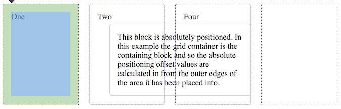
如果父容器有定位標識relative Or absolute等,那麼下麵的子item會根據原始它們應該佈局的位置定位,反之如果父容器沒有 定位標識,那麼應用了position: absolute;會脫離gird佈局,並且按照CSS傳統的方式佈局。
備註:
- 文中部分圖片以及案例均來自於A Complete Guide to Grid和MDN
- 本文代碼倉庫:https://github.com/Rynxiao/css-grid-tutorial/
- 本文部分實例:http://rynxiao.com/css-grid-tutorial/