CSS3實現各種表情 效果圖: 代碼如下,複製即可使用: 如有錯誤,歡迎聯繫我改正,非常感謝!!! ...
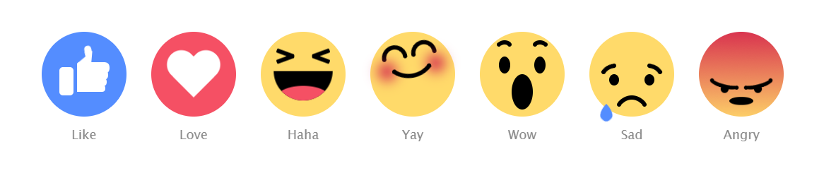
CSS3實現各種表情
效果圖:
代碼如下,複製即可使用:
<!DOCTYPE html>
<html>
<head>
    <title></title>
    <style type="text/css">
        body {
  text-align: center;
  margin: 80px auto 0;
  font-family: "Lucida Sans Unicode", "Lucida Grande", sans-serif;
}

.emoji {
  width: 120px;
  height: 120px;
  margin: 15px;
  background: #FFDA6A;
  display: inline-block;
  border-radius: 50%;
  position: relative;
}
.emoji:after {
  position: absolute;
  bottom: -40px;
  font-size: 18px;
  width: 60px;
  left: calc(50% - 30px);
  color: #8A8A8A;
}

.emoji__face, .emoji__eyebrows, .emoji__eyes, .emoji__mouth, .emoji__tongue, .emoji__heart, .emoji__hand, .emoji__thumb {
  position: absolute;
}
.emoji__face:before, .emoji__face:after, .emoji__eyebrows:before, .emoji__eyebrows:after, .emoji__eyes:before, .emoji__eyes:after, .emoji__mouth:before, .emoji__mouth:after, .emoji__tongue:before, .emoji__tongue:after, .emoji__heart:before, .emoji__heart:after, .emoji__hand:before, .emoji__hand:after, .emoji__thumb:before, .emoji__thumb:after {
  position: absolute;
  content: '';
}

.emoji__face {
  width: inherit;
  height: inherit;
}

.emoji--like {
  background: #548DFF;
}
.emoji--like:after {
  content: 'Like';
}
.emoji--like .emoji__hand {
  left: 25px;
  bottom: 30px;
  width: 20px;
  height: 40px;
  background: #FFFFFF;
  border-radius: 5px;
  z-index: 0;
  animation: hands-up 2s linear infinite;
}
.emoji--like .emoji__hand:before {
  left: 25px;
  bottom: 5px;
  width: 40px;
  background: inherit;
  height: 10px;
  border-radius: 2px 10px 10px 2px;
  box-shadow: 1px -9px 0 1px #FFFFFF, 2px -19px 0 2px #FFFFFF, 3px -29px 0 3px #FFFFFF;
}
.emoji--like .emoji__thumb {
  border-bottom: 20px solid #FFFFFF;
  border-left: 20px solid transparent;
  top: -25px;
  right: -25px;
  z-index: 2;
  transform: rotate(5deg);
  transform-origin: 0% 100%;
  animation: thumbs-up 2s linear infinite;
}
.emoji--like .emoji__thumb:before {
  border-radius: 50% 50% 0 0;
  background: #FFFFFF;
  width: 10px;
  height: 12px;
  left: -10px;
  top: -8px;
  transform: rotate(-15deg);
  transform-origin: 100% 100%;
  box-shadow: -1px 4px 0 -1px #FFFFFF;
}

.emoji--love {
  background: #F55064;
}
.emoji--love:after {
  content: 'Love';
}
.emoji--love .emoji__heart {
  left: calc(50% - 40px);
  top: calc(50% - 40px);
  width: 80px;
  height: 80px;
  animation: heart-beat 1s linear infinite alternate;
}
.emoji--love .emoji__heart:before, .emoji--love .emoji__heart:after {
  left: calc(50% - 20px);
  top: calc(50% - 32px);
  width: 40px;
  height: 64px;
  background: #FFFFFF;
  border-radius: 20px 20px 0 0;
}
.emoji--love .emoji__heart:before {
  transform: translate(20px) rotate(-45deg);
  transform-origin: 0 100%;
}
.emoji--love .emoji__heart:after {
  transform: translate(-20px) rotate(45deg);
  transform-origin: 100% 100%;
}

.emoji--haha:after {
  content: 'Haha';
}
.emoji--haha .emoji__face {
  animation: haha-face 2s linear infinite;
}
.emoji--haha .emoji__eyes {
  width: 26px;
  height: 6px;
  border-radius: 2px;
  left: calc(50% - 13px);
  top: 35px;
  transform: rotate(20deg);
  background: transparent;
  box-shadow: -25px 5px 0 0 #000000, 25px -5px 0 0 #000000;
}
.emoji--haha .emoji__eyes:after {
  left: 0;
  top: 0;
  width: 26px;
  height: 6px;
  border-radius: 2px;
  transform: rotate(-40deg);
  background: transparent;
  box-shadow: -25px -5px 0 0 #000000, 25px 5px 0 0 #000000;
}
.emoji--haha .emoji__mouth {
  width: 80px;
  height: 40px;
  left: calc(50% - 40px);
  top: 50%;
  background: #000000;
  border-radius: 0 0 40px 40px;
  overflow: hidden;
  z-index: 1;
  animation: haha-mouth 2s linear infinite;
}
.emoji--haha .emoji__tongue {
  width: 70px;
  height: 30px;
  background: #F55064;
  left: calc(50% - 35px);
  bottom: -10px;
  border-radius: 50%;
}

.emoji--yay:after {
  content: 'Yay';
  animation: yay-reverse 1s linear infinite;
}
.emoji--yay .emoji__face {
  animation: yay 1s linear infinite alternate;
}
.emoji--yay .emoji__eyebrows {
  left: calc(50% - 3px);
  top: 30px;
  height: 6px;
  width: 6px;
  border-radius: 50%;
  background: transparent;
  box-shadow: -6px 0 0 0 #000000, -36px 0 0 0px #000000, 6px 0 0 0 #000000, 36px 0 0 0px #000000;
}
.emoji--yay .emoji__eyebrows:before, .emoji--yay .emoji__eyebrows:after {
  width: 36px;
  height: 18px;
  border-radius: 60px 60px 0 0;
  background: transparent;
  border: 6px solid black;
  box-sizing: border-box;
  border-bottom: 0;
  bottom: 3px;
  left: calc(50% - 18px);
}
.emoji--yay .emoji__eyebrows:before {
  margin-left: -21px;
}
.emoji--yay .emoji__eyebrows:after {
  margin-left: 21px;
}
.emoji--yay .emoji__mouth {
  top: 60px;
  background: transparent;
  left: 50%;
}
.emoji--yay .emoji__mouth:after {
  width: 80px;
  height: 80px;
  left: calc(50% - 40px);
  top: -75px;
  border-radius: 50%;
  background: transparent;
  border: 6px solid #000000;
  box-sizing: border-box;
  border-top-color: transparent;
  border-left-color: transparent;
  border-right-color: transparent;
  z-index: 1;
}
.emoji--yay .emoji__mouth:before {
  width: 6px;
  height: 6px;
  background: transparent;
  border-radius: 50%;
  bottom: 5px;
  left: calc(50% - 3px);
  box-shadow: -25px 0 0 0 #000000, 25px 0 0 0 #000000, -35px -2px 30px 10px #D5234C, 35px -2px 30px 10px #D5234C;
}

.emoji--wow:after {
  content: 'Wow';
}
.emoji--wow .emoji__face {
  animation: wow-face 3s linear infinite;
}
.emoji--wow .emoji__eyebrows {
  left: calc(50% - 3px);
  height: 6px;
  width: 6px;
  border-radius: 50%;
  background: transparent;
  box-shadow: -18px 0 0 0 #000000, -33px 0 0 0 #000000, 18px 0 0 0 #000000, 33px 0 0 0 #000000;
  animation: wow-brow 3s linear infinite;
}
.emoji--wow .emoji__eyebrows:before, .emoji--wow .emoji__eyebrows:after {
  width: 24px;
  height: 20px;
  border: 6px solid #000000;
  box-sizing: border-box;
  border-radius: 50%;
  border-bottom-color: transparent;
  border-left-color: transparent;
  border-right-color: transparent;
  top: -3px;
  left: calc(50% - 12px);
}
.emoji--wow .emoji__eyebrows:before {
  margin-left: -25px;
}
.emoji--wow .emoji__eyebrows:after {
  margin-left: 25px;
}
.emoji--wow .emoji__eyes {
  width: 16px;
  height: 24px;
  left: calc(50% - 8px);
  top: 35px;
  border-radius: 50%;
  background: transparent;
  box-shadow: 25px 0 0 0 #000000, -25px 0 0 0 #000000;
}
.emoji--wow .emoji__mouth {
  width: 30px;
  height: 45px;
  left: calc(50% - 15px);
  top: 50%;
  border-radius: 50%;
  background: #000000;
  animation: wow-mouth 3s linear infinite;
}

.emoji--sad:after {
  content: 'Sad';
}
.emoji--sad .emoji__face {
  animation: sad-face 2s ease-in infinite;
}
.emoji--sad .emoji__eyebrows {
  left: calc(50% - 3px);
  top: 35px;
  height: 6px;
  width: 6px;
  border-radius: 50%;
  background: transparent;
  box-shadow: -40px 9px 0 0 #000000, -25px 0 0 0 #000000, 25px 0 0 0 #000000, 40px 9px 0 0 #000000;
}
.emoji--sad .emoji__eyebrows:before, .emoji--sad .emoji__eyebrows:after {
  width: 30px;
  height: 20px;
  border: 6px solid #000000;