1. 前言 Fall Creators Update中提供了一個新得ColorPicker控制項,解決了以前選擇顏色只能用Combo Box的窘境。 2. 一個簡單的例子 如上所示,ColorPiker可以通過在光譜或色輪上拖動滑塊,或者在RGB/HSV及十六進位的TextBox中直接輸入顏色的數值改 ...
1. 前言
Fall Creators Update中提供了一個新得ColorPicker控制項,解決了以前選擇顏色只能用Combo Box的窘境。
2. 一個簡單的例子
<ColorPicker x:Name="ColorPicker"
             Margin="5" />

<Grid Margin="5">
    <Grid.Background>
        <SolidColorBrush Color="{x:Bind ColorPicker.Color, Mode=OneWay}" />
    </Grid.Background>
    <TextBlock Text="{x:Bind ColorPicker.Color}" />
</Grid>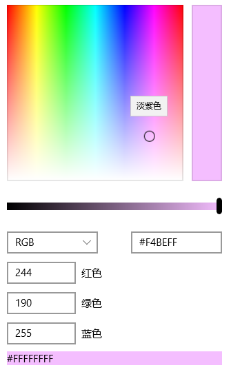
如上所示,ColorPiker可以通過在光譜或色輪上拖動滑塊,或者在RGB/HSV及十六進位的TextBox中直接輸入顏色的數值改變Color屬性。
3. 定製ColorPicker
ColorPicker提供了很多屬性以設置它的外觀,下麵介紹一些常用的屬性。
3.1 ColorSpectrumShape
ColorSpectrumShape是定義ColorPicker外觀的主要屬性。當設置為ColorSpectrumShape.Box時顯示正方形的光譜,設置為ColorSpectrumShape.Ring時顯示為圓型的HSV色輪。
3.2 最簡化顯示
完整的ColorPicker實在太占空間,而且整個控制項左邊高右邊低,很不平衡。使用以下設置可以隱藏ColorPreview及其它Text Box以最簡化ColorPicker的顯示,使它勉強正常一點。
<ColorPicker x:Name="ColorPicker"
             ColorSpectrumShape="Ring"
             IsColorPreviewVisible="False"
             IsColorChannelTextInputVisible="False"
             IsHexInputVisible="False" />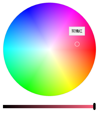
3.3 其它屬性
使用如下XAML基本可以將所有元素顯示出來:
<ColorPicker x:Name="ColorPicker"
         IsColorPreviewVisible="True"
         IsAlphaEnabled="True"
         IsMoreButtonVisible="True"/>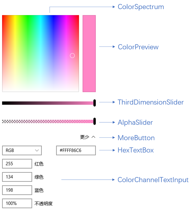
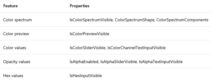
下麵列表列出了各元素對應的屬性。
4. 封裝ColorPicker
ColorPicker難用的地方在於它是個大塊頭,而且沒有Header,擺在表單裡面格格不入。官方文檔裡面還介紹了怎麼把ColorPicker放在Button的Flyout里使用,都做到這樣了還不如直接提供這個彈出控制項。
為了使它更好用我把它簡單地封裝到一個彈出控制項中。由於Picker控制項通常都是指點擊按鈕彈出一個Popup或Flyout通過滑鼠點擊選擇值的控制項,例如DatePicker、TimePicker或者Extended WPF Toolkit 中的ColorPicker,UWP中的ColorPicker這個名稱讓我很為難,只好把自己封裝的控制項命名為ColorSelector。詳細代碼請見文章最後給出的Fluent Design System Sample源碼。
<Style TargetType="local:ColorSelector">
<Setter Property="IsTabStop"
Value="False" />
<Setter Property="FontFamily"
Value="{ThemeResource ContentControlThemeFontFamily}" />
<Setter Property="FontSize"
Value="{ThemeResource ControlContentThemeFontSize}" />
<Setter Property="Template">
<Setter.Value>
<ControlTemplate TargetType="local:ColorSelector">
<StackPanel x:Name="LayoutRoot"
Margin="{TemplateBinding Padding}">
<VisualStateManager.VisualStateGroups>
<VisualStateGroup x:Name="CommonStates">
<VisualState x:Name="Normal" />
<VisualState x:Name="Disabled">
<Storyboard>
<ObjectAnimationUsingKeyFrames Storyboard.TargetName="HeaderContentPresenter"
Storyboard.TargetProperty="Foreground">
<DiscreteObjectKeyFrame KeyTime="0"
Value="{ThemeResource DatePickerHeaderForegroundDisabled}" />
</ObjectAnimationUsingKeyFrames>
</Storyboard>
</VisualState>
</VisualStateGroup>
<VisualStateGroup x:Name="PopupStates">
<VisualState x:Name="PopupOpened" />
<VisualState x:Name="PopupClosed" />
</VisualStateGroup>
</VisualStateManager.VisualStateGroups>
<local:HeaderedContentControl Header="{TemplateBinding Header}"
HeaderTemplate="{TemplateBinding HeaderTemplate}">
<ToggleButton x:Name="DateButton"
DataContext="{Binding RelativeSource={RelativeSource Mode=TemplatedParent},Path=Color}"
IsEnabled="{TemplateBinding IsEnabled}"
IsChecked="{Binding RelativeSource={RelativeSource Mode=TemplatedParent}, Path=IsDropDownOpen,Mode=TwoWay}"
HorizontalAlignment="Stretch"
HorizontalContentAlignment="Stretch">
<ToggleButton.Content>
<Grid>
<Grid.ColumnDefinitions>
<ColumnDefinition Width="Auto" />
<ColumnDefinition />
</Grid.ColumnDefinitions>
<TextBlock Text="Select A Color:" />
<Rectangle Grid.Column="1"
Margin="5,0,0,0">
<Rectangle.Fill>
<SolidColorBrush Color="{Binding}" />
</Rectangle.Fill>
</Rectangle>
</Grid>
</ToggleButton.Content>
<FlyoutBase.AttachedFlyout>
<Flyout Placement="Bottom"
x:Name="Flyout">
<Flyout.FlyoutPresenterStyle>
<Style TargetType="FlyoutPresenter">
<Setter Property="Padding"
Value="0" />
<Setter Property="BorderThickness"
Value="0" />
<Setter Property="Template">
<Setter.Value>
<ControlTemplate TargetType="FlyoutPresenter">
<ContentPresenter Background="{TemplateBinding Background}"
BorderBrush="{TemplateBinding BorderBrush}"
BorderThickness="{TemplateBinding BorderThickness}"
Content="{TemplateBinding Content}"
ContentTemplate="{TemplateBinding ContentTemplate}"
ContentTransitions="{TemplateBinding ContentTransitions}"
Margin="{TemplateBinding Padding}"
HorizontalAlignment="{TemplateBinding HorizontalContentAlignment}"
VerticalAlignment="{TemplateBinding VerticalContentAlignment}" />
</ControlTemplate>
</Setter.Value>
</Setter>
</Style>
</Flyout.FlyoutPresenterStyle>
<Grid>
<Grid.RowDefinitions>
<RowDefinition />
<RowDefinition Height="Auto" />
</Grid.RowDefinitions>
<ColorPicker x:Name="ColorPicker"
Style="{TemplateBinding ColorPickerStyle}"
IsColorPreviewVisible="False"
IsColorChannelTextInputVisible="False"
IsHexInputVisible="False" />
<Grid Grid.Row="1"
Height="45"
x:Name="AcceptDismissHostGrid">
<Grid.ColumnDefinitions>
<ColumnDefinition Width="*" />
<ColumnDefinition Width="*" />
</Grid.ColumnDefinitions>
<Rectangle Height="2"
VerticalAlignment="Top"
Fill="{ThemeResource DatePickerFlyoutPresenterSpacerFill}"
Grid.ColumnSpan="2" />
<Button x:Name="AcceptButton"
Grid.Column="0"
Content=""
FontFamily="{ThemeResource SymbolThemeFontFamily}"
FontSize="16"
HorizontalAlignment="Stretch"
VerticalAlignment="Stretch"
Style="{StaticResource DateTimePickerFlyoutButtonStyle}"
Margin="0,2,0,0" />
<Button x:Name="DismissButton"
Grid.Column="1"
Content=""
FontFamily="{ThemeResource SymbolThemeFontFamily}"
FontSize="16"
HorizontalAlignment="Stretch"
VerticalAlignment="Stretch"
Style="{StaticResource DateTimePickerFlyoutButtonStyle}"
Margin="0,2,0,0" />
</Grid>
</Grid>
</Flyout>
</FlyoutBase.AttachedFlyout>
</ToggleButton>
</local:HeaderedContentControl>
</StackPanel>
</ControlTemplate>
</Setter.Value>
</Setter>
</Style>
(也許是Flyout沒有添加陰影或邊框的原因,看起來醜醜的。)
5. 結語
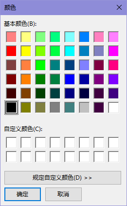
Winform中有ColorDialog:
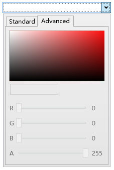
WPF有Extended WPF Toolkit 中的ColorPicker:
而UWP拖到現在才終於肯提供一個ColorPicker。每次更新技術都扔掉一些常用控制項,導致開發者只能選擇第三方控制項或自己實現,連TreeView都是拖了幾年才搞出來。這難道是微軟對我們的考驗嗎?
5. 參考
Color Picker
ColorPicker Class
6. 源碼
Fluent Design System Sample
XamlUIBasics