為了提高研發效率,經過技術選型採用了taro3+原生混合開發模式,本文主要講解我們是如何基於taro框架,進行多端能力的探索和性能優化。 ...
背景
background-color
背景顏色, 可以使用十六進位、rgb、rgba表示。
語法
/**selector  背景元素的原則去*/
/** color  背景顏色的值, 可以是 顏色名稱、十六進位值、RGB、RGBA*/
selector {
  background-color: color;
}
示例
/** 設置body標簽背景為白色 */
body {
  background-color: white;
}

/**設置h1標簽背景為紅色*/
h1 {
  background-color: #ff0000;
}

/**設置p元素背景顏色為黃色*/
p {
  background-color: rgb(255, 255, 0);
}

/**設置背景顏色為半透明的藍色*/
div {
  background-color: rgba(0, 0, 255, 0.5);
}
background-image
背景圖片;該屬性可以通過圖片路徑引用一張外部圖片。圖片路徑可以是相對論路徑、絕對路徑也可以是網路當中圖片,支持HTTP協議。
語法
/**selector  表示選擇器*/
/**url 圖片路徑*/
/**相對路徑是書寫位置到圖片位置的相對路徑
*/
selector {
  background-image: url(url);
}
示例
創建一個網頁, 使得body、h1、div 擁有不同的背景圖片。
<!DOCTYPE html>
<html lang="en">
  <head>
    <meta charset="UTF-8" />
    <meta name="viewport" content="width=device-width, initial-scale=1.0" />
    <title>背景圖片演示</title>
    <style>
			/**相對路徑, images目錄下必須要有 background-body.jpg 圖片*/
      body {
        background-image: url("images/background-body.jpg");
      }
			/**引用網路當中的圖片*/
      h1 {
        width: 100px;
        height: 100px;
        background-image: url("https://pic4.zhimg.com/v2-bbddbb4b7769475ccb591cc39106b146_r.jpg?source=1940ef5c");
      }
		  /**使用 linear-gradient 漸變函數*/
      div {
        width: 100px;
        height: 100px;
        background-image: linear-gradient(to right, red, orange, yellow);
      }
    </style>
  </head>
  <body>
    <h1></h1>
    <div></div>
  </body>
</html>
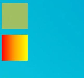
線性漸變
background-image屬性可以使用 linear-gradient()形式創建線性漸變背景。
background-image: linear-gradient(to right, blue, red)
                                    漸變方向 開始顏色 結束顏色
#漸變方向也可以用度數表示
background-image:  linear-gradient(45deg, blue, red)

#可以有多個顏色值
background-image: linear-gradient(to right, blue, yellow 20%, red)
																										表示中間色
linear-gradient 的詳細用法可以參考 地址:https://developer.mozilla.org/zh-CN/docs/Web/CSS/gradient/linear-gradient
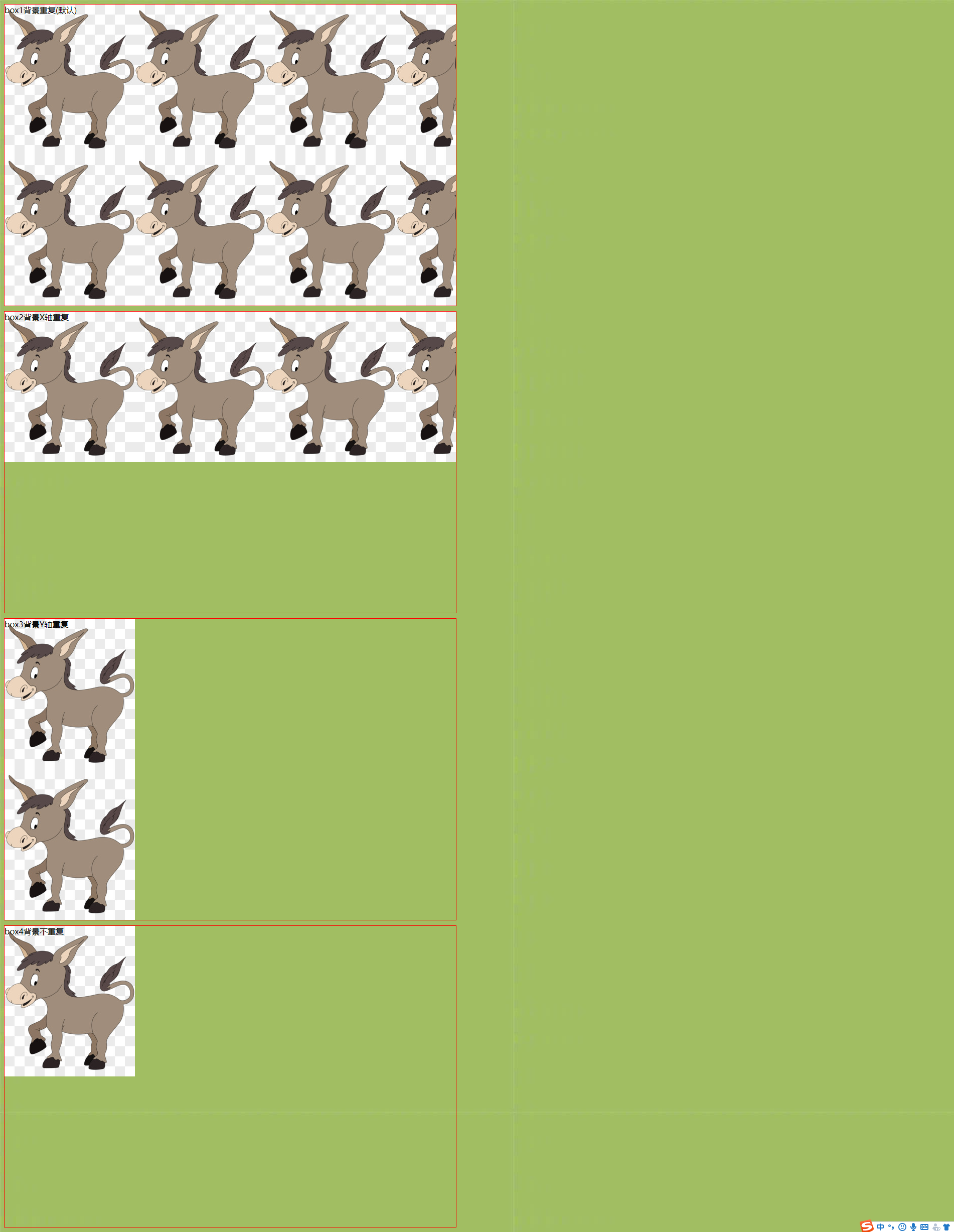
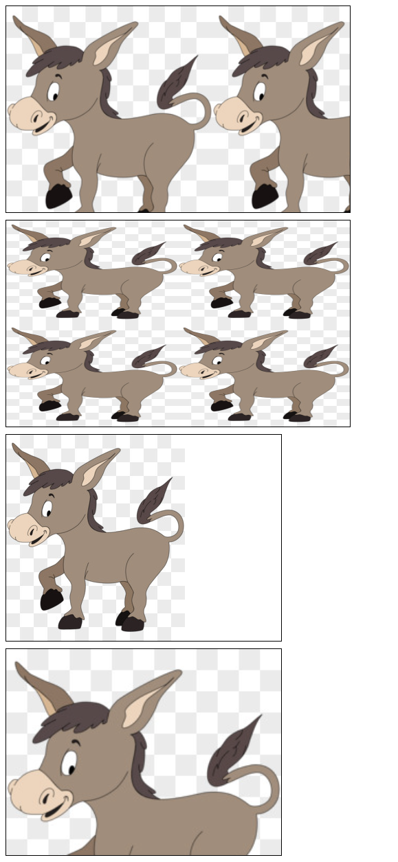
backgroud-repeat 重覆方式
background-repeat 屬性用來設置背景的重覆模式。
| 值 | 意義 |
|---|---|
| repeat; | x、y均平鋪(預設) |
| repeat-x; | x平鋪 |
| repeat-y; | y平鋪 |
| no-repeat; | 不平鋪 |
示例
<!DOCTYPE html>
<html lang="en">
  <head>
    <meta charset="UTF-8" />
    <meta http-equiv="X-UA-Compatible" content="IE=edge" />
    <meta name="viewport" content="width=device-width, initial-scale=1.0" />
    <title>背景是否重覆背景展示</title>
    <style>
      div {
        border: 1px solid red;
        width: 900px;
        height: 600px;
        margin-bottom: 10px;
        background: transparent
          url(https://ts1.cn.mm.bing.net/th/id/R-C.2fb5b20787d386d13c553acd9195367b?rik=SVaO4tCMUb4Wrw&riu=http%3a%2f%2fpic.616pic.com%2fys_img%2f00%2f18%2f72%2fVSjXnSgVHI.jpg&ehk=IeIi2DES5PyvRSxSW1k74c0befZUHhZdHWklbVTPQXM%3d&risl=&pid=ImgRaw&r=0);
      }

      .box1 {
        background-repeat: repeat;
      }

      .box2 {
        background-repeat: repeat-x;
      }

      .box3 {
        background-repeat: repeat-y;
      }

      .box4 {
        background-repeat: no-repeat;
      }

      body {
        background-image: url(https://pic4.zhimg.com/v2-bbddbb4b7769475ccb591cc39106b146_r.jpg?source=1940ef5c);
      }
    </style>
  </head>
  <body>
    <div class="box1">box1背景重覆(預設)</div>
    <div class="box2">box2背景X軸重覆</div>
    <div class="box3">box3背景Y軸重覆</div>
    <div class="box4">box4背景不重覆</div>
  </body>
</html>
background-size 背景尺寸
- background-size 屬性用來設置 背景圖片的尺寸,相容到IE9。
- background-size 的值可以用像素表示,也可以用百分比表示,表示為盒子寬、高的百分之多少。
- 需要等比例的值,用auto代替。
- contain 特殊值, 背景智能改變尺寸以容納到盒子里, 可能背景會出現空白區域。
- cover 特殊值, 將背景圖片智能改變尺寸以撐滿盒子。
/* 設置一個值, 此時代表的是背景圖片的寬度,高度預設auto*/
background-size: 50%;
background-size: 3.2em;
background-size: 12px;
background-size: auto;

/* 第一個值設置寬度,第二個值設置高度 */
background-size: 50% auto;
background-size: 3em 25%;
background-size: auto 6px;
background-size: auto auto;
示例
<!DOCTYPE html>
<html lang="en">
  <head>
    <meta charset="UTF-8" />
    <meta http-equiv="X-UA-Compatible" content="IE=edge" />
    <meta name="viewport" content="width=device-width, initial-scale=1.0" />
    <title>背景大小設置</title>
    <style>
      /* background-size 使用 auth */
      .box1 {
        width: 500px;
        height: 300px;
        border: 1px solid #000;
        background-image: url(https://ts1.cn.mm.bing.net/th/id/R-C.2fb5b20787d386d13c553acd9195367b?rik=SVaO4tCMUb4Wrw&riu=http%3a%2f%2fpic.616pic.com%2fys_img%2f00%2f18%2f72%2fVSjXnSgVHI.jpg&ehk=IeIi2DES5PyvRSxSW1k74c0befZUHhZdHWklbVTPQXM%3d&risl=&pid=ImgRaw&r=0);
        background-size: 300px auto;
        margin-bottom: 10px;
      }

      /* background-size 使用百分比 */
      .box2 {
        width: 500px;
        height: 300px;
        border: 1px solid #000;
        background-image: url(https://ts1.cn.mm.bing.net/th/id/R-C.2fb5b20787d386d13c553acd9195367b?rik=SVaO4tCMUb4Wrw&riu=http%3a%2f%2fpic.616pic.com%2fys_img%2f00%2f18%2f72%2fVSjXnSgVHI.jpg&ehk=IeIi2DES5PyvRSxSW1k74c0befZUHhZdHWklbVTPQXM%3d&risl=&pid=ImgRaw&r=0);
        background-size: 50% 50%;
        margin-bottom: 10px;
      }

      /* background-size 使用 contain 智能背景圖片尺寸,以容納到盒子里 */
      .box3 {
        width: 400px;
        height: 300px;
        border: 1px solid #000;
        background-image: url(https://ts1.cn.mm.bing.net/th/id/R-C.2fb5b20787d386d13c553acd9195367b?rik=SVaO4tCMUb4Wrw&riu=http%3a%2f%2fpic.616pic.com%2fys_img%2f00%2f18%2f72%2fVSjXnSgVHI.jpg&ehk=IeIi2DES5PyvRSxSW1k74c0befZUHhZdHWklbVTPQXM%3d&risl=&pid=ImgRaw&r=0);
        background-size: contain;
        background-repeat: no-repeat;
        margin-bottom: 10px;
      }

      /* background-size 使用 cover 智能改變尺寸,以撐滿盒子 */
      .box4 {
        width: 400px;
        height: 300px;
        border: 1px solid #000;
        background-image: url(https://ts1.cn.mm.bing.net/th/id/R-C.2fb5b20787d386d13c553acd9195367b?rik=SVaO4tCMUb4Wrw&riu=http%3a%2f%2fpic.616pic.com%2fys_img%2f00%2f18%2f72%2fVSjXnSgVHI.jpg&ehk=IeIi2DES5PyvRSxSW1k74c0befZUHhZdHWklbVTPQXM%3d&risl=&pid=ImgRaw&r=0);
        background-size: cover;
        margin-bottom: 10px;
      }
    </style>
  </head>
  <body>
    <div class="box1"></div>
    <div class="box2"></div>
    <div class="box3"></div>
    <div class="box4"></div>
  </body>
</html>
background-clip 背景繪製區域
指定背景的繪製區域。
預設情況下,背景被繪製到元素的邊框外沿,但是可以通過 background-clip 屬性來控制背景的繪製區域。
語法
background-clip: border-box | padding-box | content-box;
border-box: 背景延伸至邊框外沿(但是在邊框下層), 預設值。padding-box: 背景延伸至內邊距([padding](https://developer.mozilla.org/zh-CN/docs/Web/CSS/padding))外沿。不會繪製到邊框處。content-box: 背景被裁剪至內容區(content box)外沿。
示例
三種取值的演示
<!DOCTYPE html>
<html lang="en">
<head>
    <meta charset="UTF-8">
    <meta http-equiv="X-UA-Compatible" content="IE=edge">
    <meta name="viewport" content="width=device-width, initial-scale=1.0">
    <title>控制背景的控制區域</title>
    <style>

        /* 裁剪到內容區域 */
        .box1 {
            width: 400px;
            height: 300px;
            padding: 50px;
            border: 10px dotted red;
            background-color: yellow;
            background-clip: content-box;
            margin-bottom: 10px;
        }

        /* 裁剪至邊框區域(包含border) */
        .box2 {
            width: 400px;
            height: 300px;
            padding: 50px;
            border: 10px dotted red;
            background-color: yellow;
            background-clip: border-box;
            margin-bottom: 10px;
        }

        /* 裁剪至pading區域(包含padding) */
        .box3 {
            width: 400px;
            height: 300px;
            padding: 50px;
            border: 10px dotted red;
            background-color: yellow;
            background-clip: padding-box;
        }


    </style>
</head>
<body>
    <div class="box1">div1</div>
    <div class="box2">div2</div>
    <div class="box3">div3</div>
</body>
</html>
background-origin 背景圖片定位區域
指定背景圖片的定位區域。
預設情況下,背景圖片的定位區域是元素的 padding box。但是可以使用 background-origin 屬性來控制背景圖片的定位區域。
語法
background-origin: border-box | padding-box | content-box;
border-box:背景圖片的擺放以 border 區域為參考, 以邊框的左上角外沿為基準。padding-box:背景圖片的擺放以 padding 區域為參考, 以padding的左上角外沿為基準。content-box:背景圖片的擺放以 padding 區域為參考,以 padding內真正的內容的外沿為基準。
示例
<!DOCTYPE html>
<html lang="en">
<head>
<meta charset="UTF-8" />
<meta http-equiv="X-UA-Compatible" content="IE=edge" />
<meta name="viewport" content="width=device-width, initial-scale=1.0" />
<title>background-origin 定位起始位置</title>
<style>
/* 背景圖片/顏色 從 邊框開始(包含邊框) */
.box1 {
height: 400px;
width: 300px;
background-image: url(https://ts1.cn.mm.bing.net/th/id/R-C.2fb5b20787d386d13c553acd9195367b?rik=SVaO4tCMUb4Wrw&riu=http%3a%2f%2fpic.616pic.com%2fys_img%2f00%2f18%2f72%2fVSjXnSgVHI.jpg&ehk=IeIi2DES5PyvRSxSW1k74c0befZUHhZdHWklbVTPQXM%3d&risl=&pid=ImgRaw&r=0);
background-origin: border-box;
background-repeat: no-repeat;
border: 10px dotted red;
}
/* 背景圖片/顏色 從 內容開始 (包含內容) */
.box2 {
height: 400px;
width: 300px;
padding: 30px;
background-image: url(https://ts1.cn.mm.bing.net/th/id/R-C.2fb5b20787d386d13c553acd9195367b?rik=SVaO4tCMUb4Wrw&riu=http%3a%2f%2fpic.616pic.com%2fys_img%2f00%2f18%2f72%2fVSjXnSgVHI.jpg&ehk=IeIi2DES5PyvRSxSW1k74c0befZUHhZdHWklbVTPQXM%3d&risl=&pid=ImgRaw&r=0);
border: 10px dotted red;
background-origin: content-box;
background-repeat: no-repeat;
}
/* 預設 background-origin 是 padding-box
background-origin 從 padding 開始(包含padding區域)
*/
.box3 {
height: 400px;
width: 300px;
padding: 30px;
border: 10px dotted red;
background-image: url(https://ts1.cn.mm.bing.net/th/id/R-C.2fb5b20787d386d13c553acd9195367b?rik=SVaO4tCMUb4Wrw&riu=http%3a%2f%2fpic.616pic.com%2fys_img%2f00%2f18%2f72%2fVSjXnSgVHI.jpg&ehk=IeIi2DES5PyvRSxSW1k74c0befZUHhZdHWklbVTPQXM%3d&risl=&pid=ImgRaw&r=0);
background-repeat: no-repeat;
/* background-origin: padding-box; */
background-clip: padding-box;
}
</style>
</head>
<body>
<div class="box1"></div>
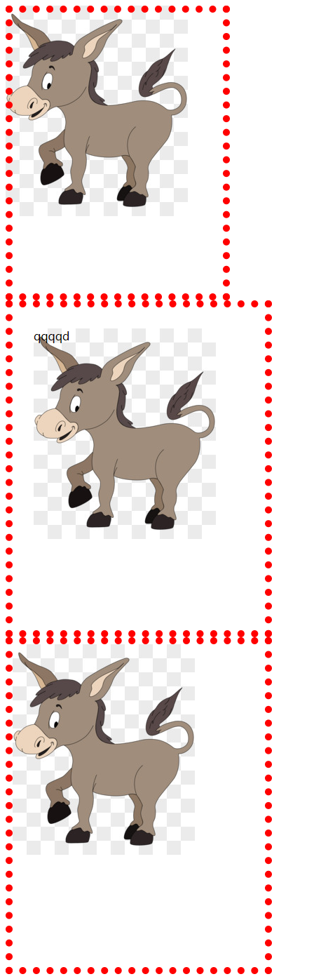
<div class="box2">qqqqd</div>
<div class="box3"></div>
</body>
</html>
background-attachment
background-attachment 決定了背景圖像的位置是在視口內固定,或者包含它的區塊滾動。
| 值 | 意義 |
|---|---|
| fixed | 背景圖像固定在視口中,不隨頁面滾動而滾動。 |
| local | 背景圖像會隨著元素內容的滾動而滾動,而不是隨頁面滾動而滾動。 |
| scroll | 背景圖像會隨著頁面的滾動而滾動(預設)。 |
<!DOCTYPE html>
<html lang="en">
  <head>
    <meta charset="UTF-8" />
    <meta http-equiv="X-UA-Compatible" content="IE=edge" />
    <meta name="viewport" content="width=device-width, initial-scale=1.0" />
    <title>背景定位演示</title>
    <style>
      body {
        height: 3000px;
      }
      .box1 {
        position: relative;
        top: 100px;
        width: 200px;
        height: 200px;
        border: 1px solid #000;
        /* 縱向溢出的內容,用滾動條顯示 */
        overflow-y: scroll;
        background-image: url(https://ts1.cn.mm.bing.net/th/id/R-C.2fb5b20787d386d13c553acd9195367b?rik=SVaO4tCMUb4Wrw&riu=http%3a%2f%2fpic.616pic.com%2fys_img%2f00%2f18%2f72%2fVSjXnSgVHI.jpg&ehk=IeIi2DES5PyvRSxSW1k74c0befZUHhZdHWklbVTPQXM%3d&risl=&pid=ImgRaw&r=0);
        background-attachment: scroll;
      }
    </style>
  </head>
  <body>
    <div class="box1">
      <p>內容1</p>
      <p>內容1</p>
      <p>內容1</p>
      <p>內容1</p>
      <p>內容1</p>
      <p>內容1</p>
      <p>內容1</p>
      <p>內容1</p>
      <p>內容1</p>
      <p>內容1</p>
      <p>內容1</p>
    </div>
  </body>
</html>
background-position 圖片其實位置
精確設置圖像的初始位置。屬性值可以使用 px 像素描述,也可以用 top、bottom、center、left、right描述圖片的位置。
/**水平方向 在上, 垂直方向 預設為 center*/
background-position: top;

/**水平方向 在左, 垂直方向再上 (左上角)*/
background-position: left top;

/**定義了 水平位置 25% 垂直位置25%。 左上角 定義為 0%, 右下角定義為 100% 100%*/
background-position: 25% 75%;

/**水平位置 10像素 垂直為 10像素 。 左上角定義為 0px 0px*/
background-position: 10px 10px;
示例
<!DOCTYPE html>
<html lang="en">
  <head>
    <meta charset="UTF-8" />
    <meta http-equiv="X-UA-Compatible" content="IE=edge" />
    <meta name="viewport" content="width=device-width, initial-scale=1.0" />
    <title>背景圖片定位位置</title>
    <style>
      .box1 {
        width: 200px;
        height: 200px;
        border: 1px solid black;
        background-image: url(https://ts1.cn.mm.bing.net/th/id/R-C.2fb5b20787d386d13c553acd9195367b?rik=SVaO4tCMUb4Wrw&riu=http%3a%2f%2fpic.616pic.com%2fys_img%2f00%2f18%2f72%2fVSjXnSgVHI.jpg&ehk=IeIi2DES5PyvRSxSW1k74c0befZUHhZdHWklbVTPQXM%3d&risl=&pid=ImgRaw&r=0);
        background-size: 50% auto;
        background-repeat: no-repeat;
        background-position: 0px 0px;
      }

      .box2 {
        width: 200px;
        height: 200px;
        border: 1px solid black;
        background-image: url(https://ts1.cn.mm.bing.net/th/id/R-C.2fb5b20787d386d13c553acd9195367b?rik=SVaO4tCMUb4Wrw&riu=http%3a%2f%2fpic.616pic.com%2fys_img%2f00%2f18%2f72%2fVSjXnSgVHI.jpg&ehk=IeIi2DES5PyvRSxSW1k74c0befZUHhZdHWklbVTPQXM%3d&risl=&pid=ImgRaw&r=0);
        background-size: 50% auto;
        background-repeat: no-repeat;
        background-position: top right;
      }
    </style>
  </head>
  <body>
    <div class="box1"></div>
    <div class="box2"></div>
  </body>
</html>
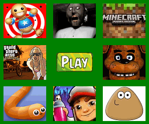
精靈圖技術
將多個小圖標放在一個圖片上,並使用 background-position 技術只顯示其中一個。
優點: 減少http請求次數
缺點: 不方便測量,後期改動麻煩
示例
展示精靈圖
-
使用 PS 測量圖標在圖片當中的位置
ps中選擇切片工具, 選擇需要測量的圖片後雙擊,彈出層終的 x、y表示其在圖片中的橫縱坐標位置。 w、h分別表示圖片的寬度和高度
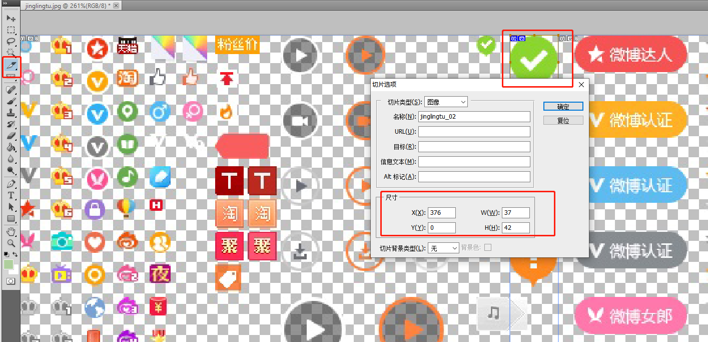
-
編寫代碼
指定 background-position: - 376px 0px; (以盒子左上角為原點, 相當於把 圖片往左拉動 376 像素,往上拉動 0px )
<!DOCTYPE html>
<html lang="en">
  <head>
    <meta charset="UTF-8" />
    <meta http-equiv="X-UA-Compatible" content="IE=edge" />
    <meta name="viewport" content="width=device-width, initial-scale=1.0" />
    <title>css精靈圖演示</title>
    <style>
      .dui {
        position: absolute;
        top: 100px;
        left: 100px;
        width: 37px;
        height: 42px;
        border: 1px solid #000;
        background-image: url(images/jinglingtu.jpeg);
        background-position: -376px 0px;
      }
    </style>
  </head>
  <body>
    <i class="dui"></i>
  </body>
</html>
background 合寫屬性
可以使用 background 屬性來同時設置背景顏色、背景圖片、背景位置、背景大小等屬性。
語法
selector {
  background: color url(image.jpg) no-repeat center center / cover;
}
示例
例如將背景顏色設置為黃色,背景圖片為 01.jpg ,不重覆,居中對齊 。
background: yellow    url(image/01.jpg) no-repeat center center
            背景顏色   背景圖片           背景重覆  背景位置
 微信公眾號
微信公眾號