在uwp開發中必不可少的一個環節就是各種通用的控制項的開發,所以在閑暇時間彙總了一下在uwp開發中控制項的幾種常用寫法,以及屬性的幾種綁定方式,有可能不全面,請大家多多包涵 :) 1、先從win10新增的{x:Bind}綁定方式說起,相對於{Binding},{x:Bind}在時間複雜度和空間複雜度上都 ...
在uwp開發中必不可少的一個環節就是各種通用的控制項的開發,所以在閑暇時間彙總了一下在uwp開發中控制項的幾種常用寫法,以及屬性的幾種綁定方式,有可能不全面,請大家多多包涵 :)
1、先從win10新增的{x:Bind}綁定方式說起,相對於{Binding},{x:Bind}在時間複雜度和空間複雜度上都要降低不少。但並不是說{x:Bind}能夠完全取代{Binding},因為{x:Bind} 比 {Binding} 少了許多功能,例如 Source、UpdateSourceTrigger等,並且不支持後臺C#代碼編寫,所以使用者還是要根據自己的需求來選擇用哪種方式,下麵是Control1的簡單實現
Control1.xaml
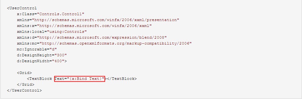
<UserControl
    x:Class="Controls.Control1"
    xmlns="http://schemas.microsoft.com/winfx/2006/xaml/presentation"
    xmlns:x="http://schemas.microsoft.com/winfx/2006/xaml"
    xmlns:local="using:Controls"
    xmlns:d="http://schemas.microsoft.com/expression/blend/2008"
    xmlns:mc="http://schemas.openxmlformats.org/markup-compatibility/2006"
    mc:Ignorable="d"
    d:DesignHeight="300"
    d:DesignWidth="400">

    <Grid>
        <TextBlock Text="{x:Bind Text}"></TextBlock>
    </Grid>
</UserControl>
Control1.xaml.cs
using Windows.UI.Xaml.Controls;

// The User Control item template is documented at http://go.microsoft.com/fwlink/?LinkId=234236

namespace Controls
{
    public sealed partial class Control1 : UserControl
    {
        public Control1()
        {
            this.InitializeComponent();
        }

        public string Text { set; get; }
    }
}
使用方式
<Page
    x:Class="Controls.MainPage"
    xmlns="http://schemas.microsoft.com/winfx/2006/xaml/presentation"
    xmlns:x="http://schemas.microsoft.com/winfx/2006/xaml"
    xmlns:local="using:Controls"
    xmlns:d="http://schemas.microsoft.com/expression/blend/2008"
    xmlns:mc="http://schemas.openxmlformats.org/markup-compatibility/2006"
    mc:Ignorable="d"
    xmlns:controls="using:Controls">

    <StackPanel Background="{ThemeResource ApplicationPageBackgroundThemeBrush}" Margin="40">
        <controls:Control1 Text="這是控制項1"></controls:Control1>
    </StackPanel>
</Page>
值得一提是{x:Bind}在DataTemplate中綁定時是需要指定類型的(x:DataType),並且Mode預設是OneTime,所以使用者如果有需要千萬不要忘了改成Mode=OneWay或者Mode=TwoWay
<DataTemplate x:DataType="model:Student">
        <TextBlock Text="{x:Bind Name}"></TextBlock>
        <TextBlock Text="{x:Bind Age}"></TextBlock>
</DataTemplate>
2、{Binding}綁定方式,大家應該比較熟悉了,它提供了豐富的綁定功能,綁定方式也比較靈活,閑話不多說啦,下麵的Control2和Control3的實現
TextVisibilityConverter.cs


using System;
using System.Collections.Generic;
using System.Linq;
using System.Text;
using System.Threading.Tasks;
using Windows.UI.Xaml;
using Windows.UI.Xaml.Data;

namespace Controls.Common
{
    public class TextVisibilityConverter : IValueConverter
    {
        public object Convert(object value, Type targetType, object parameter, string language)
        {
            if(value is string)
            {
                var text = value as string;

                if(string.IsNullOrEmpty(text))
                {
                    return Visibility.Collapsed;
                }
                else
                {
                    return Visibility.Visible;
                }
            }

            return Visibility.Visible;
        }

        public object ConvertBack(object value, Type targetType, object parameter, string language)
        {
            throw new NotImplementedException();
        }
    }
}
View Code
Control2.xaml
<UserControl
    x:Class="Controls.Control2"
    xmlns="http://schemas.microsoft.com/winfx/2006/xaml/presentation"
    xmlns:x="http://schemas.microsoft.com/winfx/2006/xaml"
    xmlns:local="using:Controls"
    xmlns:converter="using:Controls.Common"
    xmlns:d="http://schemas.microsoft.com/expression/blend/2008"
    xmlns:mc="http://schemas.openxmlformats.org/markup-compatibility/2006"
    mc:Ignorable="d"
    d:DesignHeight="300"
    d:DesignWidth="400">
    <UserControl.Resources>
        <converter:TextVisibilityConverter x:Name="TextVisibilityConverter"></converter:TextVisibilityConverter>
    </UserControl.Resources>
    <Grid>
        <TextBlock Text="{Binding Text}" Visibility="{Binding Text,Converter={StaticResource TextVisibilityConverter}}"></TextBlock>
    </Grid>
</UserControl>
Control2.xaml.cs
using Windows.UI.Xaml;
using Windows.UI.Xaml.Controls;

// The User Control item template is documented at http://go.microsoft.com/fwlink/?LinkId=234236

namespace Controls
{
    public sealed partial class Control2 : UserControl
    {
        public Control2()
        {
            this.InitializeComponent();

            this.DataContext = this;
        }

        public string Text
        {
            get { return (string)GetValue(TextProperty); }
            set { SetValue(TextProperty, value); }
        }

        // Using a DependencyProperty as the backing store for Text.  This enables animation, styling, binding, etc...
        public static readonly DependencyProperty TextProperty =
            DependencyProperty.Register("Text", typeof(string), typeof(Control2), new PropertyMetadata(""));

    }
}
Control3.xaml
<UserControl
    x:Class="Controls.Control3"
    Name="uc"
    xmlns="http://schemas.microsoft.com/winfx/2006/xaml/presentation"
    xmlns:x="http://schemas.microsoft.com/winfx/2006/xaml"
    xmlns:local="using:Controls"
    xmlns:d="http://schemas.microsoft.com/expression/blend/2008"
    xmlns:mc="http://schemas.openxmlformats.org/markup-compatibility/2006"
    mc:Ignorable="d"
    d:DesignHeight="300"
    d:DesignWidth="400">

    <Grid>
        <TextBlock Text="{Binding ElementName=uc,Path=Text}"></TextBlock>
    </Grid>
</UserControl>
Control3.xaml.cs
using System;
using System.Collections.Generic;
using System.IO;
using System.Linq;
using System.Runtime.InteropServices.WindowsRuntime;
using Windows.Foundation;
using Windows.Foundation.Collections;
using Windows.UI.Xaml;
using Windows.UI.Xaml.Controls;
using Windows.UI.Xaml.Controls.Primitives;
using Windows.UI.Xaml.Data;
using Windows.UI.Xaml.Input;
using Windows.UI.Xaml.Media;
using Windows.UI.Xaml.Navigation;

// The User Control item template is documented at http://go.microsoft.com/fwlink/?LinkId=234236

namespace Controls
{
    public sealed partial class Control3 : UserControl
    {
        public Control3()
        {
            this.InitializeComponent();
        }

        public string Text { set; get; }
    }
}
大家可以看出Control2和Control3是有些微差別的:
Control2是通過 this.DataContext = this,然後將依賴屬性(至於為什麼是依賴屬性,下麵會有詳細的介紹)綁到xaml頁面的控制項屬性上
Control3的特點也不難發現,充分利用了{Binding}強大功能的一個小小角落;個人感覺應該提一下的是,如果Control3有一個叫做Control1屬性,類型是Control1,我們可以把控制項1綁到控制項3上面去,這樣我們就可以在控制項3里訪問控制項1啦,這個只是{Binding}靈活運用的一個例子
<controls:Control1 x:Name="ctr1" Text="這是控制項1"></controls:Control1>
<controls:Control3 Control1="{Binding ElementName=ctr1}"></controls:Control3>
3、通過依賴屬性的PropertyChangedCallback來實現對控制項屬性賦值,請看示例Control5
Control5.xaml
<UserControl
    x:Class="Controls.Control5"
    xmlns="http://schemas.microsoft.com/winfx/2006/xaml/presentation"
    xmlns:x="http://schemas.microsoft.com/winfx/2006/xaml"
    xmlns:local="using:Controls"
    xmlns:d="http://schemas.microsoft.com/expression/blend/2008"
    xmlns:mc="http://schemas.openxmlformats.org/markup-compatibility/2006"
    mc:Ignorable="d"
    d:DesignHeight="300"
    d:DesignWidth="400">

    <Grid>
        <TextBlock Name="txt"></TextBlock>
    </Grid>
</UserControl>
Control5.xaml.cs
using Windows.UI.Xaml;
using Windows.UI.Xaml.Controls;

// The User Control item template is documented at http://go.microsoft.com/fwlink/?LinkId=234236

namespace Controls
{
    public sealed partial class Control5 : UserControl
    {
        public Control5()
        {
            this.InitializeComponent();
        }

        public string Text
        {
            get { return (string)GetValue(TextProperty); }
            set { SetValue(TextProperty, value); }
        }

        // Using a DependencyProperty as the backing store for Text.  This enables animation, styling, binding, etc...
        public static readonly DependencyProperty TextProperty =
            DependencyProperty.Register("Text", typeof(string), typeof(Control5), new PropertyMetadata("", OnTextChanged));

        private static void OnTextChanged(DependencyObject d, DependencyPropertyChangedEventArgs e)
        {
            var me = d as Control5;
            me.OnTextChanged();
        }

        private void OnTextChanged()
        {
            var text = txt.Text = this.Text;

            if (string.IsNullOrEmpty(text))
            {
                txt.Visibility = Visibility.Collapsed;
            }
            else
            {
                txt.Visibility = Visibility.Visible;
            }
        }
    }
}
不用通過任何綁定,就可以實現數據賦值,好處在於更加靈活,實現了與Control2同樣的功能,您會不會覺得與使用Converter相比,這樣寫更加直觀和舒服呢,而且很多複雜的功能都可以在OnTextChanged裡面處理。當然,並不是說Converter是多餘的,如果僅限於“值”的轉換,Converter還是很方便的,而且還可以重用。
如果我們增加一個屬性TextMaxLength,用來表示最多可顯示的字元數,這樣我們把Control5做一下改裝
Control5.xaml
<UserControl
    x:Class="Controls.Control5"
    xmlns="http://schemas.microsoft.com/winfx/2006/xaml/presentation"
    xmlns:x="http://schemas.microsoft.com/winfx/2006/xaml"
    xmlns:local="using:Controls"
    xmlns:d="http://schemas.microsoft.com/expression/blend/2008"
    xmlns:mc="http://schemas.openxmlformats.org/markup-compatibility/2006"
    mc:Ignorable="d"
    d:DesignHeight="300"
    d:DesignWidth="400">

    <StackPanel>
        <TextBlock Name="txt"></TextBlock>
        <TextBlock><Run Text="最多可顯示"></Run><Run x:Name="run1" Foreground="Red"></Run><Run Text="個字元"></Run></TextBlock>
        <TextBlock><Run Text="還有"></Run><Run x:Name="run2" Foreground="Blue"></Run><Run Text="個字元可以顯示"></Run></TextBlock>
    </StackPanel>
</UserControl>
Control5.xaml.cs
using Windows.UI.Xaml;
using Windows.UI.Xaml.Controls;

// The User Control item template is documented at http://go.microsoft.com/fwlink/?LinkId=234236

namespace Controls
{
    public sealed partial class Control5 : UserControl
    {
        public Control5()
        {
            this.InitializeComponent();
        }

        public int TextMaxLength
        {
            get { return (int)GetValue(TextMaxLengthProperty); }
            set { SetValue(TextMaxLengthProperty, value); }
        }

        // Using a DependencyProperty as the backing store for TextMaxLength.  This enables animation, styling, binding, etc...
        public static readonly DependencyProperty TextMaxLengthProperty =
            DependencyProperty.Register("TextMaxLength", typeof(int), typeof(Control5),
                new PropertyMetadata(int.MaxValue, OnTextChanged));

        public string Text
        {
            get { return (string)GetValue(TextProperty); }
            set { SetValue(TextProperty, value); }
        }

        // Using a DependencyProperty as the backing store for Text.  This enables animation, styling, binding, etc...
        public static readonly DependencyProperty TextProperty =
            DependencyProperty.Register("Text", typeof(string), typeof(Control5),
                new PropertyMetadata("", OnTextChanged));

        private static void OnTextChanged(DependencyObject d, DependencyPropertyChangedEventArgs e)
        {
            var me = d as Control5;
            me.OnTextChanged();
        }

        private void OnTextChanged()
        {
            run1.Text = TextMaxLength.ToString();

            if (string.IsNullOrEmpty(this.Text))
            {
                txt.Visibility = Visibility.Collapsed;
            }
            else
            {
                txt.Visibility = Visibility.Visible;
                var len = this.Text.Length;
                if (len <= TextMaxLength)
                {
                    txt.Text = this.Text;
                    run2.Text = (TextMaxLength - len).ToString();
                }
                else
                {
                    txt.Text = this.Text.Remove(TextMaxLength);
                    run2.Text = "0";
                }
            }
        }
    }
}
使用方式
<Page
    x:Class="Controls.MainPage"
    xmlns="http://schemas.microsoft.com/winfx/2006/xaml/presentation"
    xmlns:x="http://schemas.microsoft.com/winfx/2006/xaml"
    xmlns:local="using:Controls"
    xmlns:d="http://schemas.microsoft.com/expression/blend/2008"
    xmlns:mc="http://schemas.openxmlformats.org/markup-compatibility/2006"
    mc:Ignorable="d"
    xmlns:controls="using:Controls">

    <StackPanel Background="{ThemeResource ApplicationPageBackgroundThemeBrush}" HorizontalAlignment="Center" Margin="40">
        <controls:Control5 x:Name="control5" TextMaxLength="10" Text="這是控制項5"></controls:Control5>
    </StackPanel>
</Page>
運行結果

需求好無釐頭啊,不過確實體現出了通過PropertyChangedCallback來處理實現兩種或兩種以上屬性間“聯動”(我給起的名字,具體意思就是多個屬性聯合在一起來實現某個功能,意會吧)情況的方便之處,在這裡提醒一下大家,請儘量使用同一個PropertyChangedCallback來處理屬性“聯動”問題,否則可能會因為屬性賦值先後問題,而導致出現各種“值”不一致的bug
4、{TemplateBinding}綁定方式實現自定義控制項
用UserControl來製作自定義控制項是一個很方便的做法,但是用來製作一些簡單或者功能單一的那些最基本的自定義控制項時,就顯得有點大材小用了,同時UserControl也帶來了許多多餘的開銷,這個時候就可以用另外一種方式來編寫這樣的控制項了,我們可以通過看一下Control4的實現方式,來瞭解一下
Generic.xaml
<ResourceDictionary
    xmlns="http://schemas.microsoft.com/winfx/2006/xaml/presentation"
    xmlns:x="http://schemas.microsoft.com/winfx/2006/xaml"
    xmlns:controls="using:Controls">

    <Style TargetType="controls:Control4">
        <Setter Property="Template">
            <Setter.Value>
                <ControlTemplate TargetType="controls:Control4">
                    <Grid>
                        <TextBlock x:Name="txt" Text="{TemplateBinding Text}"></TextBlock>
                    </Grid>
                </ControlTemplate>
            </Setter.Value>
        </Setter>
    </Style>
</ResourceDictionary>
Control4.cs
using Windows.UI.Xaml;
using Windows.UI.Xaml.Controls;

namespace Controls
{
    public class Control4 : Control
    {
        TextBlock txt;

        public Control4()
        {
            DefaultStyleKey = typeof(Control4);
        }

        //public string Text { set; get; }


        public string Text
        {
            get { return (string)GetValue(TextProperty); }
            set { SetValue(TextProperty, value); }
        }

        // Using a DependencyProperty as the backing store for Text.  This enables animation, styling, binding, etc...
        public static readonly DependencyProperty TextProperty =
            DependencyProperty.Register("Text", typeof(string), typeof(Control4), new PropertyMetadata(""));


        protected override void OnApplyTemplate()
        {
            base.OnApplyTemplate();

            txt = GetTemplateChild("txt") as TextBlock;
        }
    }
}
這種實現方式有幾個特點:
a)Generic.xaml文件要放在主項目的根目錄下的一個叫做“Themes”的文件夾下,如果沒有“Themes”文件夾,可以自己創建一個
b)構造函數里不能缺少DefaultStyleKey = typeof(Control4)
c)您需要對控制項的生命周期有一定的瞭解,因為在不同的時期txt有可能為null
d)所有的綁定方式都是TemplateBinding,當然你也可以用txt.Text=Text來賦值,但是在這之前最好能確定txt不為空
一般在重寫控制項時使用的比較多例如重寫Button、ListView等,您可以到系統的“C:\Program Files (x86)\Windows Kits\10\DesignTime\CommonConfiguration\Neutral\UAP\{版本號比如 10.0.10586.0}\Generic\generic.xaml”里找到這些控制項的樣式,可以根據視覺需求對控制項樣式做一些修改,也可以增加一些自定義的功能
5、比較一下
把這5個控制項放到一起比較一下
MainPage.xaml
<Page
    x:Class="Controls.MainPage"
    xmlns="http://schemas.microsoft.com/winfx/2006/xaml/presentation"
    xmlns:x="http://schemas.microsoft.com/winfx/2006/xaml"
    xmlns:local="using:Controls"
    xmlns:d="http://schemas.microsoft.com/expression/blend/2008"
    xmlns:mc="http://schemas.openxmlformats.org/markup-compatibility/2006"
    mc:Ignorable="d"
    xmlns:controls="using:Controls">

    <StackPanel Background="{ThemeResource ApplicationPageBackgroundThemeBrush}" HorizontalAlignment="Center" Margin="40">
        <controls:Control1 x:Name="control1" Text="這是控制項1"></controls:Control1>
        <controls:Control2 x:Name="control2" Text="這是控制項2"></controls:Control2>
        <controls:Control3 x:Name="control3" Text="這是控制項3"></controls:Control3>
        <controls:Control4 x:Name="control4" Text="這是控制項4"></controls:Control4>
        <controls:Control5 x:Name="control5" Text="這是控制項5"></controls:Control5>
        <TextBox Name="txt"></TextBox>
        <Button Click="Button_Click">update</Button>
    </StackPanel>
</Page>
MainPage.xaml.cs
using Windows.UI.Xaml;
using Windows.UI.Xaml.Controls;

// The Blank Page item template is documented at http://go.microsoft.com/fwlink/?LinkId=402352&clcid=0x409

namespace Controls
{
    /// <summary>
    /// An empty page that can be used on its own or navigated to within a Frame.
    /// </summary>
    public sealed partial class MainPage : Page
    {
        public MainPage()
        {
            this.InitializeComponent();
        }

        private void Button_Click(object sender, RoutedEventArgs e)
        {
            control1.Text = txt.Text;
            control2.Text = txt.Text;
            control3.Text = txt.Text;
            control4.Text = txt.Text;
            control5.Text = txt.Text;
        }
    }
}
運行結果
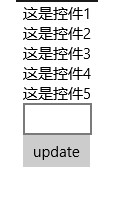
看上去這些控制項都沒有問題,但是如果我們在TextBox中輸入內容,然後update一下,再看一下結果
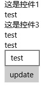
我們發現Control1和Control3的值沒有更新,問題到底出在哪呢?仔細檢查一下會發現這倆個控制項的Text屬性是普通屬性(public string Text { set; set; }),依賴屬性是有通知屬性變更的能力的,而普通屬性是不具備這個能力的,所以我們需要控制項繼承INotifyPropertyChanged介面,於是我們將Control1.xaml.cs作如下變更,Control3也如Control1一樣
using System.ComponentModel;
using System.Runtime.CompilerServices;
using Windows.UI.Xaml.Controls;

// The User Control item template is documented at http://go.microsoft.com/fwlink/?LinkId=234236

namespace Controls
{
    public sealed partial class Control1 : UserControl, INotifyPropertyChanged
    {
        public event PropertyChangedEventHandler PropertyChanged;

        public void RaisePropertyChanged([CallerMemberName]string propertyName = null)
        {
            var handler = PropertyChanged;

            if (handler != null)
                handler(this, new PropertyChangedEventArgs(propertyName));
        }

        public Control1()
        {
            this.InitializeComponent();
        }

        private string text;

        public string Text
        {
            get
            {
                return text;
            }
            set
            {
                text = value;
                RaisePropertyChanged();
            }
        }
    }
}
現在我們再來看一下運行結果
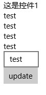
Control3是可以了,可是為什麼Control1還是不能更新呢,why?讓我們來重新看一下Control1的code,原來問題出現在這裡
前面我們說過{x:Bind}的預設Mode是OneTime,所以我們需要把它改成OneWay
<UserControl
    x:Class="Controls.Control1"
    xmlns="http://schemas.microsoft.com/winfx/2006/xaml/presentation"
    xmlns:x="http://schemas.microsoft.com/winfx/2006/xaml"
    xmlns:local="using:Controls"
    xmlns:d="http://schemas.microsoft.com/expression/blend/2008"
    xmlns:mc="http://schemas.openxmlformats.org/markup-compatibility/2006"
    mc:Ignorable="d"
    d:DesignHeight="300"
    d:DesignWidth="400">

    <Grid>
        <TextBlock Text="{x:Bind Text,Mode=OneWay}"></TextBlock>
    </Grid>
</UserControl>
再來不厭其煩地看一下結果

Great!用螺絲釘們經常說的一句話叫“大功告成”。:-D
題外話,給大家出個謎語,猜一猜下麵的程式運行結果是多少?
for (var i = 0; i < 10; i++)
{
    await Dispatcher.RunAsync(Windows.UI.Core.CoreDispatcherPriority.Normal, async () =>
    {
        await Dispatcher.RunAsync(Windows.UI.Core.CoreDispatcherPriority.Normal, () =>
        {
            Debug.WriteLine(i);
        });
    });
}