
iconfont的使用: "https://www.cnblogs.com/changxin7/p/11479216.html" Bootstrap介紹 Bootstrap是Twitter開源的基於HTML、CSS、JavaScript的前端框架。 它是為實現快速開發Web應用程式而設計的一套前端工 ...
iconfont的使用:https://www.cnblogs.com/changxin7/p/11479216.html
Bootstrap介紹
Bootstrap是Twitter開源的基於HTML、CSS、JavaScript的前端框架。
它是為實現快速開發Web應用程式而設計的一套前端工具包。
它支持響應式佈局,並且在V3版本之後堅持移動設備優先。
就是複製黏貼一把梭,html\css\js代碼的封裝組合
為什麼要使用Bootstrap?
在Bootstrap出現之前:
命名:重覆、複雜、無意義(想個名字費勁)
樣式:重覆、冗餘、不規範、不和諧
頁面:錯亂、不規範、不和諧
在使用Bootstrap之後: 各種命名都統一併且規範化。 頁面風格統一,畫面和諧。
Bootstrap下載
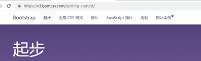
官方地址:https://getbootstrap.com
中文地址:http://www.bootcss.com/
我們使用V3版本的Bootstrap,我們下載的是用於生產環境的Bootstrap。
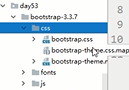
Bootstrap環境搭建
目錄結構:
bootstrap-3.3.7-dist/
├── css  // CSS文件
│   ├── bootstrap-theme.css  // Bootstrap主題樣式文件,官方提供的,一般不用
│   ├── bootstrap-theme.css.map
│   ├── bootstrap-theme.min.css  // 主題相關樣式壓縮文件
│   ├── bootstrap-theme.min.css.map
│   ├── bootstrap.css  //引用的時候,引用這一個或者下麵那個bootstrap.min.css文件就可以了
│   ├── bootstrap.css.map
│   ├── bootstrap.min.css  // 核心CSS樣式壓縮文件,其他的文件都是在這個核心文件的基礎上加了一些其他的樣式
│   └── bootstrap.min.css.map
├── fonts  // 字體文件
│   ├── glyphicons-halflings-regular.eot
│   ├── glyphicons-halflings-regular.svg
│   ├── glyphicons-halflings-regular.ttf
│   ├── glyphicons-halflings-regular.woff
│   └── glyphicons-halflings-regular.woff2
└── js  // JS文件
    ├── bootstrap.js
    ├── bootstrap.min.js  // 核心JS壓縮文件
    └── npm.js
處理依賴
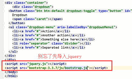
由於Bootstrap的某些組件依賴於jQuery,所以請確保下載對應版本的jQuery文件,來保證Bootstrap相關組件運行正常。
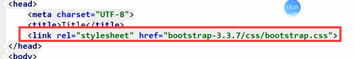
引入:
將下載解壓的那個文件夾放到我們的項目目錄下就能夠使用了
可以把主題那些你用不到的css等文件刪除。
然後引入一下就能用了,很簡單
Bootstrap全局樣式
排版、按鈕、表格、表單、圖片等我們常用的HTML元素,Bootstrap中都提供了全局樣式。
我們只要在基本的HTML元素上通過設置class就能夠應用上Bootstrap的樣式,從而使我們的頁面更美觀和諧。
基礎模板:簡單看看結構
<!DOCTYPE html>
<html lang="zh-CN">
  <head>
    <meta charset="utf-8">
    <meta http-equiv="X-UA-Compatible" content="IE=edge">
    <meta name="viewport" content="width=device-width, initial-scale=1">  <!--頁面寬度自適應設備的屏幕寬度-->
    <!-- 上述3個meta標簽*必須*放在最前面,任何其他內容都*必須*跟隨其後! -->
    <title>Bootstrap 101 Template</title>

    <!-- Bootstrap -->
    <link href="https://cdn.jsdelivr.net/npm/[email protected]/dist/css/bootstrap.min.css" rel="stylesheet">

    <!-- HTML5 shim 和 Respond.js 是為了讓 IE8 支持 HTML5 元素和媒體查詢(media queries)功能 -->
    <!-- 警告:通過 file:// 協議(就是直接將 html 頁面拖拽到瀏覽器中)訪問頁面時 Respond.js 不起作用 -->
    <!--[if lt IE 9]>
      <script src="https://cdn.jsdelivr.net/npm/[email protected]/dist/html5shiv.min.js"></script>
      <script src="https://cdn.jsdelivr.net/npm/[email protected]/dest/respond.min.js"></script>
    <![endif]-->
  </head>
  <body>
    <h1>你好,世界!</h1>

    <!-- jQuery (Bootstrap 的所有 JavaScript 插件都依賴 jQuery,所以必須放在前邊) -->
    <script src="https://cdn.jsdelivr.net/npm/[email protected]/dist/jquery.min.js"></script>
    <!-- 載入 Bootstrap 的所有 JavaScript 插件。你也可以根據需要只載入單個插件。 -->
    <script src="https://cdn.jsdelivr.net/npm/[email protected]/dist/js/bootstrap.min.js"></script>
  </body>
</html> 
想讓手機端能夠顯示完整的頁面,就需要寫上
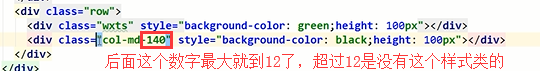
使用柵格進行佈局的時候註意人家bootstrap官網裡面寫的要求:寫法就按照下麵的來,寫到佈局容器裡面,列是行裡面的元素。
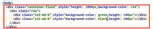
效果:

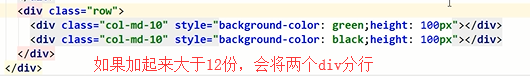
如果裡面的列元素沒有占滿12份,那麼右邊就會空出來幾份的寬度。

還有:
列偏移
關於媒體查詢:
<!DOCTYPE html>
<html lang="en">
<head>
    <meta charset="UTF-8">
    <title>Title</title>
    <meta name="viewport" content="width=device-width, initial-scale=1">
    <style>
        body {
            margin: 0;
        }
        .c1 {
            background-color: red;
            height: 200px;
        }
        /*媒體查詢,捕捉顯示屏幕的寬度,來顯示不同的定製效果*/
        @media screen and (max-width: 700px) {
            .c1 {
                background-color: green;
            }
        }
    </style>
</head>
<body>

<div class="c1">

</div>
</body>
</html>
媒體查詢的使用
<!DOCTYPE html>
<html lang="zh-CN">
<head>
    <meta charset="utf-8">
    <meta http-equiv="X-UA-Compatible" content="IE=edge">
    <meta name="viewport" content="width=device-width, initial-scale=1">
    <!-- 上述3個meta標簽*必須*放在最前面,任何其他內容都*必須*跟隨其後! -->
    <title>Bootstrap 101 Template</title>

    <!-- Bootstrap -->
    <link href="bootstrap/css/bootstrap.css" rel="stylesheet">

    <style>
        #con1{
            /*background-color: red;*/
            /*height: 600px;*/
        }
        .c1{
            background-color: red;
            height: 40px;
        }
        .c2{
            background-color: green;
            height: 40px;
        }
        @media screen and (min-width: 700px) {
            .c1{
                background-color: yellow;
                height: 40px;
            }
            .c2{
                background-color: blue;
                height: 40px;
            }
        }


    </style>

</head>
<body>
<!--<h1>你好,世界!</h1>-->


<!--<div id="con1" class="container"></div>-->
<!--<div id="con1" class="container-fluid">-->
    <!--<div class="row">-->
        <!--<div class="col-md-2 col-xs-2 c1 col-md-offset-1 col-xs-offset-1">-->

        <!--</div>-->
        <!--<div class="col-md-8 col-xs-8 c2">-->

        <!--</div>-->
    <!--</div>-->

<!--</div>-->
<div id="con1" class="container-fluid">
    <div class="row">
        <div class="col-md-2 col-xs-2 c1 col-md-offset-1 col-xs-offset-1">

        </div>
        <div class="col-md-8 col-xs-8 c2">

        </div>
    </div>

</div>


<!-- jQuery (Bootstrap 的所有 JavaScript 插件都依賴 jQuery,所以必須放在前邊) -->
<script src="jquery.js"></script>
<!-- 載入 Bootstrap 的所有 JavaScript 插件。你也可以根據需要只載入單個插件。 -->
<script src="bootstrap/js/bootstrap.js"></script>
</body>
</html>
標題相關
標題
<h1>一級標題36px</h1>
<h2>二級標題30px</h2>
<h3>三級標題24px</h3>
<h4>四級標題18px</h4>
<h5>五級標題14px</h5>
<h6>六級標題12px</h6>
<!--除了使用h標簽,Bootstrap內置了相應的全局樣式-->
<!--內聯標簽應用標題樣式-->
<span class="h1">一級標題36px</span>
<span class="h2">二級標題30px</span>
<span class="h3">三級標題24px</span>
<span class="h4">四級標題18px</span>
<span class="h5">五級標題14px</span>
<span class="h6">六級標題12px</span>
副標題
<!--一級標題中嵌入小標題-->
<h1>一級標題<small>小標題</small></h1>
文本對齊
<!--文本對齊-->
<p class="text-left">文本左對齊</p>
<p class="text-center">文本居中</p>
<p class="text-right">文本右對齊</p>
文本大小寫
<!--大小寫-->
<p class="text-lowercase">Lowercased text.</p>
<p class="text-uppercase">Uppercased text.</p>
<p class="text-capitalize">Capitalized text.</p>
表格
| Class | 描述 |
|---|---|
| .table-striped | 條紋狀表格 |
| .table-bordered | 帶邊框的表格 |
| .table-hover | 滑鼠懸停變色的表格 |
| .table-condensed | 緊縮型表格 |
| .table-responsive | 響應式表格 |
狀態類
| Class | 描述 |
|---|---|
.active |
滑鼠懸停在行或單元格上時所設置的顏色 |
.success |
標識成功或積極的動作 |
.info |
標識普通的提示信息或動作 |
.warning |
標識警告或需要用戶註意 |
.danger |
標識危險或潛在的帶來負面影響的動作 |
表單
內聯表單
表單狀態
帶圖標的表單
按鈕
<a class="btn btn-default" href="#" role="button">Link</a>
<button class="btn btn-default" type="submit">Button</button>
<input class="btn btn-default" type="button" value="Input">
<input class="btn btn-default" type="submit" value="Submit">
按鈕樣式
<!-- Standard button -->
<button type="button" class="btn btn-default">(預設樣式)Default</button>
<!-- Provides extra visual weight and identifies the primary action in a set of buttons -->
<button type="button" class="btn btn-primary">(首選項)Primary</button>
<!-- Indicates a successful or positive action -->
<button type="button" class="btn btn-success">(成功)Success</button>
<!-- Contextual button for informational alert messages -->
<button type="button" class="btn btn-info">(一般信息)Info</button>
<!-- Indicates caution should be taken with this action -->
<button type="button" class="btn btn-warning">(警告)Warning</button>
<!-- Indicates a dangerous or potentially negative action -->
<button type="button" class="btn btn-danger">(危險)Danger</button>
<!-- Deemphasize a button by making it look like a link while maintaining button behavior -->
<button type="button" class="btn btn-link">(鏈接)Link</button>
按鈕大小
<p>
  <button type="button" class="btn btn-primary btn-lg">(大按鈕)Large button</button>
  <button type="button" class="btn btn-default btn-lg">(大按鈕)Large button</button>
</p>
<p>
  <button type="button" class="btn btn-primary">(預設尺寸)Default button</button>
  <button type="button" class="btn btn-default">(預設尺寸)Default button</button>
</p>
<p>
  <button type="button" class="btn btn-primary btn-sm">(小按鈕)Small button</button>
  <button type="button" class="btn btn-default btn-sm">(小按鈕)Small button</button>
</p>
<p>
  <button type="button" class="btn btn-primary btn-xs">(超小尺寸)Extra small button</button>
  <button type="button" class="btn btn-default btn-xs">(超小尺寸)Extra small button</button>
</p>
圖片
<img src="..." class="img-responsive" alt="Responsive image">圖片形狀
<img src="..." alt="..." class="img-rounded">
<img src="..." alt="..." class="img-circle">
<img src="..." alt="..." class="img-thumbnail">
輔助類
文本顏色
<p class="text-muted">...</p>
<p class="text-primary">...</p>
<p class="text-success">...</p>
<p class="text-info">...</p>
<p class="text-warning">...</p>
<p class="text-danger">...</p>
背景顏色
<p class="bg-primary">...</p>
<p class="bg-success">...</p>
<p class="bg-info">...</p>
<p class="bg-warning">...</p>
<p class="bg-danger">...</p>
關閉按鈕
<button type="button" class="close" aria-label="Close"><span aria-hidden="true">×</span></button>下拉三角
<span class="caret"></span>快速浮動
<div class="pull-left">...</div>
<div class="pull-right">...</div>
內容塊居中
<div class="center-block">...</div>清除浮動
<!-- Usage as a class -->
<div class="clearfix">...</div>
顯示與隱藏
<div class="show">...</div>
<div class="hidden">...</div>
bootstrap寫一個簡單的登陸頁面:
<!DOCTYPE html>
<html lang="en">
<head>
<meta charset="UTF-8">
<title>登錄頁面</title>
<link rel="stylesheet" href="bootstrap-3.3.7/css/bootstrap.css">
<style>
body {
background-color: #eeeeee;
}
</style>
</head>
<body>
<div class="container">
<div class="row">
<div class="col-md-4 col-md-offset-4" style="margin-top: 70px">
<h2 class="text-center">歡迎登錄</h2>
<form>
<div class="form-group">
<label for="exampleInputEmail1">郵箱</label>
<input type="email" class="form-control" id="exampleInputEmail1" placeholder="Email">
<span class="help-block"></span>
</div>
<div class="form-group">
<label for="exampleInputPassword1">密碼</label>
<input type="password" class="form-control" id="exampleInputPassword1" placeholder="Password">
<span class="help-block"></span>
</div>
<div class="checkbox">
<label>
<input type="checkbox"> 記住
</label>
</div>
<button type="submit" id="login-btn" class="btn btn-success btn-block">登錄</button>
</form>
</div>
</div>
</div>
<script src="jquery.js"></script>
<script>
// 給登錄按鈕綁定點擊事件
$('#login-btn').click(function () {
// 定義一個是否允許提交的標誌位
var flag = true;
// 1. 找到登錄框中所有的input框,判斷值是否為空
$('form input').each(function () {
var value = $(this).val();
if (value.length===0){
// 2. 為空就顯示提示信息
// 2.1 給下麵的span標簽設置文本提示信息
var errMsg = $(this).prev().text() + '不能為空';
$(this).next().text(errMsg);
// 2.2 給父標簽設置has-error的樣式
$(this).parent().addClass('has-error');
// 2.3 阻止表單提交
flag = false;
return false;
}
});
return flag;
});
// 給input框綁定focus事件
$('form input').focus(function () {
// 1. 去掉當前input框後面的span標簽的文本
$(this).next().text('');
// 2. 去掉父標簽的has-error樣式
$(this).parent().removeClass('has-error');
})
</script>
</body>
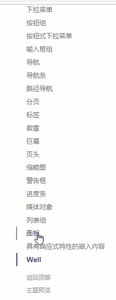
</html>常用Bootstrap組件(就是一些搭配起來的效果,也涉及到一些動作相關的,所以需要引入js文件了)
- 字體圖標(fontawesome裡面比較全)
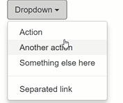
- 下拉菜單
- 按鈕組
- 輸入框俎
- 導航
- 分頁
- 標簽和徽章
- 頁頭
- 縮率圖
- 進度條
作業:來實現這麼一個頁面

就在bootstrap官網的全局css樣式裡面的右邊這個地方找你需要使用的功能。
<!DOCTYPE html>
<html lang="zh-CN">
<head>
    <meta charset="UTF-8">
    <title>Title</title>
    <link rel="stylesheet" href="bootstrap-3.3.7/css/bootstrap.css">
</head>
<body>

<div class="container">
    <div class="row">
        <div class="col-md-12">
            <div class="page-header">
                <h1>信息收集卡
                    <small>共三步</small>
                </h1>
            </div>
            <div class="progress">
                <div class="progress-bar progress-bar-success" role="progressbar" aria-valuenow="60" aria-valuemin="0"
                     aria-valuemax="100" style="width: 33.33%;">
                    1/3
                </div>
            </div>
            <!--面板-->
            <div class="panel panel-primary">
                <div class="panel-heading">
                    <h3 class="panel-title">基本信息<span class="glyphicon glyphicon-pushpin pull-right"></span></h3>

                </div>
                <div class="panel-body">
                    <!--表單-->
                    <form class="form-horizontal">
                        <div class="form-group">
                            <label for="inputEmail1" class="col-sm-2 control-label">Email</label>
                            <div class="col-sm-4">
                                <input type="email" class="form-control" id="inputEmail1" placeholder="Email">
                            </div>
                        </div>
                        <div class="form-group">
                            <label for="inputPassword2" class="col-sm-2 control-label">Password</label>
                            <div class="col-sm-4">
                                <input type="password" class="form-control" id="inputPassword2" placeholder="Password">
                            </div>
                        </div>
                        <div class="form-group">
                            <label for="inputEmail3" class="col-sm-2 control-label">Email</label>
                            <div class="col-sm-4">
                                <input type="email" class="form-control" id="inputEmail3" placeholder="Email">
                            </div>
                        </div>
                        <div class="form-group">
                            <label for="inputPassword3" class="col-sm-2 control-label">Password</label>
                            <div class="col-sm-4">
                                <input type="password" class="form-control" id="inputPassword3" placeholder="Password">
                            </div>
                        </div>
                        <div class="form-group">
                            <label for="inputFile" class="col-sm-2 control-label">Password</label>
                            <div class="col-sm-4">
                                <input type="file" class="" id="inputFile" placeholder="Password">
                                <span class="help-block">只支持png</span>
                            </div>
                        </div>
                        <hr>
                        <div class="form-group">
                            <div class="col-sm-2 control-label">屬性</div>
                            <div class="col-sm-4">
                                <div class="radio">
                                    <label>
                                        <input type="radio" name="optionsRadios" id="optionsRadios1" value="option1"
                                               checked>
                                        我是一個好人
                                    </label>
                                </div>
                                <div class="radio">
                                    <label>
                                        <input type="radio" name="optionsRadios" id="optionsRadios2" value="option2">
                                         我是一個壞人
                                    </label>
                                </div>
                                <div class="radio disabled">
                                    <label>
                                        <input type="radio" name="optionsRadios" id="optionsRadios3" value="option3"
                                               disabled>
                                        我不是一個人
                                    </label>
                                </div>
                            </div>
                        </div>
                    </form>
                </div>
            </div>
            <!--下一步按鈕-->
            <div>
                <button class="btn btn-success pull-right">下一步</button>
            </div>
        </div>
    </div>
</div>


<script src="jquery.js"></script>
<script src="bootstrap-3.3.7/js/bootstrap.js"></script>
</body>
</html>
模擬滾動的進度條:
var $d1 = $("#d1");
var width = 0;
var theID = setInterval(setValue, 200);

function setValue() {
  if (width === 100) {
    clearInterval(theID);
  } else {
    width++;
    $d1.css("width", width+"%").text(width+"%");
  }
}
關於fontawesome的使用
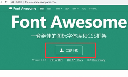
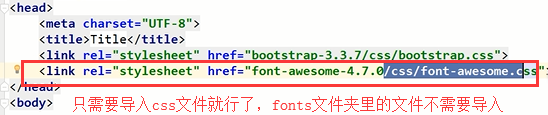
下載解壓,然後放到我們的項目目錄裡面去,直接引用就行了

css文件夾和fonts文件夾必須是同一級目錄,因為那個css裡面的內容就是通過相對路徑來找fonts裡面的內容的
找個微信圖標看看:
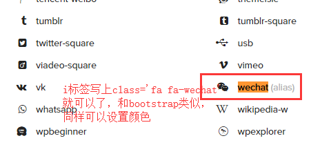
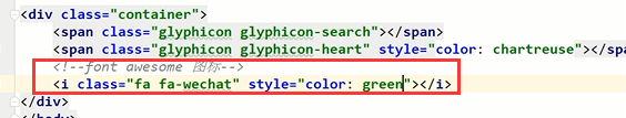
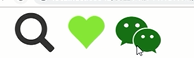
咱們大家再看看font awesome裡面的一些用法,比bootstrap裡面的圖標用起來更高級一些,並且和bootstrap完美相容。


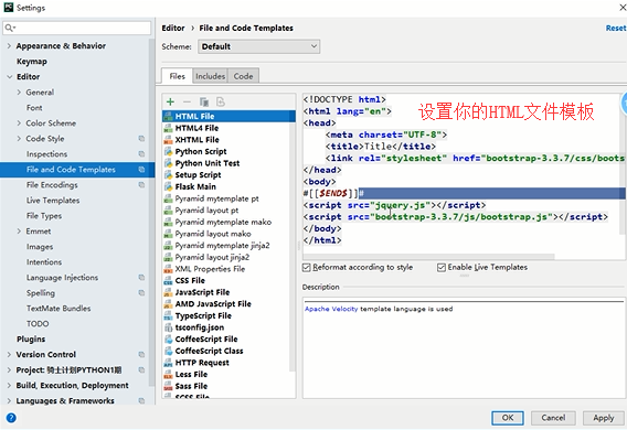
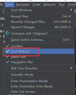
pycharm中設置HTML的模板樣式:
京東的標簽頁:
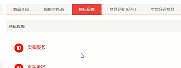
標簽頁示例:
<!DOCTYPE html>
<html lang="zh-CN">
<head>
<meta charset="UTF-8">
<title>Title</title>
<link rel="stylesheet" href="bootstrap-3.3.7/css/bootstrap.css">
</head>
<body>
<div class="container">
<div>
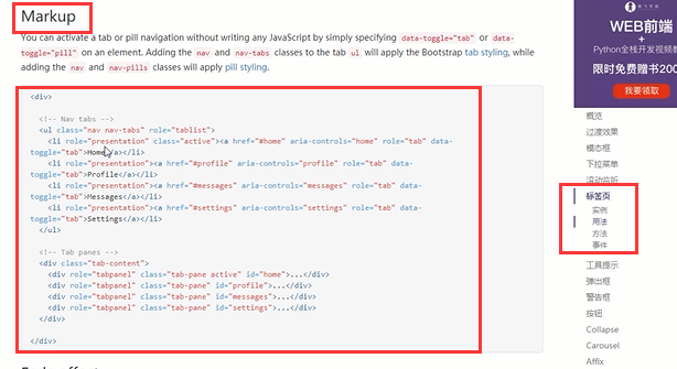
<!-- Nav tabs -->
<ul class="nav nav-tabs nav-justified" role="tablist">
<li role="presentation" class="active">
<a href="#home" aria-controls="home" role="tab" data-toggle="tab">主頁</a>
</li>
<li role="presentation">
<a href="#profile" aria-controls="profile" role="tab" data-toggle="tab">詳情頁</a>
</li>
<li role="presentation">
<a href="#messages" aria-controls="messages" role="tab" data-toggle="tab">售後服務</a>
</li>
<li role="presentation">
<a href="#settings" aria-controls="settings" role="tab" data-toggle="tab">評論專區</a>
</li>
</ul>
<!-- Tab panes -->
<div class="tab-content">
<div role="tabpanel" class="tab-pane active" id="home">這是主頁的內容</div>
<div role="tabpanel" class="tab-pane" id="profile">這是詳情頁的內容</div>
<div role="tabpanel" class="tab-pane" id="messages">這是售後服務專區的內容</div>
<div role="tabpanel" class="tab-pane" id="settings">這是評論區的內容</div>
</div>
</div>
</div>
<script src="jquery.js"></script>
<script src="bootstrap-3.3.7/js/bootstrap.js"></script>
</body>
</html>
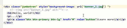
巨幕:
進度條
<!DOCTYPE html>
<html lang="zh-CN">
<head>
    <meta charset="UTF-8">
    <title>Title</title>
    <link rel="stylesheet" href="bootstrap-3.3.7/css/bootstrap.css">
</head>
<body>


<div class="container">
    <div class="progress">
      <div id="p1" class="progress-bar progress-bar-info progress-bar-striped active" role="progressbar" aria-valuenow="60" aria-valuemin="0" aria-valuemax="100" style="width: 0%;min-width: 2%">
        0%
      </div>
    </div>
    <button class="btn btn-success btn-sm" id="b1">開始</button>
</div>


<script src="jquery.js"></script>
<script src="bootstrap-3.3.7/js/bootstrap.js"></script>
<script>
        var n = 0;
        var t;
    // jQuery操作標簽的CSS屬性
        function foo(){
            $('#p1').css('width', n+'%').text(n+'%');
            n += 1;
            if (n > 100){
                clearInterval(t);
            }
        }
    // 點擊開始按鈕,讓滾動條滾動起來
    $('#b1').click(function () {
        // 每隔一秒鐘執行一下上面的代碼
        t = setInterval(foo, 100);
    });

</script>
</body>
</html>
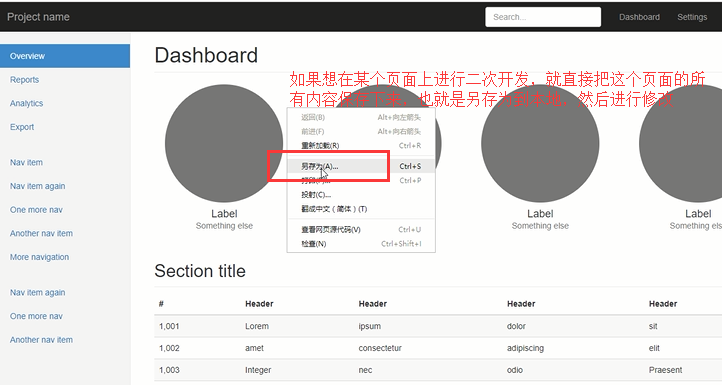
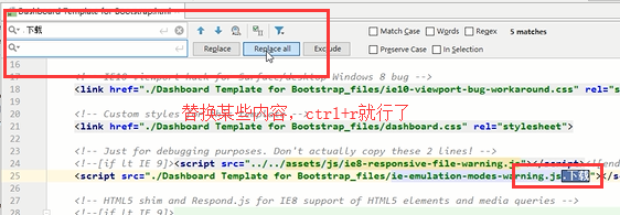
保存網頁的方法:
響應式開發
為什麼要進行響應式開發?
隨著移動設備的流行,網頁設計必須要考慮到移動端的設計。同一個網站為了相容PC端和移動端顯示,就需要進行響應式開發。
什麼是響應式?
利用媒體查詢,讓同一個網站相容不同的終端(PC端、移動端)呈現不同的頁面佈局。
用到的技術:
CSS3@media查詢
用於查詢設備是否符合某一特定條件,這些特定條件包括屏幕尺寸、是否可觸摸、屏幕精度、橫屏豎屏等信息。
常見屬性:
1.device-width, device-height 屏幕寬、高
2.width,height 渲染視窗寬、高
3.orientation 設備方向
4.resolution 設備解析度
語法:
@media mediatype and|not|only (media feature) {
    CSS-Code;
}
不同的媒體使用不同的stylesheet
<link rel="stylesheet" media="mediatype and|not|only (media feature)" href="mystylesheet.css">
viewport
手機瀏覽器是把頁面放在一個虛擬的"視窗"(viewport)中,通常這個虛擬的"視窗"(viewport)比屏幕寬,這樣就不用把每個網頁擠到很小的視窗中(這樣會破壞沒有針對手機瀏覽器優化的網頁的佈局),用戶可以通過平移和縮放來看網頁的不同部分。
設置viewport
一個常用的針對移動網頁優化過的頁面的 viewport meta 標簽大致如下:
<meta name=”viewport” content=”width=device-width, initial-scale=1, maximum-scale=1″>
- width:控制 viewport 的大小,可以指定的一個值,如果 600,或者特殊的值,如 device-width 為設備的寬度(單位為縮放為 100% 時的 CSS 的像素)。
- height:和 width 相對應,指定高度。
- initial-scale:初始縮放比例,也即是當頁面第一次 load 的時候縮放比例。
- maximum-scale:允許用戶縮放到的最大比例。
- minimum-scale:允許用戶縮放到的最小比例。
- user-scalable:用戶是否可以手動縮放。
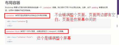
Bootstrap的柵格系統
- container
- row
- column
註意事項: 使用Bootstrap的時候不要讓自己的名字與Bootstrap的類名衝突。
JavaScript插件
Bootstrap實例精選:
- 封面圖
- Carousel
- 博客頁面
- 控制台
- 登錄頁
- Offcanvas
補充一些內容:
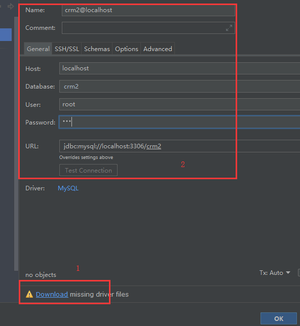
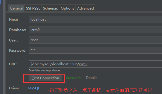
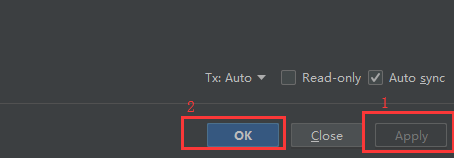
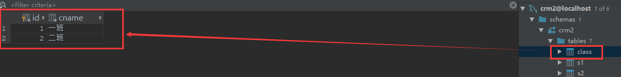
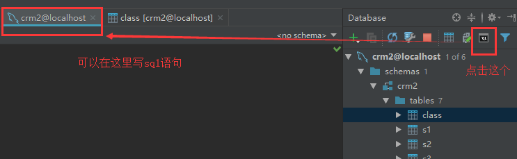
pycharm如何連接上資料庫
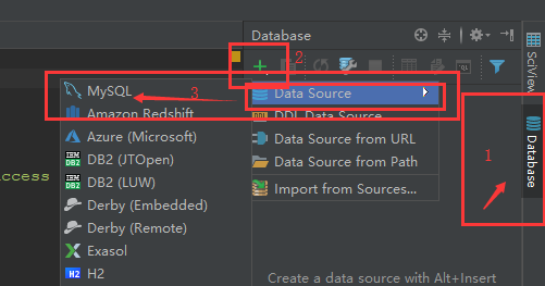
然後就可以在pycharm上看到這個庫和裡面的表了
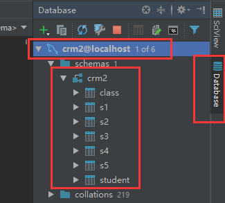
還可以在裡面寫sql語句
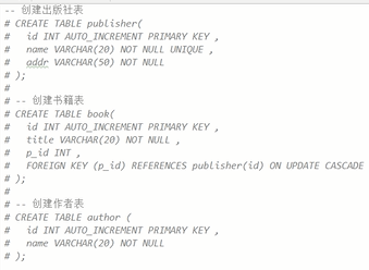
我們設計三張表,書籍、作者、出版社,方便之後django的學習:
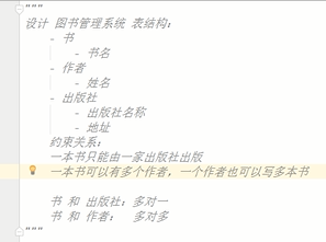
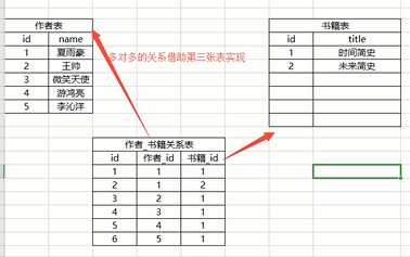
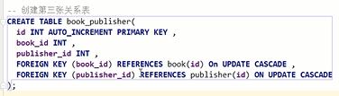
大家通過sql語句將表和表關係創建出來吧(使用上foreign key吧)
課後作業:
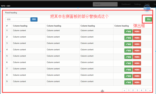
修改成下麵這樣的效果
- 後臺管理頁面(修改Dashbord,https://v3.bootcss.com/examples/dashboard/)
- 常用組件練習

