CSS盒模型的概念與分類 CSS盒模型就是一個盒子,封裝周圍的HTML元素,它包括內容content、邊框border、內邊距padding、外邊距margin。 CSS盒模型分為標準模型和IE模型; 標準模型和IE模型的區別 標準模型的width是內容content 的寬度; 設置方式: box- ...
CSS盒模型的概念與分類
CSS盒模型就是一個盒子,封裝周圍的HTML元素,它包括內容content、邊框border、內邊距padding、外邊距margin。
CSS盒模型分為標準模型和IE模型;
標準模型和IE模型的區別
標準模型:width = 內容content 的寬度;(預設) 設置方式: box-sizing:content-box;
IE模型:width = 內容content + 邊框border + 內邊距paddig 的寬度; 設置方式: box-sizing:border-box;
通過js如何獲取盒模型的寬高
1.dom.style.width/height 只能獲取到dom的內聯樣式
2.dom.currentStyle.width/height 獲取到的是dom的實際寬高,但這種方式只在IE中可以使用
3.window.getComputedStyle(dom,null).width/height 獲取到的是dom的實際寬高,但是不支持IE
4.dom.offsetWidth/offerHeight 最常用的,相容性最好的
第2,3個組合下就可以相容ie與其他瀏覽器了
window.getComputedStyle ? window.getComputedStyle(obj,null).width : obj.currentStyle.width;
邊距重疊
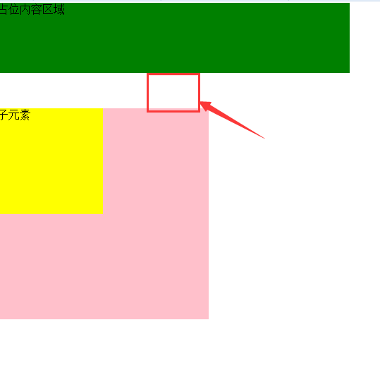
邊距重疊是指兩個或多個盒子相鄰邊界重合在一起形成一個邊界。水平方向邊界不會重疊,垂直方向會重疊,垂直方向的實際邊界是邊界中的最大值。
比如子元素設置了margin-top,父元素沒有設置,但是父元素也有了上邊距。
<!DOCTYPE html>
<html>
<head>
    <title>邊距重疊</title>
    <meta charset="utf-8">
    <style type="text/css">
        html *{
            margin: 0;
            padding: 0;
        }

        .content{
            width: 500px;
            height:100px;
            background: green;
        }
        .parent{
            width: 300px;
            height: 300px;
            background: pink;
        }
        .child{
            width: 150px;
            height: 150px;
            background: yellow;
            margin-top: 50px;
        }
    </style>
</head>
<body>
    <div class="content">
        占位內容區域
    </div>
    <div class="parent">
        <div class="child">

        </div>
    </div>
</body>
</html>
下圖就是代碼運行結果:
解決邊距重疊-BFC
1、BFC概念:塊級格式化上下文
2、BFC的原理:
BFC的區域不會與浮動區域重疊
計算BFC區域高度時,浮動區域也參與計算
BFC區域是獨立的一個區域,不與其他區域相互影響
3、如何創建BFC
脫離文檔流:float不為none;position為absolutely或fixed
overflow不為visible(如overflow:hidden)
display為“table-cell”, “table-caption”, “inline-block”中的任何一個
4、BFC應用場景
自適應兩欄佈局
清除浮動
防止垂直margin重疊