
本文主要是總結學習pandas過程中用到的函數和方法, 在此記錄, 防止遺忘. Python數據分析--Pandas知識點(一) Python數據分析--Pandas知識點(二) 下麵將是在知識點一, 二的基礎上繼續總結. 前面所介紹的都是以表格的形式中展現數據, 下麵將介紹Pandas與Matpl ...
本文主要是總結學習pandas過程中用到的函數和方法, 在此記錄, 防止遺忘.
下麵將是在知識點一, 二的基礎上繼續總結.
前面所介紹的都是以表格的形式中展現數據, 下麵將介紹Pandas與Matplotlib配合繪製出折線圖, 散點圖, 餅圖, 柱形圖, 直方圖等五大基本圖形.
Matplotlib是python中的一個2D圖形庫, 它能以各種硬拷貝的格式和跨平臺的互動式環境生成高質量的圖形, 比如說柱狀圖, 功率譜, 條形圖, 誤差圖, 散點圖等. 其中, matplotlib.pyplot 提供了一個類似matlab的繪圖框架, 使用該框架前, 必須先導入它.
19. 折線圖
折線圖: 數據隨著時間的變化情況描點連線而形成的圖形, 通常被用於顯示在相等時間間隔下數據的趨勢. 下麵將採用兩種方式進行繪製折線圖, 一種是pandas中plot()方法, 該方法用來繪製圖形, 然後在matplotlib中的繪圖框架中展示; 另一種則是直接利用matplotlib中繪圖框架的plot()方法.
19.1 採用pandas中的plot()方法繪製折線圖
在pandas中繪製折線圖的函數是plot(x=None, y=None, kind='line', figsize = None, legend=True, style=None, color = "b", alpha = None):
第一個: x軸的數據
第二個: y軸的數據
第三個: kind表示圖形種類, 預設為折線圖
第四個: figsize表示圖像大小的元組
第五個: legend=True表示使用圖例, 否則不使用, 預設為True.
第六個: style表示線條樣式
第七個: color表示線條顏色, 預設為藍色
第八個: alpha表示透明度, 介於0~1之間.
plot()函數更多參數請查看官方文檔:http://pandas.pydata.org/pandas-docs/stable/generated/pandas.DataFrame.plot.html?highlight=plot#pandas.DataFrame.plot
數據來源: https://assets.datacamp.com/production/course_1639/datasets/percent-bachelors-degrees-women-usa.csv
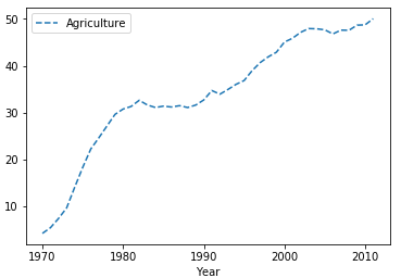
1 import pandas as pd
2 import matplotlib.pyplot as plt
3 #第一步讀取數據: 使用read_csv()函數讀取csv文件中的數據
4 df = pd.read_csv(r"D:\Data\percent-bachelors-degrees-women-usa.csv")
5 #第二步利用pandas的plot方法繪製折線圖
6 df.plot(x = "Year", y = "Agriculture")
7 #第三步: 通過plt的show()方法展示所繪製圖形
8 plt.show()
在執行上述代碼過程了報錯ImportError: matplotlib is required for plotting, 若遇到請點擊參考辦法
最終顯示效果:

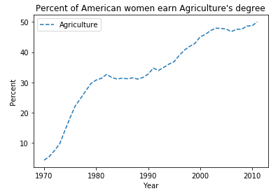
如果想將實線變為虛線呢, 可修改style參數為"--":
1 import pandas as pd
2 import matplotlib.pyplot as plt
3 df = pd.read_csv(r"D:\Data\percent-bachelors-degrees-women-usa.csv")
4 #添加指定的style參數
5 df.plot(x = "Year", y = "Agriculture", style = "--")
6 plt.show()
添加坐標軸標簽以及標題:
 1 import pandas as pd
 2 import matplotlib.pyplot as plt
 3 df = pd.read_csv(r"D:\Data\percent-bachelors-degrees-women-usa.csv")
 4 df.plot(x = "Year", y = "Agriculture", style = "--")
 5 #添加橫坐標軸標簽
 6 plt.xlabel("Year")
 7 #添加縱坐標軸標簽
 8 plt.ylabel("Percent")
 9 #添加標題
10 plt.title("Percent of American women earn Agriculture's degree")
11 plt.show()
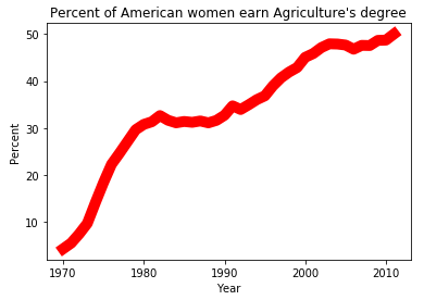
19.2 採用matplotlib.pyplot的plot()方法繪製折線圖
matplotlib.pyplot.plot(x, y, style, color, linewidth)函數的參數分別表示: x軸數據, y軸數據, style線條樣式, color線條顏色, linewidth線寬.
 1 import pandas as pd
 2 import matplotlib.pyplot as plt
 3 #第一步: 讀取數據
 4 df = pd.read_csv(r"D:\Data\percent-bachelors-degrees-women-usa.csv")
 5 #第二步: 將所需數據賦值給對應的變數
 6 df_year, df_Agriculture = df["Year"], df["Agriculture"]
 7 #第三步: 用matplotlib中繪圖框架的plot()方法繪製紅色的折線圖
 8 plt.plot(df_year, df_Agriculture,"-", color = "r",linewidth = 10)
 9 #添加橫坐標軸標簽
10 plt.xlabel("Year")
11 #添加縱坐標軸標簽
12 plt.ylabel("Percent")
13 #添加標題
14 plt.title("Percent of American women earn Agriculture's degree")
15 plt.show()
顯示效果:
20. 散點圖
散點圖: 用兩組數據構成多個坐標點, 考察坐標點的分佈, 判斷兩變數之間是否存在某種關聯或總結坐標點的分佈模式. 各點的值由點在坐標中的位置表示, 用不同的標記方式表示各點所代表的不同類別.
20.1 採用pandas中的plot()方法繪製散點圖
只需將plot()函數中的kind參數的值改為"scatter"即可.
數據來源: http://archive.ics.uci.edu/ml/machine-learning-databases/iris/
 1 import pandas as pd
 2 import matplotlib.pyplot as plt
 3 #讀取數據
 4 df = pd.read_csv(r"D:\Data\Iris.csv")
 5 #原始數據中沒有給出欄位名, 在這裡指定
 6 df.columns = ['sepal_len', 'sepal_wid', 'petal_len', 'petal_wid','species']
 7 #指定x軸與y軸數據並繪製散點圖
 8 df.plot(x = "sepal_len", y = "sepal_wid", kind = "scatter" )
 9 #添加橫坐標軸標簽
10 plt.xlabel("sepal length")
11 #添加縱坐標軸標簽
12 plt.ylabel("sepal width")
13 #添加標題
14 plt.title("Iris sepal length and width analysis")
15 plt.show()

20.2 採用matplotlib.pyplot的plot()方法繪製散點圖
 1 import pandas as pd
 2 import matplotlib.pyplot as plt
 3 df = pd.read_csv(r"D:\Data\Iris.csv")
 4 df.columns = ['sepal_len', 'sepal_wid', 'petal_len', 'petal_wid','species']
 5 #用繪圖框架的plot()方法繪圖, 樣式為".", 顏色為紅色
 6 plt.plot(df["sepal_len"], df["sepal_wid"],".", color = "r")
 7 plt.xlabel("sepal length")
 8 plt.ylabel("sepal width")
 9 plt.title("Iris sepal length and width analysis")
10 plt.show()

21. 餅圖
餅圖: 將一個圓形劃分為多個扇形的統計圖, 它通常被用來顯示各個組成部分所占比例.
由於在繪製餅狀圖先要對數據進行分類彙總, 先查看數據的總體信息
1 import pandas as pd
2 df = pd.read_csv(r"D:\Data\Iris.csv")
3 df.columns = ['sepal_len', 'sepal_wid', 'petal_len', 'petal_wid','species']
4 #查看數據總體信息
5 df.describe()
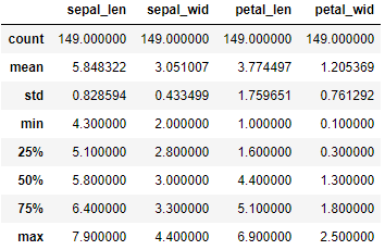
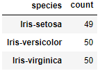
可以看出每一列都是149個數據, 那麼接下來對species列進行分類彙總
1 import pandas as pd
2 df = pd.read_csv(r"D:\Data\Iris.csv")
3 df.columns = ['sepal_len', 'sepal_wid', 'petal_len', 'petal_wid','species']
4 #對species列進行分類並對sepal_len列進行計數
5 df_gbsp = df.groupby("species")["sepal_len"].agg(["count"])
6 df_gbsp
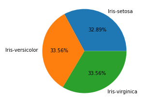
21.1 採用pandas中的plot()方法繪製餅狀圖
1 import pandas as pd
2 import matplotlib.pyplot as plt
3 df = pd.read_csv(r"D:\Data\Iris.csv")
4 df.columns = ['sepal_len', 'sepal_wid', 'petal_len', 'petal_wid','species']
5 #對species列進行分類並對sepal_len列進行計數
6 df_gbsp = df.groupby("species")["sepal_len"].agg(["count"])
7 #繪製圖形樣式為餅圖, 百分比保留兩位小數, 字體大小為20, 圖片大小為6x6, subplots為True表示將數據每列繪製為一個子圖,legend為True表示隱藏圖例
8 df_gbsp.plot(kind = "pie", autopct='%.2f%%', fontsize=20, figsize=(6, 6), subplots = True, legend = False)
9 plt.show()

21.2 採用matplotlib.pyplot的pie()方法繪製餅狀圖
pie(x, explode = None, labels = None, colors=None, autopct=None)的參數分別表示:
第一個: x表示要繪圖的序列
第二個: explode要突出顯示的組成部分
第三個: labels各組成部分的標簽
第四個: colors各組成部分的顏色
第五個: autopct數值顯示格式
1 import pandas as pd
2 import matplotlib.pyplot as plt
3 df = pd.read_csv(r"D:\Data\Iris.csv")
4 df.columns = ['sepal_len', 'sepal_wid', 'petal_len', 'petal_wid','species']
5 df["species"] = df["species"].apply(lambda x: x.replace("Iris-",""))
6 df_gbsp = df.groupby("species",as_index = False)["sepal_len"].agg({"counts": "count"})
7 #對counts列的數據繪製餅狀圖.
8 plt.pie(df_gbsp["counts"],labels = df_gbsp["species"], autopct = "%.2f%%" )
9 plt.show()
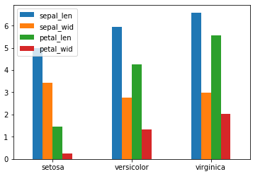
22. 柱形圖
柱形圖: 又稱為長條圖, 是一種以長方形的長度為變數的統計圖. 柱形圖常用來比較兩個或以上的數據不同時間或者不同條件).
22.1 採用pandas的plot()方法繪製柱形圖
 1 import pandas as pd
 2 import matplotlib.pyplot as plt
 3 df = pd.read_csv(r"D:\Data\Iris.csv")
 4 df.columns = ['sepal_len', 'sepal_wid', 'petal_len', 'petal_wid','species']
 5 df["species"] = df["species"].apply(lambda x: x.replace("Iris-",""))
 6 #對species分組求均值
 7 df_gbsp = df.groupby("species", as_index = False).mean()
 8 #繪製柱形圖
 9 df_gbsp.plot(kind = "bar")
10 #修改橫坐標軸刻度值
11 plt.xticks(df_gbsp.index,df_gbsp["species"],rotation=360)
12 plt.show()
當然也可以繪製橫向柱形圖
 1 import pandas as pd
 2 import matplotlib.pyplot as plt
 3 df = pd.read_csv(r"D:\Data\Iris.csv")
 4 df.columns = ['sepal_len', 'sepal_wid', 'petal_len', 'petal_wid','species']
 5 df["species"] = df["species"].apply(lambda x: x.replace("Iris-",""))
 6 df_gbsp = df.groupby("species", as_index = False).mean()
 7 #將bar改為barh即可繪製橫向柱形圖
 8 df_gbsp.plot(kind = "barh")
 9 plt.yticks(df_gbsp.index,df_gbsp["species"],rotation=360)
10 plt.show()

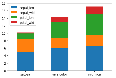
若想要將樣式改為堆積柱形圖:
#修改stacked參數為True即可
df_gbsp.plot(kind = "barh", stacked = True)
22.2 採用matplotlib.pyplot的bar()方法繪製柱形圖
bar( x, height, width=0.8, color = None, label =None, bottom =None, tick_label = None)的參數分別表示:
第一個: x表示x軸的位置序列
第二個: height表示某個系列柱形圖的高度
第三個: width表示某個系列柱形圖的寬度
第四個: label表示圖例
第五個: bottom表示底部為哪個系列, 常被用在堆積柱形圖中
第六個: tick_label刻度標簽
1 import pandas as pd
2 import matplotlib.pyplot as plt
3 df = pd.read_csv(r"D:\Data\Iris.csv")
4 df.columns = ['sepal_len', 'sepal_wid', 'petal_len', 'petal_wid','species']
5 df["species"] = df["species"].apply(lambda x: x.replace("Iris-",""))
6 df_gbsp = df.groupby("species").mean()
7 #繪製"sepal_len"列柱形圖
8 plt.bar(df_gbsp.index,df_gbsp["sepal_len"], width= 0.5 , color = "g")
9 plt.show()

繪製多組柱形圖:
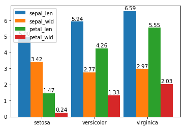
 1 import numpy as np
 2 import pandas as pd
 3 import matplotlib.pyplot as plt
 4 df = pd.read_csv(r"D:\Data\Iris.csv")
 5 df.columns = ['sepal_len', 'sepal_wid', 'petal_len', 'petal_wid','species']
 6 df["species"] = df["species"].apply(lambda x: x.replace("Iris-",""))
 7 df_gbsp = df.groupby("species").mean()
 8 #計算有多少個列
 9 len_spe = len(df_gbsp.count())
10 #計算有多少行, 並生成一個步進為1的數組
11 index = np.arange(len(df_gbsp.index))
12 #設置每組總寬度
13 total_width= 1.4
14 #求出每組每列寬度
15 width = total_width/len_spe
16 #對每個欄位進行遍歷
17 for i in range(len_spe):
18     #得出每個欄位的名稱
19     het = df_gbsp.columns[i]
20     #求出每個欄位所包含的數組, 也就是對應的高度
21     y_values = df_gbsp[het]
22     #設置x軸標簽
23     x_tables = index * 1.5 + i*width
24     #繪製柱形圖
25     plt.bar(x_tables, y_values, width =width)
26     #通過zip接收(x_tables,y_values),返回一個可迭代對象, 每一個元素都是由(x_tables,y_values)組成的元組.
27     for x, y in zip(x_tables, y_values):
28         #通過text()方法設置數據標簽, 位於柱形中心, 最頂部, 字體大小為10.5
29         plt.text(x, y ,'%.2f'% y ,ha='center', va='bottom', fontsize=10.5)
30 #設置x軸刻度標簽位置
31 index1 = index * 1.5 + 1/2
32 #通過xticks設置x軸標簽為df_gbsp的索引
33 plt.xticks(index1 , df_gbsp.index)
34 #添加圖例
35 plt.legend(df_gbsp.columns)
36 plt.show()
繪製堆積柱形圖
 1 import numpy as np
 2 import pandas as pd
 3 import matplotlib.pyplot as plt
 4 df = pd.read_csv(r"D:\Data\Iris.csv")
 5 df.columns = ['sepal_len', 'sepal_wid', 'petal_len', 'petal_wid','species']
 6 df["species"] = df["species"].apply(lambda x: x.replace("Iris-",""))
 7 df_gbsp = df.groupby("species").mean()
 8 len_spe = len(df_gbsp.count())
 9 index = np.arange(len(df_gbsp.index))
10 total_width= 1
11 width = total_width/len_spe
12 ysum = 0
13 for i in range(len_spe):
14     het = df_gbsp.columns[i]
15     y_values = df_gbsp[het]
16     #將x軸標簽改為index/2, 之後在設置bottom為ysum.
17     plt.bar(index/2, y_values, width =width, bottom = ysum)
18     ysum, ysum1= ysum+ y_values, ysum
19     #計算堆積後每個區域中心對應的高度
20     zsum = ysum1 + (ysum - ysum1)/2
21     for x, y , z in zip(index/2, y_values, zsum):
22         plt.text(x, z ,'%.2f'% y ,ha='center', va='center', fontsize=10.5)
23 plt.xticks(index/2 , df_gbsp.index)
24 plt.legend(df_gbsp.columns)
25 plt.show()

bar()函數是用來繪製豎直柱形圖, 而繪製橫向柱形圖用barh()函數即可, 兩者用法相差不多
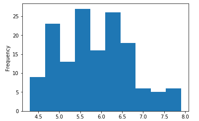
23. 直方圖
直方圖: 由一系列高度不等的長方形表示數據分佈的情況, 寬度表示間隔, 高度表示在對應寬度下出現的頻數.
23.1 採用pandas中的plot()方法繪製折線圖
將plot()方法中的kind參數改為"hist"即可, 參考官方文檔: http://pandas.pydata.org/pandas-docs/version/0.15.0/visualization.html#histograms
 1 import numpy as np
 2 import pandas as pd
 3 import matplotlib.pyplot as plt
 4 df = pd.read_csv(r"D:\Data\Iris.csv")
 5 df.columns = ['sepal_len', 'sepal_wid', 'petal_len', 'petal_wid','species']
 6 df["species"] = df["species"].apply(lambda x: x.replace("Iris-",""))
 7 df_gbsp = df["sepal_len"]
 8 #繪製直方圖
 9 df_gbsp.plot(kind = "hist")
10 plt.show()
#可修改cumulative=True實現累加直方圖, 以及通過bins參數修改分組數
df_gbsp.plot(kind = "hist", cumulative='True', bins = 20)

23.2 採用matplotlib.pyplot的hist()方法繪製折線圖
1 import numpy as np
2 import pandas as pd
3 import matplotlib.pyplot as plt
4 df = pd.read_csv(r"D:\Data\Iris.csv")
5 df.columns = ['sepal_len', 'sepal_wid', 'petal_len', 'petal_wid','species']
6 df["species"] = df["species"].apply(lambda x: x.replace("Iris-",""))
7 #hist()方法繪製直方圖
8 plt.hist(df["sepal_wid"], bins =20, color = "k")
9 plt.show()

#修改為累加直方圖, 透明度為0.7
plt.hist(df["sepal_wid"], bins =20, color = "K", cumulative=True, alpha = 0.7)

以上是對pandas的幾個基本可視化視圖的總結, 更多pandas可視化相關參考官方文檔: http://pandas.pydata.org/pandas-docs/version/0.15.0/visualization.html
參考資料:
https://www.cnblogs.com/dev-liu/p/pandas_plt_basic.html
https://blog.csdn.net/qq_29721419/article/details/71638912