
[TOC] 時間序列深度學習:seq2seq 模型預測太陽黑子 本文翻譯自《Time Series Deep Learning, Part 2: Predicting Sunspot Frequency With Keras Lstm in R》,略有刪減 "原文鏈接" 深度學習於商業 的用途之一是 ...
目錄
時間序列深度學習:seq2seq 模型預測太陽黑子
本文翻譯自《Time Series Deep Learning, Part 2: Predicting Sunspot Frequency With Keras Lstm in R》,略有刪減
深度學習於商業的用途之一是提高時間序列預測的準確性。之前的教程顯示瞭如何利用自相關性預測未來 10 年的月度太陽黑子數量。本教程將藉助 RStudio 重新審視太陽黑子數據集,並且使用到 TensorFlow for R 中一些高級的深度學習功能,展示基於 keras 的深度學習教程遇到 tfruns(用於追蹤、可視化和管理 TensorFlow 訓練、實驗的一整套工具)後產生出的有趣結果。
學習路線
該深度學習教程將教會你:
- 時間序列深度學習如何應用於商業
- 深度學習預測太陽黑子
- 如何建立 LSTM 模型
- 如何回測 LSTM 模型
事實上,最酷的事之一是你能畫出 LSTM 預測的回測結果。

商業中的時間序列深度學習
時間序列預測是商業中實現投資回報率(ROI)的一個關鍵領域。想一想:預測準確度提高 10% 就可以為機構節省數百萬美元。這怎麼可能?下麵讓我們來看看。
我們將以 NVIDIA 為例,一家為 Artificial Intelligence 和 Deep Learning 生產最先進晶元的半導體廠商。NVIDIA 生產的圖形處理器或 GPU,這對於高性能深度學習所要求的大規模數值計算來說是必需的。晶元看起來像這樣。

與所有製造商一樣,NVIDIA 需要預測其產品的需求。為什麼? 因為他們據此可以為客戶提供合適數量的晶元。這個預測很關鍵,需要很多技巧和一些運氣才能做到這一點。
我們所討論的是銷售預測,它推動了 NVIDIA 做出的所有生產製造決策。這包括購買多少原材料,有多少人來製造晶元,以及需要多少預算用於加工和裝配操作。銷售預測中的錯誤越多,NVIDIA 產生的成本就越大,因為所有這些活動(供應鏈、庫存管理、財務規劃等)都會變得沒有意義!
商業中應用時間序列深度學習
時間序列深度學習對於預測具有高自相關性的數據非常準確,因為包括 LSTM 和 GRU 在內的演算法可以從序列中學習信息,無論模式何時發生。這些特殊的 RNN 旨在具有長期記憶性,這意味著它們善於在最近發生的觀察和很久之前發生的觀察之間學習模式。這使它們非常適合時間序列!但它們對銷售數據有用嗎?也許,來!我們討論一下。
銷售數據混合了各種特征,但通常有季節性模式和趨勢。趨勢可以是平坦的、線性的、指數的等等。這通常不是 LSTM 擅長的地方,但其他傳統的預測方法可以檢測趨勢。但是,季節性不同。銷售數據中的季節性是一種可以在多個頻率(年度、季度、月度、周度甚至每天)上出現的模式。LSTM 非常適合檢測季節性,因為它通常具有自相關性。因此,LSTM 和 GRU 可以很好地幫助改進季節性檢測,從而減少銷售預測中的整體預測誤差。
深度學習時間序列預測:使用 keras 預測太陽黑子
這一節我們將藉助基本的 R 工具在太陽黑子數據集上做時間序列預測。太陽黑子是太陽錶面的低溫區域,這裡有一張來自 NASA 的太陽黑子圖片。

我們使用月度數據集 sunspots.month(也有一個年度頻率的版本),它包括 265 年間(1749 - 2013)的月度太陽黑子觀測。
預測該數據集具有相當的挑戰性,因為短期內的高變異性以及長期內明顯的不規則周期性。例如,低頻周期達到的最大幅度差異很大,達到最大低頻周期高度所需的高頻周期步數也是如此。(譯註:數據中的局部高點之間間隔大約為 11 年)
我們的文章將重點關註兩個主要方面:如何將深度學習應用於時間序列預測,以及如何在該領域中正確應用交叉驗證。對於後者,我們將使用 rsample 包來允許對時間序列數據進行重新抽樣。對於前者,我們的目標不是達到最佳表現,而是顯示使用遞歸神經網路對此類數據進行建模時的一般操作過程。
遞歸神經網路
當我們的數據具有序列結構時,我們就用遞歸神經網路(RNN)進行建模。
目前為止,在 RNN 中,建立的最佳架構是 GRU(門遞歸單元)和 LSTM(長短期記憶網路)。今天,我們不要放大它們自身獨特的東西,而是集中於它們與最精簡的 RNN 的共同點上:基本的遞歸結構。
與通常稱為多層感知器(MLP)的神經網路的原型相比,RNN 具有隨時間推移的狀態。來自 Goodfellow 等人的著作——“深度學習的聖經”,從這個圖中可以很好地看出這一點:
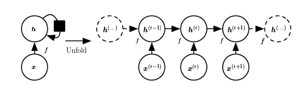
每次,狀態是當前輸入和先前隱含狀態的組合。這讓人聯想到自回歸模型,但是對於神經網路,我們必須在某種程度上停止依賴。
因為那是為了確定權重,我們會不斷計算輸入變化後我們的損失如何變化。現在,如果我們必須考慮的輸入在任意時間步無限地返回,那麼我們將無法計算所有這些梯度。然而,在實踐中,我們的隱含狀態將在每次迭代中通過固定數量的步驟繼續前進。
一旦我們載入並預處理數據,我們就會回過頭來。
設置、預處理與探索
所用的包
這裡是該教程所涉及到的包。
# Core Tidyverse
library(tidyverse)
library(glue)
library(forcats)

# Time Series
library(timetk)
library(tidyquant)
library(tibbletime)

# Visualization
library(cowplot)

# Preprocessing
library(recipes)

# Sampling / Accuracy
library(rsample)
library(yardstick)

# Modeling
library(keras)
library(tfruns)
如果你之前沒有在 R 中運行過 Keras,你需要用 install_keras() 函數安裝 Keras。
# Install Keras if you have not installed before
install_keras()
數據
數據集 sunspot.month 是一個 ts 類對象(非 tidy 類),所以我們將使用 timetk 中的 tk_tbl() 函數轉換為 tidy 數據集。我們使用這個函數而不是來自 tibble 的 as.tibble(),用來自動將時間序列索引保存為zoo yearmon 索引。最後,我們將使用 lubridate::as_date()(使用 tidyquant 時載入)將 zoo 索引轉換為日期,然後轉換為 tbl_time 對象以使時間序列操作起來更容易。
sun_spots <- datasets::sunspot.month %>%
    tk_tbl() %>%
    mutate(index = as_date(index)) %>%
    as_tbl_time(index = index)

sun_spots
# A time tibble: 3,177 x 2
# Index: index
index value
<date> <dbl>
1 1749-01-01 58
2 1749-02-01 62.6
3 1749-03-01 70
4 1749-04-01 55.7
5 1749-05-01 85
6 1749-06-01 83.5
7 1749-07-01 94.8
8 1749-08-01 66.3
9 1749-09-01 75.9
10 1749-10-01 75.5
# ... with 3,167 more rows探索性數據分析
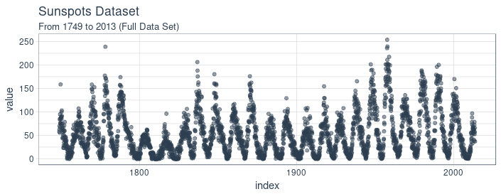
時間序列很長(有 265 年!)。我們可以將時間序列的全部(265 年)以及前 50 年的數據可視化,以獲得該時間系列的直觀感受。
使用 cowplot 可視化太陽黑子數據
我們將創建若幹 ggplot 對象並藉助 cowplot::plot_grid() 把這些對象組合起來。對於需要縮放的部分,我們使用 tibbletime::time_filter(),可以方便的實現基於時間的過濾。
p1 <- sun_spots %>%
    ggplot(aes(index, value)) +
    geom_point(
        color = palette_light()[[1]],
        alpha = 0.5) +
    theme_tq() +
    labs(
        title = "From 1749 to 2013 (Full Data Set)")

p2 <- sun_spots %>%
    filter_time("start" ~ "1800") %>%
    ggplot(aes(index, value)) +
    geom_line(
        color = palette_light()[[1]],
        alpha = 0.5) +
    geom_point(color = palette_light()[[1]]) +
    geom_smooth(
        method = "loess",
        span = 0.2, se = FALSE) +
    theme_tq() +
    labs(
        title = "1749 to 1759 (Zoomed In To Show Changes over the Year)",
        caption = "datasets::sunspot.month")

p_title <- ggdraw() +
    draw_label(
        "Sunspots", size = 18,
        fontface = "bold",
        colour = palette_light()[[1]])

plot_grid(
    p_title, p1, p2,
    ncol = 1, rel_heights = c(0.1, 1, 1))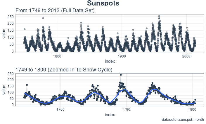
回測:時間序列交叉驗證
在序列數據上執行交叉驗證時,必須保留對以前時間樣本的時間依賴性。我們可以通過平移視窗的方式選擇連續子樣本,進而創建交叉驗證抽樣計劃。實質上,由於沒有未來測試數據,我們需要創造若幹人造“未來”數據來解決這個問題,在金融領域這通常被稱為“回測”。
之前的教程提到過,rsample 包包含回測功能。“Time Series Analysis Example”描述了一個使用 rolling_origin() 函數為時間序列交叉驗證創建樣本的過程。我們將使用這種方法。
開發一個回測策略
我們創建的抽樣計劃使用 100 年(initial = 12 x 100)的數據作為訓練集,50 年(assess = 12 x 50)的數據用於測試集。我們選擇大約 22 年的跳躍跨度(skip = 12 x 22 - 1),將樣本均勻分佈到 6 組中,跨越整個 265 年的太陽黑子歷史。最後,我們選擇 cumulative = FALSE 來允許平移起始點,這確保了較近期數據上的模型相較那些不太新近的數據沒有不公平的優勢(使用更多的觀測數據)。rolling_origin_resamples 是一個 tibble 型的返回值。
periods_train <- 12 * 100
periods_test  <- 12 * 50
skip_span     <- 12 * 22 - 1

rolling_origin_resamples <- rolling_origin(
    sun_spots,
    initial    = periods_train,
    assess     = periods_test,
    cumulative = FALSE,
    skip       = skip_span)

rolling_origin_resamples
# Rolling origin forecast resampling
# A tibble: 6 x 2
splits id
<list> <chr>
1 <S3: rsplit> Slice1
2 <S3: rsplit> Slice2
3 <S3: rsplit> Slice3
4 <S3: rsplit> Slice4
5 <S3: rsplit> Slice5
6 <S3: rsplit> Slice6可視化回測策略
我們可以用兩個自定義函數來可視化再抽樣。首先是 plot_split(),使用 ggplot2 繪製一個再抽樣分割圖。請註意,expand_y_axis 參數預設將日期範圍擴展成整個 sun_spots 數據集的日期範圍。當我們將所有的圖形同時可視化時,這將變得有用。
# Plotting function for a single split
plot_split <- function(split,
                       expand_y_axis = TRUE,
                       alpha = 1,
                       size = 1,
                       base_size = 14)
{

    # Manipulate data
    train_tbl <- training(split) %>%
        add_column(key = "training")

    test_tbl  <- testing(split) %>%
        add_column(key = "testing")

    data_manipulated <- bind_rows(
        train_tbl, test_tbl) %>%
        as_tbl_time(index = index) %>%
        mutate(
            key = fct_relevel(
                key, "training", "testing"))

    # Collect attributes
    train_time_summary <- train_tbl %>%
        tk_index() %>%
        tk_get_timeseries_summary()

    test_time_summary <- test_tbl %>%
        tk_index() %>%
        tk_get_timeseries_summary()

    # Visualize
    g <- data_manipulated %>%
        ggplot(
            aes(x = index, y = value, color = key)) +
        geom_line(size = size, alpha = alpha) +
        theme_tq(base_size = base_size) +
        scale_color_tq() +
        labs(
            title    = glue("Split: {split$id}"),
            subtitle = glue(
                "{train_time_summary$start} to {test_time_summary$end}"),
            y = "",
            x = "") +
        theme(legend.position = "none")

    if (expand_y_axis)
    {

        sun_spots_time_summary <- sun_spots %>%
            tk_index() %>%
            tk_get_timeseries_summary()

        g <- g +
            scale_x_date(
                limits = c(
                    sun_spots_time_summary$start,
                    sun_spots_time_summary$end))
    }

    return(g)
}
plot_split() 函數接受一個分割(在本例中為 Slice01),並可視化抽樣策略。我們使用 expand_y_axis = TRUE 將橫坐標範圍擴展到整個數據集的日期範圍。
rolling_origin_resamples$splits[[1]] %>%
    plot_split(expand_y_axis = TRUE) +
    theme(legend.position = "bottom")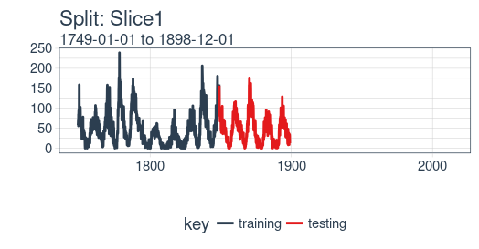
第二個函數是 plot_sampling_plan(),使用 purrr 和 cowplot 將 plot_split() 函數應用到所有樣本上。
# Plotting function that scales to all splits
plot_sampling_plan <- function(sampling_tbl,
                               expand_y_axis = TRUE,
                               ncol = 3,
                               alpha = 1,
                               size = 1,
                               base_size = 14,
                               title = "Sampling Plan")
{
    # Map plot_split() to sampling_tbl
    sampling_tbl_with_plots <- sampling_tbl %>%
        mutate(
            gg_plots = map(
                splits, plot_split,
                expand_y_axis = expand_y_axis,
                alpha = alpha, base_size = base_size))

    # Make plots with cowplot
    plot_list <- sampling_tbl_with_plots$gg_plots

    p_temp <- plot_list[[1]] +
        theme(legend.position = "bottom")
    legend <- get_legend(p_temp)

    p_body <- plot_grid(
        plotlist = plot_list, ncol = ncol)

    p_title <- ggdraw() +
        draw_label(
            title, size = 14,
            fontface = "bold",
            colour = palette_light()[[1]])

    g <- plot_grid(
        p_title, p_body,
        legend, ncol = 1,
        rel_heights = c(0.05, 1, 0.05))

    return(g)
}
現在我們可以使用 plot_sampling_plan() 可視化整個回測策略!我們可以看到抽樣計劃如何平移抽樣視窗逐漸切分出訓練和測試子樣本。
rolling_origin_resamples %>%
    plot_sampling_plan(
        expand_y_axis = T, ncol = 3,
        alpha = 1, size = 1, base_size = 10,
        title = "Backtesting Strategy: Rolling Origin Sampling Plan")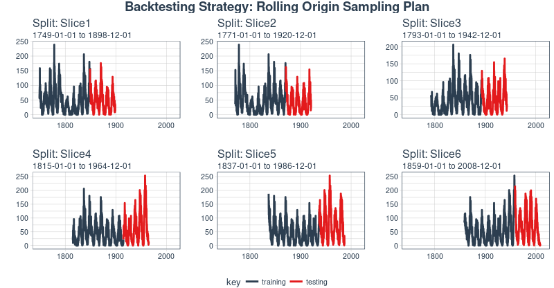
此外,我們可以讓 expand_y_axis = FALSE,對每個樣本進行縮放。
rolling_origin_resamples %>%
    plot_sampling_plan(
        expand_y_axis = F, ncol = 3,
        alpha = 1, size = 1, base_size = 10,
        title = "Backtesting Strategy: Zoomed In")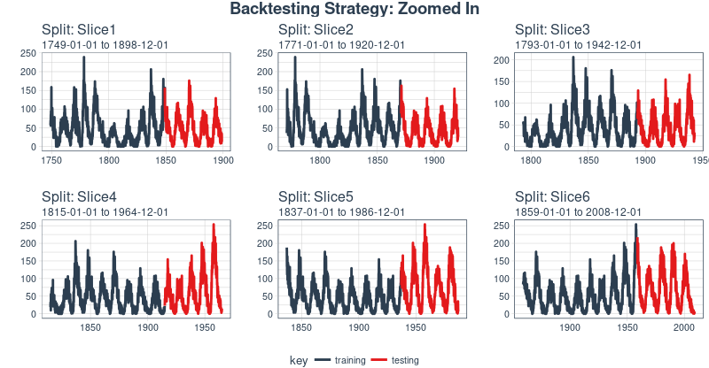
當在太陽黑子數據集上測試 LSTM 模型準確性時,我們將使用這種回測策略(來自一個時間序列的 6 個樣本,每個時間序列分為 100/50 兩部分,並且樣本之間有大約 22 年的偏移)。
LSTM 模型
首先,我們將在回測策略的某個樣本上用 Keras 開發一個狀態 LSTM 模型,通常是最近的一個。然後,我們將模型套用到所有樣本,以測試和驗證模型性能。
example_split    <- rolling_origin_resamples$splits[[6]]
example_split_id <- rolling_origin_resamples$id[[6]]
我麽可以用 plot_split() 函數可視化該分割,設定 expand_y_axis = FALSE 以便將橫坐標縮放到樣本本身的範圍。
plot_split(
    example_split,
    expand_y_axis = FALSE,
    size = 0.5) +
    theme(legend.position = "bottom") +
    ggtitle(glue("Split: {example_split_id}"))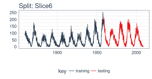
數據準備
為了幫助進行超參數調整,除了訓練集之外,我們還需要一個驗證集。例如,我們將使用一個回調函數 callback_early_stopping,當驗證集上沒有顯著的表現時,它會停止訓練(多少算顯著由你決定)。
我們將分析集的三分之二用於訓練,三分之一用於驗證。
df_trn <- analysis(example_split)[1:800, , drop = FALSE]
df_val <- analysis(example_split)[801:1200, , drop = FALSE]
df_tst <- assessment(example_split)
首先,我們將訓練和測試數據集合成一個數據集,並使用列 key 來標記它們來自哪個集合(training 或 testing)。請註意,tbl_time 對象需要在調用 bind_rows() 時重新指定索引,但是這個問題應該很快在 dplyr 包中得到糾正。
df <- bind_rows(
    df_trn %>% add_column(key = "training"),
    df_val %>% add_column(key = "validation"),
    df_tst %>% add_column(key = "testing")) %>%
    as_tbl_time(index = index)

df
# A time tibble: 1,800 x 3
# Index: index
index value key
<date> <dbl> <chr>
1 1849-06-01 81.1 training
2 1849-07-01 78 training
3 1849-08-01 67.7 training
4 1849-09-01 93.7 training
5 1849-10-01 71.5 training
6 1849-11-01 99 training
7 1849-12-01 97 training
8 1850-01-01 78 training
9 1850-02-01 89.4 training
10 1850-03-01 82.6 training
# ... with 1,790 more rows用 recipe 做數據預處理
LSTM 演算法通常要求輸入數據經過中心化並標度化。我們可以使用 recipe 包預處理數據。我們用 step_sqrt 來轉換數據以減少異常值的影響,再結合 step_center 和 step_scale 對數據進行中心化和標度化。最後,數據使用 bake() 函數實現處理轉換。
rec_obj <- recipe(
    value ~ ., df) %>%
    step_sqrt(value) %>%
    step_center(value) %>%
    step_scale(value) %>%
    prep()

df_processed_tbl <- bake(rec_obj, df)

df_processed_tbl
# A tibble: 1,800 x 3
index value key
<date> <dbl> <fct>
1 1849-06-01 0.714 training
2 1849-07-01 0.660 training
3 1849-08-01 0.473 training
4 1849-09-01 0.922 training
5 1849-10-01 0.544 training
6 1849-11-01 1.01 training
7 1849-12-01 0.974 training
8 1850-01-01 0.660 training
9 1850-02-01 0.852 training
10 1850-03-01 0.739 training
# ... with 1,790 more rows接著,記錄中心化和標度化的信息,以便在建模完成之後可以將數據逆向轉換回去。平方根轉換可以通過乘方運算逆轉回去,但要在逆轉中心化和標度化之後。
center_history <- rec_obj$steps[[2]]$means["value"]
scale_history  <- rec_obj$steps[[3]]$sds["value"]

c("center" = center_history, "scale" = scale_history)
center.value scale.value
6.694468 3.238935調整數據形狀
Keras LSTM 希望輸入和目標數據具有特定的形狀。輸入必須是 3 維數組,維度大小為 num_samples、num_timesteps、num_features。
這裡,num_samples 是集合中觀測的數量。這將以每份 batch_size 大小的分量分批提供給模型。第二個維度 num_timesteps 是我們上面討論的隱含狀態的長度。最後,第三個維度是我們正在使用的預測變數的數量。對於單變數時間序列,這是 1。
隱含狀態的長度應該選擇多少?這通常取決於數據集和我們的目標。如果我們提前一步預測,即僅預測下個月,我們主要關註的是選擇一個狀態長度,以便學習數據中存在的任何模式。
現在說我們想要預測 12 個月的數據,就像 SILSO(世界數據中心,用於生產、保存和傳播國際太陽黑子觀測)所做的。我們通過 Keras 實現這一目標的方法是使 LSTM 隱藏狀態與後續輸出有相同的長度。因此,如果我們想要產生 12 個月的預測,我們的 LSTM 隱藏狀態長度應該是 12。(譯註:原始數據的周期大約是 10 到 11 年,使用相鄰兩年的數據不能涵蓋一個完整的周期,致使模型無法學習到和周期有關的模式,最終表現可能不佳。)
然後使用 time_distributed() 包裝器將這 12 個時間步連接到 12 個線性預測器單元。該包裝器的任務是將相同的計算(即,相同的權重矩陣)應用於它接收的每個狀態輸入。
目標數組的格式應該是什麼?由於我們在這裡預測了幾個時間步,目標數據也需要是 3 維的。維度 1 同樣是批量維度,維度 2 同樣對應於時間步(被預測的),維度 3 是包裝層的大小。在我們的例子中,包裝層是單個單元的 layer_dense(),因為我們希望每個時間點只有一個預測。
所以,讓我們調整數據形狀。這裡的主要動作是用滑動視窗創建長度 12 的輸入,後續 12 個觀測作為輸出。舉個更簡單的例子,假設我們的輸入是從 1 到 10 的數字,我們選擇的序列長度(狀態大小)是 4,下麵就是我們希望我們的訓練輸入看起來的樣子:
1,2,3,4
2,3,4,5
3,4,5,6
相應的目標數據:
5,6,7,8
6,7,8,9
7,8,9,10
我們將定義一個簡短的函數,對給定的數據集進行調整。最後,我們形式上添加了需要的第三個維度(即使在我們的例子中該維度的大小為 1)。
# these variables are being defined just because of the order in which
# we present things in this post (first the data, then the model)
# they will be superseded by FLAGS$n_timesteps, FLAGS$batch_size and n_predictions
# in the following snippet
n_timesteps <- 12
n_predictions <- n_timesteps
batch_size <- 10

# functions used
build_matrix <- function(tseries,
                         overall_timesteps)
{
    t(sapply(
        1:(length(tseries) - overall_timesteps + 1),
        function(x) tseries[x:(x + overall_timesteps - 1)]))
}

reshape_X_3d <- function(X)
{
    dim(X) <- c(dim(X)[1], dim(X)[2], 1)
    X
}

# extract values from data frame
train_vals <- df_processed_tbl %>%
    filter(key == "training") %>%
    select(value) %>%
    pull()
valid_vals <- df_processed_tbl %>%
    filter(key == "validation") %>%
    select(value) %>%
    pull()
test_vals <- df_processed_tbl %>%
    filter(key == "testing") %>%
    select(value) %>%
    pull()

# build the windowed matrices
train_matrix <- build_matrix(
    train_vals, n_timesteps + n_predictions)
valid_matrix <- build_matrix(
    valid_vals, n_timesteps + n_predictions)
test_matrix <- build_matrix(
    test_vals, n_timesteps + n_predictions)

# separate matrices into training and testing parts
# also, discard last batch if there are fewer than batch_size samples
# (a purely technical requirement)
X_train <- train_matrix[, 1:n_timesteps]
y_train <- train_matrix[, (n_timesteps + 1):(n_timesteps * 2)]
X_train <- X_train[1:(nrow(X_train) %/% batch_size * batch_size), ]
y_train <- y_train[1:(nrow(y_train) %/% batch_size * batch_size), ]

X_valid <- valid_matrix[, 1:n_timesteps]
y_valid <- valid_matrix[, (n_timesteps + 1):(n_timesteps * 2)]
X_valid <- X_valid[1:(nrow(X_valid) %/% batch_size * batch_size), ]
y_valid <- y_valid[1:(nrow(y_valid) %/% batch_size * batch_size), ]

X_test <- test_matrix[, 1:n_timesteps]
y_test <- test_matrix[, (n_timesteps + 1):(n_timesteps * 2)]
X_test <- X_test[1:(nrow(X_test) %/% batch_size * batch_size), ]
y_test <- y_test[1:(nrow(y_test) %/% batch_size * batch_size), ]
# add on the required third axis
X_train <- reshape_X_3d(X_train)
X_valid <- reshape_X_3d(X_valid)
X_test <- reshape_X_3d(X_test)

y_train <- reshape_X_3d(y_train)
y_valid <- reshape_X_3d(y_valid)
y_test <- reshape_X_3d(y_test)
構建 LSTM 模型
現在我們的數據具有了所需的形式,讓我們構建最終模型。與深度學習一樣,一項重要且經常耗時的工作是調整超參數。為了使這篇文章保持獨立,並且考慮到這主要是關於如何在 R 中使用 LSTM 的教程,讓我們假設在經過大量實驗後發現了以下設置(實際上實驗確實發生了,但沒有達到最佳的表現)。
我們沒有硬編碼超參數,而是使用 tfruns 設置了一個環境,在環境中可以輕鬆地實現網格搜索。
我們會註釋這些參數的作用,但具體含義留到以後再解釋。
FLAGS <- flags(
    # There is a so-called "stateful LSTM" in Keras. While LSTM is stateful per se,
    # this adds a further tweak where the hidden states get initialized with values
    # from the item at same position in the previous batch.
    # This is helpful just under specific circumstances, or if you want to create an
    # "infinite stream" of states, in which case you'd use 1 as the batch size.
    # Below, we show how the code would have to be changed to use this, but it won't be further
    # discussed here.
    flag_boolean("stateful", FALSE),
    # Should we use several layers of LSTM?
    # Again, just included for completeness, it did not yield any superior performance on this task.
    # This will actually stack exactly one additional layer of LSTM units.
    flag_boolean("stack_layers", FALSE),
    # number of samples fed to the model in one go
    flag_integer("batch_size", 10),
    # size of the hidden state, equals size of predictions
    flag_integer("n_timesteps", 12),
    # how many epochs to train for
    flag_integer("n_epochs", 100),
    # fraction of the units to drop for the linear transformation of the inputs
    flag_numeric("dropout", 0.2),
    # fraction of the units to drop for the linear transformation of the recurrent state
    flag_numeric("recurrent_dropout", 0.2),
    # loss function. Found to work better for this specific case than mean squared error
    flag_string("loss", "logcosh"),
    # optimizer = stochastic gradient descent. Seemed to work better than adam or rmsprop here
    # (as indicated by limited testing)
    flag_string("optimizer_type", "sgd"),
    # size of the LSTM layer
    flag_integer("n_units", 128),
    # learning rate
    flag_numeric("lr", 0.003),
    # momentum, an additional parameter to the SGD optimizer
    flag_numeric("momentum", 0.9),
    # parameter to the early stopping callback
    flag_integer("patience", 10))

# the number of predictions we'll make equals the length of the hidden state
n_predictions <- FLAGS$n_timesteps
# how many features = predictors we have
n_features <- 1
# just in case we wanted to try different optimizers, we could add here
optimizer <- switch(
    FLAGS$optimizer_type,
    sgd = optimizer_sgd(
        lr = FLAGS$lr,
        momentum = FLAGS$momentum))

# callbacks to be passed to the fit() function
# We just use one here: we may stop before n_epochs if the loss on the validation set
# does not decrease (by a configurable amount, over a configurable time)
callbacks <- list(
    callback_early_stopping(
        patience = FLAGS$patience))
經過所有這些準備工作,構建和訓練模型的代碼就相當簡短!讓我們首先快速查看“長版本”,這將允許你測試堆疊多個 LSTM 或使用狀態 LSTM,然後通過最終的短版本(兩者都不做)並對其進行評論。
完整的代碼,僅供參考。
model <- keras_model_sequential()

model %>%
    layer_lstm(
        units = FLAGS$n_units,
        batch_input_shape  = c(
            FLAGS$batch_size,
            FLAGS$n_timesteps,
            n_features),
        dropout = FLAGS$dropout,
        recurrent_dropout = FLAGS$recurrent_dropout,
        return_sequences = TRUE,
        stateful = FLAGS$stateful)

if (FLAGS$stack_layers)
{
    model %>%
        layer_lstm(
            units             = FLAGS$n_units,
            dropout           = FLAGS$dropout,
            recurrent_dropout = FLAGS$recurrent_dropout,
            return_sequences  = TRUE,
            stateful          = FLAGS$stateful)
}

model %>% time_distributed(
    layer_dense(units = 1))

model %>%
    compile(
        loss      = FLAGS$loss,
        optimizer = optimizer,
        metrics   = list("mean_squared_error"))

if (!FLAGS$stateful) {
    model %>% fit(
        x          = X_train,
        y          = y_train,
        validation_data = list(X_valid, y_valid),
        batch_size = FLAGS$batch_size,
        epochs     = FLAGS$n_epochs,
        callbacks  = callbacks)

} else
{
    for (i in 1:FLAGS$n_epochs)
    {
        model %>% fit(
            x          = X_train,
            y          = y_train,
            validation_data = list(X_valid, y_valid),
            callbacks  = callbacks,
            batch_size = FLAGS$batch_size,
            epochs     = 1,
            shuffle    = FALSE)
        model %>% reset_states()
    }
}

if (FLAGS$stateful)
    model %>% reset_states()
現在讓我們逐步完成下麵更簡單但更好(或同樣)的配置。
# create the model
model <- keras_model_sequential()

# add layers
# we have just two, the LSTM and the time_distributed
model %>%
    layer_lstm(
        units = FLAGS$n_units,
        # the first layer in a model needs to know the shape of the input data
        batch_input_shape  = c(
            FLAGS$batch_size, FLAGS$n_timesteps, n_features),
        dropout = FLAGS$dropout,
        recurrent_dropout = FLAGS$recurrent_dropout,
        # by default, an LSTM just returns the final state
        return_sequences = TRUE) %>%
    time_distributed(layer_dense(units = 1))

model %>%
    compile(
        loss = FLAGS$loss,
        optimizer = optimizer,
        # in addition to the loss, Keras will inform us about current MSE while training
        metrics = list("mean_squared_error"))

history <- model %>% fit(
    x          = X_train,
    y          = y_train,
    validation_data = list(X_valid, y_valid),
    batch_size = FLAGS$batch_size,
    epochs     = FLAGS$n_epochs,
    callbacks  = callbacks)
正如我們所見,訓練在約 55 個周期後停止,因為驗證集損失不再減少。我們還發現驗證集上的表現比訓練集上的性能差——通常表明過度擬合。
這個話題,我們將在另一個時間單獨討論,但有趣的是,使用更高 dropout 和 recurrent_dropout(與增加的模型容量相結合)的正則化並沒有產生更好的泛化表現。這可能與我們在介紹中提到的這個特定時間序列的特征有關。
plot(history, metrics = "loss")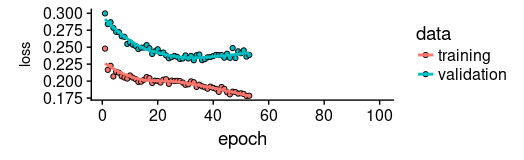
現在讓我們看看該模型捕捉訓練集特征的效果如何。
pred_train <- model %>%
    predict(
        X_train,
        batch_size = FLAGS$batch_size) %>%
    .[, , 1]

# Retransform values to original scale
pred_train <- (pred_train * scale_history + center_history) ^2
compare_train <- df %>%
    filter(key == "training")

# build a dataframe that has both actual and predicted values
for (i in 1:nrow(pred_train))
{
    varname <- paste0("pred_train", i)
    compare_train <- mutate(
        compare_train,
        !!varname := c(
            rep(NA, FLAGS$n_timesteps + i - 1),
            pred_train[i,],
            rep(NA,
                nrow(compare_train) - FLAGS$n_timesteps * 2 - i + 1)))
}
我們計算所有預測序列的平均 RSME。
coln <- colnames(compare_train)[4:ncol(compare_train)]
cols <- map(coln, quo(sym(.)))
rsme_train <- map_dbl(
    cols,
    function(col)
    {
        rmse(
            compare_train,
            truth = value,
            estimate = !!col,
            na.rm = TRUE)
    }) %>%
    mean()

rsme_train21.01495這些預測看起來如何?由於所有預測序列的可視化看起來會非常擁擠,我們會間隔地選擇起始點。
ggplot(
    compare_train,
    aes(x = index, y = value)) +
    geom_line() +
    geom_line(aes(y = pred_train1), color = "cyan") +
    geom_line(aes(y = pred_train50), color = "red") +
    geom_line(aes(y = pred_train100), color = "green") +
    geom_line(aes(y = pred_train150), color = "violet") +
    geom_line(aes(y = pred_train200), color = "cyan") +
    geom_line(aes(y = pred_train250), color = "red") +
    geom_line(aes(y = pred_train300), color = "red") +
    geom_line(aes(y = pred_train350), color = "green") +
    geom_line(aes(y = pred_train400), color = "cyan") +
    geom_line(aes(y = pred_train450), color = "red") +
    geom_line(aes(y = pred_train500), color = "green") +
    geom_line(aes(y = pred_train550), color = "violet") +
    geom_line(aes(y = pred_train600), color = "cyan") +
    geom_line(aes(y = pred_train650), color = "red") +
    geom_line(aes(y = pred_train700), color = "red") +
    geom_line(aes(y = pred_train750), color = "green") +
    ggtitle("Predictions on the training set")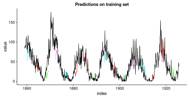
看起來像當好。對於驗證集,我們並不認為有同樣好的結果。
pred_test <- model %>%
    predict(
        X_test,
        batch_size = FLAGS$batch_size) %>%
    .[, , 1]

# Retransform values to original scale
pred_test <- (pred_test * scale_history + center_history) ^2
pred_test[1:10, 1:5] %>% print()
compare_test <- df %>% filter(key == "testing")

# build a dataframe that has both actual and predicted values
for (i in 1:nrow(pred_test))
{
    varname <- paste0("pred_test", i)
    compare_test <-mutate(
        compare_test,
        !!varname := c(
            rep(NA, FLAGS$n_timesteps + i - 1),
            pred_test[i,],
            rep(NA,
                nrow(compare_test) - FLAGS$n_timesteps * 2 - i + 1)))
}

compare_test %>% write_csv(
    str_replace(model_path, ".hdf5", ".test.csv"))
compare_test[FLAGS$n_timesteps:(FLAGS$n_timesteps + 10), c(2, 4:8)] %>%
    print()

coln <- colnames(compare_test)[4:ncol(compare_test)]
cols <- map(coln, quo(sym(.)))
rsme_test <- map_dbl(
    cols,
    function(col)
    {
        rmse(
            compare_test,
            truth = value,
            estimate = !!col,
            na.rm = TRUE)
    }) %>%
    mean()

rsme_test31.31616ggplot(
compare_test,
aes(x = index, y = value)) +
geom_line() +
geom_line(aes(y = pred_test1), color = "cyan") +
geom_line(aes(y = pred_test50), color = "red") +
geom_line(aes(y = pred_test100), color = "green") +
geom_line(aes(y = pred_test150), color = "violet") +
geom_line(aes(y = pred_test200), color = "cyan") +
geom_line(aes(y = pred_test250), color = "red") +
geom_line(aes(y = pred_test300), color = "green") +
geom_line(aes(y = pred_test350), color = "cyan") +
geom_line(aes(y = pred_test400), color = "red") +
geom_line(aes(y = pred_test450), color = "green") +
geom_line(aes(y = pred_test500), color = "cyan") +
geom_line(aes(y = pred_test550), color = "violet") +
ggtitle("Predictions on test set")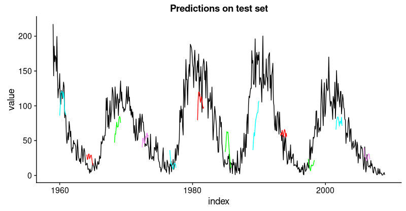
這不如訓練集那麼好,但也不錯,因為這個時間序列非常具有挑戰性。
在手動選擇的示例分割中定義並運行我們的模型後,讓我們現在回到我們的整體重新抽樣框架。
在所有分割上回測模型
為了獲得所有分割的預測,我們將上面的代碼移動到一個函數中並將其應用於所有分割。它返回包含兩個數據框的列表,分別對應訓練和測試集,每個數據框包含模型的預測以及實際值。
obtain_predictions <- function(split)
{
    df_trn <- analysis(split)[1:800, , drop = FALSE]
    df_val <- analysis(split)[801:1200, , drop = FALSE]
    df_tst <- assessment(split)

    df <- bind_rows(
        df_trn %>% add_column(key = "training"),
        df_val %>% add_column(key = "validation"),
        df_tst %>% add_column(key = "testing")) %>%
        as_tbl_time(index = index)

    rec_obj <- recipe(
        value ~ ., df) %>%
        step_sqrt(value) %>%
        step_center(value) %>%
        step_scale(value) %>%
        prep()

    df_processed_tbl <- bake(rec_obj, df)

    center_history <- rec_obj$steps[[2]]$means["value"]
    scale_history  <- rec_obj$steps[[3]]$sds["value"]

    FLAGS <- flags(
        flag_boolean("stateful", FALSE),
        flag_boolean("stack_layers", FALSE),
        flag_integer("batch_size", 10),
        flag_integer("n_timesteps", 12),
        flag_integer("n_epochs", 100),
        flag_numeric("dropout", 0.2),
        flag_numeric("recurrent_dropout", 0.2),
        flag_string("loss", "logcosh"),
        flag_string("optimizer_type", "sgd"),
        flag_integer("n_units", 128),
        flag_numeric("lr", 0.003),
        flag_numeric("momentum", 0.9),
        flag_integer("patience", 10))

    n_predictions <- FLAGS$n_timesteps
    n_features <- 1

    optimizer <- switch(
        FLAGS$optimizer_type,
        sgd = optimizer_sgd(
            lr = FLAGS$lr, momentum = FLAGS$momentum))
    callbacks <- list(
        callback_early_stopping(patience = FLAGS$patience))

    train_vals <- df_processed_tbl %>%
        filter(key == "training") %>%
        select(value) %>%
        pull()
    valid_vals <- df_processed_tbl %>%
        filter(key == "validation") %>%
        select(value) %>%
        pull()
    test_vals <- df_processed_tbl %>%
        filter(key == "testing") %>%
        select(value) %>%
        pull()

    train_matrix <- build_matrix(
        train_vals, FLAGS$n_timesteps + n_predictions)
    valid_matrix <- build_matrix(
        valid_vals, FLAGS$n_timesteps + n_predictions)
    test_matrix <- build_matrix(
        test_vals, FLAGS$n_timesteps + n_predictions)

    X_train <- train_matrix[, 1:FLAGS$n_timesteps]
    y_train <- train_matrix[, (FLAGS$n_timesteps + 1):(FLAGS$n_timesteps * 2)]
    X_train <- X_train[1:(nrow(X_train) %/% FLAGS$batch_size * FLAGS$batch_size),]
    y_train <- y_train[1:(nrow(y_train) %/% FLAGS$batch_size * FLAGS$batch_size),]

    X_valid <- valid_matrix[, 1:FLAGS$n_timesteps]
    y_valid <- valid_matrix[, (FLAGS$n_timesteps + 1):(FLAGS$n_timesteps * 2)]
    X_valid <- X_valid[1:(nrow(X_valid) %/% FLAGS$batch_size * FLAGS$batch_size),]
    y_valid <- y_valid[1:(nrow(y_valid) %/% FLAGS$batch_size * FLAGS$batch_size),]

    X_test <- test_matrix[, 1:FLAGS$n_timesteps]
    y_test <- test_matrix[, (FLAGS$n_timesteps + 1):(FLAGS$n_timesteps * 2)]
    X_test <- X_test[1:(nrow(X_test) %/% FLAGS$batch_size * FLAGS$batch_size),]
    y_test <- y_test[1:(nrow(y_test) %/% FLAGS$batch_size * FLAGS$batch_size),]

    X_train <- reshape_X_3d(X_train)
    X_valid <- reshape_X_3d(X_valid)
    X_test <- reshape_X_3d(X_test)

    y_train <- reshape_X_3d(y_train)
    y_valid <- reshape_X_3d(y_valid)
    y_test <- reshape_X_3d(y_test)

    model <- keras_model_sequential()

    model %>%
        layer_lstm(
            units              = FLAGS$n_units,
            batch_input_shape  = c(
                FLAGS$batch_size, FLAGS$n_timesteps, n_features),
            dropout            = FLAGS$dropout,
            recurrent_dropout  = FLAGS$recurrent_dropout,
            return_sequences   = TRUE) %>%
        time_distributed(layer_dense(units = 1))

    model %>%
        compile(
            loss = FLAGS$loss,
            optimizer = optimizer,
            metrics = list("mean_squared_error"))

    model %>% fit(
        x          = X_train,
        y          = y_train,
        validation_data = list(X_valid, y_valid),
        batch_size = FLAGS$batch_size,
        epochs     = FLAGS$n_epochs,
        callbacks  = callbacks)

    pred_train <- model %>%
        predict(
            X_train,
            batch_size = FLAGS$batch_size) %>%
        .[, , 1]

    # Retransform values
    pred_train <- (pred_train * scale_history + center_history) ^ 2
    compare_train <- df %>% filter(key == "training")

    for (i in 1:nrow(pred_train))
    {
        varname <- paste0("pred_train", i)
        compare_train <- mutate(
            compare_train,
            !!varname := c(
                rep(NA, FLAGS$n_timesteps + i - 1),
                pred_train[i, ],
                rep(NA,
                    nrow(compare_train) - FLAGS$n_timesteps * 2 - i + 1)))
    }

    pred_test <- model %>%
        predict(
            X_test,
            batch_size = FLAGS$batch_size) %>%
        .[, , 1]

    # Retransform values
    pred_test <- (pred_test * scale_history + center_history) ^ 2
    compare_test <- df %>% filter(key == "testing")

    for (i in 1:nrow(pred_test))
    {
        varname <- paste0("pred_test", i)
        compare_test <- mutate(
            compare_test,
            !!varname := c(
                rep(NA, FLAGS$n_timesteps + i - 1),
                pred_test[i, ],
                rep(NA,
                    nrow(compare_test) - FLAGS$n_timesteps * 2 - i + 1)))
    }

    list(
        train = compare_train,
        test = compare_test)
}
將函數應用到所有分割上,得到一系列預測。
all_split_preds <- rolling_origin_resamples %>%
     mutate(predict = map(splits, obtain_predictions))
計算所有分割的 RMSE:
calc_rmse <- function(df)
{
    coln <- colnames(df)[4:ncol(df)]
    cols <- map(coln, quo(sym(.)))
    map_dbl(
        cols,
        function(col)
        {
            rmse(
                df, truth = value,
                estimate = !!col, na.rm = TRUE)
        }) %>%
        mean()
}

all_split_preds <- all_split_preds %>% unnest(predict)
all_split_preds_train <- all_split_preds[seq(1, 11, by = 2), ]
all_split_preds_test <- all_split_preds[seq(2, 12, by = 2), ]

all_split_rmses_train <- all_split_preds_train %>%
    mutate(rmse = map_dbl(predict, calc_rmse)) %>%
    select(id, rmse)

all_split_rmses_test <- all_split_preds_test %>%
    mutate(rmse = map_dbl(predict, calc_rmse)) %>%
    select(id, rmse)
這是 6 個分割的 RMSE。
all_split_rmses_train# A tibble: 6 x 2
id rmse
<chr> <dbl>
1 Slice1 22.2
2 Slice2 20.9
3 Slice3 18.8
4 Slice4 23.5
5 Slice5 22.1
6 Slice6 21.1all_split_rmses_test# A tibble: 6 x 2
id rmse
<chr> <dbl>
1 Slice1 21.6
2 Slice2 20.6
3 Slice3 21.3
4 Slice4 31.4
5 Slice5 35.2
6 Slice6 31.4在這些數字中,我們看到了一些有趣的東西:時間序列的前三個分割上的泛化表現比後者更好。這證實了我們的印象,如上所述,數據似乎有一些隱藏的變化發展,這使預測更加困難。
這裡是相應訓練和測試集的預測可視化。
首先,訓練集:
plot_train <- function(slice,
                       name)
{
    ggplot(
        slice,
        aes(x = index, y = value)) +
        geom_line() +
        geom_line(aes(y = pred_train1), color = "cyan") +
        geom_line(aes(y = pred_train50), color = "red") +
        geom_line(aes(y = pred_train100), color = "green") +
        geom_line(aes(y = pred_train150), color = "violet") +
        geom_line(aes(y = pred_train200), color = "cyan") +
        geom_line(aes(y = pred_train250), color = "red") +
        geom_line(aes(y = pred_train300), color = "red") +
        geom_line(aes(y = pred_train350), color = "green") +
        geom_line(aes(y = pred_train400), color = "cyan") +
        geom_line(aes(y = pred_train450), color = "red") +
        geom_line(aes(y = pred_train500), color = "green") +
        geom_line(aes(y = pred_train550), color = "violet") +
        geom_line(aes(y = pred_train600), color = "cyan") +
        geom_line(aes(y = pred_train650), color = "red") +
        geom_line(aes(y = pred_train700), color = "red") +
        geom_line(aes(y = pred_train750), color = "green") +
        ggtitle(name)
}

train_plots <- map2(
    all_split_preds_train$predict,
    all_split_preds_train$id, plot_train)
p_body_train  <- plot_grid(
    plotlist = train_plots, ncol = 3)
p_title_train <- ggdraw() +
    draw_label(
        "Backtested Predictions: Training Sets",
        size = 18, fontface = "bold")

plot_grid(
    p_title_train, p_body_train,
    ncol = 1,
    rel_heights = c(0.05, 1, 0.05))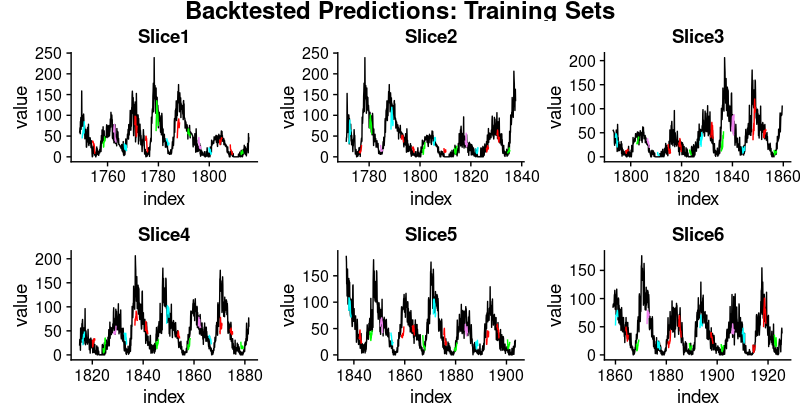
接著是測試集:
plot_test <- function(slice,
                      name)
{
    ggplot(
        slice, aes(x = index, y = value)) +
        geom_line() +
        geom_line(aes(y = pred_test1), color = "cyan") +
        geom_line(aes(y = pred_test50), color = "red") +
        geom_line(aes(y = pred_test100), color = "green") +
        geom_line(aes(y = pred_test150), color = "violet") +
        geom_line(aes(y = pred_test200), color = "cyan") +
        geom_line(aes(y = pred_test250), color = "red") +
        geom_line(aes(y = pred_test300), color = "green") +
        geom_line(aes(y = pred_test350), color = "cyan") +
        geom_line(aes(y = pred_test400), color = "red") +
        geom_line(aes(y = pred_test450), color = "green") +
        geom_line(aes(y = pred_test500), color = "cyan") +
        geom_line(aes(y = pred_test550), color = "violet") +
        ggtitle(name)
}

test_plots <- map2(
    all_split_preds_test$predict,
    all_split_preds_test$id, plot_test)

p_body_test  <- plot_grid(
    plotlist = test_plots, ncol = 3)
p_title_test <- ggdraw() +
    draw_label(
        "Backtested Predictions: Test Sets",
        size = 18, fontface = "bold")

plot_grid(
    p_title_test, p_body_test,
    ncol = 1, rel_heights = c(0.05, 1, 0.05))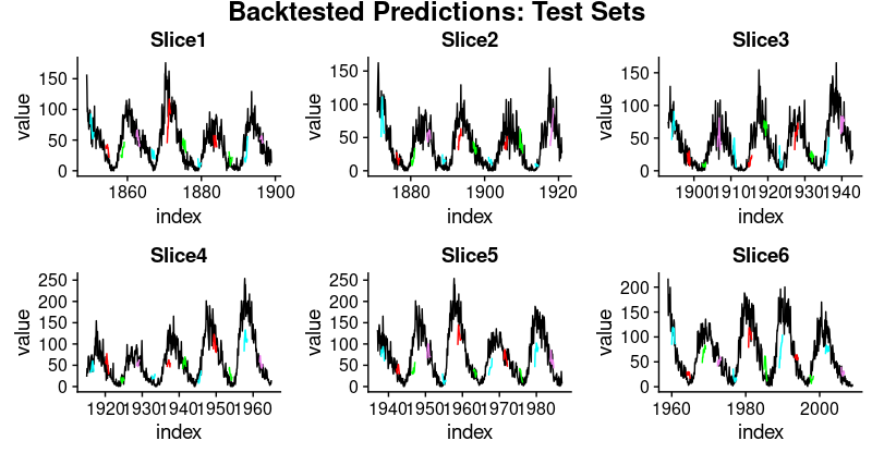
這是一個很長的帖子,必然會留下很多問題,首先是我們如何獲得好的超參數設置(學習率、周期數、dropout)? 我們如何選擇隱含狀態的長度?或者甚至,我們能否直觀瞭解 LSTM 在給定數據集上的表現(具有其特定特征)?我們將在未來的文章中解決上述問題。