一 寫在開頭1.1 寫在開頭微軟是一家偉大的公司。評價一門技術的好壞得看具體的需求,沒有哪門技術是面面俱到地好,應該拋棄對微軟和微軟的技術的偏見。 1.2 本文內容本文主要內容為WPF中的常用佈局,大部分內容轉載至https://blog.csdn.net/woshisunjiale/article ...
一 寫在開頭
1.1 寫在開頭
微軟是一家偉大的公司。評價一門技術的好壞得看具體的需求,沒有哪門技術是面面俱到地好,應該拋棄對微軟和微軟的技術的偏見。
1.2 本文內容
本文主要內容為WPF中的常用佈局,大部分內容轉載至https://blog.csdn.net/woshisunjiale/article/details/54136323,代碼片段可能有所不同。
二 WPF中的常用佈局
因為項目需要,所以得學習WPF開發。WPF使軟體界面和邏輯相分離,手寫xaml進行程式UI的開發是件很愜意的事情。從這點來說WPF要比Qt和GTK+要好。當然了,如果其能跨平臺甚至開源那就更好了。但是,商業有商業自身的規律。
2.1 Canvas佈局
Canvas是一個類似於坐標系的面板,所有的元素通過設置坐標來決定其在坐標系中的位置。具體表現為使用Left、Top、Right、 Bottom附加屬性在Canvas中定位控制項。
 1 <Window x:Class="WPF_Layout.MainWindow"
 2 xmlns="http://schemas.microsoft.com/winfx/2006/xaml/presentation"
 3 xmlns:x="http://schemas.microsoft.com/winfx/2006/xaml"
 4 Title="WPF-Layout" Height="350" Width="525">
 5 <Grid>
 6 <Canvas>
 7 <Button Canvas.Left="50" Canvas.Top="50" Content="Button 1"></Button>
 8 <Button Canvas.Right="50" Canvas.Top="50" Content="Button 2"></Button>
 9 <Button Canvas.Left="50" Canvas.Bottom="50" Content="Button 3"></Button>
10 <Button Canvas.Right="50" Canvas.Bottom="50" Content="Button 4"></Button>
11 </Canvas>
12 </Grid>
13 </Window>
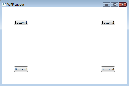
註意:如果同時設置 Canvas.Left="50"Canvas.Right="50",則以Canvas.Left="50"為準。如果同時設置Canvas.Top="50" Canvas.Bottom="50",則以Canvas.Top ="50"為準。(別這麼喪心病狂地同時寫Left和Right,請遵循基本的編程邏輯)
2.2 StackPanel佈局
StackPanel將控制項按照行或列來順序排列,但不會換行。通過設置面板的Orientation屬性設置了兩種排列方式:橫排(Horizontal預設的)和豎排(Vertical),預設為豎排(Vertical)。
 1 <Window x:Class="WPF_Layout.MainWindow"
 2 xmlns="http://schemas.microsoft.com/winfx/2006/xaml/presentation"
 3 xmlns:x="http://schemas.microsoft.com/winfx/2006/xaml"
 4 Title="WPF-Layout" Height="350" Width="525">
 5 <Grid>
 6 <StackPanel Name="stackpanel1" Orientation="Horizontal">
 7 <Button Content="Button1"></Button>
 8 <Button Content="Button2"></Button>
 9 <Button Content="Button3"></Button>
10 </StackPanel>
11 <StackPanel Name="stackpanel2" Orientation="Vertical">
12 <Button Content="Button4"></Button>
13 <Button Content="Button5"></Button>
14 <Button Content="Button6"></Button>
15 </StackPanel>
16 <StackPanel Name="stackpanel3" Orientation="Horizontal" FlowDirection="RightToLeft">
17 <Button Content="Button7"></Button>
18 <Button Content="Button8"></Button>
19 <Button Content="Button9"></Button>
20 </StackPanel>
21 </Grid>
22 </Window>
註意:Orientation="Horizontal"時,設置FlowDirection屬性為RightToLeft,,則元素將從右向左排列。
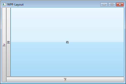
2.3 DockPanel佈局
DockPanel支持讓元素簡單地停靠在整個面板的某一條邊上,然後拉伸元素以填滿全部寬度或高度。它也支持讓一個元素填充其他已停靠元素沒有占用的剩餘空間。
DockPanel有一個Dock附加屬性,因此子元素用4個值來控制她們的停靠:Left、Top、Right、Bottom。Dock沒有Fill值。作為替代,最後的子元素將加入一個DockPanel並填滿所有剩餘的空間,除非DockPanel的LastChildFill屬性為false,它將朝某個方向停靠。
 1 <Window x:Class="WPF_Layout.MainWindow"
 2         xmlns="http://schemas.microsoft.com/winfx/2006/xaml/presentation"
 3         xmlns:x="http://schemas.microsoft.com/winfx/2006/xaml"
 4         Title="WPF-Layout" Height="350" Width="525">
 5     <Grid>
 6         <DockPanel>
 7             <Button Content="上" DockPanel.Dock="Left"></Button>
 8             <Button Content="下" DockPanel.Dock="Bottom"></Button>
 9             <Button Content="左" DockPanel.Dock="Left"></Button>
10             <Button Content="右" DockPanel.Dock="Right"></Button>
11         </DockPanel>
12     </Grid>
13 </Window>
設置LastChildFill屬性為false
 1 <Window x:Class="WPF_Layout.MainWindow"
 2         xmlns="http://schemas.microsoft.com/winfx/2006/xaml/presentation"
 3         xmlns:x="http://schemas.microsoft.com/winfx/2006/xaml"
 4         Title="WPF-Layout" Height="350" Width="525">
 5     <Grid>
 6         <DockPanel LastChildFill="False">
 7             <Button Content="上" DockPanel.Dock="Left"></Button>
 8             <Button Content="下" DockPanel.Dock="Bottom"></Button>
 9             <Button Content="左" DockPanel.Dock="Left"></Button>
10             <Button Content="右" DockPanel.Dock="Right"></Button>
11         </DockPanel>
12     </Grid>
13 </Window>

2.4 WrapPanel佈局
WrapPanel佈局面板將各個控制項按照一定方向羅列,當長度或高度不夠時自動調整進行換行換列。
Orientation="Horizontal"時各控制項從左至右羅列,當面板長度不夠時,子控制項就會自動換行,繼續按照從左至右的順序排列。
Orientation="Vertical"時各控制項從上至下羅列,當面板高度不夠時,子控制項就會自動換列,繼續按照從上至下的順序排列。
 1 <Window x:Class="WPF_Layout.MainWindow"
 2         xmlns="http://schemas.microsoft.com/winfx/2006/xaml/presentation"
 3         xmlns:x="http://schemas.microsoft.com/winfx/2006/xaml"
 4         Title="WPF-Layout" Height="350" Width="525">
 5     <Grid>
 6         <WrapPanel Orientation="Horizontal">
 7             <Button Content="Button 150" Width="150"></Button>
 8             <Button Content="Button 200" Width="200"></Button>
 9             <Button Content="Button 150" Width="150"></Button>
10             <Button Content="Button 200" Width="200"></Button>
11             <Button Content="Button 150" Width="150"></Button>
12             <Button Content="Button 200" Width="200"></Button>
13             <Button Content="Button 150" Width="150"></Button>
14         </WrapPanel>
15     </Grid>
16 </Window>

2.5 Grid佈局
Grid允許我們通過自定義行列來進行佈局,這類似於表格.通過定義Grid的RowDifinitions和ColumnDifinitions來實現對於表格行和列的定義,元素根據附加屬性Grid.Row和Grid.Column確定自己的位置。
1)Grid的列寬與行高可採用固定、自動、按比列三種方式定義
第一種,固定長度——值為一個確定的數字
第二種,自動長度——值為Auto,實際作用就是取實際控制項所需的最小值
第三種,比例長度——*表示占用剩餘的全部寬度;兩行都是*,將平分剩餘寬度;一個2*,一個*,則前者占剩餘全部寬度的2/3,後者占1/3;依此類推
 1 <Window x:Class="WPF_Layout.MainWindow"
 2         xmlns="http://schemas.microsoft.com/winfx/2006/xaml/presentation"
 3         xmlns:x="http://schemas.microsoft.com/winfx/2006/xaml"
 4         Title="WPF-Layout" Height="350" Width="525">
 5     <Grid>
 6         <Grid.RowDefinitions>
 7             <RowDefinition Height="40"></RowDefinition>
 8             <RowDefinition Height="Auto"></RowDefinition>
 9             <RowDefinition Height="2*"></RowDefinition>
10             <RowDefinition Height="*"></RowDefinition>
11         </Grid.RowDefinitions>
12         <Button Grid.Row="0" Content="Button 1"></Button>
13         <Button Grid.Row="1" Content="Button 2"></Button>
14         <Button Grid.Row="2" Content="Button 3"></Button>
15         <Button Grid.Row="3" Content="Button 4"></Button>
16     </Grid>
17 </Window>

2) 合併行或列
 1 <Window x:Class="WPF_Layout.MainWindow"
 2         xmlns="http://schemas.microsoft.com/winfx/2006/xaml/presentation"
 3         xmlns:x="http://schemas.microsoft.com/winfx/2006/xaml"
 4         Title="WPF-Layout" Height="350" Width="525">
 5     <Grid>
 6         <Grid.RowDefinitions>
 7             <RowDefinition Height="40"></RowDefinition>
 8             <RowDefinition Height="Auto"></RowDefinition>
 9             <RowDefinition Height="2*"></RowDefinition>
10             <RowDefinition Height="*"></RowDefinition>
11         </Grid.RowDefinitions>
12         <Button Grid.Row="0" Content="Button 1"></Button>
13         <Button Grid.Row="1" Content="Button 2"></Button>
14         <Button Grid.Row="2" Grid.RowSpan="2" Content="Button 3"></Button>
15     </Grid>
16 </Window>

3)GridSplitter重新分佈Grid控制項的列間距或行間距。(類似於WinForm中SplitContainer)
 1 <Window x:Class="WPF_Layout.MainWindow"
 2         xmlns="http://schemas.microsoft.com/winfx/2006/xaml/presentation"
 3         xmlns:x="http://schemas.microsoft.com/winfx/2006/xaml"
 4         Title="WPF-Layout" Height="350" Width="525">
 5     <Grid>
 6         <Grid.RowDefinitions>
 7             <RowDefinition Height="*"></RowDefinition>
 8             <RowDefinition Height="3"></RowDefinition>
 9             <RowDefinition Height="*"></RowDefinition>
10         </Grid.RowDefinitions>
11         <Button Grid.Row="0" Content="Button"></Button>
12         <GridSplitter Grid.Row="1" HorizontalAlignment="Stretch"></GridSplitter>
13         <Button Grid.Row="2" Content="Button"></Button>
14     </Grid>
15 </Window>

2.6 UniformGrid佈局
UniformGrid就是Grid的簡化版,每個單元格的大小相同,不需要定義行列集合。每個單元格始終具有相同的大小,每個單元格只能容納一個控制項。
若不設置RowsColums,則按照定義在其內部的元素個數,自動創建行列,並通常保持相同的行列數。若只設置Rows則固定行數,自動擴展列數。若只設置Colums則固定列數,自動擴展行數。
UniformGrid 中沒有Row和Column附加屬性,也沒有空白單元格。
 1 <Window x:Class="WPF_Layout.MainWindow"
 2         xmlns="http://schemas.microsoft.com/winfx/2006/xaml/presentation"
 3         xmlns:x="http://schemas.microsoft.com/winfx/2006/xaml"
 4         Title="WPF-Layout" Height="350" Width="525">
 5     <Grid>
 6         <UniformGrid>
 7             <Button Content="Button"></Button>
 8             <Button Content="Button"></Button>
 9             <Button Content="Button"></Button>
10             <Button Content="Button"></Button>
11             <Button Content="Button"></Button>
12             <Button Content="Button"></Button>
13             <Button Content="Button"></Button>
14         </UniformGrid>
15     </Grid>
16 </Window>

 1 <Window x:Class="WPF_Layout.MainWindow"
 2         xmlns="http://schemas.microsoft.com/winfx/2006/xaml/presentation"
 3         xmlns:x="http://schemas.microsoft.com/winfx/2006/xaml"
 4         Title="WPF-Layout" Height="350" Width="525">
 5     <Grid>
 6         <UniformGrid Columns="2">
 7             <Button Content="Button"></Button>
 8             <Button Content="Button"></Button>
 9             <Button Content="Button"></Button>
10             <Button Content="Button"></Button>
11             <Button Content="Button"></Button>
12             <Button Content="Button"></Button>
13             <Button Content="Button"></Button>
14         </UniformGrid>
15     </Grid>
16 </Window>

2.7 ScrollViewer佈局
ScrollViewer是帶有滾動條的面板。在ScrollViewer中只能有一個子控制項,若要顯示多個子控制項,需要將一個附加的 Panel控制項放置在父 ScrollViewer中。然後可以將子控制項放置在該控制項中。
HorizontalScrollBarVisibility水平滾動條是否顯示預設為Hidden
VerticalScrollBarVisibility垂直滾動條是否顯示 預設為Visible。
一般我們都會設置 HorizontalScrollBarVisibility="Auto" VerticalScrollBarVisibility="Auto"
意思是:當內容超出可視範圍時,才顯示橫向/縱向滾動條
 1 <Window x:Class="WPF_Layout.MainWindow"
 2         xmlns="http://schemas.microsoft.com/winfx/2006/xaml/presentation"
 3         xmlns:x="http://schemas.microsoft.com/winfx/2006/xaml"
 4         Title="WPF-Layout" Height="350" Width="525">
 5     <Grid>
 6         <ScrollViewer HorizontalScrollBarVisibility="Auto" VerticalScrollBarVisibility="Auto">
 7             <Button Content="Button" Width="800" Height="800"></Button>
 8         </ScrollViewer>
 9     </Grid>
10 </Window>

2.8 ViewBox佈局
Viewbox的作用是拉伸或延展位於其中的組件,以填滿可用空間。在Viewbox中只能有一個子控制項,若要顯示多個子控制項,需要將一個附加的Panel控制項放置在父Viewbox中。然後可以將子控制項放置在該控制項中。
常用屬性:
Stretch:獲取或設置拉伸模式以決定該組件中的內容以怎樣的形式填充該組件的已有空間。具體設置值如下:
None:不進行拉伸,按子元素設置的長寬顯示。
Uniform:按原比例縮放子元素,使得一邊不足,另一邊恰好填充
Fill:縮放子元素,使得子元素的長變為Viewbox的長,寬變為Viewbox的寬
UniformToFill:按原比例縮放子元素,使得子元素一邊恰好填充,另一邊超出Viewbox的區域
Stretch預設值為Uniform。
 1 <Window x:Class="WPF_Layout.MainWindow"
 2         xmlns="http://schemas.microsoft.com/winfx/2006/xaml/presentation"
 3         xmlns:x="http://schemas.microsoft.com/winfx/2006/xaml"
 4         Title="WPF-Layout" Height="350" Width="525">
 5     <Grid>
 6         <Grid.RowDefinitions>
 7             <RowDefinition>
 8
 9             </RowDefinition>
10         </Grid.RowDefinitions>
11         <Grid.ColumnDefinitions>
12             <ColumnDefinition>
13
14             </ColumnDefinition>
15         </Grid.ColumnDefinitions>
16         <Viewbox Grid.Row="0" Grid.Column="0" Stretch="None">
17             <Button Width="100" Height="50" Content="None"></Button>
18         </Viewbox>
19         <Viewbox Grid.Row="0" Grid.Column="1" Stretch="Uniform">
20             <Button Width="100" Height="50" Content="Uniform"></Button>
21         </Viewbox>
22         <Viewbox Grid.Row="1" Grid.Column="0" Stretch="Fill">
23             <Button Width="100" Height="50" Content="Fill"></Button>
24         </Viewbox>
25         <Viewbox Grid.Row="1" Grid.Column="1" Stretch="UniformToFill">
26