歡迎各位同學加入: React-Native群:397885169 大前端群:544587175 大神超多,熱情無私幫助解決各種問題。 最近項目需求需要用到輪播圖,所以寫兩Demo練練手,不過效果不太理想,希望大牛予以指正。 不多說,先上圖。 這種輪播很常見,但是一個問題是,總感覺有點卡的感覺,最氣 ...
//:仿餓了麽github:https://github.com/stoneWeb/elm-react-native
歡迎各位同學加入:
React-Native群:397885169
大前端群:544587175
大神超多,熱情無私幫助解決各種問題。最近項目需求需要用到輪播圖,所以寫兩Demo練練手,不過效果不太理想,希望大牛予以指正。
不多說,先上圖。
這種輪播很常見,但是一個問題是,總感覺有點卡的感覺,最氣人的是,你滑動到哪裡,他就聽到哪裡,給用戶感覺很不爽!
下麵我分享一下該輪播的代碼!
//import liraries
import React, { Component } from 'react';
import { View, Text, StyleSheet, TouchableOpacity, Dimensions, Image, ScrollView } from 'react-native';
import Swiper from 'react-native-swiper';

let { width, height } = Dimensions.get('window');
let Images = [
    { src: require('../assets/images/1.jpg') },
    { src: require('../assets/images/2.jpg') },
    { src: require('../assets/images/3.jpg') },
    { src: require('../assets/images/4.jpg') }
];
const loading = require('../assets/images/loading.gif');

// create a component
class TargetView extends Component {
    static navigationOptions = {
        title: '目標',
        headerStyle: {
            backgroundColor: '#FF3344',
        },
    }

    _renderSwiper() {
        return (
            <Swiper
                style={styles.swiperStyle}
                height={200}
                horizontal={true}
                autolay={true}
                loop={true}
                paginationStyle={{ bottom: 10 }}
                showsPagination={true}
                index={0}
                dotStyle={{ backgroundColor: 'rgba(0,0,0,.2)', width: 6, height: 6 }}
                activeDotStyle={{ backgroundColor: 'rgba(0,0,0,.5)', width: 6, height: 6 }}>
                <View style={styles.swiperItem}>
                    <Image style={styles.imageStyle} source={Images[0].src}></Image>
                </View>
                <View style={styles.swiperItem}>
                    <Image style={styles.imageStyle} source={Images[1].src}></Image>
                </View>
                <View style={styles.swiperItem}>
                    <Image style={styles.imageStyle} source={Images[2].src}></Image>
                </View>
                <View style={styles.swiperItem}>
                    <Image style={styles.imageStyle} source={Images[3].src}></Image>
                </View>
            </Swiper>
        )
    }


    render() {
        return (
            <ScrollView
                style={styles.container}>
                {this._renderSwiper()}
            </ScrollView>
        );
    }
}

// define your styles
const styles = StyleSheet.create({
    container: {
        flex: 1
    },
    swiperStyle: {
        marginTop:10,
        width: width,
    },
    swiperItem: {
        flex: 1,
        justifyContent: 'center',
        backgroundColor: 'transparent',
    },
    imageStyle: {
        flex: 1,
        width:width,
    },
});

//make this component available to the app
export default TargetView;
第二個情況,先上一張圖
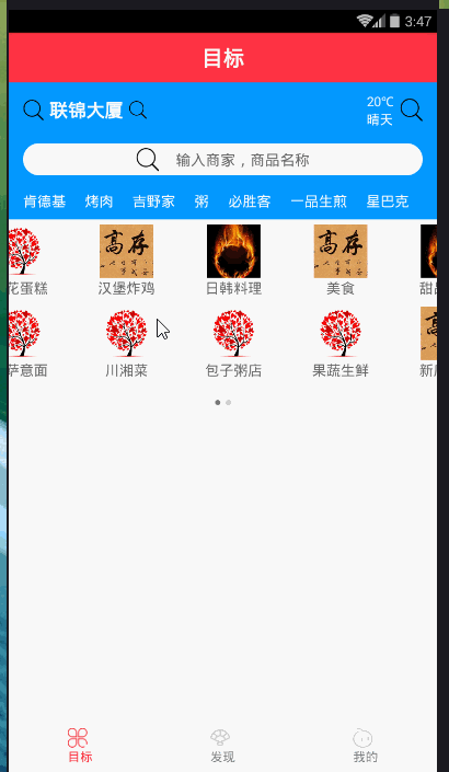
都看到這是仿餓了麽的輪播效果,但情況依然很不爽,大牛給出點優化建議啊!
下麵我分享一下該輪播的效果,(如果你正在做輪播,做的比較好,謝謝分享我一下,本人虛心學習,微信:jkxx123321)//import liraries import React, { Component } from 'react'; import { View, Text, StyleSheet, Dimensions, Image, TouchableOpacity, TouchableNativeFeedback, TouchableWithoutFeedback, ScrollView, Platform, Animated, } from 'react-native'; import Swiper from 'react-native-swiper'; import px2pd from '../utils/px2dp'; let { width, height } = Dimensions.get('window'); const isIOS = Platform.OS == 'ios'; const headH = px2pd(isIOS ? 140 : 120); const inputHeight = px2pd(28); const imgTypes = [ { src: require('../assets/images/1.jpg') }, { src: require('../assets/images/2.jpg') }, { src: require('../assets/images/3.jpg') }, { src: require('../assets/images/4.jpg') }, { src: require('../assets/images/4.jpg') }, { src: require('../assets/images/1.jpg') }, { src: require('../assets/images/2.jpg') }, { src: require('../assets/images/3.jpg') }, { src: require('../assets/images/4.jpg') }, { src: require('../assets/images/4.jpg') }, { src: require('../assets/images/1.jpg') }, { src: require('../assets/images/2.jpg') }, { src: require('../assets/images/3.jpg') }, { src: require('../assets/images/4.jpg') }, { src: require('../assets/images/4.jpg') }, { src: require('../assets/images/4.jpg') }, { src: require('../assets/images/4.jpg') } ]; const loading = require('../assets/images/loading.gif'); // create a component class TargetView extends Component { static navigationOptions = { title: '目標', headerStyle: { backgroundColor: '#FF3344', }, } constructor(props) { super(props) this.state = { location: "聯錦大廈", } } _renderHeader() { return ( <View style={styles.header}> {/*定位、天氣*/} <View style={styles.lbsWeather}> <TouchableWithoutFeedback> <View style={styles.lbs}> <Image source={require('../assets/icons/search.png')} style={{ width: px2pd(18), height: px2pd(18) }}></Image> <Text style={{ fontSize: px2pd(16), fontWeight: 'bold', color: '#fff', paddingHorizontal: px2pd(5) }}>{this.state.location}</Text> <Image source={require('../assets/icons/search.png')} style={{ width: px2pd(16), height: px2pd(16) }}></Image> </View> </TouchableWithoutFeedback> <View style={styles.weather}> <View style={{ marginRight: px2pd(5) }}> <Text style={{ fontSize: px2pd(11), color: '#fff', textAlign: 'center' }}>{'20℃'}</Text> <Text style={{ fontSize: px2pd(11), color: '#fff' }}>{'晴天'}</Text> </View> <Image source={require('../assets/icons/search.png')} style={{ width: px2pd(20), height: px2pd(20) }}></Image> </View> </View> {/*搜索框*/} <View style={{ marginTop: px2pd(15), }}> <TouchableWithoutFeedback onPress={() => { }}> <View style={styles.searchBtn}> <Image source={require('../assets/icons/search.png')} style={{ width: px2pd(20), height: px2pd(20) }}></Image> <Text style={{ fontSize: px2pd(13), color: '#666', marginLeft: px2pd(15) }}>{'輸入商家,商品名稱'}</Text> </View> </TouchableWithoutFeedback> </View> <Animated.View style={styles.keywords}> { ['肯德基', '烤肉', '吉野家', '粥', '必勝客', '一品生煎', '星巴克'].map((item, i) => { return ( <TouchableWithoutFeedback key={i}> <View style={{ marginRight: px2pd(12) }}> <Text style={{ fontSize: px2pd(12), color: '#fff' }}>{item}</Text> </View> </TouchableWithoutFeedback> ) }) } </Animated.View> </View> ) } _renderTypes() { const w = width / 4, h = w * .6 + 20; let renderSwipeView = (types, n) => { return ( <View style={styles.typesView}> { types.map((item, i) => { let render = ( <View style={[{ width: w, height: h }, styles.typesItem]}> <Image source={imgTypes[n + i].src} style={{ width: w * .5, height: w * .5 }} /> <Text style={{ fontSize: px2pd(12), color: "#666" }}>{item}</Text> </View> ) return ( isIOS ? ( <TouchableHighlight style={{ width: w, height: h }} key={i} onPress={() => { }}>{render}</TouchableHighlight> ) : ( <TouchableNativeFeedback style={{ width: w, height: h }} key={i} onPress={() => { }}>{render}</TouchableNativeFeedback> ) ) }) } </View> ) } return ( <Swiper height={h * 2.4} paginationStyle={{ bottom: 10 }} dotStyle={{ backgroundColor: 'rgba(0,0,0,.2)', width: 6, height: 6 }} activeDotStyle={{ backgroundColor: 'rgba(0,0,0,.5)', width: 6, height: 6 }}> {renderSwipeView(['美食', '甜品飲品', '商店超市', '預定早餐', '果蔬生鮮', '新店特惠', '準時達', '高鐵訂餐'], 0)} {renderSwipeView(['土豪推薦', '鮮花蛋糕', '漢堡炸雞', '日韓料理', '麻辣燙', '披薩意麵', '川湘菜', '包子粥店'], 8)} </Swiper> ) } render() { return ( <View style={styles.container}> <ScrollView style={styles.scrollView}> {this._renderHeader()} <View style={{ backgroundColor: "#fff", paddingBottom: px2pd(10) }}> {this._renderTypes()} </View> </ScrollView> </View> ); } } // define your styles const styles = StyleSheet.create({ container: { flex: 1, backgroundColor: '#f3f3f3', }, scrollView: { marginBottom: px2pd(46), }, header: { backgroundColor: '#0398ff', height: headH, paddingTop: px2pd(isIOS ? 30 : 10), paddingHorizontal: 16, }, lbsWeather: { height: inputHeight, overflow: "hidden", flexDirection: 'row', justifyContent: 'space-between', }, lbs: { flexDirection: 'row', justifyContent: 'center', alignItems: 'center', }, weather: { flexDirection: 'row', alignItems: 'center', }, searchBtn: { borderRadius: inputHeight, height: inputHeight, flexDirection: 'row', backgroundColor: '#fff', justifyContent: 'center', alignItems: 'center', }, keywords: { marginTop: px2pd(14), flexDirection: 'row', justifyContent: 'space-between', }, typesView: { paddingBottom: px2pd(10), flex: 1, backgroundColor: "#fff", flexDirection: "row", flexWrap: "wrap" }, typesItem: { backgroundColor: '#fff', justifyContent: 'center', alignItems: 'center' }, }); //make this component available to the app export default TargetView;
//---------------------px2dp.js------------------------------// import { Dimensions } from 'react-native' const deviceH = Dimensions.get('window').height const deviceW = Dimensions.get('window').width const basePx = 375 export default function px2dp(px) { return px * deviceW / basePx }附一張屬性表:
3.1 基本屬性
Prop
Default Type Description horizontal true bool 如果值為true時,那麼滾動的內容將是橫向排列的,而不是垂直於列中的。 loop true bool 如果設置為false,那麼滑動到最後一張時,再次滑動將不會展示第一張圖片。 index 0 number 初始進入的頁面標識為0的頁面。 showsButtons false bool 如果設置為true,那麼就可以使控制按鈕(即:左右兩側的箭頭)可見。 autoplay false bool 設置為true,則頁面可以自動跳轉。 3.2 自定義屬性
Prop Default Type Description width - number 如果你沒有特殊的設置,就通過flex:1預設為全屏。 height - number 如果你沒有特殊的設置,就通過flex:1預設為全屏。 style {...} style 設置頁面的樣式。 3.3 pagination 分頁
Prop Default Type Description showsPagination true bool 預設值為true,在頁面下邊顯示圓點,以標明當前頁面位於第幾個。 paginationStyle {...} style 設置頁面原點的樣式,自定義的樣式會和預設樣式進行合併。 renderPagination dot <View style={{backgroundColor:'rgba(0,0,0,.2)', width: 8, height: 8,borderRadius: 4, marginLeft: 3, marginRight: 3, marginTop: 3, marginBottom: 3,}} /> element 可以自定義不是當前圓點的樣式 activeDot <View style={{backgroundColor: '#007aff', width: 8, height: 8, borderRadius: 4, marginLeft: 3, marginRight: 3, marginTop: 3, marginBottom: 3,}} /> element 可以自定義當前頁面圓點的樣式 3.4 自動播放
Prop Default Type Description autoplay true bool設置為true可以使頁面自動滑動。 autoplayTimeout 2.5 number設置每個頁面自動滑動停留的時間 autoplayDirection true bool圓點的方向允許預設自己控制 3.5 控制按鈕
Prop Default Type Description showsButtons true bool是否顯示控制箭頭按鈕 buttonWrapperStyle {position: 'absolute', paddingHorizontal: 15, paddingVertical: 30, top: 70, left: 0, alignItems:'flex-start'}style定義預設箭頭按鈕的樣式 nextButton <Text style={{fontSize:60, color:'#00a7ec', paddingTop:30, paddingBottom:30}}>‹</Text>element自定義右箭頭按鈕樣式 prevButton <Text style={{fontSize:60, color:'#00a7ec', paddingTop:30, paddingBottom:30}}>›</Text>element自定義左箭頭按鈕樣式 加油!