創建一個簡單用戶控制項是開始自定義控制項的好方法。本章主要介紹創建一個基本的顏色拾取器。接下來分析如何將這個控制項分解成功能更強大的基於模板的控制項。 創建基本的顏色拾取器很容易。然而,創建自定義顏色拾取器仍是有價值的聯繫,因為這不僅演示了構建控制項的各種重要概念,而且提供了一個實用的功能。 可為顏色拾取器創 ...
創建一個簡單用戶控制項是開始自定義控制項的好方法。本章主要介紹創建一個基本的顏色拾取器。接下來分析如何將這個控制項分解成功能更強大的基於模板的控制項。
創建基本的顏色拾取器很容易。然而,創建自定義顏色拾取器仍是有價值的聯繫,因為這不僅演示了構建控制項的各種重要概念,而且提供了一個實用的功能。
可為顏色拾取器創建自定義對話框。但如果希望創建能集成進不同視窗的顏色拾取器,使用自定義控制項是更好的選擇。最簡單的自定義控制項類型是用戶控制項,當設計視窗或頁面時通過用戶控制項可以使用相同的方式組裝多個元素。因為僅通過直接組合現有控制項並添加功能並不能實現顏色拾取器,所以用戶控制項看起來是更合理的選擇。
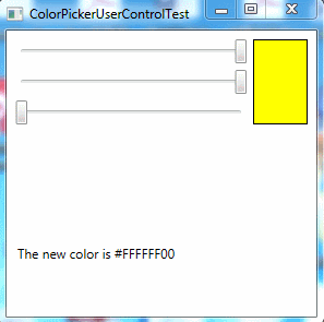
典型的顏色拾取器允許用戶通過單擊顏色梯度中的某個位置或分別指定紅、綠和藍三元色成分來選擇顏色。下圖顯示了創建的基本顏色拾取器。該顏色拾取器包含三個Slider控制項,這些控制項用於調節顏色成分,同時使用Rectangle元素預覽選擇的顏色。
一、定義依賴性屬性
創建顏色拾取器的第一步是為自定義控制項庫項目添加用戶控制項。當添加用戶控制項後,Visual Studio會創建XAML標記文件和相應的包含初始化代碼即事件處理代碼的自定義類。這與創建新的視窗或也賣弄是相同的——唯一的區別在與頂級容器是UserControl類:
<UserControl x:Class="CustomControls.ColorPickerUserControl"
             xmlns="http://schemas.microsoft.com/winfx/2006/xaml/presentation"
             xmlns:x="http://schemas.microsoft.com/winfx/2006/xaml"
             xmlns:mc="http://schemas.openxmlformats.org/markup-compatibility/2006"
             xmlns:d="http://schemas.microsoft.com/expression/blend/2008"
             mc:Ignorable="d"  Name="colorPicker">
</UserControl>
最簡單的起點是設計用戶控制項對外界公開的公共介面。換句話說,就是設計控制項使用者使用的魚顏色拾取器進行交互的屬性、方法和事件。
最基本的細節是Color屬性——畢竟,顏色拾取器不過是用於顯示和選擇顏色的特定工具。為支持WPF特性,如數據綁定、樣式以及動畫,控制項的可寫屬性幾乎都是依賴項屬性。
在前面章節中學習過,創建依賴項屬性的第一步是為之定義靜態欄位,併在屬性名稱的後面加上單詞Property:
public static DependencyProperty ColorProperty;
Color屬性將允許控制項使用者通過代碼設置或檢索顏色值。然而,顏色拾取器中的滑動條控制項也允許用戶修改當前顏色的一個方面。為實現這一設計,當滑動條額值發生變化時,需要使用事件處理程式進行響應,並且響應地更新Color屬性。但使用數據綁定關聯滑動條會更加清晰。為使用數據綁定,需要將每個顏色成分定義為單獨的依賴項屬性:
public static DependencyProperty RedProperty;
public static DependencyProperty GreenProperty;
public static DependencyProperty BlueProperty;
儘管Color屬性存儲了System.Windows.Media.Color對象,但Red、Green以及Blue屬性將存儲表示每個顏色成分的單個位元組值。
為屬性定義靜態欄位只有第一步。還需要有靜態構造函數,用於在用戶控制項中註冊這些依賴性屬性,指定屬性的名稱、數據類型以及擁有屬性的控制項類。可通過傳遞具有正確標記設置的FrameworkPropertyMetadata對象,在靜態構造函數中指定選擇的特定屬性特性(如值繼承)。還可指出在什麼地方為驗證、數據強制以及屬性更改通知關聯回調函數。
在顏色拾取器中,只需要考慮一個因素——當各種屬性變化時需要關聯回調函數進行響應。因為Red、Green和Blue屬性實際上時Color屬性的不同表示,並且如果一個屬性發生變化,就需要確保其他屬性保持同步。
下麵是註冊顏色拾取器的4個依賴性屬性的靜態構造函數的代碼:
static ColorPickerUserControl()
        {
            ColorProperty = DependencyProperty.Register("Color", typeof(Color),
                typeof(ColorPickerUserControl),
                new FrameworkPropertyMetadata(Colors.Black, new PropertyChangedCallback(OnColorChanged)));

            RedProperty = DependencyProperty.Register("Red", typeof(byte),
                typeof(ColorPickerUserControl),
                new FrameworkPropertyMetadata(new PropertyChangedCallback(OnColorRGBChanged)));

            GreenProperty = DependencyProperty.Register("Green", typeof(byte),
                typeof(ColorPickerUserControl),
                new FrameworkPropertyMetadata(new PropertyChangedCallback(OnColorRGBChanged)));

            BlueProperty = DependencyProperty.Register("Blue", typeof(byte),
                typeof(ColorPickerUserControl),
                new FrameworkPropertyMetadata(new PropertyChangedCallback(OnColorRGBChanged)));
        }
現在已經定義了依賴性屬性,可添加標準的屬性封裝器,使範文它們變得更加容易,並可在XAML中使用它們:
public Color Color
        {
            get { return (Color)GetValue(ColorProperty); }
            set { SetValue(ColorProperty, value); }
        }
public byte Red
        {
            get { return (byte)GetValue(RedProperty); }
            set { SetValue(RedProperty, value); }
        }

public byte Green
        {
            get{return (byte)GetValue(GreenProperty);}
            set{SetValue(GreenProperty,value);}
        }
public byte Blue
        {
            get { return (byte)GetValue(BlueProperty); }
            set { SetValue(BlueProperty, value); }
        }
請記住,屬性封裝器不能包含任何邏輯,因為可直接使用DependencyObject基類的SetValue()和GetValue()方法設置和檢索屬性。例如,在這個示例中的屬性同步邏輯是使用回調函數實現的,當屬性發生變化時通過屬性封裝器或者直接調用SetValue()方法引發回調函數。
屬性變化回調函數負責使Color屬性與Red、Green以及Blue屬性保持一致。無論何時Red、Green以及Blue屬性發生變化,都會相應地調整Color屬性:
private static void OnColorRGBChanged(DependencyObject sender, DependencyPropertyChangedEventArgs e)
        {
            ColorPickerUserControl colorPicker = (ColorPickerUserControl)sender;
            Color color = colorPicker.Color;
            if (e.Property == RedProperty)
                color.R = (byte)e.NewValue;
            else if (e.Property == GreenProperty)
                color.G = (byte)e.NewValue;
            else if (e.Property == BlueProperty)
                color.B = (byte)e.NewValue;

            colorPicker.Color = color;
        }
當設置Color屬性時,也會更新Red、Green和Blue值:
 private static void OnColorChanged(DependencyObject sender, DependencyPropertyChangedEventArgs e)
        {
            ColorPickerUserControl colorPicker = (ColorPickerUserControl)sender;
            Color oldColor = (Color)e.OldValue;
            Color newColor = (Color)e.NewValue;
            colorPicker.Red = newColor.R;
            colorPicker.Green = newColor.G;
            colorPicker.Blue = newColor.B;
        }
儘管很明顯,但當各個屬性試圖改變其他屬性時,上面的代碼不會引起一系列無休止的調用。因為WPF不允許重新進入屬性變化回調函數。例如,如果改變Color順序,就會觸發OnColorChanged()方法。OnColorChanged()方法會修改Red、Green以及Blue屬性,從而觸發OnColorRGBChanged()回調方法三次(每個屬性觸發一次)。然而,OnColorRGBChanged()方法不會再次觸發OnColorChanged()方法。
二、定義路由事件
通過添加路由事件,當發生一些事情時用於通知控制項使用者。在顏色拾取器示例中,當顏色發生變化後,觸發一個事件是很有用處的。儘管可將這個事件定義為普通的.NET事件,但使用路由事件可提供冒泡和隧道特性,從而可在更高層次的父元素中處理事件。
與依賴項屬性一樣,定義路由事件的一個步驟是為值創建靜態屬性,併在時間名稱的後面添加單詞Event:
public static readonly RoutedEvent ColorChangedEvent;
然後可在靜態構造函數中註冊事件。在靜態構造函數中指定事件的名稱、路由策略、簽名以及擁有事件的類:
ColorChangedEvent = EventManager.RegisterRoutedEvent("ColorChanged", RoutingStrategy.Bubble,
                typeof(RoutedPropertyChangedEventHandler<Color>), typeof(ColorPickerUserControl));
不一定要為事件簽名創建新的委托,有時可重用已經存在的委托。兩個有用的委托是RoutedEventHandler(用於不帶額外信息的路由事件)和RoutedPropertyChangedEventHandler(用於提供屬性發生變化之後的舊值和新值得路由事件)。上例中使用RoutedPropertyChangedEventHandler委托,是被類型參數化了的泛型委托。所以,可為任何屬性數據類型使用該委托,而不會犧牲類型安全功能。
定義並註冊事件後,需要創建標準的.NET事件封裝器來公開事件。事件封裝器可用於關聯和刪除事件監聽程式:
public event RoutedPropertyChangedEventHandler<Color> ColorChanged
        {
            add { AddHandler(ColorChangedEvent, value); }
            remove { RemoveHandler(ColorChangedEvent, value); }
        }
最後的細節是在適當時候引發事件的代碼。該代碼必須調用繼承自DependencyObject基類的RaiseEvent()方法。
在顏色拾取器示例中,只需要在OnColorChanged()方法之後添加如下代碼即可:
RoutedPropertyChangedEventArgs<Color> args = new RoutedPropertyChangedEventArgs<Color>(oldColor, newColor);
args.RoutedEvent = ColorChangedEvent;
colorPicker.RaiseEvent(args);
請記住,無論何時修改Color屬性,不管是直接修改還是通過修改Red、Green以及Blue成分,都會觸發OnColorChanged()回調函數。
三、添加標記
現在已經定義好用戶控制項的公有介面,需要做的所有工作就是創建控制項外觀的標記。在這個示例中,需要使用一個基本Grid控制項將三個Slider控制項和預覽顏色的Rectangle元素組合在一起。技巧是使用數據綁定表達式,將這些控制項連接到合適的屬性,而不需要使用事件處理代碼。
總之,顏色拾取器中總共使用4個數據綁定表達式。三個滑動條被綁定到Red、Green和Blue屬性。而且屬性值得允許範圍是0~255(一個位元組可以接受的數值)。Rectangle.Fill屬性使用SolidColorBrush畫刷進行設置。畫刷的Color屬性被綁定到用戶控制項的Color屬性。
下麵是完整的標記:
<UserControl x:Class="CustomControls.ColorPickerUserControl"
             xmlns="http://schemas.microsoft.com/winfx/2006/xaml/presentation"
             xmlns:x="http://schemas.microsoft.com/winfx/2006/xaml"
             xmlns:mc="http://schemas.openxmlformats.org/markup-compatibility/2006"
             xmlns:d="http://schemas.microsoft.com/expression/blend/2008"
             mc:Ignorable="d"  Name="colorPicker">
    <Grid>
        <Grid.RowDefinitions>
            <RowDefinition Height="Auto"/>
            <RowDefinition Height="Auto"/>
            <RowDefinition Height="Auto"/>
        </Grid.RowDefinitions>
        <Grid.ColumnDefinitions>
            <ColumnDefinition></ColumnDefinition>
            <ColumnDefinition Width="Auto"></ColumnDefinition>
        </Grid.ColumnDefinitions>
        <Slider Name="sliderRed" Minimum="0" Maximum="255"
                Margin="{Binding ElementName=colorPicker,Path=Padding}"
                Value="{Binding ElementName=colorPicker,Path=Red}"></Slider>
        <Slider Grid.Row="1" Name="sliderGreen" Minimum="0" Maximum="255"
                Margin="{Binding ElementName=colorPicker,Path=Padding}"
                Value="{Binding ElementName=colorPicker,Path=Green}"></Slider>
        <Slider Grid.Row="2" Name="sliderBlue" Minimum="0" Maximum="255"
                Margin="{Binding ElementName=colorPicker,Path=Padding}"
                Value="{Binding ElementName=colorPicker,Path=Blue}"></Slider>
        <Rectangle Grid.Column="1" Grid.RowSpan="3"
                   Margin="{Binding ElementName=colorPicker,Path=Padding}"
                   Width="50" Stroke="Black" StrokeThickness="1">
            <Rectangle.Fill>
                <SolidColorBrush Color="{Binding ElementName=colorPicker,Path=Color}"></SolidColorBrush>
            </Rectangle.Fill>
        </Rectangle>
    </Grid>
</UserControl>
用於用戶控制項的標記和無外觀控制項的控制項模板扮演相同的角色。如果希望使標記中的一些細節是可配置的,可使用將他們連接到控制項屬性的綁定表達式。例如,目前Rectangle元素的寬度被固定為50個單位。然而,可使用數據綁定表達式從用戶控制項的依賴性屬性中提取數值來代替這些細節。這樣,控制項使用者可通過修改屬性來選擇不同的寬度。同樣,可使筆畫顏色和寬度也是可變的。然而,如果希望使控制項具有真正的靈活性,最好的創建無外觀的控制項,併在模板中定義標記。
偶爾可選用數據綁定表達式,重用已在控制項中定義過的核心屬性。例如,UserControl類使用Padding屬性在外側邊緣和用戶定義的內部內容之間添加空間(這一細節是通過UserControl控制項的控制項模板實現的)。然而,也可以使用Padding屬性在每個滑動條的周圍設置空間,如下所示:
 <Slider Name="sliderRed" Minimum="0" Maximum="255"
                Margin="{Binding ElementName=colorPicker,Path=Padding}"
                Value="{Binding ElementName=colorPicker,Path=Red}"></Slider>
類似地,也可從UserControl類的BorderThickness和BorderBrush屬性為Rectan元素獲取邊框設置。同樣,這樣快捷方式對於創建簡單的控制項是非常合理的,但可通過引入額外的屬性(如SliderMargin、PreviewBorderBrush以及PreviewBorderThickness)或創建功能完備的基於模板的控制項加以改進。
四、使用控制項
現在完成了控制項,使用該控制項很容易。為在另一個視窗中使用顏色拾取器,首先需要將程式集合.NET名稱控制項映射到XAML名稱空間,如下所示:
<Window x:Class="CustomControlsClient.ColorPickerUserControlTest"
        xmlns="http://schemas.microsoft.com/winfx/2006/xaml/presentation"
        xmlns:x="http://schemas.microsoft.com/winfx/2006/xaml"
        xmlns:lib="clr-namespace:CustomControls;assembly=CustomControls"  ...>
使用定義的XML名稱控制項和用戶控制項類名,在XAML標記中可像創建其他類型的對象那樣創建自定義的用戶控制項。還可在控制項標記中設置它的屬性,以及直接關聯事件處理程式,如下所示:
<lib:ColorPickerUserControl
        Name="colorPicker" Margin="2" Padding="3" ColorChanged="colorPicker_ColorChanged"  Color="Yellow"></lib:ColorPickerUserControl>
因為Color屬性使用Color數據類型,並且Color數據類型使用TypeConverter特性進行了修飾,所以在設置Color屬性之前,WPF知道使用ColorConverter轉換器將顏色名稱字元串轉換成相應的Color對象。
處理ColorChanged事件的代碼很簡單:
private void colorPicker_ColorChanged(object sender, RoutedPropertyChangedEventArgs<Color> e)
        {
            if (lblColor != null) lblColor.Text = "The new color is " + e.NewValue.ToString();
        }
現在已經完成了自定義控制項。
五、命令支持
許多控制項具有命令支持。可使用以下兩種方法為自定義控制項添加命令支持:
- 添加將控制項鏈接到特定命令的命令綁定。通過這種方法,控制項可以相應命令,而且不需要藉助於任何外部代碼。
- 為命令創建新的RoutedUICommand對象,作為自定義控制項的靜態欄位。然後為這個命令對象添加命令綁定。這種方法可使自定義控制項自動支持沒有在基本命令類集合中定義的命令。
接下來的將使用第一種方法為ApplicationCommands.Undo命令添加支持。
在顏色拾取器中為了支持Undo功能,需要使用成員欄位跟蹤以前選擇的顏色:
private Color? previousColor;
將該欄位設置為可空是合理的,因為當第一次創建控制項時,還沒有設置以前選擇的顏色。
當顏色發生變化時,只需要記錄舊值。可通過在OnColorChanged()方法的最後添加以下代碼行來達到該目的:
colorPicker.previousColor = oldColor;
現在已經具備了支持Undo命令需要的基礎框架。剩餘的工作是創建將控制項鏈接到命令以及處理CanExecute和Executed事件的命令綁定。
第一次創建控時是創建命令綁定的最佳時機。例如,下麵的代碼使用顏色拾取器的構造函數為ApplicationCommands.Undo命令添加命令綁定:
 public ColorPickerUserControl()
        {
            InitializeComponent();
            SetUpCommands();
        }

        private void SetUpCommands()
        {
            CommandBinding binding = new CommandBinding(ApplicationCommands.Undo,
                UndoCommand_Executed, UndoCommand_CanExecute);
            this.CommandBindings.Add(binding);
        }
為使命令奏效,需要處理CanExecute事件,並且只要有以前的顏色值就允許執行命令:
private void UndoCommand_CanExecute(object sender, CanExecuteRoutedEventArgs e)
        {
            e.CanExecute = previousColor.HasValue;
        }
最後,當執行命令後,可交換新的顏色:
private void UndoCommand_Executed(object sender, ExecutedRoutedEventArgs e)
        {
            this.Color = (Color)previousColor;
        }
可通過兩種不同方式觸發Undo命令。當用戶控制項中的某個元素具有焦點時,可以使用預設的Ctrl+Z組合鍵綁定,也可為客戶添加用於觸發命令的按鈕,如下所示:
<Button Command="Undo" CommandTarget="{Binding ElementName=colorPicker}" Margin="5,0,5,0" Padding="2">Undo</Button>
這兩種方法都會丟棄當前顏色並應用以前的顏色。
更可靠的命令
前面描述的技術是將命令鏈接到控制項的相當合理的方法,但這不是在WPF元素和專業控制項中使用的技術。這些元素使用更可靠的方法,並使用CommandManager.RegisterClassCommandBinding()方法關聯靜態的命令處理程式。
上一個示例中演示的實現存在問題:使用公用CommandBindings集合。這使得命令比較脆弱,因為客戶可自由修改CommandBindings集合。而使用RegisterClassCommandBinding()方法無法做到這一點。WPF控制項使用的就是這種方法。例如,如果查看TextBox的CommandBindings集合,不會發現任何用於硬編碼命令的綁定,例如Undo、Redo、Cut、Copy以及Paste等命令,因為他們被註冊為類綁定。
這種技術非常簡單。不在實例構造函數中創建命令綁定,而必須在靜態構造函數中創建命令綁定,使用如下所示的代碼:
CommandManager.RegisterClassCommandBinding(typeof(ColorPickerUserControl),
                new CommandBinding(ApplicationCommands.Undo, UndoCommand_Executed, UndoCommand_CanExecute));
儘管上面的代碼變化不大,但有一個重要變化。因為 UndoCommand_Executed()和UndoCommand_CanExecute()方法是在構造函數中引用的,所以必須是靜態方法。為檢索實例數據(例如當前顏色和以前顏色的信息),需要將事件發送者轉換為ColorPickerUserControl對象,並使用該對象。
下麵是修改之後的命令處理代碼:
private static void UndoCommand_CanExecute(object sender, CanExecuteRoutedEventArgs e)
        {
            ColorPickerUserControl colorPicker = (ColorPickerUserControl)sender;
            e.CanExecute =colorPicker.previousColor.HasValue;
        }

private static void UndoCommand_Executed(object sender, ExecutedRoutedEventArgs e)
        {
            ColorPickerUserControl colorPicker = (ColorPickerUserControl)sender;
            colorPicker.Color = (Color)colorPicker.previousColor.Value;
        }
此外,這種技術不局限於命令。如果希望將事件處理邏輯硬編碼到自定義控制項,可通過EventManager.RegisterClassHandler()方法使用類事件處理程式。類事件處理程式總在實例事件處理程式之前調用,從而允許開發人員很容易地抑制事件。
六、深入分析用戶控制項
用戶控制項提供了一種非常簡單的,但是有一定限制的創建自定義控制項的方法。為理解其中的原因,深入分析用戶控制項的工作原理是很有幫助的。
在後臺,UserControl類的工作方式和其父類ContentControl非常類似。實際上,只有幾個重要的區別:
- UserControl類改變了一些預設值。即該類將IsTabStop和Focusable屬性設置為false(從而在Tab順序中沒有占據某個單獨的額位置),並將HorizontalAlignment和VerticalAlignment屬性設置為Stretch(而非Left或Top),從而可以填充可用空間。
- UserControl類應用了一個新的控制項模板,該模板由包含ContentPresenter元素的Border元素組成。ContentPresenter元素包含了用標記添加的內容。
- UserControl類改變了路由事件的源。當事件從用戶控制項內的控制項向用戶控制項外的元素冒泡或隧道路由時,事件源變為指向用戶控制項而不是原始元素。這提供了更好的封裝性。
用戶控制項和其他類型的自定義控制項之間最重的區別是設計用戶控制項的方法。與所有控制項一樣,用戶控制項有控制項模板。然而,很少改變控制項模板——反而,將作為自定義用戶控制項類的一部分提供標記,並且當創建了控制項後,會使用InitializeComponet()方法處理這個標記。另一個方面,無外觀控制項是沒有標記——需要的所有內容都在模板中。
普通的ContentControl控制項具有下麵的簡單模板:
<ControlTemplate TargetType="ContentControl">
    <ContentPresenter
        ContentTemplate="{TemplateBinding ContentControl.ContentTemplate}"
        Content="{TemplateBinding ContentControl.Content}"/>
</ControlTemplate>
這個模板僅填充所提供的內容並應用可選的內容模板。Padding、Background、HorizontalAlignment以及VerticalAlignment等熟悉沒有任何影響(除非顯示綁定屬性)。
UserControl類有一個類似的模板,並又更多的細節。最明顯的是,它添加了一個Border元素並將其屬性綁定到用戶控制項的BorderBrush、BorderThickness、Background以及Padding屬性,以確保它們具有相同的含義。此外,內部的ContentPresenter元素已綁定到對齊屬性。
<ControlTempalte TargetType="UserControl">
    <Border BorderBrush="{TemplateBinding Border.BorderBrush}"
       BorderThickness="{TemplateBinding Border.BorderThickness}"
       Background="{TemplateBinding Border.Background}"
       Padding="{TemplateBinding Border.Padding}"
       SnapsToDevicePixels="True">
        <ContentPresenter
            HorizontalAlignment="{TemplateBinding Control.HorizontalAlignment}"
            VerticalAlignment="{TemplateBinding Control.VerticalAlignment}"
            SnapsToDevicePixels="{TemplateBinding UIElement.SnapsToDevicePixels}"
            Contenttemplate="{TemplateBinding ContentControl.ContentTemplate}"
            Content="{TemplateBinding ContentControl.Content}"/>
    </Border>
</ControlTemplate>
從技術角度看,可改變用戶控制項的模板。實際上,只需要進行很少的調整,就可以將所有標記移到模板中。但卻是沒有理由採取該方法——如果希望得到更靈活的控制項,時可視化外觀和由自定義控制項類定義的借款分開,創建無外觀的自定義控制項可能會更好一些。
本章程式源代碼:CustomControl.zip