一、設置內容模板如下 二、前端調用(xaml) 三、代碼調用(cs) 四、效果圖如下 ...
一、設置內容模板如下
 <Style x:Key="ComboBoxToggleButton" TargetType="{x:Type ToggleButton}">
            <Setter Property="OverridesDefaultStyle" Value="true"/>
            <Setter Property="IsTabStop" Value="false"/>
            <Setter Property="Focusable" Value="false"/>
            <Setter Property="ClickMode" Value="Press"/>
            <Setter Property="Template">
                <Setter.Value>
                    <ControlTemplate TargetType="{x:Type ToggleButton}">
                        <!--綁定背景色、邊框顏色及粗細、圓角5-->
                        <Border x:Name="templateRoot" Background="{TemplateBinding Background}" BorderThickness="{TemplateBinding BorderThickness}" BorderBrush="{TemplateBinding BorderBrush}" SnapsToDevicePixels="true" CornerRadius="5">
                            <Border x:Name="splitBorder" BorderThickness="1" BorderBrush="Transparent" HorizontalAlignment="Right" Margin="0" SnapsToDevicePixels="true" Width="{DynamicResource {x:Static SystemParameters.VerticalScrollBarWidthKey}}">
                                <!--綁定箭頭的顏色為邊框顏色-->
                                <Path x:Name="arrow" Data="F1 M 0,0 L 2.667,2.66665 L 5.3334,0 L 5.3334,-1.78168 L 2.6667,0.88501 L0,-1.78168 L0,0 Z" Fill="{TemplateBinding BorderBrush}" HorizontalAlignment="Center" Margin="0" VerticalAlignment="Center"/>
                            </Border>
                        </Border>
                    </ControlTemplate>
                </Setter.Value>
            </Setter>
        </Style>
        <ControlTemplate x:Key="ComboBoxTemplate1" TargetType="{x:Type ComboBox}">
            <Grid x:Name="templateRoot" SnapsToDevicePixels="true">
                <Grid.ColumnDefinitions>
                    <ColumnDefinition Width="*"/>
                    <ColumnDefinition MinWidth="{DynamicResource {x:Static SystemParameters.VerticalScrollBarWidthKey}}" Width="0"/>
                </Grid.ColumnDefinitions>
                <Popup x:Name="PART_Popup" AllowsTransparency="true" Grid.ColumnSpan="2" IsOpen="{Binding IsDropDownOpen, Mode=TwoWay, RelativeSource={RelativeSource TemplatedParent}}" Margin="1" Placement="Bottom" PopupAnimation="{DynamicResource {x:Static SystemParameters.ComboBoxPopupAnimationKey}}">
                    <theme:SystemDropShadowChrome x:Name="shadow" Color="Transparent" MinWidth="{Binding ActualWidth, ElementName=templateRoot}" MaxHeight="{TemplateBinding MaxDropDownHeight}">
                        <!--綁定下拉框的背景色、框顏色及粗細、圓角5-->
                        <Border x:Name="dropDownBorder" Background="{TemplateBinding Background}" BorderThickness="{TemplateBinding BorderThickness}" BorderBrush="{TemplateBinding BorderBrush}" CornerRadius="5">
                            <ScrollViewer x:Name="DropDownScrollViewer">
                                <Grid x:Name="grid" RenderOptions.ClearTypeHint="Enabled">
                                    <Canvas x:Name="canvas" HorizontalAlignment="Left" Height="0" VerticalAlignment="Top" Width="0">
                                        <Rectangle x:Name="opaqueRect" Fill="{Binding Background, ElementName=dropDownBorder}" Height="{Binding ActualHeight, ElementName=dropDownBorder}" Width="{Binding ActualWidth, ElementName=dropDownBorder}"/>
                                    </Canvas>
                                    <ItemsPresenter x:Name="ItemsPresenter" KeyboardNavigation.DirectionalNavigation="Contained" SnapsToDevicePixels="{TemplateBinding SnapsToDevicePixels}"/>
                                </Grid>
                            </ScrollViewer>
                        </Border>
                    </theme:SystemDropShadowChrome>
                </Popup>
                <ToggleButton x:Name="toggleButton" Background="{TemplateBinding Background}" BorderThickness="{TemplateBinding BorderThickness}" BorderBrush="{TemplateBinding BorderBrush}" Grid.ColumnSpan="2" IsChecked="{Binding IsDropDownOpen, Mode=TwoWay, RelativeSource={RelativeSource TemplatedParent}}" Style="{StaticResource ComboBoxToggleButton}"/>
                <ContentPresenter x:Name="contentPresenter" ContentTemplate="{TemplateBinding SelectionBoxItemTemplate}" Content="{TemplateBinding SelectionBoxItem}" ContentTemplateSelector="{TemplateBinding ItemTemplateSelector}" ContentStringFormat="{TemplateBinding SelectionBoxItemStringFormat}"
                                  HorizontalAlignment="{TemplateBinding HorizontalContentAlignment}" IsHitTestVisible="false" Margin="{TemplateBinding Padding}" SnapsToDevicePixels="{TemplateBinding SnapsToDevicePixels}" VerticalAlignment="{TemplateBinding VerticalContentAlignment}"/>
            </Grid>

        </ControlTemplate>
二、前端調用(xaml)
        <ComboBox Template="{DynamicResource ComboBoxTemplate1}"  Background="Red" BorderBrush="Blue" BorderThickness="2"  >
            <ComboBoxItem IsSelected="True">
                <TextBlock Foreground="White">aaa</TextBlock>
            </ComboBoxItem>
            <ComboBoxItem >
                <TextBlock Foreground="Green">bbb</TextBlock>
            </ComboBoxItem>
        </ComboBox>
三、代碼調用(cs)
            ComboBox cb = new ComboBox() { Background=Brushes.Red,BorderBrush=Brushes.Blue,BorderThickness=new Thickness(2)};
            cb.Items.Add( new TextBox { Text = "aaa" ,Foreground=Brushes.White} );
            cb.Items.Add(new TextBox { Text = "bbb", Foreground = Brushes.Green });
            cb.SelectedIndex = 0;
            cb.Template = Resources["ComboBoxTemplate1"] as ControlTemplate;
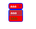
四、效果圖如下