swipper快速切換插件 swipper.js自己去官網下載哈。先來一個tab切換案例: demo.html <!doctype html> <html> <head> <meta charset="utf-8"> <meta name="viewport" content="width=devi ...
swipper快速切換插件
swipper.js自己去官網下載哈。
先來一個tab切換案例:

demo.html
<!doctype html>
<html>
<head>
    <meta charset="utf-8">
    <meta name="viewport" content="width=device-width, initial-scale=1, maximum-scale=1, minimum-scale=1, user-scalable=no, minimal-ui">
    <title>Swiper Demo</title>
    <link rel="stylesheet" type="text/css" href="../js/swiper/idangerous.swiper2.7.6.css">
    <link rel="stylesheet" type="text/css" href="../css/index.css">
</head>
<body>

<div class="swiper-container">
    <div class="swiper-wrapper">
        <div class="swiper-slide bg-1png"></div>
        <div class="swiper-slide bg-2png"></div>
        <div class="swiper-slide bg-3png"></div>
        <div class="swiper-slide bg-4png"></div>
    </div>
</div>

<div class="tabs">
    <a href="" class="active">首頁</a>
    <a href="">課程</a>
    <a href="">發現</a>
    <a href="">我的</a>
</div>

<script type="text/javascript" src="../js/jquery/jquery-1.10.1.min.js"></script>
<script type="text/javascript" src="../js/swiper/idangerous.swiper2.7.6.min.js"></script>
<script type="text/javascript" src="../js/index.js"></script>
</body>
</html>
index.js
var swiper = new Swiper(".swiper-container", {
    onSlideChangeStart: function(swiper) {
        var index = swiper.activeIndex;
        $(".tabs a").removeClass("active");
        $(".tabs a").eq(index).addClass("active");
    }
});

$(".tabs a").click(function(e){
    e.preventDefault();
    var index = $(this).index();
    $(".tabs a").removeClass("active");
    $(this).addClass("active");
    swiper.swipeTo(index);
    return false;
});
swipper雜七雜八知識點補充:
/*垂直滾動:Demo1*/
var swiper = new Swiper(".swiper-container", {
    mode: 'vertical'
});

/*Progress插件:Demo2*/
var swiper = new Swiper(".swiper-container", {
    progress: true,
    onProgressChange: function(swiper){
        for (var i = 0; i < swiper.slides.length; i++){
          var slide = swiper.slides[i];
          var progress = slide.progress;
          var scale, translate, opacity;
          if (progress<=0) {
            opacity = 1 - Math.min(Math.abs(progress),1);
            scale = 1 - Math.min(Math.abs(progress/2),1);
            translate = progress*swiper.width;
          }
          else {
            opacity = 1 - Math.min(Math.abs(progress/2),1);
            scale=1;
            translate=0;
          }
          slide.style.opacity = opacity;
          swiper.setTransform(slide,'translate3d('+(translate)+'px,0,0) scale('+scale+')');
        }
      },
      onTouchStart:function(swiper){
        for (var i = 0; i < swiper.slides.length; i++){
          swiper.setTransition(swiper.slides[i], 0);
        }
      },
      onSetWrapperTransition: function(swiper, speed) {
        for (var i = 0; i < swiper.slides.length; i++){
          swiper.setTransition(swiper.slides[i], speed);
        }
      }
});

// Set Z-Indexes
  for (var i = 0; i < swiper.slides.length; i++){
    swiper.slides[i].style.zIndex = swiper.slides.length - i;
  }

/*3D Flow 插件使用:Demo3*/
var swiper = new Swiper(".swiper-container", {
  tdFlow: {}
});

/*scroll Bar 插件使用: Demo4*/
var swiper = new Swiper(".swiper-container", {
    scrollbar: {
        container : '.swiper-scrollbar',
        draggable : true,
        hide: true,
        snapOnRelease: true
    }
});

/*Tab 綜合示例 :Demo5*/
var swiper = new Swiper(".swiper-container", {
    onSlideChangeStart: function(swiper) {
        var index = swiper.activeIndex;
        $(".tabs a").removeClass("active");
        $(".tabs a").eq(index).addClass("active");
    }
});

$(".tabs a").click(function(e){
    e.preventDefault();
    var index = $(this).index();
    $(".tabs a").removeClass("active");
    $(this).addClass("active");
    swiper.swipeTo(index);
    return false;
});
WebApp綜合案例:
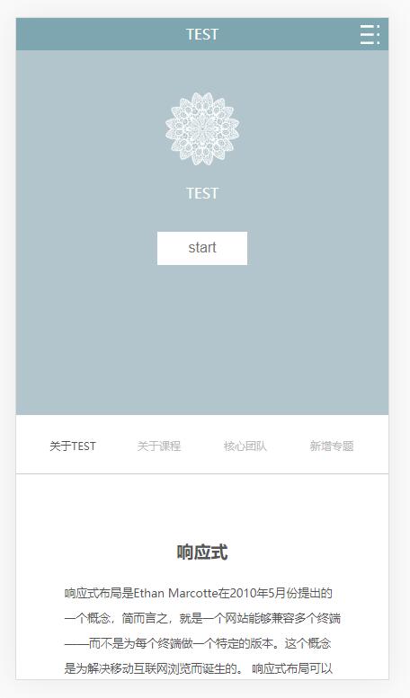
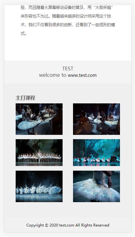
首先是移動端效果:
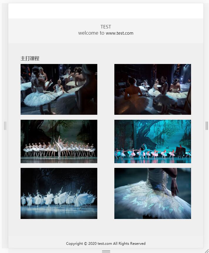
然後是pc端效果

index.html
<!DOCTYPE html> <html lang="en"> <head> <meta charset="UTF-8"> <title>index</title> <meta charset="UTF-8"> <meta name="viewport" content="width=device-width, initial-scale=1, minimum-scale=1, maximum-scale=1, user-scalable=no"> <link rel="stylesheet" href="css/base.css"> <link rel="stylesheet" href="css/grid.css"> <link rel="stylesheet" href="css/index.css"> </head> <body> <!-- 第一區域 --> <div class="container1"> <!-- ipad導航 --> <nav class="nav-container col-md-12 d-none d-md-block"> <ul class="nav col-md-8 col-offset-2 "> <li class="nav-item"> <a href="###" class="nav-link nav-link-active">前端</a> </li> <li class="nav-item"> <a href="###" class="nav-link">java</a> </li> <li class="nav-item"> <a href="###" class="nav-link">ios</a> </li> <li class="nav-item"> <a href="###" class="nav-link">Android</a> </li> <li class="nav-item"> <a href="###" class="nav-link">php</a> </li> </ul> </nav> <!-- 移動端導航 --> <nav class="nav-container nav-container-sm d-md-none" id="nav"> <div class="nav-container-wrap"> <p>TEST</p> <div class="nav-container-sm-right"><img id="toggle-btn" src="img/zhankai.svg" alt=""></div> <ul class="container-sm"> <li><a href="###" class="nav-link-sm">前端</a></li> <li><a href="###" class="nav-link-sm">java</a></li> <li><a href="###" class="nav-link-sm">ios</a></li> <li><a href="###" class="nav-link-sm">Android</a></li> <li><a href="###" class="nav-link-sm">php</a></li> </ul> </div> </nav> <!-- 內容 --> <div class="container1-content"> <img src="img/1.png"> <p class="img1-p">TEST</p> <button>start</button> </div> </div> <!-- 第二區域 --> <div class="container2"> <nav class="container2-nav col-md-12"> <ul class="nav"> <li class="container2-nav-item"> <a href="###" class="nav-link nav-link-active">關於TEST</a> </li> <li class="container2-nav-item"> <a href="###" class="nav-link">關於課程</a> </li> <li class="container2-nav-item"> <a href="###" class="nav-link">核心團隊</a> </li> <li class="container2-nav-item"> <a href="###" class="nav-link">新增專題</a> </li> </ul> </nav> </div> <!-- 第三區域 --> <div class="container3 col-md-12"> <div class="container3-content col-md-8 col-md-offset-2"> <h2>響應式</h2> <p class="container3-content-p">響應式佈局是Ethan Marcotte在2010年5月份提出的一個概念,簡而言之,就是一個網站能夠相容多個終端——而不是為每個終端做一個特定的版本。這個概念是為解決移動互聯網瀏覽而誕生的。 響應式佈局可以為不同終端的用戶提供更加舒適的界面和更好的用戶體驗,而且隨著大屏幕移動設備的普及,用“大勢所趨”來形容也不為過。隨著越來越多的設計師採用這個技術,我們不僅看到很多的創新,還看到了一些成形的模式。</p> </div> </div> <!-- 第四區域 --> <div class="container4 col-md-12"> <div class="container4-left"> <p>TEST</p> </div> <div class="container4-right"> <p>welcome to <a href="#">www.test.com</a></p> </div> </div> <!-- 第五區域 --> <div class="container5 col-md-12"> <h3>主打課程</h3> <div class="container5-content"> <div class="container5-content-img"> <img src="img/1.jpg" alt=""> </div> <div class="container5-content-img"> <img src="img/2.jpg" alt=""> </div> <div class="container5-content-img"> <img src="img/3.jpg" alt=""> </div> <div class="container5-content-img"> <img src="img/4.jpg" alt=""> </div> <div class="container5-content-img"> <img src="img/5.jpg" alt=""> </div> <div class="container5-content-img"> <img src="img/6.jpg" alt=""> </div> </div> </div> <!-- 第六區域 --> <div class="container6 col-md-12"> <p>Copyright © 2020 test.com All Rights Reserved</p> </div> <script src="js/jquery-1.10.1.min.js"></script> <script src="js/index.js"></script> </body> </html>
base.css
* {box-sizing: border-box; padding: 0; margin: 0; }
html {font-size:16px; }
li {list-style: none; }
a {font-size: 14px; color: #363636; text-decoration: none; }
a:hover {color: #1428a0; }
img {vertical-align: top; width: 100%; height:100%; border: none; }
grid.css
.container {

    width: 100%;

    padding-left: 15px;

    padding-right: 15px;

    margin-left: auto;

    margin-right: auto;

}


.row {

    margin-left: -15px;

    margin-right: -15px;

}


.col-1, .col-2, .col-3, .col-4, .col-5, .col-6, .col-7, .col-8, .col-9, .col-10, .col-11, .col-12,

.col-sm-1, .col-sm-2, .col-sm-3, .col-sm-4, .col-sm-5, .col-sm-6, .col-sm-7, .col-sm-8, .col-sm-9, .col-sm-10, .col-sm-11, .col-sm-12,

.col-md-1, .col-md-2, .col-md-3, .col-md-4, .col-md-5, .col-md-6, .col-md-7, .col-md-8, .col-md-9, .col-md-10, .col-md-11, .col-md-12,

.col-lg-1, .col-lg-2, .col-lg-3, .col-lg-4, .col-lg-5, .col-lg-6, .col-lg-7, .col-lg-8, .col-lg-9, .col-lg-10, .col-lg-11, .col-lg-12,

.col-xl-1, .col-xl-2, .col-xl-3, .col-xl-4, .col-xl-5, .col-xl-6, .col-xl-7, .col-xl-8, .col-xl-9, .col-xl-10, .col-xl-11, .col-xl-12 {

    position: relative;

    padding-left: 15px;

    padding-right: 15px;

}


.col-1, .col-2, .col-3, .col-4, .col-5, .col-6, .col-7, .col-8, .col-9, .col-10, .col-11, .col-12 {

    float: left;

}

.col-1 {

    width: 8.33333333%;

}

.col-2 {

    width: 16.66666667%;

}

.col-3 {

    width: 25%;

}

.col-4 {

    width: 33.33333333%;

}

.col-5 {

    width: 41.66666667%;

}

.col-6 {

    width: 50%;

}

.col-7 {

    width: 58.33333333%;

}

.col-8 {

    width: 66.66666667%;

}

.col-9 {

    width: 75%;

}

.col-10 {

    width: 83.33333333%;

}

.col-11 {

    width: 91.66666667%;

}

.col-12 {

    width: 100%;

}


.col-offset-12 {

    margin-left: 100%;

}

.col-offset-11 {

    margin-left: 91.66666667%;

}

.col-offset-10 {

    margin-left: 83.33333333%;

}

.col-offset-9 {

    margin-left: 75%;

}

.col-offset-8 {

    margin-left: 66.66666667%;

}

.col-offset-7 {

    margin-left: 58.33333333%;

}

.col-offset-6 {

    margin-left: 50%;

}

.col-offset-5 {

    margin-left: 41.66666667%;

}

.col-offset-4 {

    margin-left: 33.33333333%;

}

.col-offset-3 {

    margin-left: 25%;

}

.col-offset-2 {

    margin-left: 16.66666667%;

}

.col-offset-1 {

    margin-left: 8.33333333%;

}

.col-offset-0 {

    margin-left: 0;

}


.col-pull-12 {

    right: 100%;

}

.col-pull-11 {

    right: 91.66666667%;

}

.col-pull-10 {

    right: 83.33333333%;

}

.col-pull-9 {

    right: 75%;

}

.col-pull-8 {

    right: 66.66666667%;

}

.col-pull-7 {

    right: 58.33333333%;

}

.col-pull-6 {

    right: 50%;

}

.col-pull-5 {

    right: 41.66666667%;

}

.col-pull-4 {

    right: 33.33333333%;

}

.col-pull-3 {

    right: 25%;

}

.col-pull-2 {

    right: 16.66666667%;

}

.col-pull-1 {

    right: 8.33333333%;

}

.col-pull-0 {

    right: auto;

}

.col-push-12 {

    left: 100%;

}

.col-push-11 {

    left: 91.66666667%;

}

.col-push-10 {

    left: 83.33333333%;

}

.col-push-9 {

    left: 75%;

}

.col-push-8 {

    left: 66.66666667%;

}

.col-push-7 {

    left: 58.33333333%;

}

.col-push-6 {

    left: 50%;

}

.col-push-5 {

    left: 41.66666667%;

}

.col-push-4 {

    left: 33.33333333%;

}

.col-push-3 {

    left: 25%;

}

.col-push-2 {

    left: 16.66666667%;

}

.col-push-1 {

    left: 8.33333333%;

}

.col-push-0 {

    left: auto;

}


/*sm*/

@media (min-width: 576px) {

    .col-sm-1, .col-sm-2, .col-sm-3, .col-sm-4, .col-sm-5, .col-sm-6, .col-sm-7, .col-sm-8, .col-sm-9, .col-sm-10, .col-sm-11, .col-sm-12 {

        float: left;

    }

    .col-sm-1 {

        width: 8.33333333%;

    }

    .col-sm-2 {

        width: 16.66666667%;

    }

    .col-sm-3 {

        width: 25%;

    }

    .col-sm-4 {

        width: 33.33333333%;

    }

    .col-sm-5 {

        width: 41.66666667%;

    }

    .col-sm-6 {

        width: 50%;

    }

    .col-sm-7 {

        width: 58.33333333%;

    }

    .col-sm-8 {

        width: 66.66666667%;

    }

    .col-sm-9 {

        width: 75%;

    }

    .col-sm-10 {

        width: 83.33333333%;

    }

    .col-sm-11 {

        width: 91.66666667%;

    }

    .col-sm-12 {

        width: 100%;

    }


    .col-sm-offset-12 {

        margin-left: 100%;

    }

    .col-sm-offset-11 {

        margin-left: 91.66666667%;

    }

    .col-sm-offset-10 {

        margin-left: 83.33333333%;

    }

    .col-sm-offset-9 {

        margin-left: 75%;

    }

    .col-sm-offset-8 {

        margin-left: 66.66666667%;

    }

    .col-sm-offset-7 {

        margin-left: 58.33333333%;

    }

    .col-sm-offset-6 {

        margin-left: 50%;

    }

    .col-sm-offset-5 {

        margin-left: 41.66666667%;

    }

    .col-sm-offset-4 {

        margin-left: 33.33333333%;

    }

    .col-sm-offset-3 {

        margin-left: 25%;

    }

    .col-sm-offset-2 {

        margin-left: 16.66666667%;

    }

    .col-sm-offset-1 {

        margin-left: 8.33333333%;

    }

    .col-sm-offset-0 {

        margin-left: 0;

    }


    .col-sm-pull-12 {

        right: 100%;

    }

    .col-sm-pull-11 {

        right: 91.66666667%;

    }

    .col-sm-pull-10 {

        right: 83.33333333%;

    }

    .col-sm-pull-9 {

        right: 75%;

    }

    .col-sm-pull-8 {

        right: 66.66666667%;

    }

    .col-sm-pull-7 {

        right: 58.33333333%;

    }

    .col-sm-pull-6 {

        right: 50%;

    }

    .col-sm-pull-5 {

        right: 41.66666667%;

    }

    .col-sm-pull-4 {

        right: 33.33333333%;

    }

    .col-sm-pull-3 {

        right: 25%;

    }

    .col-sm-pull-2 {

        right: 16.66666667%;

    }

    .col-sm-pull-1 {

        right: 8.33333333%;

    }

    .col-sm-pull-0 {

        right: auto;

    }

    .col-sm-push-12 {

        left: 100%;

    }

    .col-sm-push-11 {

        left: 91.66666667%;

    }

    .col-sm-push-10 {

        left: 83.33333333%;

    }

    .col-sm-push-9 {

        left: 75%;

    }

    .col-sm-push-8 {

        left: 66.66666667%;

    }

    .col-sm-push-7 {

        left: 58.33333333%;

    }

    .col-sm-push-6 {

        left: 50%