一、iView(View UI) 1、簡介 官網:https://www.iviewui.com/ 倉庫:https://github.com/view-design/ViewUI iView 與 View UI 本質上是一個東西,隨著版本的升級,iView (4.0)改名為 View UI。是一套 ...
一、iView(View UI)
1、簡介
官網:https://www.iviewui.com/
倉庫:https://github.com/view-design/ViewUI
iView 與 View UI 本質上是一個東西,隨著版本的升級,iView (4.0)改名為 View UI。是一套基於Vue.js 的開源 UI 組件庫。
2、安裝、使用
(1)使用 npm 安裝(項目中如何使用,命令行運行)
npm install view-design --save
使用 vue-cli3.0 創建項目,可以參考:https://www.cnblogs.com/l-y-h/p/11241503.html。
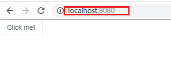
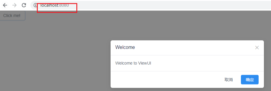
【小案例:在項目的 main.js 中引入】
【main.js】
import Vue from 'vue'
import App from './App.vue'
// step1: 引入 ViewUI
import ViewUI from 'view-design'
// step2: 引入 css
import 'view-design/dist/styles/iview.css'

Vue.config.productionTip = false
// step3:聲明使用 ViewUI
Vue.use(ViewUI)

new Vue({
  render: h => h(App),
}).$mount('#app')


【修改App.vue】
<template>
    <div>
        <i-button @click="show">Click me!</i-button>
        <Modal v-model="visible" title="Welcome">Welcome to ViewUI</Modal>
    </div>
</template>

<script>
    export default {
        data() {
            return {
                visible: false
            }
        },
        methods: {
            show() {
                this.visible = true
            }
        }
    }
</script>

<style>

</style>
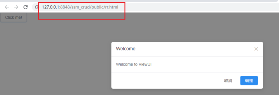
(2)不使用 npm 安裝(單 html 中使用,直接運行)
【使用 <script> 標簽引入 js 文件】
<script type="text/javascript" src="http://unpkg.com/view-design/dist/iview.min.js"></script>

【使用 <link> 標簽引入 css 文件】
<link rel="stylesheet" type="text/css" href="http://unpkg.com/view-design/dist/styles/iview.css">


【小案例:(index.html)】
<!DOCTYPE html>
<html>
<head>
    <meta charset="utf-8">
    <title>ViewUI example</title>
    <link rel="stylesheet" type="text/css" href="http://unpkg.com/view-design/dist/styles/iview.css">
    <script type="text/javascript" src="http://vuejs.org/js/vue.min.js"></script>
    <script type="text/javascript" src="http://unpkg.com/view-design/dist/iview.min.js"></script>
</head>
<body>
<div id="app">
    <i-button @click="show">Click me!</i-button>
    <Modal v-model="visible" title="Welcome">Welcome to ViewUI</Modal>
</div>
<script>
    new Vue({
        el: '#app',
        data: {
            visible: false
        },
        methods: {
            show: function () {
                this.visible = true
            }
        }
    })
  </script>
</body>
</html>

二、組件 -- 基礎
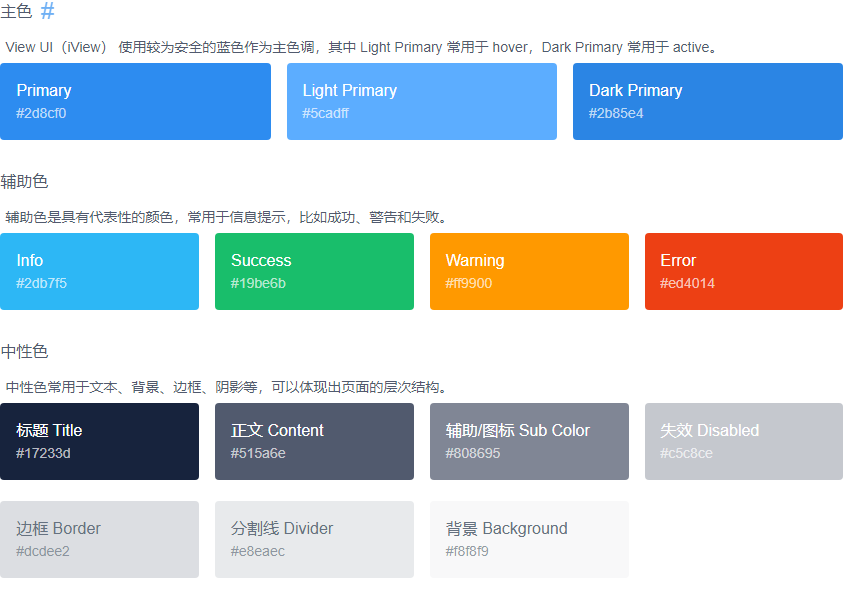
1、顏色(Color)
詳見: https://www.iviewui.com/components/color
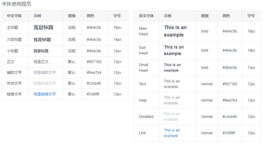
2、字體(Font)
詳見:https://www.iviewui.com/components/font
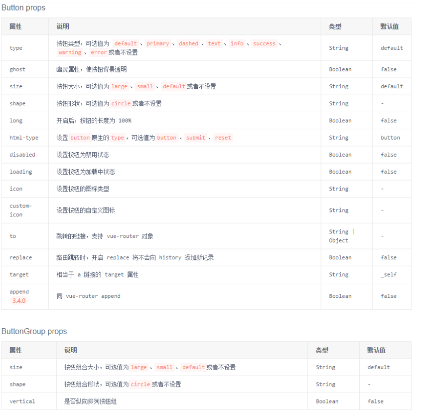
3、按鈕(Button)
詳見:https://www.iviewui.com/components/button
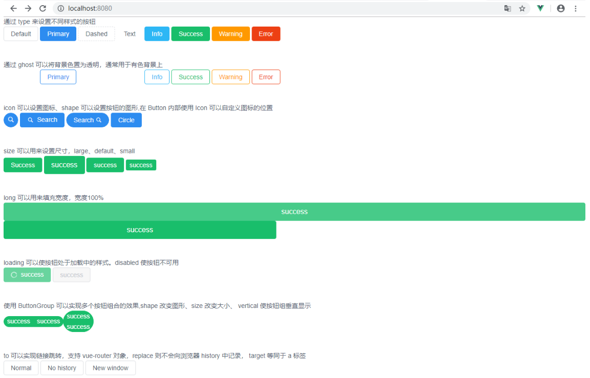
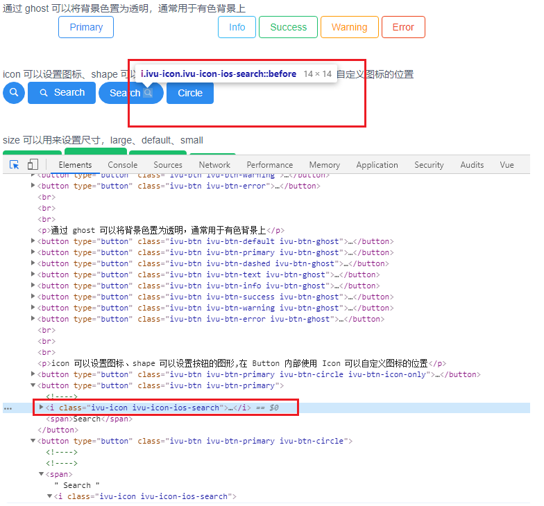
【App.vue】 <template> <div> <p>通過 type 來設置不同樣式的按鈕</p> <Button>Default</Button> <Button type="primary">Primary</Button> <Button type="dashed">Dashed</Button> <Button type="text">Text</Button> <Button type="info">Info</Button> <Button type="success">Success</Button> <Button type="warning">Warning</Button> <Button type="error">Error</Button> <br/><br/><br/> <p>通過 ghost 可以將背景色置為透明,通常用於有色背景上</p> <Button ghost>Default</Button> <Button type="primary" ghost>Primary</Button> <Button type="dashed" ghost>Dashed</Button> <Button type="text" ghost>Text</Button> <Button type="info" ghost>Info</Button> <Button type="success" ghost>Success</Button> <Button type="warning" ghost>Warning</Button> <Button type="error" ghost>Error</Button> <br/><br/><br/> <P>icon 可以設置圖標、shape 可以設置按鈕的圖形,在 Button 內部使用 Icon 可以自定義圖標的位置</P> <Button type="primary" shape="circle" icon="ios-search"></Button> <Button type="primary" icon="ios-search">Search</Button> <Button type="primary" shape="circle"> Search <Icon type="ios-search"></Icon> </Button> <Button type="primary">Circle</Button> <br/><br/><br/> <p>size 可以用來設置尺寸,large、default、small</p> <Button type="success">Success</Button> <Button type="success" size="large">success</Button> <Button type="success" size="default">success</Button> <Button type="success" size="small">success</Button> <br/><br/><br/> <p>long 可以用來填充寬度,寬度100%</p> <Button type="success" size="large" long>success</Button> <Button type="success" size="large" long style="width: 600px;">success</Button> <br/><br/><br/> <p>loading 可以使按鈕處於載入中的樣式。disabled 使按鈕不可用</p> <Button type="success" loading>success</Button> <Button type="success" disabled>success</Button> <br/><br/><br/> <p>使用 ButtonGroup 可以實現多個按鈕組合的效果,shape 改變圖形、size 改變大小、 vertical 使按鈕組垂直顯示</p> <ButtonGroup shape="circle" size="small"> <Button type="success">success</Button> <Button type="success">success</Button> </ButtonGroup> <ButtonGroup shape="circle" size="small" vertical> <Button type="success">success</Button> <Button type="success">success</Button> </ButtonGroup> <br/><br/><br/> <p>to 可以實現鏈接跳轉,支持 vue-router 對象,replace 則不會向瀏覽器 history 中記錄, target 等同於 a 標簽</p> <Button to="https://www.baidu.com">Normal</Button> <Button to="https://www.baidu.com" replace>No history</Button> <Button to="https://www.baidu.com" target="_blank">New window</Button> </div> </template> <script> export default { } </script> <style> </style>
4、圖標(Icon)
詳見:https://www.iviewui.com/components/icon
【渲染前:】
<Icon type="ios-search" />

【渲染後:】
<i class="ivu-icon ivu-icon-ios-search"></i>
三、組件 -- 佈局
1、柵格系統(Grid)
詳見:https://www.iviewui.com/components/grid
(1)使用柵格系統進行網頁佈局,可以使頁面排版更加美觀、舒適。
(2)採用 24 柵格系統。分為 row(行)和 col (列),其中 col 24 等分,可以使用 span 來控制。
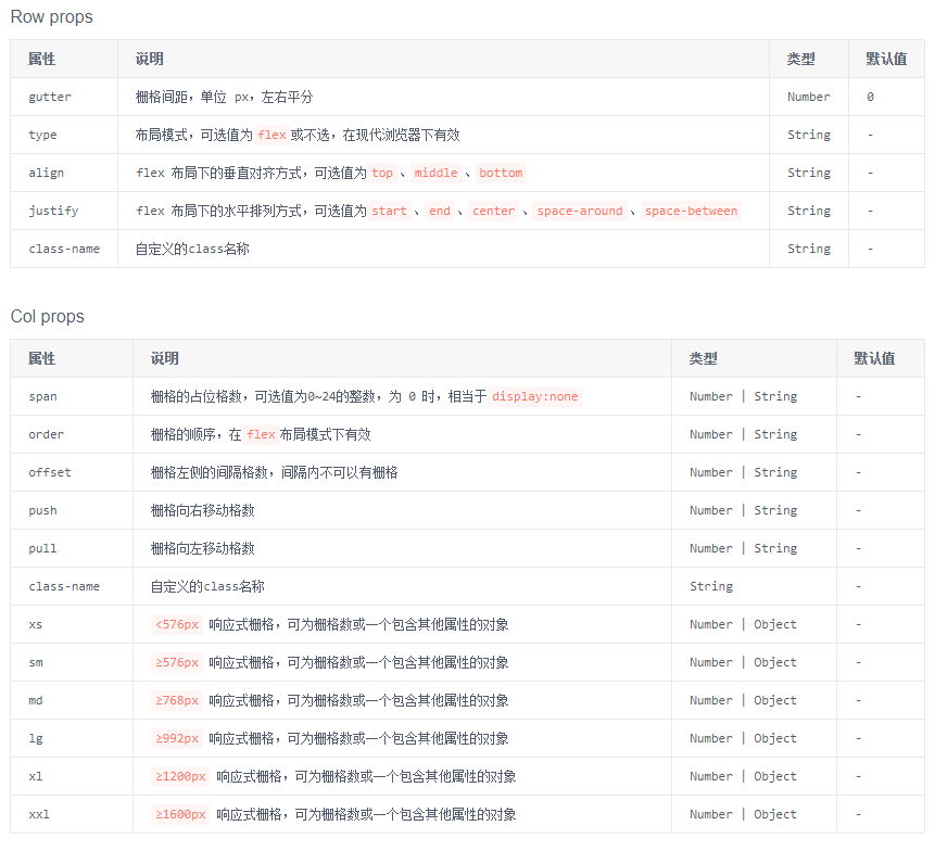
【App.vue】

<template>
    <div style="width: 800px;">
        <h5>基本使用、水平佈局</h5>
        <row>
            <i-col span="4"><div style="background: #219161;">col-4</div></i-col>
            <i-col span="8"><div style="background: #19469D">col-8</div></i-col>
            <i-col span="12"><div style="background: #880000">col-12</div></i-col>
        </row>
        <row>
            <i-col span="4" style="background: #219161;">col-4</i-col>
            <i-col span="4" style="background: #19469D">col-8</i-col>
            <i-col span="12" style="background: #880000">col-12</i-col>
        </row>
        <br/>

        <h5>區塊間隔, 使用 :gutter 可以設置區塊間隔,Flex 可以改變 柵格順序(與 order 連用)</h5>
        <row :gutter="16">
            <i-col span="4" order="3"><div style="background: #219161;">col-4</div></i-col>
            <i-col span="8" order="2"><div style="background: #19469D">col-8</div></i-col>
            <i-col span="12" order="1"><div style="background: #880000">col-12</div></i-col>
        </row>
        <row :gutter="16" type="flex">
            <i-col span="4" order="3"><div style="background: #219161;">col-4</div></i-col>
            <i-col span="8" order="2"><div style="background: #19469D">col-8</div></i-col>
            <i-col span="12" order="1"><div style="background: #880000">col-12</div></i-col>
        </row>
        <br/>

        <h5>push="x" 向右移 x 格, pull="x" 向左移 x 格, offset="x" 向右偏移 x 格</h5>
        <Row>
            <i-col span="18" push="6"><div style="background: #219161;">push-6</div></i-col>
            <i-col span="6" pull="18"><div style="background: #880000;">pull-18</div></i-col>
        </Row>
        <Row>
            <i-col span="8" offset="2"><div style="background: #219161;">push-6</div></i-col>
            <i-col span="10" offset="4"><div style="background: #880000;">pull-18</div></i-col>
        </Row>
        <br/>

        <h5>justify:flex 佈局下的水平排列方式,可選值為start、end、center、space-around、space-between</h5>
        <p>子元素向左排列</p>
        <Row type="flex" justify="start" style="background-color: #999999">
            <i-col span="4"><div style="background: #219161;">col-4</div></i-col>
            <i-col span="4"><div style="background: #19469D;">col-4</div></i-col>
            <i-col span="4"><div style="background: #880000;">col-4</div></i-col>
            <i-col span="4"><div style="background: #00A000">col-4</div></i-col>
        </Row>
        <p>子元素向右排列</p>
        <Row type="flex" justify="end" style="background-color: #999999">
            <i-col span="4"><div style="background: #219161;">col-4</div></i-col>
            <i-col span="4"><div style="background: #19469D;">col-4</div></i-col>
            <i-col span="4"><div style="background: #880000;">col-4</div></i-col>
            <i-col span="4"><div style="background: #00A000">col-4</div></i-col>
        </Row>
        <p>子元素向居中排列</p>
        <Row type="flex" justify="center" style="background-color: #999999">
            <i-col span="4"><div style="background: #219161;">col-4</div></i-col>
            <i-col span="4"><div style="background: #19469D;">col-4</div></i-col>
            <i-col span="4"><div style="background: #880000;">col-4</div></i-col>
            <i-col span="4"><div style="background: #00A000">col-4</div></i-col>
        </Row>
        <p>子元素等寬排列</p>
        <Row type="flex" justify="space-around" style="background-color: #999999">
            <i-col span="4"><div style="background: #219161;">col-4</div></i-col>
            <i-col span="4"><div style="background: #19469D;">col-4</div></i-col>
            <i-col span="4"><div style="background: #880000;">col-4</div></i-col>
            <i-col span="4"><div style="background: #00A000">col-4</div></i-col>
        </Row>
        <p>子元素分散排列</p>
        <Row type="flex" justify="space-between" style="background-color: #999999">
            <i-col span="4"><div style="background: #219161;">col-4</div></i-col>
            <i-col span="4"><div style="background: #19469D;">col-4</div></i-col>
            <i-col span="4"><div style="background: #880000;">col-4</div></i-col>
            <i-col span="4"><div style="background: #00A000">col-4</div></i-col>
        </Row>
        <br/>

        <h5>align:flex 佈局下的垂直對齊方式,可選值為top、middle、bottom</h5>
        <p>子元素頂部對齊</p>
        <Row type="flex" justify="center" align="top" style="background-color: #999999">
            <i-col span="4"><div style="background: #219161; height: 40px;">col-4</div></i-col>
            <i-col span="4"><div style="background: #19469D; height: 30px;">col-4</div></i-col>
            <i-col span="4"><div style="background: #880000; height: 20px;">col-4</div></i-col>
            <i-col span="4"><div style="background: #00A000; height: 35px;">col-4</div></i-col>
        </Row>
        <p>子元素居中對齊</p>
        <Row type="flex" justify="center" align="middle" style="background-color: #999999">
            <i-col span="4"><div style="background: #219161; height: 40px;">col-4</div></i-col>
            <i-col span="4"><div style="background: #19469D; height: 30px;">col-4</div></i-col>
            <i-col span="4"><div style="background: #880000; height: 20px;">col-4</div></i-col>
            <i-col span="4"><div style="background: #00A000; height: 35px;">col-4</div></i-col>
        </Row>
        <p>子元素底部對齊</p>
        <Row type="flex" justify="center" align="bottom" style="background-color: #999999">
            <i-col span="4"><div style="background: #219161; height: 40px;">col-4</div></i-col>
            <i-col span="4"><div style="background: #19469D; height: 30px;">col-4</div></i-col>
            <i-col span="4"><div style="background: #880000; height: 20px;">col-4</div></i-col>
            <i-col span="4"><div style="background: #00A000; height: 35px;">col-4</div></i-col>
        </Row>
    </div>
</template>

<script>
    export default {}
</script>

<style>

</style>

2、佈局(Layout)
詳見:https://www.iviewui.com/components/layout
常用組件:Header、Sider、Content、Footer、 Layout
(1)Layout:佈局容器,內部可嵌套 Header、Sider、Content、Footer、 Layout。可放在任意父容器中。
(2)Header:頂部佈局,自帶預設樣式,只能放在 Layout 中。
(3)Sider:側邊欄佈局,自帶預設樣式,只能放在 Layout 中。
(4)Content:內容主體佈局,自帶預設樣式,只能放在 Layout 中。
(5)Footer:底部佈局,自帶預設樣式,只能放在 Layout 中。
【App.vue】

<template>
    <div class="layout">
        <Layout>
            <Header>
                <Menu mode="horizontal" theme="dark" active-name="1">
                    <div class="layout-logo"></div>
                    <div class="layout-nav">
                        <MenuItem name="1">
                            <Icon type="ios-navigate"></Icon>
                            Item 1
                        </MenuItem>
                        <MenuItem name="2">
                            <Icon type="ios-keypad"></Icon>
                            Item 2
                        </MenuItem>
                        <MenuItem name="3">
                            <Icon type="ios-analytics"></Icon>
                            Item 3
                        </MenuItem>
                        <MenuItem name="4">
                            <Icon type="ios-paper"></Icon>
                            Item 4
                        </MenuItem>
                    </div>
                </Menu>
            </Header>
            <Layout>
                <!-- hide-trigger,隱藏預設觸發器 -->
                <Sider hide-trigger :style="{background: '#fff'}">
                    <Menu active-name="1-2" theme="light" width="auto" :open-names="['1']">
                        <Submenu name="1">
                            <!-- 使用 slot 自定義觸發器 -->
                            <template slot="title">
                                <Icon type="ios-navigate"></Icon>
                                Item 1
                            </template>
                            <MenuItem name="1-1">Option 1</MenuItem>
                            <MenuItem name="1-2">Option 2</MenuItem>
                            <MenuItem name="1-3">Option 3</MenuItem>
                        </Submenu>
                        <Submenu name="2">
                            <template slot="title">
                                <Icon type="ios-keypad"></Icon>
                                Item 2
                            </template>
                            <MenuItem name="2-1">Option 1</MenuItem>
                            <MenuItem name="2-2">Option 2</MenuItem>
                        </Submenu>
                        <Submenu name="3">
                            <template slot="title">
                                <Icon type="ios-analytics"></Icon>
                                Item 3
                            </template>
                            <MenuItem name="3-1">Option 1</MenuItem>
                            <MenuItem name="3-2">Option 2</MenuItem>
                        </Submenu>
                    </Menu>
                </Sider>
                <Layout :style="{padding: '0 24px 24px'}">
                    <Breadcrumb :style="{margin: '24px 0'}">
                        <BreadcrumbItem>Home</BreadcrumbItem>
                        <BreadcrumbItem>Components</BreadcrumbItem>
                        <BreadcrumbItem>Layout</BreadcrumbItem>
                    </Breadcrumb>
                    <Content :style="{padding: '24px', minHeight: '280px', background: '#fff'}">
                        Content
                    </Content>
                </Layout>
            </Layout>
        </Layout>
    </div>
</template>
<script>
    export default {

    }
</script>
<style scoped>
.layout{
    border: 1px solid #d7dde4;
    background: #f5f7f9;
    position: relative;
    border-radius: 4px;
    overflow: hidden;
    width: 800px;
}
.layout-logo{
    width: 100px;
    height: 30px;
    background: #5b6270;
    border-radius: 3px;
    float: left;
    position: relative;
    top: 15px;
    left: 20px;
}
.layout-nav{
    width: 420px;
    margin: 0 auto;
    margin-right: 20px;
}
</style>

3、列表(List)
詳見:https://www.iviewui.com/components/list
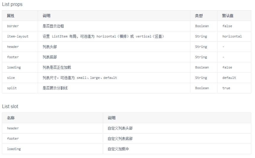
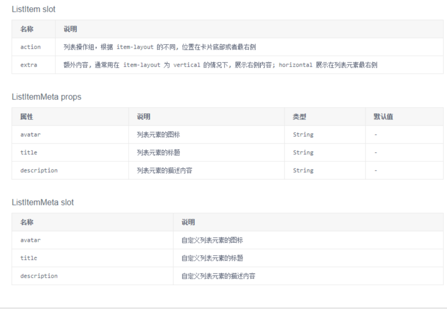
(1)基礎的列表展示,可承載文字、列表、圖片、段落,常用於後臺數據展示頁面。
(2)小案例分析
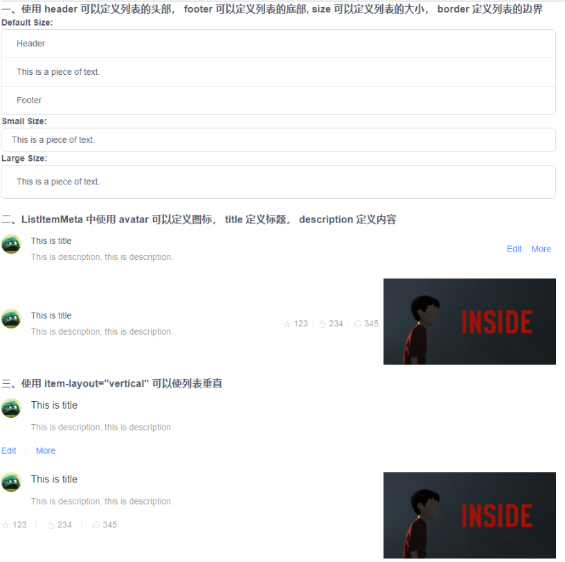
【App.vue】
<template>
    <div style="width: 900px;">
        <h3>一、使用 header 可以定義列表的頭部, footer 可以定義列表的底部, size 可以定義列表的大小, border 定義列表的邊界</h3>
        <strong>Default Size:</strong>
        <List header="Header" footer="Footer" border>
            <ListItem>This is a piece of text.</ListItem>
        </List>
        <strong>Small Size:</strong>
        <List border size="small">
            <ListItem>This is a piece of text.</ListItem>
        </List>
        <strong>Large Size:</strong>
        <List border size="large">
            <ListItem>This is a piece of text.</ListItem>
        </List>
        <br>

        <h3>二、ListItemMeta 中使用 avatar 可以定義圖標, title 定義標題, description 定義內容</h3>
        <List>
            <ListItem>
                <ListItemMeta avatar="https://dev-file.iviewui.com/userinfoPDvn9gKWYihR24SpgC319vXY8qniCqj4/avatar" title="This is title" description="This is description, this is description." />
                <template slot="action">
                    <li>
                        <a href="">Edit</a>
                    </li>
                    <li>
                        <a href="">More</a>
                    </li>
                </template>
            </ListItem>
        </List>
        <List>
            <ListItem>
                <ListItemMeta avatar="https://dev-file.iviewui.com/userinfoPDvn9gKWYihR24SpgC319vXY8qniCqj4/avatar" title="This is title" description="This is description, this is description." />
                <template slot="action">
                    <li>
                        <Icon type="ios-star-outline" /> 123
                    </li>
                    <li>
                        <Icon type="ios-thumbs-up-outline" /> 234
                    </li>
                    <li>
                        <Icon type="ios-chatbubbles-outline" /> 345
                    </li>
                </template>
                <template slot="extra">
                    <img src="https://dev-file.iviewui.com/5wxHCQMUyrauMCGSVEYVxHR5JmvS7DpH/large" style="width: 280px">
                </template>
            </ListItem>
        </List>

        <h3>三、使用 item-layout="vertical" 可以使列表垂直</h3>
        <List item-layout="vertical">
            <ListItem>
                <ListItemMeta avatar="https://dev-file.iviewui.com/userinfoPDvn9gKWYihR24SpgC319vXY8qniCqj4/avatar" title="This is title" description="This is description, this is description." />
                <template slot="action">
                    <li>
                        <a href="">Edit</a>
                    </li>
                    <li>
                        <a href="">More</a>
                    </li>
                </template>
            </ListItem>
        </List>

        <List item-layout="vertical">
            <ListItem>
                <ListItemMeta avatar="https://dev-file.iviewui.com/userinfoPDvn9gKWYihR24SpgC319vXY8qniCqj4/avatar" title="This is title" description="This is description, this is description." />
                <template slot="action">
                    <li>
                        <Icon type="ios-star-outline" /> 123
                    </li>
                    <li>
                        <Icon type="ios-thumbs-up-outline" /> 234
                    </li>
                    <li>
                        <Icon type="ios-chatbubbles-outline" /> 345
                    </li>
                </template>
                <template slot="extra">
                    <img src="https://dev-file.iviewui.com/5wxHCQMUyrauMCGSVEYVxHR5JmvS7DpH/large" style="width: 280px">
                </template>
            </ListItem>
        </List>
    </div>
</template>
<script>
    export default {

    }
</script>
<style>
</style>
4、卡片(Card)
詳見:https://www.iviewui.com/components/card
(1)基礎容器,用來顯示文字、列表、圖文等內容,也可以配合其它組件一起使用。
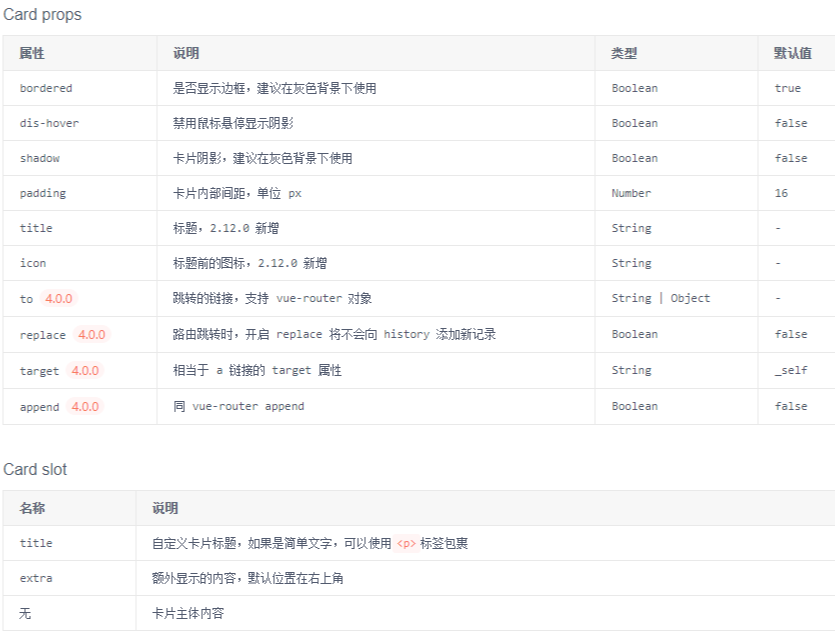
(2)小案例分析:
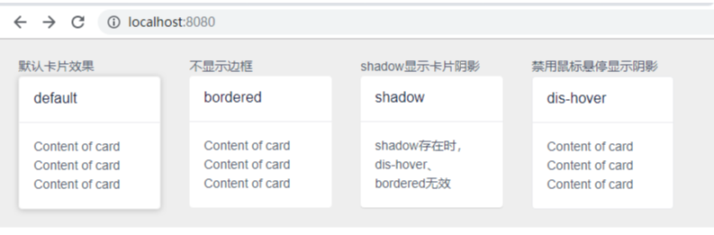
【App.vue】

<template>
    <div style="width: 800px;">
        <Row style="background:#eee;padding:20px">
            <i-col span="5">
                <p>預設卡片效果</p>
                <Card>
                    <p slot="title">default</p>
                    <p>Content of card</p>
                    <p>Content of card</p>
                    <p>Content of card</p>
                </Card>
            </i-col>
            <i-col span="5" offset="1">
                <p>不顯示邊框</p>
                <Card :bordered="false">
                    <p slot="title">bordered</p>
                    <p>Content of card</p>
                    <p>Content of card</p>
                    <p>Content of card</p>
                </Card>
            </i-col>
            <i-col span="5" offset="1">
                <p>shadow顯示卡片陰影</p>
                <Card shadow>
                    <p slot="title">shadow</p>
                    <p>shadow存在時,dis-hover、bordered無效</p>
                </Card>
            </i-col>
            <i-col span="5" offset="1">
                <p>禁用滑鼠懸停顯示陰影</p>
                <Card dis-hover>
                    <p slot="title">dis-hover</p>
                    <p>Content of card</p>
                    <p>Content of card</p>
                    <p>Content of card</p>
                </Card>
            </i-col>
        </Row>
    </div>
</template>
<script>
    export default {

    }
</script>
截圖看的不明顯,可以複製代碼自行比較。
5、摺疊面板(Collapse)
詳見:https://www.iviewui.com/components/collapse
(1)可以顯示、隱藏內容
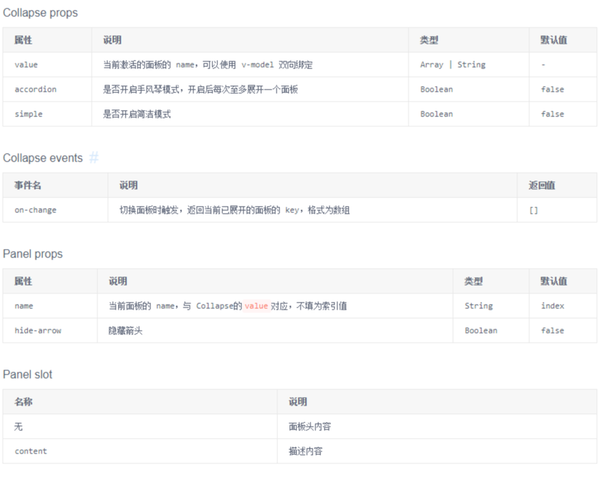
(2)小案例分析
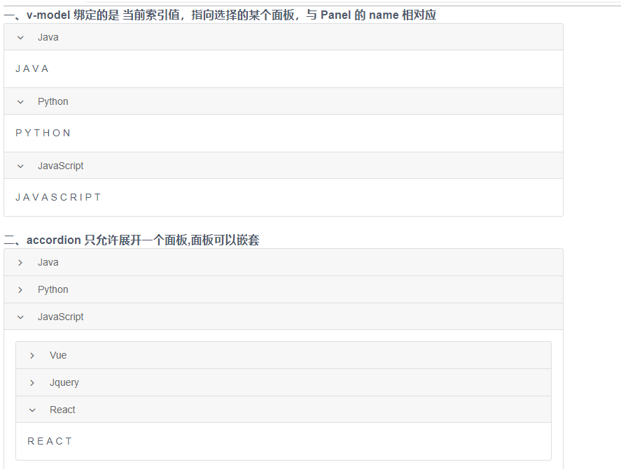
【App.vue】

<template>
    <div style="width: 800px;">
        <h3>一、v-model 綁定的是 當前索引值,指向選擇的某個面板,與 Panel 的 name 相對應</h3>
        <Collapse v-model="value1">
            <Panel name="1">
                Java
                <p slot="content">J A V A</p>
            </Panel>
            <Panel name="2">
                Python
                <p slot="content">P Y T H O N</p>
            </Panel>
            <Panel name="3">
                JavaScript
                <p slot="content">J A V A S C R I P T</p>
            </Panel>
        </Collapse>
        <br/>

        <h3>二、accordion 只允許展開一個面板,面板可以嵌套</h3>
        <Collapse v-model="value2" accordion>
            <Panel name="1">
                Java
                <p slot="content">J A V A</p>
            </Panel>
            <Panel name="2">
                Python
                <p slot="content">P Y T H O N</p>
            </Panel>
            <Panel name="3">
                JavaScript
                <Collapse slot="content" v-model="value3">
                    <Panel name="1">
                        Vue
                        <p slot="content">V U E</p>
                    </Panel>
                    <Panel name="2">
                        Jquery
                        <p slot="content">J Q U E R Y</p>
                    </Panel>
                    <Panel name="3">
                        React
                        <p slot="content">R E A C T</p>
                    </Panel>
                </Collapse>
            </Panel>
        </Collapse>
    </div>
</template>
<script>
    export default {
        data() {
            return {
                value1: '2',
                value2: '1',
                value3: '3'
            }
        }
    }
</script>
6、面板切割、拖動效果(Split)
詳見:https://www.iviewui.com/components/split
(1)可將一片區域,分割為可以拖拽調整寬度或高度的兩部分區域。

(2)小案例分析:
【App.vue】

<template>
    <div style="width: 800px; background-color:#BBBBCC">
        <h3>一、左右分割</h3>
        <div class="demo-split">
            <Split v-model="split1">
                <div slot="left" class="demo-split-pane">
                    Left Pane
                </div>
                <div slot="right" class="demo-split-pane">
                    Right Pane
                </div>
            </Split>
        </div>
        <br>

        <h3>二、上下分割</h3>
        <div class="demo-split">
            <Split v-model="split2" mode="vertical">
                <div slot="top" class="demo-split-pane">
                    Top Pane
                </div>
                <div slot="bottom" class="demo-split-pane">
                    Bottom Pane
                </div>
            </Split>
        </div>
        <br>

        <h3>三、組合分割</h3>
        <div class="demo-split">
            <Split v-model="split3">
                <div slot="left" class="demo-split-pane">
                    Left Pane
                    <div class="demo-split2">
                        <Split v-model="split4" mode="vertical">
                            <div slot="top" class="demo-split-pane">
                                Top Pane
                            </div>
                            <div slot="bottom" class="demo-split-pane">
                                Bottom Pane
                            </div>
                        </Split>
                    </div>
                </div>
                <div slot="right" class="demo-split-pane">
                    Right Pane
                </div>
            </Split>
        </div>
    </div>
</template>
<script>
    export default {
        data() {
            return {
                split1: 0.5,
                split2: 0.3,
                split3: 0.7,
                split4: 0.4
            }
        },
    }
</script>
<style>
    .demo-split {
        height: 250px;
        border: 1px solid #dcdee2;
    }

    .demo-split2 {
        height: 200px;
        border: 1px solid #dcdee2;
    }

    .demo-split-pane {
        padding: 10px;
    }
</style>

7、分割線(Divider)
詳見:https://www.iviewui.com/components/divider
(1)區分內容的分割線。

(2)小案例分析:
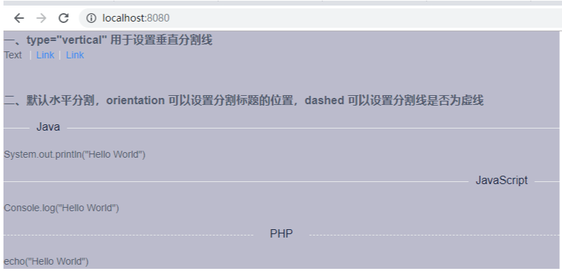
【App.vue】

<template>
    <div style="width: 800px; background-color: #BBBBCC;">
        <h3>一、type="vertical" 用於設置垂直分割線</h3>
        Text
        <Divider type="vertical" />
        <a href="#">Link</a>
        <Divider type="vertical" />
        <a href="#">Link</a>
        <br><br><br>

        <h3>二、預設水平分割,orientation 可以設置分割標題的位置,dashed 可以設置分割線是否為虛線</h3>
        <div>
            <Divider orientation="left">Java</Divider>
            <p>System.out.println("Hello World")</p>
            <Divider orientation="right">JavaScript</Divider>
            <p>Console.log("Hello World")</p>
            <Divider orientation="center" dashed>PHP</Divider>
            <p>echo("Hello World")</p>
        </div>
    </div>
</template>
<script>
    export default {

    }
</script>
8、單元格(Cell)
詳見:https://www.iviewui.com/components/cell
(1)常用於菜單列表
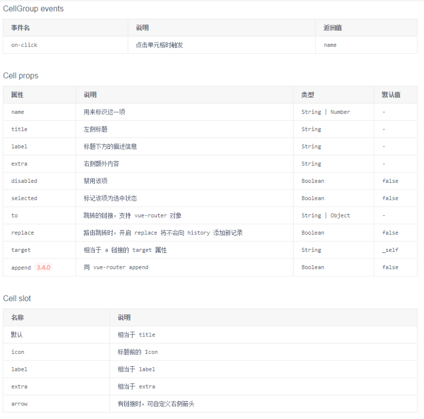
(2)小案例分析
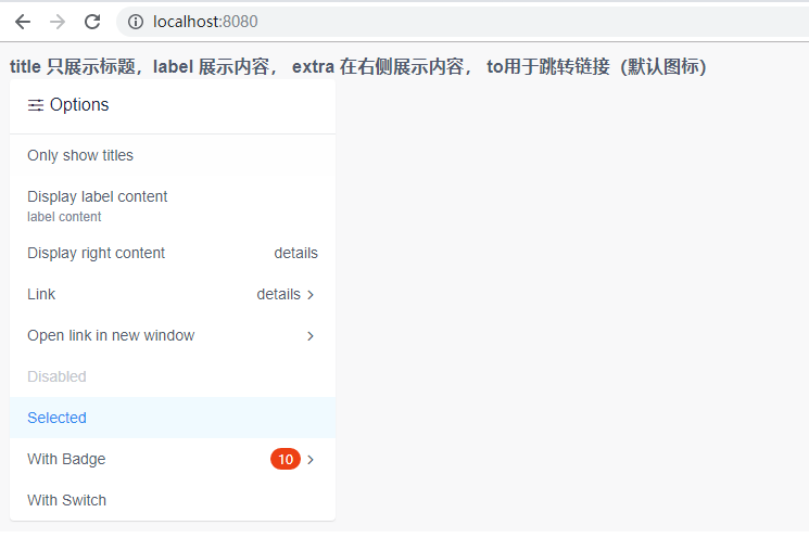
【App.vue】
<template>
    <div style="padding: 10px;background: #f8f8f9">
        <h3>title 只展示標題,label 展示內容, extra 在右側展示內容, to用於跳轉鏈接(預設圖標)</h3>
        <Card title="Options" icon="ios-options" :padding="0" shadow style="width: 300px;">
            <CellGroup>
                <Cell title="Only show titles" />
                <Cell title="Display label content" label="label content" />
                <Cell title="Display right content" extra="details" />
                <Cell title="Link" extra="details" to="https://www.baidu.com" />
                <Cell title="Open link in new window" to="https://www.baidu.com" target="_blank" />
                <Cell title="Disabled" disabled />
                <Cell title="Selected" selected />
                <Cell title="With Badge" to="https://www.baidu.com">
                    <Badge :count="10" slot="extra" />
                </Cell>
                <Cell title="With Switch">
                    <Switch v-model="switchValue" slot="extra" />
                </Cell>
            </CellGroup>
        </Card>
    </div>
</template>
<script>
    export default {
        data () {
            return {
                switchValue: true
            }
        },
    }
</script>
四、組件 -- 導航
1、導航菜單(Menu)
詳見:https://www.iviewui.com/components/menu
(1)為頁面和功能提供導航的菜單列表,常用於網站頂部和左側。
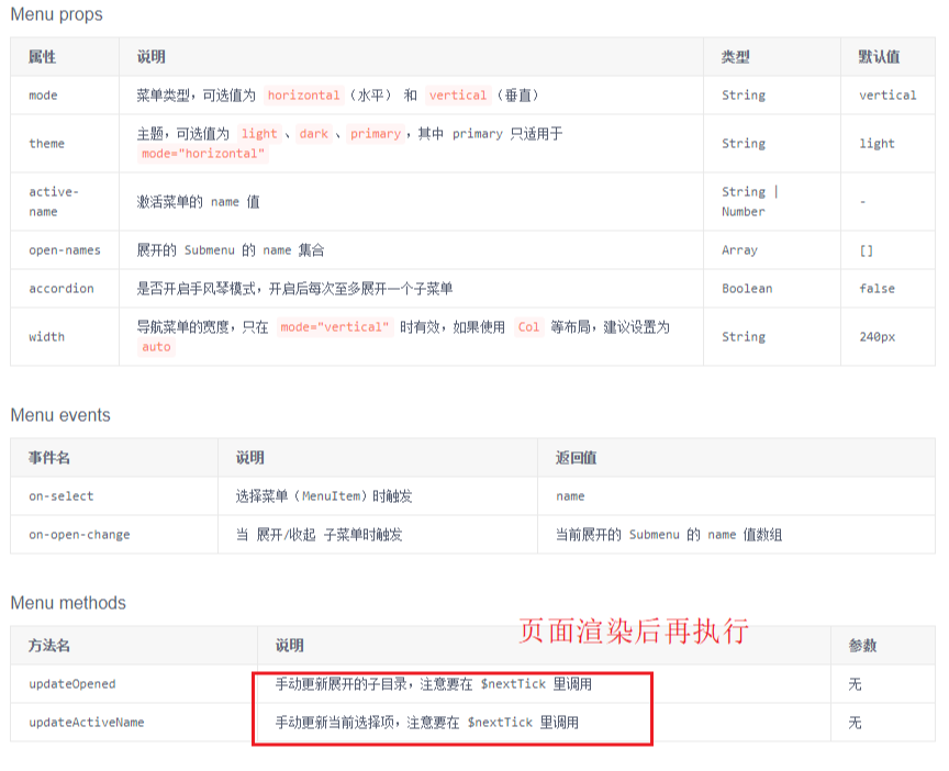
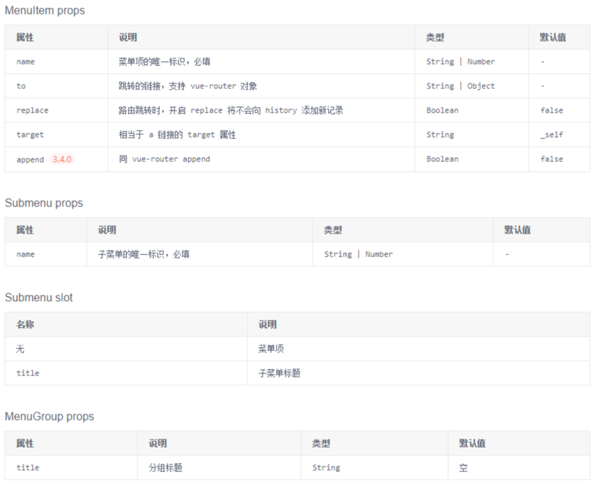
(2)小案例分析:
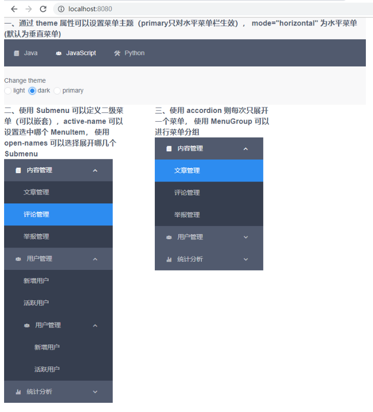
【App.vue】

<template>
    <div style="width: 800px;background: #f8f8f9">
        <h3>一、通過 theme 屬性可以設置菜單主題(primary只對水平菜單欄生效), mode="horizontal" 為水平菜單(預設為垂直菜單)</h3>
        <Menu mode="horizontal" :theme="theme1" active-name="2">
            <MenuItem name="1">
            <Icon type="ios-paper" />
            Java
            </MenuItem>
            <MenuItem name="2">
            <Icon type="ios-people" />
            JavaScript
            </MenuItem>
            <MenuItem name="3">
            <Icon type="ios-construct" />
            Python
            </MenuItem>
        </Menu>
        <br>
        <p>Change theme</p>
        <RadioGroup v-model="theme1">
            <Radio label="light"></Radio>
            <Radio label="dark"></Radio>
            <Radio label="primary"></Radio>
        </RadioGroup>
        <br><br>

        <i-col span="8">
            <h3>二、使用 Submenu 可以定義二級菜單(可以嵌套),active-name 可以設置選中哪個 MenuItem, 使用 open-names 可以選擇展開哪幾個Submenu</h3>
            <Menu :theme="theme1" active-name="1-2" open-names="['1', '2']">
                <Submenu name="1">
                    <template slot="title">
                        <Icon type="ios-paper" />
                        內容管理
                    </template>
                    <MenuItem name="1-1">文章管理</MenuItem>
                    <MenuItem name="1-2">評論管理</MenuItem>
                    <MenuItem name="1-3">舉報管理</MenuItem>
                </Submenu>
                <Submenu name="2">
                    <template slot="title">
                        <Icon type="ios-people" />
                        用戶管理
                    </template>
                    <MenuItem name="2-1">新增用戶</MenuItem>
                    <MenuItem name="2-2">活躍用戶</MenuItem>
                    <Submenu name="3">
                        <template slot="title">
                            <Icon type="ios-people" />
                            用戶管理
                        </template>
                        <MenuItem name="2-1">新增用戶</MenuItem>
                        <MenuItem name="2-2">活躍用戶</MenuItem>
                    </Submenu>
                </Submenu>
                <Submenu name="4">
                    <template slot="title">
                        <Icon type="ios-stats" />
                        統計分析
                    </template>
                    <MenuGroup title="使用">
                        <MenuItem name="3-1">新增和啟動</MenuItem>
                        <MenuItem name="3-2">活躍分析</MenuItem>
                        <MenuItem name="3-3">時段分析</MenuItem>
                    </MenuGroup>
                    <MenuGroup title="留存">
                        <MenuItem name="3-4">用戶留存</MenuItem>
                        <MenuItem name="3-5">流失用戶</MenuItem>
                    </MenuGroup>
                </Submenu>
            </Menu>
        </i-col>

        <i-col span="8" offset="2">
            <h3>三、使用 accordion 則每次只展開一個菜單, 使用 MenuGroup 可以進行菜單分組</h3>
            <Menu :theme="theme1" active-name="1-1" open-names="['1']" accordion>
                <Submenu name="1">
                    <template slot="title">
                        <Icon type="ios-paper" />
                        內容管理
                    </template>
                    <MenuItem name="1-1">文章管理</MenuItem>
                    <MenuItem name="1-2">評論管理</MenuItem>
                    <MenuItem name="1-3">舉報管理</MenuItem>
                </Submenu>
                <Submenu name="2">
                    <template slot="title">
                        <Icon type="ios-people" />
                        用戶管理
                    </template>
                    <MenuItem name="2-1">新增用戶</MenuItem>
                    <MenuItem name="2-2">活躍用戶</MenuItem>
                </Submenu>
                <Submenu name="3">
                    <template slot="title">
                        <Icon type="ios-stats" />
                        統計分析
                    </template>
                    <MenuGroup title="使用">
                        <MenuItem name="3-1">新增和啟動</MenuItem>
                        <MenuItem name="3-2">活躍分析</MenuItem>
                        <MenuItem name="3-3">時段分析</MenuItem>
                    </MenuGroup>
                    <MenuGroup title="留存">
                        <MenuItem name="3-4">用戶留存</MenuItem>
                        <MenuItem name="3-5">流失用戶</MenuItem>
                    </MenuGroup>
                </Submenu>
            </Menu>
        </i-col>
    </div>
</template>
<script>
    export default {
        data() {
            return {
                theme1: 'light'
            }
        }
    }
</script>
2、標簽頁(Tabs)
詳見:https://www.iviewui.com/components/tabs
(1)選項卡切換組件,常用於平級區域大塊內容的的收納和展現。
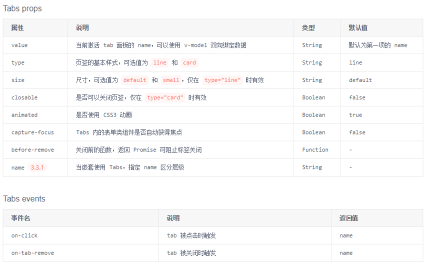

(2)小案例分析:
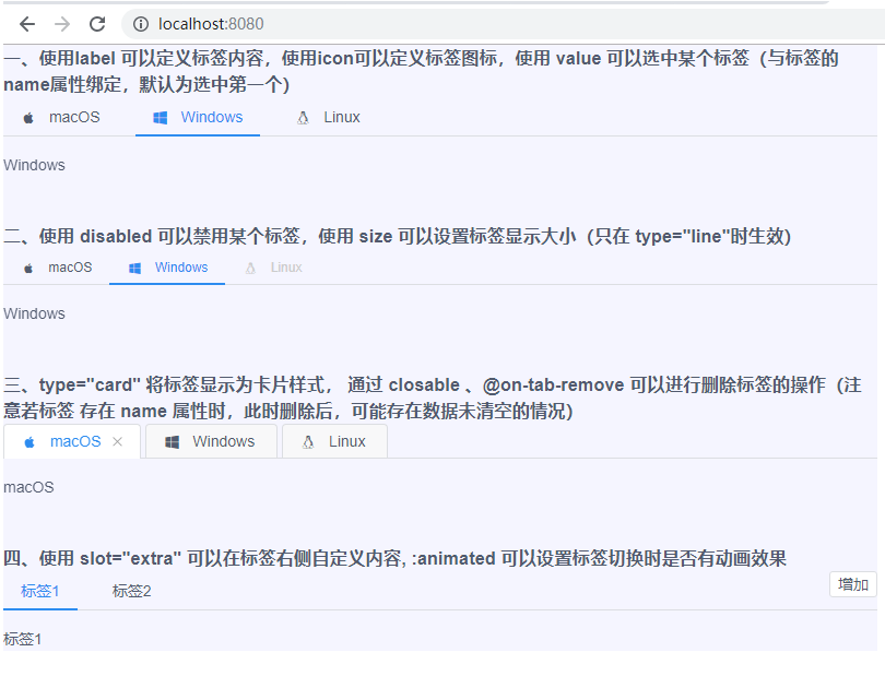
【App.vue】

<template>
    <div style="width: 800px; background-color:#F5F5FF">
        <h3>一、使用label 可以定義標簽內容,使用icon可以定義標簽圖標,使用 value 可以選中某個標簽(與標簽的name屬性綁定,預設為選中第一個)</h3>
        <Tabs value="name2">
            <TabPane label="macOS" icon="logo-apple" name="name1">macOS</TabPane>
            <TabPane label="Windows" icon="logo-windows" name="name2">Windows</TabPane>
            <TabPane label="Linux" icon="logo-tux" name="name3">Linux</TabPane>
        </Tabs>
        <br><br>

        <h3>二、使用 disabled 可以禁用某個標簽,使用 size 可以設置標簽顯示大小(只在 type="line"時生效)</h3>
        <Tabs value="name2" size="small">
            <TabPane label="macOS" icon="logo-apple" name="name1">macOS</TabPane>
            <TabPane label="Windows" icon="logo-windows" name="name2">Windows</TabPane>
            <TabPane label="Linux" icon="logo-tux" name="name3" disabled>Linux</TabPane>
        </Tabs>
        <br><br>

        <h3>三、type="card" 將標簽顯示為卡片樣式, 通過 closable 、@on-tab-remove 可以進行刪除標簽的操作(註意若標簽 存在 name 屬性時,此時刪除後,可能存在數據未清空的情況)</h3>
        <Tabs type="card" closable @on-tab-remove="handleTabRemove">
            <TabPane label="macOS" icon="logo-apple" v-if="tab0">macOS</TabPane>
            <TabPane label="Windows" icon="logo-windows" v-if="tab1">Windows</TabPane>
            <TabPane label="Linux" icon="logo-tux" name="name3" v-if="tab2">Linux</TabPane>
        </Tabs>
        <br><br>

        <h3>四、使用 slot="extra" 可以在標簽右側自定義內容, :animated 可以設置標簽切換時是否有動畫效果</h3>
        <Tabs :animated="false">
            <TabPane v-for="tab in tabs" :key="tab" :label="'標簽' + tab">標簽{{ tab }}</TabPane>
            <Button @click="handleTabsAdd" size="small" slot="extra">增加</Button>
        </Tabs>
    </div>
</template>
<script>
    export default {
        data() {
            return {
                tab0: true,
                tab1: true,
                tab2: true,
                tabs: 2
            }
        },
        methods: {
            handleTabRemove(name) {
                this['tab' + name] = false;
            },
            handleTabsAdd() {
                this.tabs++;
            }

        }
    }
</script>
3、下拉菜單(Dropdown)
詳見:https://www.iviewui.com/components/dropdown
(1)展示一組摺疊的下拉菜單。用起來類似於 摺疊面板(Collapse)

(2)小案例分析:
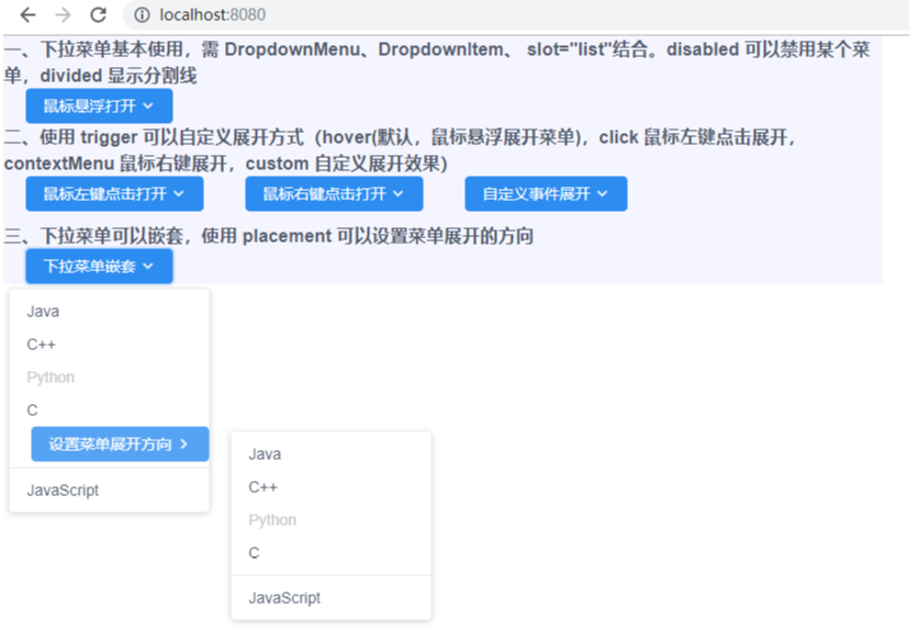
【App.vue】

<template>
    <div style="width: 800px; background-color:#F5F5FF">
        <h3>一、下拉菜單基本使用,需 DropdownMenu、DropdownItem、 slot="list"結合。disabled 可以禁用某個菜單,divided 顯示分割線</h3>
        <Dropdown style="margin-left: 20px">
            <Button type="primary">
                滑鼠懸浮打開
                <Icon type="ios-arrow-down"></Icon>
            </Button>
            <DropdownMenu slot="list">
                <DropdownItem>Java</DropdownItem>
                <DropdownItem>C++</DropdownItem>
                <DropdownItem disabled>Python</DropdownItem>
                <DropdownItem>C</DropdownItem>
                <DropdownItem divided>JavaScript</DropdownItem>
            </DropdownMenu>
        </Dropdown>

        <h3>二、使用 trigger 可以自定義展開方式(hover(預設,滑鼠懸浮展開菜單),click 滑鼠左鍵點擊展開,contextMenu 滑鼠右鍵展開,custom 自定義展開效果)</h3>
        <i-col span="4">
            <Dropdown trigger="click" style="margin-left: 20px">
                <Button type="primary">
                    滑鼠左鍵點擊打開
                    <Icon type="ios-arrow-down"></Icon>
                </Button>
                <DropdownMenu slot="list">
                    <DropdownItem>Java</DropdownItem>
                    <DropdownItem>C++</DropdownItem>
                    <DropdownItem disabled>Python</DropdownItem>
                    <DropdownItem>C</DropdownItem>
                    <DropdownItem divided>JavaScript</DropdownItem>
                </DropdownMenu>
            </Dropdown>
        </i-col>
        <i-col span="4" offset="2">
            <Dropdown trigger="contextMenu" style="margin-left: 20px">
                <Button type="primary">
                    滑鼠右鍵點擊打開
                    <Icon type="ios-arrow-down"></Icon>
                </Button>
                <DropdownMenu slot="list">
                    <DropdownItem>Java</DropdownItem>
                    <DropdownItem>C++</DropdownItem>
                    <DropdownItem disabled>Python</DropdownItem>
                    <DropdownItem>C</DropdownItem>
                    <DropdownItem divided>JavaScript</DropdownItem>
                </DropdownMenu>
            </Dropdown>
        </i-col>
        <i-col span="4" offset="2">
            <Dropdown trigger="custom" :visible="visible" style="margin-left: 20px">
                <Button type="primary" @click="visible = !visible">
                    自定義事件展開
                    <Icon type="ios-arrow-down"></Icon>
                </Button>
                <DropdownMenu slot="list">
                    <DropdownItem>Java</DropdownItem>
                    <DropdownItem>C++</DropdownItem>
                    <DropdownItem disabled>Python</DropdownItem>
                    <DropdownItem>C</DropdownItem>
                    <DropdownItem divided>JavaScript</DropdownItem>
                </DropdownMenu>
            </Dropdown>
        </i-col>
        <br><br>

        <h3>三、下拉菜單可以嵌套,使用 placement 可以設置菜單展開的方向</h3>
        <Dropdown style="margin-left: 20px">
            <Button type="primary">
                下拉菜單嵌套
                <Icon type="ios-arrow-down"></Icon>
            </Button>
            <DropdownMenu slot="list">
                <DropdownItem>Java</DropdownItem>
                <DropdownItem>C++</DropdownItem>
                <DropdownItem disabled>Python</DropdownItem>
                <DropdownItem>C</DropdownItem>
                <Dropdown style="margin-left: 20px" placement="right-start">
                    <Button type="primary">
                        設置菜單展開方向
                        <Icon type="ios-arrow-forward"></Icon>
                    </Button>
                    <DropdownMenu slot="list">
                        <DropdownItem>Java</DropdownItem>
                        <DropdownItem>C++</DropdownItem>
                        <DropdownItem disabled>Python</DropdownItem>
                        <DropdownItem>C</DropdownItem>
                        <DropdownItem divided>JavaScript</DropdownItem>
                    </DropdownMenu>
                </Dropdown>
                <DropdownItem divided>JavaScript</DropdownItem>
            </DropdownMenu>
        </Dropdown>
    </div>
</template>
<script>
    export default {
        data() {
            return {
                visible: false
            }
        }
    }
</script>
4、分頁(Page)
詳見:https://www.iviewui.com/components/page
(1)當數據量較多時,使用分頁可以快速進行數據切換。

(2)小案例分析:
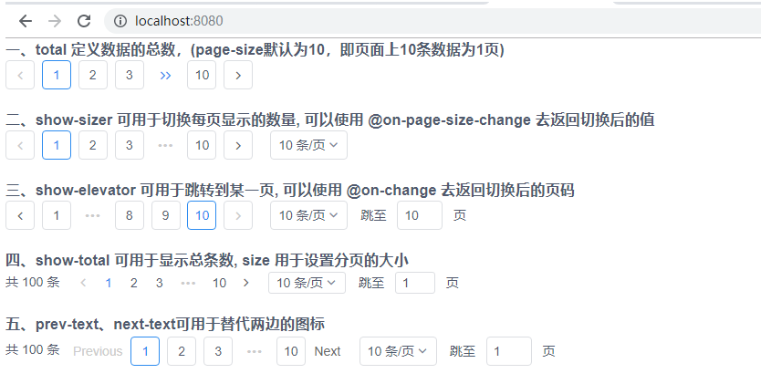
【App.vue】

<template>
    <div style="width: 800px;">
        <h3>一、total 定義數據的總數,(page-size預設為10,即頁面上10條數據為1頁)</h3>
        <Page :total="100" />
        <br>

        <h3>二、show-sizer 可用於切換每頁顯示的數量, 可以使用 @on-page-size-change 去返回切換後的值</h3>
        <Page :total="100" show-sizer @on-page-size-change="showPageSize"/>
        <br>

        <h3>三、show-elevator  可用於跳轉到某一頁, 可以使用 @on-change 去返回切換後的頁碼</h3>
        <Page :total="100" show-sizer show-elevator @on-change="showPage"/>
        <br>

        <h3>四、show-total 可用於顯示總條數, size 用於設置分頁的大小</h3>
        <Page :total="100" show-sizer show-elevator show-total size="small"/>
        <br>

        <h3>五、prev-text、next-text可用於替代兩邊的圖標</h3>
        <Page :total="100" show-sizer show-elevator show-total prev-text="Previous" next-text="Next"/>
        <br>
    </div>
</template>
<script>
    export default {
        methods: {
            showPageSize (index) {
                alert(index)
            },
            showPage (index) {
                alert(index)
            }
        }
    }
</script>
5、麵包屑(Breadcrumb )
詳見:https://www.iviewui.com/components/breadcrumb
(1)顯示網站的層級結構,告知用戶當前所在位置,以及在需要向上級導航時使用。<