純CSS3打造自行車 廢話不想多說,我們直接上圖和代碼最實際。 我們先來看看效果圖吧,看了效果圖之後你們就會有動力去打造屬於你們自己的自行車啦 怎麼樣,帥不帥呀,快來打造帥帥的自行車吧 代碼如下,複製即可用,不過這是我的自行車,你們可不能盜取我的自行車哦 你們打造好你們的自行車了嗎?還沒有的小伙伴們 ...
純CSS3打造自行車
廢話不想多說,我們直接上圖和代碼最實際。
我們先來看看效果圖吧,看了效果圖之後你們就會有動力去打造屬於你們自己的自行車啦
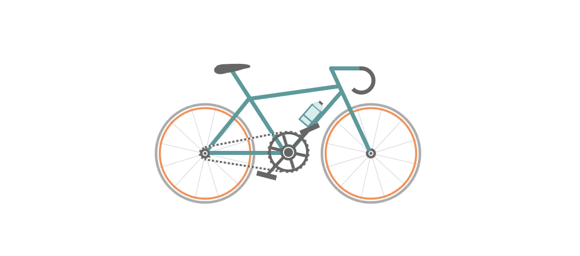
怎麼樣,帥不帥呀,快來打造帥帥的自行車吧
代碼如下,複製即可用,不過這是我的自行車,你們可不能盜取我的自行車哦
<!DOCTYPE html>
<html>
    <head>
        <meta charset="UTF-8">
        <title>快來打造屬於你們自己的自行車吧</title>
        <style type="text/css">
            * {
                margin: 0;
                padding: 0
            }

            ol,
            ul {
                list-style: none/*去掉圓點或數字*/
            }

            .cycle-outer {
                width: 534px;
                height: 260px;
                position: absolute;
                /*絕對定位*/
                top: 50%;
                /*距離頂部*/
                margin: -160px 0 0 -267px;
                /*距離外邊距*/
                left: 50%;
            }

            .cycle-wrapper {
                width: 534px;
                height: 260px;
                margin: 0 auto;
                position: relative;
                /*相對定位*/
            }

            .cycle-wheel-front {
                /*前輪*/
                margin: 100px 0 0 330px;
            }

            .cycle-wheel-back {
                /*後輪*/
                margin: 100px 0 0 0px;
            }

            .cycle-wheel-outer {
                background: transparent;
                border: 5px solid #aaa;
                border-radius: 50%;
                /*畫外輪圓圈*/
                width: 190px;
                height: 190px;
                position: absolute;
                margin-top: 5px;
                animation: wheel-rotate 2s linear infinite;
                /*定義動畫*/
            }
            /*輪胎開始旋轉*/
            @keyframes wheel-rotate {
                from {
                    transform: rotate(0deg);
                }
                to {
                    transform: rotate(360deg);
                }
            }

            .cycle-wheel-outer:after {
                /*插入內輪胎圓圈*/
                background: transparent;
                border: 4px solid #EF9058;
                border-radius: 50%;
                width: 176px;
                height: 176px;
                position: absolute;
                margin: 3px;
                content: "";
            }

            .spoke {
                /*開始畫車輪線條*/
                position: absolute;
                width: 1px;
                height: 200px;
                background: #ccc;
                margin: -5px 0 0 95px;
                z-index: 0;
            }

            .spoke:after {
                /*在後面插入兩條*/
                content: "";
                position: absolute;
                width: 1px;
                height: 200px;
                background: #ccc;
                transform: rotate(120deg);
            }

            .spoke:before {
                /*在前面插入兩條*/
                content: "";
                position: absolute;
                width: 1px;
                height: 200px;
                background: #ccc;
                transform: rotate(240deg);
            }
            /*輪胎線條完成*/

            .spoke-container li:nth-child(2) {
                /*中心點旋轉*/
                transform: rotate(30deg);
            }

            .inner-disc {
                /*畫中心軸圓點*/
                background: #666;
                width: 20px;
                height: 20px;
                border-radius: 50%;
                position: absolute;
                left: 50%;
                margin: -10px 0 0 -10px;
                top: 50%;
            }

            .inner-disc-2 {
                /*畫輪胎中心軸的圓圈*/
                background: transparent;
                width: 6px;
                height: 6px;
                border: 2px solid #FFF;
                border-radius: 50%;
                position: absolute;
                left: 50%;
                margin: -5px 0 0 -5px;
                top: 50%;
            }

            .cycle-wheel-back .inner-disc-2:after {
                /*插入後輪軸心齒輪*/
                content: "";
                background: transparent;
                width: 18px;
                height: 18px;
                border-radius: 50%;
                position: absolute;
                left: 50%;
                margin: -13px 0 0 -13px;
                top: 50%;
                border: 4px dotted #666;
            }
            .cycle-body {
                margin-left: 125px;
            }
            .front-wheel-frame {/*前叉*/
                background: #5E999B;
                width: 8px;
                height: 180px;
                position: absolute;
                z-index: 2;
                transform: rotate(-25deg);
                margin: -72px 0 0 260px;
            }
            .top-frame {/*上管*/
                background: #5E999B;
                width: 180px;
                height: 8px;
                position: absolute;
                z-index: 2;
                margin: -20px 0 0 62px;
                transform: rotate(-8deg);
            }
            .front-frame {/*下管*/
                background: #5E999B;
                width: 8px;
                height: 160px;
                position: absolute;
                z-index: 2;
                transform: rotate(41deg);
                margin: -36px 0 0 189px;
            }
            .center-frame { /*坐桿*/
                background: #5E999B;
                width: 8px;
                height: 205px;
                position: absolute;
                z-index: 2;
                transform: rotate(-33deg);
                margin: -84px 0 0 75px;
            }
            .back-frame {/*後管*/
                background: #5E999B;
                width: 8px;
                height: 136px;
                position: absolute;
                z-index: 2;
                transform: rotate(39deg);
                margin: -23px 0 0 19px;
            }
            .bottom-frame {/*後叉or平管*/
                background: #5E999B;
                width: 159px;
                height: 8px;
                position: absolute;
                z-index: 2;
                margin: 100px 0 0 -16px;
            }
            .handlebar-front {/*車把*/
                width: 60px;
                height: 8px;
                background: #5E999B;
                z-index: 2;
                position: absolute;
                margin: -68px 0 0 222px;
                border-top-left-radius: 3px;
                border-bottom-left-radius: 3px;
            }
            .handlebar-curve {/*車把手*/
                width: 40px;
                height: 40px;
                border: 8px solid #666;
                border-top-right-radius: 100%;
                border-bottom-right-radius: 100%;
                border-bottom-left-radius: 100%;
                background: transparent;
                position: absolute;
                margin: -68px 0 0 258px;
                border-left: 8px solid transparent;
                border-top: 8px solid #666;
                border-bottom: 8px solid #666;
            }
            /*座墊*/
            .seat {
                width: 50px;
                height: 10px;
                background: #666;
                border-radius: 44%;
                position: absolute;
                margin: -73px 0 0 15px;
            }

            .seat:after {
                width: 0px;
                height: 0px;
                border-style: solid;
                border-width: 0 40px 16px 40px;
                border-color: transparent transparent #666 transparent;
                content: "";
                position: absolute;
                z-index: 3;
                transform: rotate(-12deg);
                position: absolute;
                border-radius: 100%;
                margin: 0 0 0 -26px;
            }
            .seat:before {
                width: 0px;
                height: 0px;
                border-style: solid;
                border-width: 0 40px 16px 40px;
                border-color: transparent transparent #666 transparent;
                content: "";
                position: absolute;
                z-index: 3;
                transform: rotate(179deg);
                position: absolute;
                border-radius: 100%;
                margin: 0 0 0 -26px;
            }
            .seat span {
                width: 32px;
                height: 19px;
                background: #666;
                border-radius: 100%;
                position: absolute;
                margin