
1、absolute和float 擁有相同的特性表現: ①包裹性(容器應用之後,可以包裹裡面的內容); ②破壞性(內容應用之後,會破壞父容器) 2、absolute和relative absolute和relative是分離的,對立的。父容器是relative,子元素是absolute,可以限制子元 ...
1、absolute和float
擁有相同的特性表現:
①包裹性(容器應用之後,可以包裹裡面的內容);
 1 <!doctype html>
 2 <html>
 3 <head>
 4 <meta charset="utf-8">
 5 <meta name="viewport" content="width=device-width">
 6 <title>absolute的包裹性</title>
 7 <style>
 8 .box {
 9     padding: 10px;
10     background-color: #f0f0f0;
11 }
12 input {
13     position: absolute; top: 234px;
14     width: 160px; height: 32px;
15     font-size: 100%;
16 }
17 </style>
18 </head>
19
20 <body>
21 <div id="box" class="box"><img src="http://img.mukewang.com/54447b06000171a002560191.jpg" width="256" height="191"></div>
22 <input id="button" type="button" value="容器absolute化">
23 <script>
24 var eleBox = document.getElementById("box"), eleBtn = document.getElementById("button");
25 if (eleBox != null && eleBtn != null) {
26     eleBtn.onclick = function() {
27         if (this.absolute) {
28             eleBox.style.position = "";
29             this.value = "容器absolute化";
30             this.absolute = false;
31         } else {
32             eleBox.style.position = "absolute";
33             this.value = "容器去absolute";
34             this.absolute = true;
35         }
36     };
37 }
38 </script>
39 </body>
40 </html>
②破壞性(內容應用之後,會破壞父容器)
 1 <!doctype html>
 2 <html>
 3 <head>
 4 <meta charset="utf-8">
 5 <meta name="viewport" content="width=device-width">
 6 <title>absolute的破壞性</title>
 7 <style>
 8 .box {
 9     padding: 10px;
10     background-color: #f0f0f0;
11 }
12 input {
13     position: absolute; top: 234px;
14     width: 160px; height: 32px;
15     font-size: 100%;
16 }
17 </style>
18 </head>
19
20 <body>
21 <div class="box"><img id="image" src="http://img.mukewang.com/54447b06000171a002560191.jpg" width="256" height="191"></div>
22 <input id="button" type="button" value="圖片absolute化">
23 <script>
24 var eleImg = document.getElementById("image"), eleBtn = document.getElementById("button");
25 if (eleImg != null && eleBtn != null) {
26     eleBtn.onclick = function() {
27         if (this.absolute) {
28             eleImg.style.position = "";
29             this.value = "圖片absolute化";
30             this.absolute = false;
31         } else {
32             eleImg.style.position = "absolute";
33             this.value = "圖片去absolute";
34             this.absolute = true;
35         }
36     };
37 }
38 </script>
39 </body>
40 </html>
2、absolute和relative
absolute和relative是分離的,對立的。父容器是relative,子元素是absolute,可以限制子元素對父元素破壞性的影響。
獨立的absolute可以擺脫overflow的限制,無論是滾動還是隱藏。
<div style = "overflow:scroll;">
    <a href="javascript:void(0);" title="close" style="position:absolute;"></a>
    <img src="img1.jpg" />
    <img src="img2.jpg" />
</div>
3、無依賴的absolute定位
無依賴是指不受父元素relative限制的absolute定位,行為表現上是不使用top/right/bottom/left任何一個屬性或使用auto作為值。
特性:①脫離文檔流;
②位置跟隨;

③去浮動(效果同上圖);
④IE7下會inline-block化(解決方案:在元素外層套一個空div標簽)
4、absolute的實際應用
(1)圖片圖標絕對定位覆蓋:
先來點小技巧,在實際開發中,為了好看標簽一般都各占一行。為了消除不必要的空格,可以如下處理:

效果圖:
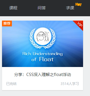
實例代碼:
 1 <!doctype html>
 2 <html>
 3 <head>
 4 <meta charset="utf-8">
 5 <title>圖標定位二三事</title>
 6 <style>
 7 body { font: 14px/1.4 "Microsoft YaHei"; background-color: #EDEFF0; }
 8 body, h3, h5 { margin: 0; }
 9 img { border: 0 none; vertical-align: bottom; }
10 .l { float: left; }.r { float: right; }
11 .constr { width: 1200px; margin-left: auto; margin-right: auto; }
12 .header { background-color: #2A2C2E; }
13 .nav { height: 60px; }
14 .nav-list { float: left; font-size: 14px; font-weight: 400; }
15 .nav-a { display: inline-block; line-height: 20px; padding: 20px 35px; color: #B5BDC0; text-decoration: none; }
16 .nav-a:hover { color: #fff; }
17
18 .course { padding-top: 10px; }
19 .course-list { float: left; width: 280px; height: 240px; margin: 5px 10px 15px; border-radius: 0 0 1px 1px; background-color: #F7FAF9; background-color: rgba(255,255,255,1); box-shadow: 0 1px 2px #c5c5c5; text-decoration: none; }
20 .course-list-img { background-color: #6396F1; }
21 .course-list-h { line-height: 50px; font-size: 14px; font-weight: 400; color: #363d40; text-align: center; }
22 .course-list-tips { margin: 0 14px; font-size: 12px; color: #b4bbbf; overflow: hidden; }
23
24 .icon-hot { position: absolute; width: 28px; height: 11px; margin: -6px 0 0 2px; background: url(http://img.mukewang.com/545304730001307300280011.gif); }
25 .icon-recom { position: absolute; line-height: 20px; padding: 0 5px; background-color: #f60; color: #fff; font-size: 12px; }
26 .icon-vip { position: absolute; width: 36px; height: 36px; margin-left: -36px; background: url(http://img.mukewang.com/5453048000015d8800360036.gif); text-indent: -9em; overflow: hidden; }
27 </style>
28 </head>
29
30 <body>
31 <div class="header">
32     <div class="constr">
33         <div class="nav">
34             <h3 class="nav-list">
35                 <a href="http://www.imooc.com/course/list" class="nav-a">課程</a>
36             </h3>
37             <h3 class="nav-list">
38                 <a href="http://www.imooc.com/wenda" class="nav-a">問答</a>
39             </h3>
40             <h3 class="nav-list">
41                 <a href="http://www.imooc.com/seek/index" class="nav-a">
42                     求課<i class="icon-hot"></i>
43                 </a>
44             </h3>
45         </div>
46     </div>
47 </div>
48
49 <div class="main">
50     <div class="constr">
51         <div class="course">
52             <a href="http://www.imooc.com/view/121" class="course-list">
53                 <div class="course-list-img">
54                     <span class="icon-recom">推薦</span>
55                     <img width="280" height="160" alt="分享:CSS深入理解之float浮動" src="http://img.mukewang.com/53d74f960001ae9d06000338-300-170.jpg"><!--
56                     --><i class="icon-vip">vip</i>
57                 </div>
58                 <h5 class="course-list-h">分享:CSS深入理解之float浮動</h5>
59                 <div class="course-list-tips">
60                     <span class="l">已完結</span>
61                     <span class="r">3514人學習</span>
62                 </div>
63             </a>
64         </div>
65     </div>
66 </div>
67 </body>
68 </html>
(2)下拉框定位最佳實踐:
效果圖:

實例代碼:
 1 <!doctype html>
 2 <html>
 3 <head>
 4 <meta charset="utf-8">
 5 <title>下拉框定位二三事</title>
 6 <style>
 7 body { margin: 0; font: 14px/1.4 "Microsoft YaHei"; background-color: #EDEFF0; }
 8 .constr { width: 1200px; max-width: 80%; margin-left: auto; margin-right: auto; padding-bottom: 300px; overflow: hidden; }
 9 .course-sidebar { width: 262px; float: left; }
10 .course-sidebar > div { border


