WPF中的Style類似於Web應用程式中的CSS,它是控制項的一個屬性,屬於資源的一種。 ControlTemplate和DataTemplate區別: ControlTemplate用於改變控制項原來的形狀(一般定義在Style中,給控制項穿上一層新的外殼,改變這個控制項的外觀),而DataTempla ...
WPF中的Style類似於Web應用程式中的CSS,它是控制項的一個屬性,屬於資源的一種。
ControlTemplate和DataTemplate區別:
ControlTemplate用於改變控制項原來的形狀(一般定義在Style中,給控制項穿上一層新的外殼,改變這個控制項的外觀),而DataTemplate不改變控制項原來的形狀(給某個控制項加上數據,相當於給控制項顯示它想顯示的內容(可能會有多種控制項組合))。
通常把Style定義在Resources中,使用方式如下:
<Windows.Resources>
  <Style  x:Key="btnstyle"  TargetType="Button">
     <Setter Property="Width" Value="80"/>
     <Setter Property="Height" Value="50"/>
     <Setter Property="Foreground" Value="Pink"/>
     <Setter Property="FontSize" Value="20"/>
     <Style.Triggers>
        <Trigger Property="IsMouseOver" Value="true">
           <Setter Property="Background" Value="pink"/>
        </Trigger>
        <MultiTrigger>
          <MultiTrigger.Conditions>
             <Condition Property="IsMouseOver" Value="false"/>
             <Condition Property="FontSize" Value="20"/>
          </MultiTrigger.Conditions>
          <MultiTrigger.Setters>
             <Setter Property="Background" Value="Gold"/>
          </MultiTrigger.Setters>
        </MultiTrigger>
     </Style.Triggers>
  </Style>
<Window.Resources>
<Button x:Name="button1" Style="{StaticResource btnstyle}" Content="button1" >
button1.style=(style)Resources["btnstyle"];
如果只需對控制項進行小幅度修飾(調整大小、位置、字體、顏色等)就用style;如果需要改變控制項的外觀和行為就用controlTemplate(形狀、事件觸發如滑鼠停留效果等)。在實際項目中,經常把Template定義在Style中,通過Style 中的Property來設置控制項的Template屬性。
WPF中的所有COntrol控制項都有Template屬性。下麵以代碼的形式,展現WPF中常用的Template。
<Window x:Class="WPFXAMLTest.WindowControlTemplate"
        xmlns="http://schemas.microsoft.com/winfx/2006/xaml/presentation"
        xmlns:x="http://schemas.microsoft.com/winfx/2006/xaml"
        Title="WindowControlTemplate" Height="300" Width="300">
    <Grid Background="Yellow">
        <Button Width="200" Height="60" Background="Cyan">
            <Button.Template>
                <ControlTemplate TargetType="Button">
                    <Grid>
                        <Rectangle Width="180" Height="50" Fill="{TemplateBinding Background}" RadiusX="20" RadiusY="20"/>
                        <ContentPresenter Content="{TemplateBinding Content}" VerticalAlignment="Center" HorizontalAlignment="Center" RecognizesAccessKey="True"/>
                    </Grid>
                </ControlTemplate>
            </Button.Template>
                <Button.Content>
                <Grid>
                    <Ellipse Fill="Red" Width="160" Height="40"/>
                    <TextBlock Text="DebugLZQ" VerticalAlignment="Center" HorizontalAlignment="Center"/>
                </Grid>
            </Button.Content>
        </Button>
        <Button  HorizontalAlignment="Left" Margin="105,190,0,0" VerticalAlignment="Top" Width="75">
           <Button.Template>
               <ControlTemplate >
                    <TextBlock Text="DebugLZQ" VerticalAlignment="Center" HorizontalAlignment="Center"/>
                </ControlTemplate>
           </Button.Template>
        </Button>
    </Grid>
</Window>
<Style  x:Key="btnstyle" TargetType="Button">
            <Setter Property="Width" Value="80"/>
            <Setter Property="Height" Value="50"/>
            <Setter Property="Foreground" Value="Pink"/>
            <Setter Property="FontSize" Value="20"/>
            <Setter Property="Template"><!--所有Control控制項都有Style和Template屬性,前者用來控制控制項的原有屬性;後者用來定義控制項的內部結構,對控制項外觀和形狀進行改變 -->
                <Setter.Value>
                    <ControlTemplate TargetType="Button"><!--ControlTemplate 描述控制項的行為和樣式-->
                        <Grid Width="80" Height="50">
                            <Image Source="Images/1.png" Stretch="Fill" />
                            <!---->
                            <ContentPresenter HorizontalAlignment="Center"  VerticalAlignment="Center" />
                        </Grid>
                        <ControlTemplate.Triggers>
                            <Trigger Property="IsMouseOver" Value="true">
                                <Setter Property="Effect">
                                    <Setter.Value>
                                        <DropShadowEffect ShadowDepth="4"/>
                                    </Setter.Value>
                                </Setter>
                            </Trigger>
                        </ControlTemplate.Triggers>
                    </ControlTemplate>
                </Setter.Value>
            </Setter>

        </Style>
<Button x:Name="button1" Style="{StaticResource btnstyle}" Content="button1" Click="Button_Click" Margin="30,23,393,238"/>
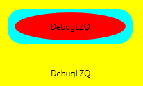
<Style x:Key="btnstyle2" TargetType="Button">
            <Setter Property="Width" Value="80"/>
            <Setter Property="Height" Value="50"/>
            <Setter Property="ContentTemplate"><!--2.ContentTemplate不改變控制項行為的基礎上,只對控制項內容進行更改 -->
                <Setter.Value>
                    <DataTemplate><!--返回值是 DataTemplate-->
                         <Grid>
                             <Image Source="Images/1.png" Stretch="Fill" />
                              <TextBlock  Text="{TemplateBinding Content}" FontSize="20" HorizontalAlignment="Center" VerticalAlignment="Center" Foreground="Pink" />
                         </Grid>
                    </DataTemplate>
                </Setter.Value>
            </Setter>
        </Style>
<Button x:Name="button2" Style="{StaticResource btnstyle2}" Content="button2" Margin="30,117,392,144" />
<Style x:Key="lstboxstyle" TargetType="ListBox">
            <Setter Property="ItemTemplate">
                <Setter.Value>
                    <DataTemplate>
                        <StackPanel>
                            <Image Source="{Binding ImgPath}" Width="70" Height="70" Margin="0"/>
                            <TextBlock Text="{Binding ImgTxt}" HorizontalAlignment="Center" Margin="5"/>
                        </StackPanel>
                    </DataTemplate>
                </Setter.Value>
            </Setter>
        </Style>
<ListBox Style="{StaticResource lstboxstyle }" Height="214" HorizontalAlignment="Left" Margin="226,12,0,0" Name="listBox1" VerticalAlignment="Top" Width="153" />
//Binding ListBox
ArrayList list = new ArrayList();
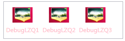
list.Add(new { ImgPath="Images/1.png",ImgTxt="DebugLZQ1"});
list.Add(new { ImgPath = "Images/1.png", ImgTxt = "DebugLZQ2" });
list.Add(new { ImgPath = "Images/1.png", ImgTxt = "DebugLZQ3" });
listBox1.ItemsSource = listBox2.ItemsSource = list;

<Style x:Key="lstboxstyle2" TargetType="ListBox">
            <Setter Property="ItemsPanel">
                <Setter.Value>
                    <ItemsPanelTemplate><!-- ItemsPanelTemplate指定控制項子項的佈局樣式,Combox,TreeView,DataGrid,TabelControl也都均有此屬性-->
                        <StackPanel Orientation="Horizontal" />
                    </ItemsPanelTemplate>
                </Setter.Value>
            </Setter>
            <Setter Property="ItemTemplate"><!-- ItemTemplate定義子項的外觀-->
                <Setter.Value>
                    <DataTemplate><!-- 返回值DataTemplate-->
                        <StackPanel>
                            <Image Source="{Binding ImgPath}" Width="70" Height="70" Margin="0"/>
                            <TextBlock Text="{Binding ImgTxt}" HorizontalAlignment="Center" Margin="5" Foreground="Pink"/><!--可以這裡改-->
                        </StackPanel>
                    </DataTemplate>
                </Setter.Value>
            </Setter>
            <Setter Property="ItemContainerStyle"><!--也能在這裡改,也能直接在TextBlock里改-->
                <Setter.Value>
                    <Style TargetType="ListBoxItem">
                        <Setter Property="FontSize" Value="20"/>
                    </Style>
                </Setter.Value>
            </Setter>
        </Style>
<ListBox Style="{StaticResource lstboxstyle2 }" Height="131" HorizontalAlignment="Left" Margin="42,256,0,0" Name="listBox2" VerticalAlignment="Top" Width="417" />