一、2D變換 1、transform 設置或檢索對象的轉換 取值: none::以一個含六值的(a,b,c,d,e,f)變換矩陣的形式指定一個2D變換,相當於直接應用一個[a,b,c,d,e,f]變換矩陣 translate(<length>[, <length>])。第一個參數對應X軸,第二個參數 ...
一、2D變換
1、transform 設置或檢索對象的轉換
取值:
none::以一個含六值的(a,b,c,d,e,f)變換矩陣的形式指定一個2D變換,相當於直接應用一個[a,b,c,d,e,f]變換矩陣
translate(<length>[, <length>])。第一個參數對應X軸,第二個參數對應Y軸。如果第二個參數未提供,則預設值為0。
translateX(<length>):指定對象X軸(水平方向)的平移
translateY(<length>):指定對象Y軸(垂直方向)的平移
rotate(<angle>):指定對象的2D rotation(2D旋轉)。第一個參數對應X軸,第二個參數對應Y軸。如果第二個參數未提供,則預設取第一個參數的值
scaleX(<number>):指定對象X軸的(水平方向)縮放
scaleY(<number>):指定對象Y軸的(垂直方向)縮放
skew(<angle> [, <angle>]):指定對象skew transformation(斜切扭曲)。第一個參數對應X軸,第二個參數對應Y軸。如果第二個參數未提供,則預設值為0 skewX(<angle>):指定對象X軸的(水平方向)扭曲
skewY(<angle>):指定對象Y軸的(垂直方向)扭曲
註:不同瀏覽器需寫以下首碼。
| 內核類型 | 寫法 |
|---|---|
| Webkit(Chrome/Safari) | -webkit-transform |
| Gecko(Firefox) | -moz-transform |
| Presto(Opera) | -o-transform |
| Trident(IE) | -ms-transform |
| W3C | transform |
例子:
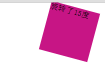
CSS代碼:
      #transform1
        {
            margin: 0 auto;
            width: 100px;
            height: 100px;
            background-color: mediumvioletred;
            -webkit-transform: rotate(15deg);
         }
HTML代碼:
<div id="transform1">旋轉了15度</div>
2、transform-origin 設置或檢索對象以某個原點進行轉換。
取值:
<percentage>:用百分比指定坐標值。可以為負值。
<length>:用長度值指定坐標值。可以為負值。
left:指定原點的橫坐標為leftcenter①:指定原點的橫坐標為
centerright:指定原點的橫坐標為
righttop:指定原點的縱坐標為
topcenter②:指定原點的縱坐標為
centerbottom:指定原點的縱坐標為bottom
不同瀏覽器下的寫法:
| 內核類型 | 寫法 |
|---|---|
| Webkit(Chrome/Safari) | -webkit-transform-origin |
| Gecko(Firefox) | -moz-transform-origin |
| Presto(Opera) | -o-transform-origin |
| Trident(IE) | -ms-transform-origin |
| W3C | transform-origin |
例子:
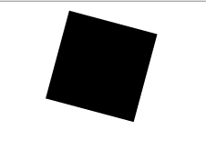
CSS代碼:
        #transform1
        {
            margin: 0 auto;
            width: 100px;
            height: 100px;
            background-color: mediumvioletred;
            -webkit-transform: rotate(15deg);/*旋轉15度*/
            -webkit-transform-origin: left center; /*以左上角為原點旋轉*/
        }
HTML代碼:
<div id="transform1"></div>
二、過渡樣式
1、transition-property 檢索或設置對象中的參與過渡的屬性。
取值:
- all:所有可以進行過渡的css屬性
- none:不指定過渡的css屬性
- 有過渡效果的屬性:
-
- 例子:
- CSS代碼:
         #transform1
        {
            margin: 0 auto;
            width: 100px;
            height: 100px;
            background-color: red;
            transition-property: background-color;

        }
        #transform1:hover
        {
            transition-duration:.5s;
            transition-timing-function:ease-in;
            background-color: yellow;
        }
- HTML代碼:
<div id="transform1">請將滑鼠放在上面</div>
請將滑鼠放在上面
2、transition-duration 檢索或設置對象過渡的持續時間
transition-duration:time
例子可參見上個例子。3、transition-timing-function 檢索或設置對象中過渡的動畫類型。
取值: linear:線性過渡。等同於貝塞爾曲線(0.0, 0.0, 1.0, 1.0) ease:平滑過渡。等同於貝塞爾曲線(0.25, 0.1, 0.25, 1.0) ease-in:由慢到快。等同於貝塞爾曲線(0.42, 0, 1.0, 1.0) ease-out:由快到慢。等同於貝塞爾曲線(0, 0, 0.58, 1.0) ease-in-out:由慢到快再到慢。等同於貝塞爾曲線(0.42, 0, 0.58, 1.0)cubic-bezier(<number>, <number>, <number>, <number>):特定的貝塞爾曲線類型,4個數值需 在[0, 1]區間內。 例子可參見上個例子。 4、transition-delay 設置對象延遲過渡的時間。 CSS代碼:
        #delay1
        {
            background-color: antiquewhite;
            width:100px;
            height:100px;
        }
        #delay1:hover
        {
            transition-duration:1s;
            transition-timing-function:ease-in;
            background-color: black;
        }
        #delay2
        {
            background-color: antiquewhite;
            width:100px;
            height:100px;
        }
        #delay2:hover
        {
            transition-duration:4s;
            transition-timing-function:ease-in;
            background-color: blue;
        }
HTML代碼;
<div id="delay1">延遲1s後開始過渡</div>
<div id="delay2">延遲4s後開始過渡</div>
延遲1s後開始過渡
延遲4s後開始過渡
***一般情況下可以將變形與過渡結合使用製作出一些特別的效果。
例:
CSS代碼:
        #all
        {
            width: 100px;
            height: 100px;
            background-color: red;
        }
        #all:hover
        {
            background-color: yellow;
            transition-delay: .5s;
            transition-timing-function: ease-in;
            transform: scale(1.5,1.5);
            transition-duration: 1s;
        }
HTML代碼:
<div id="all">請把滑鼠放在上面查看效果</div>
請把滑鼠放在上面查看效果