第3章:佈局 本章目標 理解佈局的原則 理解佈局的過程 理解佈局的容器 掌握各類佈局容器的運用 理解 WPF 中的佈局 WPF 佈局原則 WPF 視窗只能包含單個元素。為在WPF 視窗中放置多個元素並創建更貼近實用的用戶男面,需要在視窗上放置一個容器,然後在這個容器中添加其他元素。造成這一限制的 ...
第3章:佈局
本章目標
- 理解佈局的原則
- 理解佈局的過程
- 理解佈局的容器
- 掌握各類佈局容器的運用
理解 WPF 中的佈局
WPF 佈局原則
WPF 視窗只能包含單個元素。為在WPF 視窗中放置多個元素並創建更貼近實用的用戶男面,需要在視窗上放置一個容器,然後在這個容器中添加其他元素。造成這一限制的原因是 Window 類繼承自 ContentControl 類,在後續章節中將進一步分析ContentControl類。
佈局過程
WPF 佈局包括兩個階段:測量(measure)階段和排列(arange)階段。在測量階段,容器遍歷所有子元素,並詢問子元素它們所期望的尺寸。在排列階段,容器在合適的位置放置子元素。
當然,元素未必總能得到最合適的尺寸—有時容器沒有足夠大的空間以適應所含的元素。在這種情況下,容器為了適應可視化區域的尺寸,就必須剪裁不能滿足要求的元素。在後面可以看到,通常可通過設置最小視窗尺寸來避免這種情況。
註意:
佈局容器不能提供任何滾動支持.相反,滾動是由特定的內容控制項ScrollViewer—一提供的,ScrollViewer 控制項幾乎可用於任何地方。
佈局容器
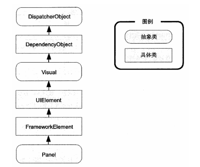
所有 WPF 佈局容器都是派生自 System.Windows.Controls.Panel 抽象類的面板(見下圖)。Panel 類添加了少量成員,包括三個公有屬性,下表列出了這三個公有屬性的詳情。
| 名稱 | 說明 |
|---|---|
| Background | 該屬性是用於為面板背景著色的畫刷。如果想接收滑鼠事件,就必須將該屬性設置為非空值(如果想接收滑鼠事件,又不希望顯示固定顏色的背景,那麼只需要將背景色設置為透明即可) |
| Children | 該屬性是在面板中存儲的條目集合。這是第一級條目—換句話說,這些條目自身也可以包含更多的條目。 |
| IsItemsHost | 該屬性是一個布爾值,如果面板用於顯示與 ItemsControl 控制項關聯的項(例如,TreeView 控制項中的節點或列表框中的列表項),該屬性值為 true。在大多數情況下,甚至不需要知道列表控制項使用後臺面板來管理它所包含的條目的佈局。但如果希望創建自定義的列表,以不同方式放置子元素(例如,以平鋪方式顯示圖像的 ListBox控制項),該細節就變得很重要了。 |
就Panel基類本身而言沒有什麼特別的,但它是其他更多特類的起點。WPF提供了大量可用於安排佈局的繼承自Panel的類,下表中列出了其中幾個最基本的類。與所有 WPF控制項和大多數可視化元素一樣,這些類位於 System. Windows.Controls 名稱空間中。
| 名稱 | 說明 |
|---|---|
| StackPanel | 在水平或垂直的堆棧中放置元素。這個佈局容器通常用於更大、更複雜視窗中的一些小區域. |
| WrapPanel | 在一系列可換行的行中放置元素。在水平方向上,WrapPanel 面板從左向右放置條目,然後在隨後的行中放置元素。在垂直方向上,WrapPanel 面板在自上而下的列中放置元素,並使用附加的列放置剩餘的條目. |
| DockPanel | 根據容器的整個邊界調整元素 |
| Grid | 根據不可見的表格在行和列中排列元素,這是最靈活、最常用的容器之一. |
| UnitformGrid | 在不可見但是強制所有單元格具有相同尺寸的表中放置元素,這個佈局容器不常用. |
| Canvas | 使用固定坐標絕對定位元素。這個佈局容器與傳統 Windows 窗體應用程式最相似,但沒有提供錨定或停靠功能。因此,對於尺寸可變的視窗,該佈局容器不是合適的選擇。如果選擇的話,需要另外做一些工作。 |
StackPanel 面板
StackPanel 面板是最簡單的佈局容器之一。該面板簡單地在單行或單列中以堆棧形式放置其子元素。例如,下麵的代碼段中,視窗包含4個按鈕。
<Window x:Class="WpfApp1.Window1"
        xmlns="http://schemas.microsoft.com/winfx/2006/xaml/presentation"
        xmlns:x="http://schemas.microsoft.com/winfx/2006/xaml"
        xmlns:d="http://schemas.microsoft.com/expression/blend/2008"
        xmlns:mc="http://schemas.openxmlformats.org/markup-compatibility/2006"
        xmlns:local="clr-namespace:WpfApp1"
        mc:Ignorable="d"
        Title="Window1" Height="450" Width="800">
    <StackPanel>
        <Label>A Button Stack</Label>
        <Button>button1</Button>
        <Button>button2</Button>
        <Button>button3</Button>
        <Button>button4</Button>
    </StackPanel>
</Window>
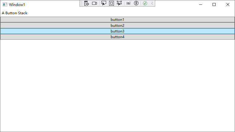
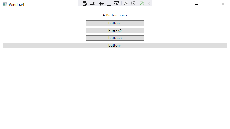
認情況下,StackPane! 面板按自上而下的順序推列元素,使每個元素的高度適合它的內≥。在這個示例中,這底味老標簽和技鈕的大小剛好足夠適應它們內部包含的文本。所有元素都被拉伸到 SatckPane! 面板的整個寬度,這也是視窗的寬度。如果加寬視窗,StackPanel 面板也會變寬,並且按鈕也會拉伸自身以適應變化。
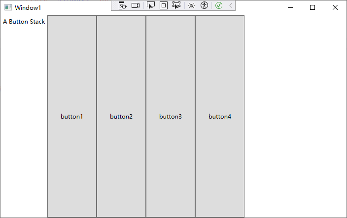
通過設置 Oricntation 屬性,StackPanel 面板也可用於水平排列元素:
<Window x:Class="WpfApp1.Window1"
        xmlns="http://schemas.microsoft.com/winfx/2006/xaml/presentation"
        xmlns:x="http://schemas.microsoft.com/winfx/2006/xaml"
        xmlns:d="http://schemas.microsoft.com/expression/blend/2008"
        xmlns:mc="http://schemas.openxmlformats.org/markup-compatibility/2006"
        xmlns:local="clr-namespace:WpfApp1"
        mc:Ignorable="d"
        Title="Window1" Height="450" Width="800">
    <StackPanel Orientation="Horizontal">
        <Label>A Button Stack</Label>
        <Button MinWidth="100">button1</Button>
        <Button MinWidth="100">button2</Button>
        <Button MinWidth="100">button3</Button>
        <Button MinWidth="100">button4</Button>
    </StackPanel>
</Window>
佈局屬性
儘管佈局由容器決定,但子元素仍有一定的決定權。實際上,佈局面板支持一小組佈局屬性,以便與子元素結合使用,下表中列出了這些佈局屬性。
| 名稱 | 說明 |
|---|---|
| HorizontalAlignment | 前水平方向上新額外的空閑時,該屬性決定了子元素在佈局容器中如何定位。可選用 Center、Left、 Right 或 Stretch 等屬性值。 |
| VerticalAlignment | 當垂直方向上有額外的空閑時,該屬性決定了子元素在佈局容中如何定位。可選用 Center、Top、Bottom 或 Stretch 等屬性值。 |
| Margin | 該屬性用於在元素的周圍添加一定的空間.Margin 屬性是 System.Windows.Thickness結構的一個實例,該結構具有分別用於為頂部、底部、左邊和右邊添加空間的獨立組件。 |
| MinWidth 和 MinHeight | 這兩個屬性用於設置元素的最小尺寸。如果一個元素對於其他佈局容器來說太大,該元素將被剪裁以適合容器。 |
| MaxWidth 和 MaxHeight | 這兩個屬性用於設置元素的最大尺寸。如果有更多可以使用的空間,那麼在擴展子元素時就不會超出這一限制,即使將 HorizontalAlignment 和 VerticalAlignment 屬性設置為 Stretch 也同樣如此。 |
| Width 和 Height | 這兩個屬性用於顯式地設置元素的尺寸。這一設置會重寫為 HorizontalAlignment 和VerticalAlignment 屬性設置的 Stretch 值。但不能超出MinWidth、MinHeight、MaxWidth 和 MaxHeight 屬性設置的範。 |
對齊方式
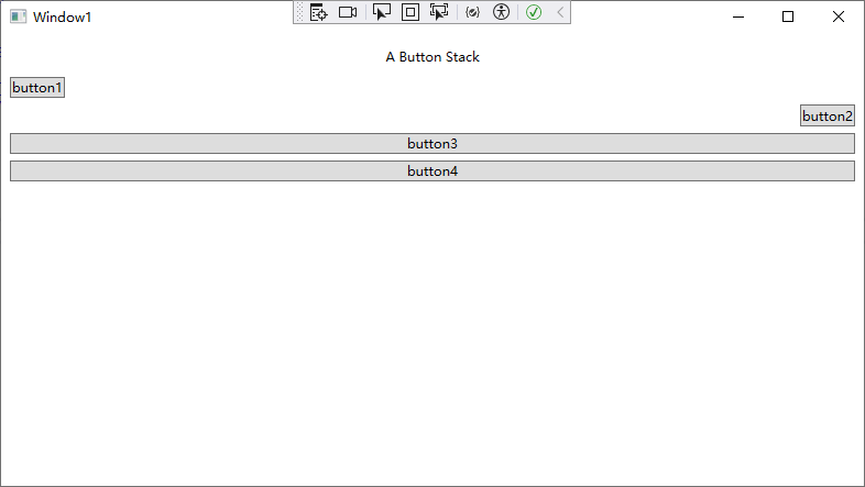
通常,對於 Label 控制項,HorizontalAligament 屬性的值預設為 Lef:對於 Button 控制項,HorzontalAlignment 屬性的售預設為 Streteh。這也是為什麼每個技鈕的寬度被調整為控列的寬度的原因所在。但可以改變這些細節:
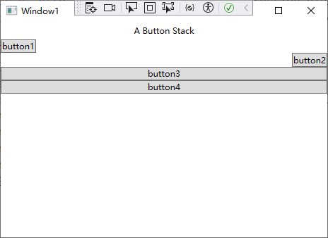
<Window x:Class="WpfApp1.Window1"
        xmlns="http://schemas.microsoft.com/winfx/2006/xaml/presentation"
        xmlns:x="http://schemas.microsoft.com/winfx/2006/xaml"
        xmlns:d="http://schemas.microsoft.com/expression/blend/2008"
        xmlns:mc="http://schemas.openxmlformats.org/markup-compatibility/2006"
        xmlns:local="clr-namespace:WpfApp1"
        mc:Ignorable="d"
        Title="Window1" Height="450" Width="800">
    <StackPanel>
        <Label HorizontalAlignment="Center">A Button Stack</Label>
        <Button HorizontalAlignment="Left">button1</Button>
        <Button HorizontalAlignment="Right">button2</Button>
        <Button>button3</Button>
        <Button>button4</Button>
    </StackPanel>
</Window>
現在前兩個按鈕的尺寸是它們應當具有的最小尺寸,併進行了對齊,而底部兩個按鈕被拉伸至整個 SiackPanel面板的寬度。如果改變視窗的尺寸,就會發現標簽保持在中間位置,而前兩個按鈕分別被粘貼到兩邊。
註意:
SiackPanel面板也有自己的HorizontalAlignment 和 VerticalAlignment 屬性。這兩個屬性職認都被設置為 Stretch,所以 StackPanel 面板完全充滿它的容器、在這個示例中,這意味著stackPanel西板充滿整個視窗。如果使用不同設置,StackPanel 面板的尺寸將足夠寬以容納最寬的控制項。
邊距
在SackPane!示例中,在當前情況下存在一個明顯的問題。設計良好的視窗不只是包含元素—還應當在元素之間包貪一定的額外空間。為了添加額外的空間並使StaokPanel 面板示例中的按鈕不那麼緊密,可為控制項設置邊距。
當設置邊距時,可為所有邊設置相同的寬度,如下所示:
<Button Margin="5">button3</Button>
相應地,也可為控制項的每個邊以左、上、右、下的順序設置不同的邊距:
<Button Margin="5,10,5,10">Button 3</Button>
在代碼中,使用 Thickness 結構來設置邊距:
btn. Margin = new Thickness (5) ;
為得到正確的控制項邊距,需要採用一些藝術手歐,因內需要考慮相鄰控制項邊距改置的相互影響。例如,如果兩個技鈕堆在一起,位於最高處的技鈕的底部邊距設置為5,而下麵技鈕的頂部邊距也設置為5,那麼在這兩個按鈕之間就有10個單位的空間。
理想情況是,能儘可能始終如一地保持不同的邊距設置,避免為不同的邊設置不同的值。
例如,在StackPanel示例中,為按鈕和麵板本身使用相同的邊距是比較合適的,如下所示:
<Window x:Class="WpfApp1.Window1"
        xmlns="http://schemas.microsoft.com/winfx/2006/xaml/presentation"
        xmlns:x="http://schemas.microsoft.com/winfx/2006/xaml"
        xmlns:d="http://schemas.microsoft.com/expression/blend/2008"
        xmlns:mc="http://schemas.openxmlformats.org/markup-compatibility/2006"
        xmlns:local="clr-namespace:WpfApp1"
        mc:Ignorable="d"
        Title="Window1" Height="450" Width="800">
    <StackPanel Margin="5">

        <Label Margin="3" HorizontalAlignment="Center">A Button Stack</Label>
        <Button Margin="3" HorizontalAlignment="Left">button1</Button>
        <Button Margin="3" HorizontalAlignment="Right">button2</Button>
        <Button Margin="3">button3</Button>
        <Button Margin="3">button4</Button>

    </StackPanel>
</Window>
尺寸設置
最後,每個元素都提供了 Height 和 Width 屬性,用於顯式地指定元素大小。但這種設置一般不是一個好主意。相反,如有必要,應當使用最大尺寸和最小尺寸屬性,將控制項限制在正確範圍內。
提示:
在WPF中顯式地設置尺寸之前一定要三思。在良好的佈局設計中,不必顯式地設置尺寸.
如果確實添加了尺寸信息,那就冒險創建了一種更不穩定的佈局,這種佈局不能適應變化(例如,不能適應不同的語言和不同的視窗尺寸),而且可能剪裁您的內容.
例如,您可能決定拉伸 StackPanel 容器中的按鈕,使其適合 StackPanel,但其寬度不能超過200單位,也不能小於100單位(預設情況下,最初按鈕的最小寬度是75單位)。
<Window x:Class="WpfApp1.Window1"
        xmlns="http://schemas.microsoft.com/winfx/2006/xaml/presentation"
        xmlns:x="http://schemas.microsoft.com/winfx/2006/xaml"
        xmlns:d="http://schemas.microsoft.com/expression/blend/2008"
        xmlns:mc="http://schemas.openxmlformats.org/markup-compatibility/2006"
        xmlns:local="clr-namespace:WpfApp1"
        mc:Ignorable="d"
        Title="Window1" Height="450" Width="800">
    <StackPanel Margin="5">

        <Label Margin="3" HorizontalAlignment="Center">A Button Stack</Label>
        <Button Margin="3" MaxWidth="200" MinWidth="100">button1</Button>
        <Button Margin="3" MaxWidth="200" MinWidth="100">button2</Button>
        <Button Margin="3" MaxWidth="200" MinWidth="100">button3</Button>
        <Button Margin="3">button4</Button>

    </StackPanel>
</Window>
當 StackPanel 調整按鈕的尺寸時,需要考慮以下幾部分信息:
- 最小尺寸: 每個按鈕的尺寸始終不能小於最小尺寸。
- 最大尺寸: 每個按鈕的尺寸始終不能超過最大尺寸(除非執行錯誤操作,使最大尺寸比最小尺寸還小)
- 內容: 如果按鈕中的內容需要更大的寬度,StackPanel 容器會嘗試擴展技鈕(可以通過檢查 DesiredSized 屬性確定所需的按鈕大小,該屬性返回最小寬度或內容的寬度,返回兩者中較大的那個)。
- 容器尺寸: 如果最小寬度大於 StackPanel 面板的寬度,按鈕的一部分將被剪裁掉。否則,不允許按鈕比 StackPanel 面板更寬,即使不能適合按鈕錶面的所有文本也同樣如此。
- 水平對齊方式: 因為預設情況下按鈕的 HorizontalAlignment 屬性值設置為Stretch,所以 StackPanel 面板將嘗試放大按鈕以占滿 StackPanel 面板的整個寬度。
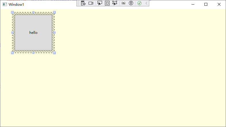
Border 控制項
Border控制項不是佈局面板,而是非常便於使用的元素,經常與佈局面板一起使用。所以,在繼續介紹其他佈局面板之前,現在先介紹一下 Border 控制項是有意義的。
Border 類非常簡單。它只能包含一段嵌套內容(通常是佈局面板),併為其添加背景或在其周圍添加邊框。為了深入地理解Border 控制項,只需要掌握下表中列出的屬性就可以了。
| 名稱 | 說明 |
|---|---|
| Barckground | 使用Brush 對象設置邊框中所有內容後面的背景。可使用固定顏色背景,也可使用其他更特殊的背景. |
| BorderBush和BorderThickness | 使用Brush 對象設置位於Border 對象邊緣的邊框的顏色,並設置邊框的寬度。為顯示邊框,必須設置這兩個屬性. |
| CornerRadius | 該屬性可使邊框具有雅緻的圓角。ComerRadius 的值越大,圓角效果就越明顯. |
| Padding | 該屬性在邊框和內部的內容之間添加空間(與此相對,Margin 屬性在邊框之外添加空間). |
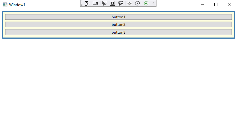
下麵是一個具有輕微圓角效果的簡單邊框,該邊框位於一組按鈕的周圍,這組按鈕包含在一個StackPanel 面板中:
<Window x:Class="WpfApp1.Window1"
        xmlns="http://schemas.microsoft.com/winfx/2006/xaml/presentation"
        xmlns:x="http://schemas.microsoft.com/winfx/2006/xaml"
        xmlns:d="http://schemas.microsoft.com/expression/blend/2008"
        xmlns:mc="http://schemas.openxmlformats.org/markup-compatibility/2006"
        xmlns:local="clr-namespace:WpfApp1"
        mc:Ignorable="d"
        Title="Window1" Height="450" Width="800">

    <Border Margin="5" Padding="5" Background="LightYellow"
         BorderBrush="SteelBlue" BorderThickness="3,3,3,5" CornerRadius="3"
         VerticalAlignment="Top">

        <StackPanel >
            <Button Margin="3">button1</Button>
            <Button Margin="3">button2</Button>
            <Button Margin="3">button3</Button>
        </StackPanel>

    </Border>
</Window>
WrapPanel 和 DockPanel 面板
WrapPanel 面板
WrapPanel 面板在可能的空間中,以一次一行或一列的方式佈置控制項。預設情況下,WrapPanel.Orientation 屬性設置為 Horizontal;控制項從左向右進行排列,再在下一行中排列。但可將 WrapPanel.Orientation 屬性設置為 Vertical,從而在多個列中放置元素。
提示:
與StackPanel 面板類似,WrapPanel 面板實際上主要用來控制用戶界面中一小部分的佈局細節,並非用於控制整個視窗佈局。例如,可能使用 WrapPanel面板以類似工具欄控制項的方式將所有按鈕保持在一起。
<Window x:Class="WpfApp1.Window1"
        xmlns="http://schemas.microsoft.com/winfx/2006/xaml/presentation"
        xmlns:x="http://schemas.microsoft.com/winfx/2006/xaml"
        xmlns:d="http://schemas.microsoft.com/expression/blend/2008"
        xmlns:mc="http://schemas.openxmlformats.org/markup-compatibility/2006"
        xmlns:local="clr-namespace:WpfApp1"
        mc:Ignorable="d"
        Title="Window1" Height="450" Width="800">

    <WrapPanel Margin="3">
        <Button VerticalAlignment="Top">Button1</Button>
        <Button MinHeight="60">Button2</Button>
        <Button VerticalAlignment="Bottom">Button3</Button>
        <Button>Button4</Button>
        <Button VerticalAlignment="Center">Button5</Button>
    </WrapPanel>

</Window>
註意:
WrapPanel 面板是唯一一個不能通過靈活使用Grid 面板代替的面板。
DockPanel 面板
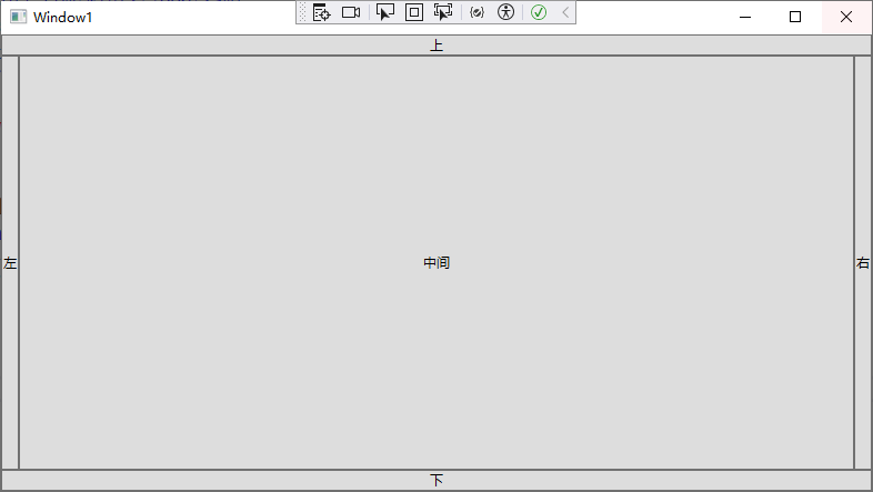
DockPanel 面板是更有趣的佈局選項。它沿著一條外邊緣來拉伸所包含的控制項。理解該面板最簡便的方法是,考慮一下位於許多 Windows 應用程式視窗頂部的工具欄。這些工具欄停靠到視窗頂部。與 StackPanel 面板類似,被停靠的元素選擇它們佈局的一個方面。例如,如果將一個按鈕停靠在DockPanel 面板的頂部,該按鈕會被拉伸至 DockPanel 面板的整個寬度,但根據內容和 MinHfeight 屬性為其設置所需的高度。而如果將一個按鈕停靠到容器左邊,該技鈕的高度將被拉伸以適應容器的高度,而其寬度可以根據需要自由增加。
案例1:
<Window x:Class="WpfApp1.Window1"
        xmlns="http://schemas.microsoft.com/winfx/2006/xaml/presentation"
        xmlns:x="http://schemas.microsoft.com/winfx/2006/xaml"
        xmlns:d="http://schemas.microsoft.com/expression/blend/2008"
        xmlns:mc="http://schemas.openxmlformats.org/markup-compatibility/2006"
        xmlns:local="clr-namespace:WpfApp1"
        mc:Ignorable="d"
        Title="Window1" Height="450" Width="800">

    <!--LastChildFill:最後一個子元素填充-->
    <DockPanel LastChildFill="True">
        <Button DockPanel.Dock="Top">上</Button>
        <Button DockPanel.Dock="Bottom">下</Button>
        <Button DockPanel.Dock="Left">左</Button>
        <Button DockPanel.Dock="Right">右</Button>
        <Button>中間</Button>
    </DockPanel>

</Window>
案例2:
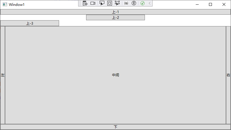
<Window x:Class="WpfApp1.Window1"
        xmlns="http://schemas.microsoft.com/winfx/2006/xaml/presentation"
        xmlns:x="http://schemas.microsoft.com/winfx/2006/xaml"
        xmlns:d="http://schemas.microsoft.com/expression/blend/2008"
        xmlns:mc="http://schemas.openxmlformats.org/markup-compatibility/2006"
        xmlns:local="clr-namespace:WpfApp1"
        mc:Ignorable="d"
        Title="Window1" Height="450" Width="800">

    <!--
    DockPanel.Dock:停靠方向
    LastChildFill:最後一個子元素填充
    HorizontalAlignment:水平對齊方式
    MinWidth:最小寬度
    -->
    <DockPanel LastChildFill="True">
        <Button DockPanel.Dock="Top">上-1</Button>
        <Button DockPanel.Dock="Top" HorizontalAlignment="Center" MinWidth="200">上-2</Button>
        <Button DockPanel.Dock="Top" HorizontalAlignment="Left" MinWidth="200">上-3</Button>
        <Button DockPanel.Dock="Bottom">下</Button>
        <Button DockPanel.Dock="Left">左</Button>
        <Button DockPanel.Dock="Right">右</Button>
        <Button>中間</Button>
    </DockPanel>

</Window>
嵌套佈局容器
很少單獨使用 StackPanel、WrapPanel 和 DockPanel 面板。相反,它們通常用來設置一部分用戶界面的佈局。例如,可使用 DockPanel 面板在視窗的合適區域放置不同的 StackPanel 和WrapPane! 面板容器。
案例1:
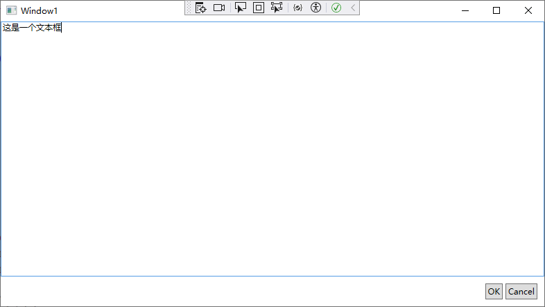
<Window x:Class="WpfApp1.Window1"
xmlns="http://schemas.microsoft.com/winfx/2006/xaml/presentation"
xmlns:x="http://schemas.microsoft.com/winfx/2006/xaml"
xmlns:d="http://schemas.microsoft.com/expression/blend/2008"
xmlns:mc="http://schemas.openxmlformats.org/markup-compatibility/2006"
xmlns:local="clr-namespace:WpfApp1"
mc:Ignorable="d"
Title="Window1" Height="450" Width="800">
<!--
LastChildFill:最後一個子元素填充
DockPanel.Dock:停靠方向
HorizontalAlignment:水平對齊方式
Orientation:排列方向(水平/垂直)
Margin:外邊距
Padding:內邊距
-->
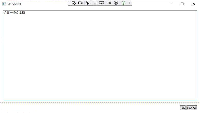
<DockPanel LastChildFill="True">
<StackPanel DockPanel.Dock="Bottom" HorizontalAlignment="Right" Orientation="Horizontal">
<Button Margin="10,10,2,10" Padding="3">OK</Button>
<Button Margin="2,10,10,10" Padding="3">Cancel</Button>
</StackPanel>
<TextBox DockPanel.Dock="Top">這是一個文本框</TextBox>
</DockPanel>
</Window>
提示:
如果有一棵茂密的嵌套元素樹,很可能看不到整個結構。Visual Studio 提供了一個方使的功能,用於顯示一棵表示各個元素的樹,並允許您通過逐步單擊進入希望查看(或修改)的元素。
這一功能是指 Document Outline 視窗,可通過選擇 View | Other Windows | Document Outline 菜單項來顯示該視窗。
Grid 面板
Grid 面板是WPF 中功能最強大的佈局容器。很多使用其他佈局控制項能完成的功能,用Grid面板也能實現。Grid 面板也是將視窗分割成(可使用其他面板進行管理的)更小區域的理想工具。實際上,由於 Grid 面板十分有用,因此在 Visual Studio 中為視窗添加新的XAML 文檔時,會自動添加 Grid 標簽作為頂級容器,並嵌套在 Window 根元素中。
Grid 面板將元素分隔到不可見的行列網格中。儘管可在一個單元格中放置多個元素(這時這些元素會相互重疊),但在每個單元格中只放置一個元素通常更合理。當然,在Grid 單元格中的元素本身也可能是另一個容器,該容器組織它所包含的一組控制項。
提示:
儘管Grid面板被設計成不可見的,但可將 Grid.ShowGridlines 屬性設置汐 true,從而更清晰她觀察Gird 面板。這一特性並不是真正試圖美化視窗,反而是為了方便調試,設計該特性旨在幫助理解 Grid 面板如何將其自身分製成多個較小的區域。這一特性十分童要,因為通過該特性可準確控制 Grid 面板如何選擇列寬和行高。
需要兩個步驟來創建基於 Crd 面板的佈局。首先,選擇希望使用的行和列的數厭。然後,為每個包含的元素指定恰當的行和列,從而在合適的位置放置元素。
Grid 面板通過使用對象填充 Grid.ColumnDefinitions和 Grid. Row Definiti ons 集合來創建網格和行。例如,如果確定需要兩行和三列,可添加以下標簽:
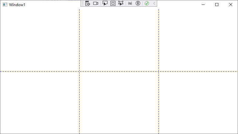
<Window x:Class="WpfApp1.Window1"
        xmlns="http://schemas.microsoft.com/winfx/2006/xaml/presentation"
        xmlns:x="http://schemas.microsoft.com/winfx/2006/xaml"
        xmlns:d="http://schemas.microsoft.com/expression/blend/2008"
        xmlns:mc="http://schemas.openxmlformats.org/markup-compatibility/2006"
        xmlns:local="clr-namespace:WpfApp1"
        mc:Ignorable="d"
        Title="Window1" Height="450" Width="800">

    <Grid ShowGridLines="True">

        <!--行-->
        <Grid.RowDefinitions>
            <RowDefinition/>
            <RowDefinition/>
        </Grid.RowDefinitions>

        <!--列-->
        <Grid.ColumnDefinitions>
            <ColumnDefinition/>
            <ColumnDefinition/>
            <ColumnDefinition/>
        </Grid.ColumnDefinitions>
    </Grid>

</Window>
為在單元格中放置各個元素,需要使用 Row 和Columm 附加屬性。這兩個屬性的值都是從0開始的索引數。例如,以下標記演示瞭如何創建Grid面板,並使用按鈕填充Grid 面板的部分單元格。
此處存在例外情況。如果不指定 Grid Row 屬性,Grid 面板會假定該屬性的值為0。對於Crid. Column 屬性也是如此。因此,在 Grid 面板的第一個單元格中放置元素時可不指定這兩個屬性。
案例1:
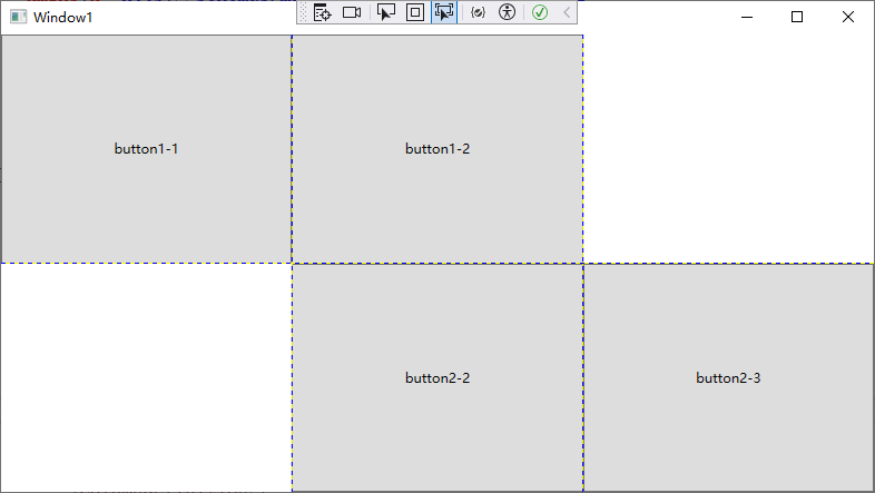
<Window x:Class="WpfApp1.Window1"
        xmlns="http://schemas.microsoft.com/winfx/2006/xaml/presentation"
        xmlns:x="http://schemas.microsoft.com/winfx/2006/xaml"
        xmlns:d="http://schemas.microsoft.com/expression/blend/2008"
        xmlns:mc="http://schemas.openxmlformats.org/markup-compatibility/2006"
        xmlns:local="clr-namespace:WpfApp1"
        mc:Ignorable="d"
        Title="Window1" Height="450" Width="800">

    <Grid ShowGridLines="True">

        <!--行-->
        <Grid.RowDefinitions>
            <RowDefinition/>
            <RowDefinition/>
        </Grid.RowDefinitions>

        <!--列-->
        <Grid.ColumnDefinitions>
            <ColumnDefinition/>
            <ColumnDefinition/>
            <ColumnDefinition/>
        </Grid.ColumnDefinitions>

        <Button Grid.Row="0" Grid.Column="0">button1-1</Button>
        <Button Grid.Row="0" Grid.Column="1">button1-2</Button>
        <Button Grid.Row="1" Grid.Column="1">button2-2</Button>
        <Button Grid.Row="1" Grid.Column="2">button2-3</Button>
    </Grid>

</Window>
調整行和列
Grid 面板支持以下三種設置尺寸的方式:
-
絕對設置尺寸方式: 使用設備無關單位準確地設置尺寸。這是最無用的策略,因為這種策略不夠靈活,難以適應內容大小和容器大小的改變,而且難以處理本地化。
-
自動設置尺寸方式: 每行和每列的尺寸剛好滿足需要。這是最有用的尺寸設置方式。
-
按比例設置尺寸方式。按比例將空間分割到一組行和列中。這是對所有行和列的標準設置。
可通過將ColumnDefinition 對象的Width 屬性或 RowDefinition 對象的 Height 屬性設置為數值來確定尺寸設置方式。例如,下麵的代碼顯示瞭如何設置100 設備無關單位的絕對寬度。
<ColumnDefinition Width="100"></ColumnDefinition>
為使用自動尺寸設置方式,可使用Auto值:
<ColumnDefinition Width="Auto"></ColumnDefinition>
最後,為了使用按比例尺寸設置方式,需要使用*號:
<ColumnDefinition Width="*"></ColumnDefinition>
如果希望不均勻地分割剩餘空間,可指定權重,權重必須放在星號之前。例如,如果有兩行是按比例設置尺寸,並希望第一行的高度是第二行高度的一半,那麼可以使用如下設置來分配剩餘空間:
<RowDefinition Height="*"></RowDefinition>
<RowDefinition Height="2*"></RowDefinition>
案例1:
<Window x:Class="WpfApp1.Window1"
xmlns="http://schemas.microsoft.com/winfx/2006/xaml/presentation"
xmlns:x="http://schemas.microsoft.com/winfx/2006/xaml"
xmlns:d="http://schemas.microsoft.com/expression/blend/2008"
xmlns:mc="http://schemas.openxmlformats.org/markup-compatibility/2006"
xmlns:local="clr-namespace:WpfApp1"
mc:Ignorable="d"
Title="Window1" Height="450" Width="800">
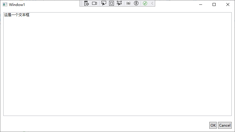
<Grid ShowGridLines="True">
<!--行-->
<Grid.RowDefinitions>
<RowDefinition Height="*"/>
<RowDefinition Height="Auto"/>
</Grid.RowDefinitions>
<!--
HorizontalAlignment:水平對齊方式
Orientation:排列方向
Margin:外邊距
-->
<TextBox Margin="10" Grid.Row="0">這是一個文本框</TextBox>
<StackPanel Grid.Row="1" HorizontalAlignment="Right" Orientation="Horizontal">
<Button Margin="10,10,2,10">OK</Button>
<Button Margin="2,10,10,10">Cancel</Button>
</StackPanel>
</Grid>
</Window>
跨越行和列
您已經看到如何使用 Row 和 Calum 附加屬性在單元格中放置元素。還可以使用另外兩個附加屬性使元素跨越多個單元格,這兩個附加屬性是 RowSpan和ColurmSpan。這兩個屬性使用元素將會占有的行數和列數進行設置。
例如,下麵的按鈕將占據第一行中的第一個和第二個單元格的所有空間:
<Button Grid.Row="0" Grid.Column="0" Grid.RowSpan="2">跨行</Button>
下麵的代碼通過跨越兩列和兩行,拉伸按鈕使其占據所有4個單元格:
<Button Grid.Row="0" Grid.Column="0" Grid.RowSpan="2" Grid.ColumnSpan="2">跨行並跨列</Button>
案例1:
<Window x:Class="WpfApp1.Window1"
        xmlns="http://schemas.microsoft.com/winfx/2006/xaml/presentation"
        xmlns:x="http://schemas.microsoft.com/winfx/2006/xaml"
        xmlns:d="http://schemas.microsoft.com/expression/blend/2008"
        xmlns:mc="http://schemas.openxmlformats.org/markup-compatibility/2006"
        xmlns:local="clr-namespace:WpfApp1"
        mc:Ignorable="d"
        Title="Window1" Height="450" Width="800">

    <Grid UseLayoutRounding="True" >

        <Grid.RowDefinitions>
            <RowDefinition Height="*"/>
            <RowDefinition Height="Auto"/>
        </Grid.RowDefinitions>
        <Grid.ColumnDefinitions>
            <ColumnDefinition Width="*"/>
            <ColumnDefinition Width="Auto"/>
            <ColumnDefinition Width="Auto"/>
        </Grid.ColumnDefinitions>

        <TextBox Margin="10" Grid.Row="0" Grid.Column="0" Grid.ColumnSpan="3">
            這是一個文本框
        </TextBox>
        <Button Margin="10,10,2,10" Padding="3" Grid.Row="1" Grid.Column="1">OK</Button>
        <Button Margin="2,10,10,10" Padding="3" Grid.Row="1" Grid.Column="2">Cancel</Button>

    </Grid>

</Window>
分割視窗
每個 Windows 用戶都見過分割條一能將視窗的一部分與另一部分分離的可拖動分割器,
例如,當使用Windows 資源管理器時,會看到一系列立件實(在左邊)和一系列文件(在右邊)、可拖動它們之間的分割條來確定每部分占據視窗的比例。
理解如何使用 GridSplitter 類,從而得到所期望的效果需要一定的經驗。下麵列出幾條指導原則:
- GrdSpliter 對象必須放在Grid 單元格中。可與已經存在的內容一併放到單元格中,這時循要調整邊距設置,使它們不相互重疊。更好的方法是預留一列或一行專門用於放置 Gridspliter對象,並將預留行或列的Heigh 或 Width 屬性的值設置為 Auto。
- Gridspliter 對象總是改變整行或整列的尺寸(而非改變單個單元格的尺寸)。為使Cridspliter對象的外觀和行為保持一致,需要拉伸Gridsplitter 對象使其穿越整行或整列,而不是將其限制在單元格中。為此,可使用前面介紹過的RowSpan或ColumnSpan 屬性。
- 最初,GridSpliter 對象很小不易看見。為了使其更可用,需要為其設置最小尺寸。對於豎直分割條,需要將 VericalAlignment 屬性設置為stretch(使分割條填滿區域的整個高度),並將 Width 設置為固定值(如10個設備無關單位)。對於水平分割條,需要設置 HorizontalAlignmeat 屬性來拉伸,並將 Height 屬性設置為固定值。
- Gridspliter 對齊方式還決定了分割條是水平的(用於改變行的尺寸)還是豎直的(用於改變列的尺寸)。對於水平分割條,需要將 VerticalAlignment 屬性設置為Center(這也是預設值),以指明拖動分割條改變上面行和下麵行的尺寸。對於豎直分割條,需要將 HorizontalAlignment 屬性設置為 Center,以改變分割條兩側列的尺寸。
案例1:
<Window x:Class="WpfApp1.Window1"
xmlns="http://schemas.microsoft.com/winfx/2006/xaml/presentation"
xmlns:x="http://schemas.microsoft.com/winfx/2006/xaml"
xmlns:d="http://schemas.microsoft.com/expression/blend/2008"
xmlns:mc="http://schemas.openxmlformats.org/markup-compatibility/2006"
xmlns:local="clr-namespace:WpfApp1"
mc:Ignorable="d"
Title="Window1" Height="450" Width="800">
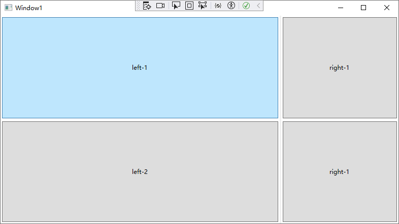
<Grid UseLayoutRounding="True" >
<!--行設置-->
<Grid.RowDefinitions>
<RowDefinition/>
<RowDefinition/>
</Grid.RowDefinitions>
<!--列設置-->
<Grid.ColumnDefinitions>
<ColumnDefinition MinWidth="100"/>
<ColumnDefinition Width="Auto"/>
<ColumnDefinition MinWidth="50"/>
</Grid.ColumnDefinitions>
<!--按鈕-->
<Button Grid.Row="0" Grid.Column="0" Margin="3">left-1</Button>
<Button Grid.Row="0" Grid.Column="2" Margin="3">right-1</Button>
<Button Grid.Row="1" Grid.Column="0" Margin="3">left-2</Button>
<Button Grid.Row="1" Grid.Column="2" Margin="3">right-1</Button>
<!--分割線-->
<!--ShowsPreview:是否顯示預覽-->
<GridSplitter Grid.Row="0" Grid.Column="1" Grid.RowSpan="2" Width="3" VerticalAlignment="Stretch" HorizontalAlignment="Center" ShowsPreview="False"></GridSplitter>
</Grid>
</Window>
上面的標記還包含了一處額外的細節。在聲明GridSplitter 對象時,將 ShowsPreview 屬性設置為 false .因此,當把分割線從一邊拖到另一邊時,會立即改變列的尺寸。但是如果將 ShowsPreview 屬性設置為 true,當拖動分割條時就會看到一個灰色的陰影跟隨滑鼠指針,用於顯示將在何處進行分割。並且直到釋放了滑鼠鍵之後列的尺寸才改變。如果GridSplitter 對象獲得了焦點,可可以使用箭頭改變相應的尺寸。
如果希望分割條以更大的幅度(如每次10個單位)進行移動,可調整DragIncrement 屬性。
提示:
可以改變 GridSplitter 對象的填充方式,使其不只是具有陰影的灰色矩形。技巧是使用Background 屬性應用填充,該屬性接受簡單的顏色或更複雜的畫刷。
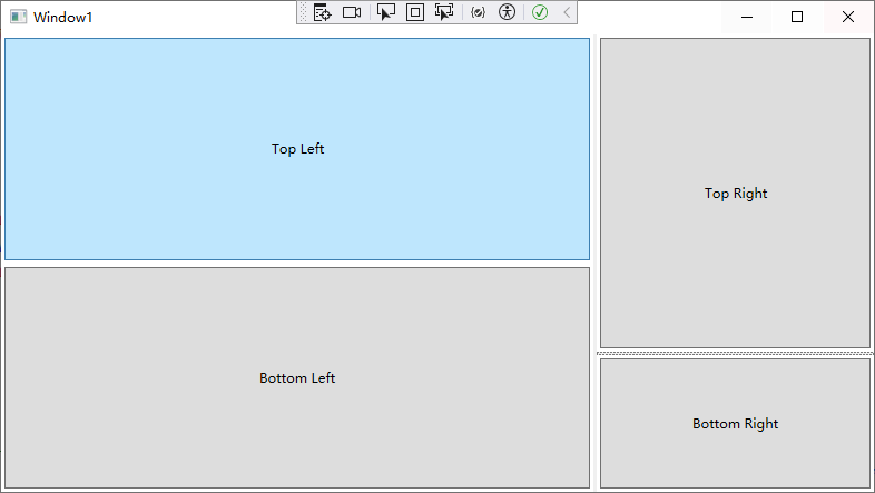
Grid 面板通常包含多個 GridSpliter 對象。然而,可以在一個 Grid 面板中嵌套另一個Grid面板;而且,如果確實在 Grid 面板中嵌套了Grid 面板,那麼每個Grid 面板可以有自己的GridSplitter對象。這樣就可以創建被分割成兩部分(如左邊窗格和右邊窗格)的視窗,然後將這些區域(如右邊的窗格)進一步分成更多的部分(例如,可調整大小的上下兩部分)。
案例2:
<Window x:Class="WpfApp1.Window1"
        xmlns="http://schemas.microsoft.com/winfx/2006/xaml/presentation"
        xmlns:x="http://schemas.microsoft.com/winfx/2006/xaml"
        xmlns:d="http://schemas.microsoft.com/expression/blend/2008"
        xmlns:mc="http://schemas.openxmlformats.org/markup-compatibility/2006"
        xmlns:local="clr-namespace:WpfApp1"
        mc:Ignorable="d"
        Title="Window1" Height="450" Width="800">

    <Grid UseLayoutRounding="True" >


        <!--列設置:3列-->
        <Grid.ColumnDefinitions>
            <ColumnDefinition MinWidth="100"/>
            <ColumnDefinition Width="Auto"/>
            <ColumnDefinition MinWidth="50"/>
        </Grid.ColumnDefinitions>

        <!--左側Grid-->
        <Grid Grid.Column="0">

            <!--行設置:2行-->
            <Grid.RowDefinitions>
                <RowDefinition/>
                <RowDefinition/>
            </Grid.RowDefinitions>

            <Button Margin="3" Grid.Row="0">Top Left</Button>
            <Button Margin="3" Grid.Row="1">Bottom Left</Button>

        </Grid>

        <!--分割線-->
        <!--ShowsPreview:是否顯示預覽-->
        <GridSplitter Grid.Column="1" Grid.RowSpan="2" Width="3" VerticalAlignment="Stretch" HorizontalAlignment="Center" ShowsPreview="False"></GridSplitter>

        <!--右側Grid-->
        <Grid Grid.Column="2">

            <!--行設置:3行-->
            <Grid.RowDefinitions>
                <RowDefinition/>
                <RowDefinition Height="Auto"/>
                <RowDefinition/>
            </Grid.RowDefinitions>

            <Button Margin="3" Grid.Row="0">Top Right</Button>
            <Button Margin="3" Grid.Row="2">Bottom Right</Button>

            <GridSplitter Grid.Row="1" Height="3" VerticalAlignment="Center" HorizontalAlignment="Stretch" ShowsPreview="False"></GridSplitter>

        </Grid>
    </Grid>

</Window>
共用尺寸組
正如在前面看到的,Grid 面板包含一個行列集合,可以明確地按比例確定行和列的尺寸,或根據其子元素的尺寸確定行和列的尺寸。還有另一種確定一行或一列尺寸的方法—與其他行或列的尺寸相匹配。這是通過稱為“共用尺寸組”(Shared size groups)的特性實現的。
共用尺寸組的目標是保持用戶界面獨立部分的一致性。例如,可能希望改變一列的尺寸以適應其內容,並改變另一列的尺寸使其與前面一列改變後的尺寸相匹配。然而,共用尺寸組的真正優點是使獨立的Grid 控制項具有相同的比例。
案例1:
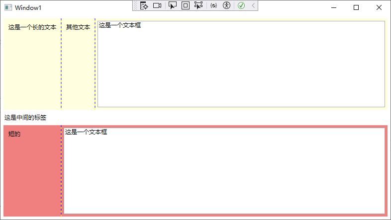
<Window x:Class="WpfApp1.Window1"
        xmlns="http://schemas.microsoft.com/winfx/2006/xaml/presentation"
        xmlns:x="http://schemas.microsoft.com/winfx/2006/xaml"
        xmlns:d="http://schemas.microsoft.com/expression/blend/2008"
        xmlns:mc="http://schemas.openxmlformats.org/markup-compatibility/2006"
        xmlns:local="clr-namespace:WpfApp1"
        mc:Ignorable="d"
        Title="Window1" Height="450" Width="800">

    <Grid Grid.IsSharedSizeScope="True" Margin="3">

        <!--設置行:3行-->
        <Grid.RowDefinitions>
            <RowDefinition/>
            <RowDefinition Height="auto"/>
            <RowDefinition/>
        </Grid.RowDefinitions>

        <!--上方Grid-->
        <Grid Margin="3" Background="LightYellow" ShowGridLines="True">

            <!--設置列:3列-->
            <!--SharedSizeGroup:共用尺寸組-->
            <Grid.ColumnDefinitions>
                <ColumnDefinition Width="auto" SharedSizeGroup="TextLabel"/>
                <ColumnDefinition Width="auto"/>
                <ColumnDefinition/>
            </Grid.ColumnDefinitions>

            <Label Margin="5" Grid.Column="0">這是一個長的文本</Label>
            <Label Margin="5" Grid.Column="1">其他文本</Label>
            <TextBox Margin="5" Grid.Column="2">這是一個文本框</TextBox>
        </Grid>

        <!--中間標簽-->
        <Label Grid.Row="1">這是中間的標簽</Label>

        <!--下方Grid-->
        <Grid Grid.Row="2" Margin="3" Background="LightCoral" ShowGridLines="True">

            <!--設置列:2列-->
            <!--SharedSizeGroup:共用尺寸組-->
            <Grid.ColumnDefinitions>
                <ColumnDefinition Width="auto" SharedSizeGroup="TextLabel"/>
                <ColumnDefinition/>
            </Grid.ColumnDefinitions>

            <Label Margin="5" Grid.Column="0">短的</Label>
            <TextBox Margin="5" Grid.Column="1">這是一個文本框</TextBox>

        </Grid>
    </Grid>

</Window>
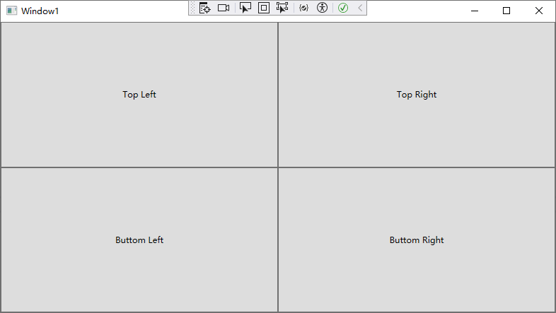
UnitformGrid 面板
有一種網格不遵循前面討論的所有原則--UniformGrid 面板。與Grid 面板不同,UaifommCrid 面板不需要(甚至不支持)預先定義的列和行。相反,通過簡單地設置Rows 和Colurs 屬性來設置其尺寸。每個單元格始終具有相同的大小,因為可用的空間被均分。最後,元素根據定義的順序被放置到適當的單元格中。UniformGrid 面板中沒有 Row和 Column 附加屬性,也沒有空白單元格。
案例1:
<Window x:Class="WpfApp1.Window1"
        xmlns="http://schemas.microsoft.com/winfx/2006/xaml/presentation"
        xmlns:x="http://schemas.microsoft.com/winfx/2006/xaml"
        xmlns:d="http://schemas.microsoft.com/expression/blend/2008"
        xmlns:mc="http://schemas.openxmlformats.org/markup-compatibility/2006"
        xmlns:local="clr-namespace:WpfApp1"
        mc:Ignorable="d"
        Title="Window1" Height="450" Width="800">

    <!--
    Rows:行數
    Columns:列數
    -->
    <UniformGrid Rows="2" Columns="2">
        <Button>Top Left</Button>
        <Button>Top Right</Button>
        <Button>Buttom Left</Button>
        <Button>Buttom Right</Button>
    </UniformGrid>

</Window>
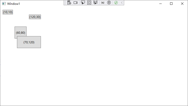
Canvas 面板
Canvas 面板允許使用精確的坐標放潭元案,如果設計數據驅動的富窗體和標準對話框,這並非好的選擇;但如果需要構建其他一些不同的內容(例如,為圖形工具創建繪圖錶面),Canvas 面板可能是個有用的工具。Canvas面板還是最輕量級的佈局容器。這是因為 Canvas面板沒有包含任何複雜的佈局邏輯,用以改變其子元素的首選尺寸。Canvas 面板只是在指定的位置放置其子元素,並且其子元素具有所希望的精確尺寸。
為在 Canvas 面板中定位元素,需要設置 Canvas.Left 和 Canvas,Top 附加屬性。Canvas.Left 屬性設置元素左邊和 Canvas 面板左邊之間的單位數,Canvas.Top 屬性設置子元素頂邊和Canvas 面板頂邊之間的單位數。同樣,這些數值也是以設備無關單位設置的,當將系統DPI設置為 96 dpi 時,設備無關單位恰好等於通常的像素。
註意:
另外,可使用 Canvas.Right 屬性而不是 Canvas.Lef 屬性來確定元素和 Canvas 面板右邊緣間的距離;可使用 Canvas.Bottom 屬性而不是 Canvas.Top 屬性來確定元素和 Canvas 面板底部邊緣的距離。不能同時使用 Canvas.Right 和 Canvas. Left 屬性,也不能同時使用 Canvas.Top 和Canvas.Bottom 屬性。
案例1:
<Window x:Class="WpfApp1.Window1"
        xmlns="http://schemas.microsoft.com/winfx/2006/xaml/presentation"
        xmlns:x="http://schemas.microsoft.com/winfx/2006/xaml"
        xmlns:d="http://schemas.microsoft.com/expression/blend/2008"
        xmlns:mc="http://schemas.openxmlformats.org/markup-compatibility/2006"
        xmlns:local="clr-namespace:WpfApp1"
        mc:Ignorable="d"
        Title="Window1" Height="450" Width="800">

    <!--
    Canvas.Left: 左邊距
    Canvas.Top: 上邊距
    Width: 寬度
    Height: 高度
    -->
    <Canvas>
        <Button Canvas.Left="10" Canvas.Top="10">(10,10)</Button>
        <Button Canvas.Left="120" Canvas.Top="30">(120,30)</Button>
        <Button Canvas.Left="60" Canvas.Top="80" Width="50" Height="50">(60,80)</Button>
        <Button Canvas.Left="70" Canvas.Top="120" Width="100" Height="50">(70,120)</Button>
    </Canvas>

</Window>
Z 軸坐標
如果 Canvas 面板中有多個互相重疊的元素,可通過設置Canvas ZIndex 附加屬性來控制它們的層疊方式。
添加的所有元素通常都具有相同的 Zlndex 值—0。如果元素具有相同的 ZIndex 值,就按它們在Canvas.Children 集合中的順序進行顯示,這個順序依賴於元素在 XAMIL 標記中定義的順序。
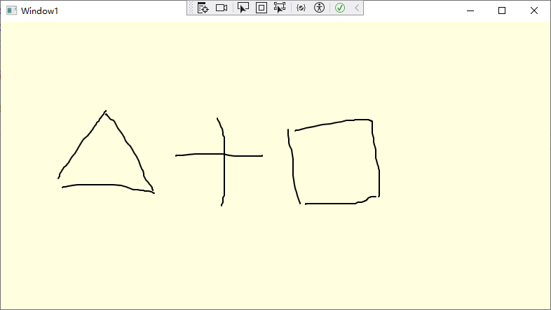
lnkCanvas 元素
WPF 還提供了 InkCanvas 元素,它與 Canvas 面板在某些方面是類似的(而在其他方面卻完全不同)。和 Canvas 面板一樣,InkCanvas 元素定義了4個附加屬性(Top、Left、Bottom 和 Righn),可將這4個附加屬性應用於子元素,以根據坐標進行定位。然而,基本的內容區別很大—零際上,InkCanvas 類不是派生自 Canvas類,甚至也不是派生自 Pane! 基類,而是直接派生自FrameworkElement類。
InkCanvas元素的主要目的是用於接收手寫筆輸入。手寫筆是一種在平板 PC 中使用的類似於鋼筆的輸入設備,然而,InkCanvas 元素同時也可使用滑鼠進行工作,就像使用手寫筆一樣。因此,用戶可使用滑鼠在 InkCanvas 元素上繪製線條,或者選擇以及操作 InkCanvas 中的元素。
InkCanvas 元素實際上包含兩個子內容集合。一個是為人熟知的Children集合,它保存任意元素,就像 Canvas 面板一樣。每個子元素可根據Top、Lef、Bottom 和 Right屬性進行定位。另一個是Strokes 集合,它保存 System.Windows.Ink.Stroke 對象,該對象表示用戶在 InkCanvas。元素上繪製的圖形輸入。用戶繪製的每條直線或曲線都變成獨立的 Stroke 對象。得益於這兩個集合,可使用 InkCanvas 讓用戶使用存儲在 Strokes 集合中的筆畫(stroke)為保存在Children 集合中的內容添加註釋。
根據為 EditingMode 屬性設置的值,可以採用截然不同的方式使用 InkCanvas 元素。下表列出了所有選項:
| 名稱 | 說明 |
|---|---|
| Ink | InkCanvas 元素允許用戶繪製批註,這是預設模式。當用戶用滑鼠或手寫筆繪圖時,會繪製筆畫. |
| GestureOnly | InkCanvas 元素不允許用戶繪製筆畫批註,但會關註預先定義的特定姿勢(例如在某個方向拖動手寫筆或塗畫內容)•能識別的姿勢的完整列表由 System.Windows. Ink.Application Gesture 枚舉給出. |
| InkAndGesture | InkCanvas元素允許用戶繪製筆畫批註,也可以識別預先定義的姿勢. |
| EraseByStroke | 當單擊筆畫時,InkCanvas 元素會擦除筆畫。如果用戶使用手寫筆,可使用手寫筆的底端切換到該模式(可使用只讀的 ActiveEditingMode 屬性確定當前編輯模式,也可通過改變EditingModelinverted 屬性來改變手寫筆的底端使用的工作模式) |
| EraseByPoint | 當單擊筆畫時,InkCanvas 元素會擦除筆畫中被單擊的部分(筆畫上的一個點) |
| Select | InkCanvas 面板允許用戶選擇保存在Children集合中的元素。要選擇一個元素,用戶必須單擊該元素或拖動“套索”選擇該元素。一旦選擇一個元素,就可以移動該元素、改變其尺寸或將其刪除 |
| None | InkCanvas 元素忽略滑鼠和手寫筆輸入。 |
案例1:
<Window x:Class="WpfApp1.Window1"
        xmlns="http://schemas.microsoft.com/winfx/2006/xaml/presentation"
        xmlns:x="http://schemas.microsoft.com/winfx/2006/xaml"
        xmlns:d="http://schemas.microsoft.com/expression/blend/2008"
        xmlns:mc="http://schemas.openxmlformats.org/markup-compatibility/2006"
        xmlns:local="clr-namespace:WpfApp1"
        mc:Ignorable="d"
        Title="Window1" Height="450" Width="800">

    <InkCanvas Name="inkCanvas" Background="LightYellow" EditingMode="Ink">

    </InkCanvas>

</Window>
inkCanvas 元素會引發多種事件,當編輯模式改變時會引發 ActiveEditingModeCbanged 事件,在 GestureOnly 或 InkAndGesture 模式下刪除姿勢時會引發Gesture 事件,繪製完筆畫時會引發SrokeColleoted 事件,擦除筆畫時會引發 StokeErasing 事件和StrokeErased 事件,在 Select 模式下選擇元素或改變元素時會引發 SelectionChanging 事件、SelectionChanged 事件、SelectionMoving 事件、SelectionMoved 事件、SelectionResizing 事件和 SelectionResized 事件。其中,名稱以 “ing”結尾的事件表示動作將要發生,但可以通過設置 EventATgs 對象的Cancel屬性取消事件。
在Select 模式下,InkCanvas 元素可為拖動以及操作內容提供功能強大的設計界面。下圖顯示了 InkCanvas 元素中的一個按鈕控制項,左圖中顯示的是該按鈕被選中的情況,而右圖中顯示的是選中該按鈕後,改變其位置和尺寸的情況。
案例2:
<Window x:Class="WpfApp1.Window1"
        xmlns="http://schemas.microsoft.com/winfx/2006/xaml/presentation"
        xmlns:x="http://schemas.microsoft.com/winfx/2006/xaml"
        xmlns:d="http://schemas.microsoft.com/expression/blend/2008"
        xmlns:mc="http://schemas.openxmlformats.org/markup-compatibility/2006"
        xmlns:local="clr-namespace:WpfApp1"
        mc:Ignorable="d"
        Title="Window1" Height="450" Width="800">

    <InkCanvas Name="inkCanvas" Background="LightYellow" EditingMode="Select">

        <Button InkCanvas.Top="20" InkCanvas.Left="50">hello</Button>

    </InkCanvas>

</Window>
佈局示例
列設置
佈局容器(如Grid面板)使得視窗創建整個佈局結構變得非常容易。例如下圖中顯示的視窗及設置。該視窗在一個表格結構中排列各個組件--標簽、文本框以及按鈕。
案例1:
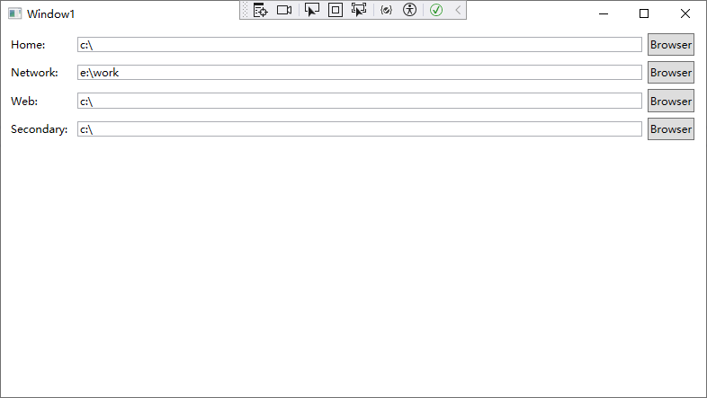
<Window x:Class="WpfApp1.Window1"
        xmlns="http://schemas.microsoft.com/winfx/2006/xaml/presentation"
        xmlns:x="http://schemas.microsoft.com/winfx/2006/xaml"
        xmlns:d="http://schemas.microsoft.com/expression/blend/2008"
        xmlns:mc="http://schemas.openxmlformats.org/markup-compatibility/2006"
        xmlns:local="clr-namespace:WpfApp1"
        mc:Ignorable="d"
        Title="Window1" Height="450" Width="800">

    <Grid Margin="3,3,10,3" ShowGridLines="False">

        <!--行設置-->
        <Grid.RowDefinitions>
            <RowDefinition Height="auto"/>
            <RowDefinition Height="auto"/>
            <RowDefinition Height="auto"/>
            <RowDefinition Height="auto"/>
        </Grid.RowDefinitions>

        <!--列設置-->
        <Grid.ColumnDefinitions>
            <ColumnDefinition Width="auto"/>
            <ColumnDefinition Width="*"/>
            <ColumnDefinition Width="auto"/>
        </Grid.ColumnDefinitions>

        <Label Grid.Row="0" Grid.Column="0" Margin="3" VerticalAlignment="Center">Home:</Label>
        <TextBox Grid.Row="0" Grid.Column="1" Margin="3" Height="auto" VerticalAlignment="Center">c:\</TextBox>
        <Button Grid.Row="0" Grid.Column="2" Margin="3" Padding="2">Browser</Button>

        <Label Grid.Row="1" Grid.Column="0" Margin="3" VerticalAlignment="Center">Network:</Label>
        <TextBox Grid.Row="1" Grid.Column="1" Margin="3" Height="auto" VerticalAlignment="Center">e:\work</TextBox>
        <Button Grid.Row="1" Grid.Column="2" Margin="3" Padding="2">Browser</Button>

        <Label Grid.Row="2" Grid.Column="0" Margin="3" VerticalAlignment="Center">Web:</Label>
        <TextBox Grid.Row="2" Grid.Column="1" Margin="3" Height="auto" VerticalAlignment="Center">c:\</TextBox>
        <Button Grid.Row="2" Grid.Column="2" Margin="3" Padding="2">Browser</Button>


        <Label Grid.Row="3" Grid.Column="0" Margin="3" VerticalAlignment="Center">Secondary:</Label>
        <TextBox Grid.Row="3" Grid.Column="1" Margin="3" Height="auto" VerticalAlignment="Center">c:\</TextBox>
        <Button Grid.Row="3" Grid.Column="2" Margin="3" Padding="2">Browser</Button>
    </Grid>

</Window>
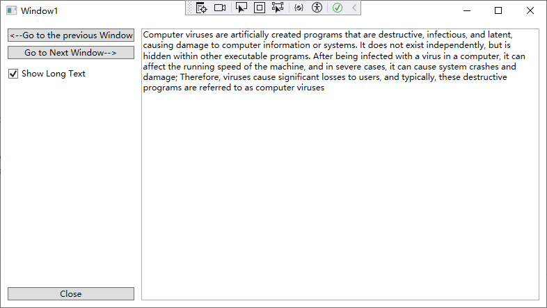
動態內容
在以下示例中,用戶界面可選擇短文本和長文本。當使用長文本時,包含文本的按鈕會自動改變其尺寸,而其它內容也會相應的調整位置。並且因為改變了尺寸的按鈕共用同一佈局容器,所以整個用戶界面都會改變尺寸。最終的結果是所有按鈕保持一致的尺寸---最大按鈕的尺寸。
案例1:
xaml代碼:
<Window x:Class="WpfApp1.Window1"
        xmlns="http://schemas.microsoft.com/winfx/2006/xaml/presentation"
        xmlns:x="http://schemas.microsoft.com/winfx/2006/xaml"
        xmlns:d="http://schemas.microsoft.com/expression/blend/2008"
        xmlns:mc="http://schemas.openxmlformats.org/markup-compatibility/2006"
        xmlns:local="clr-namespace:WpfApp1"
        mc:Ignorable="d"
        Title="Window1" Height="450" Width="800">

    <Grid>

        <!--行設置-->
        <Grid.RowDefinitions>
            <RowDefinition Height="*"/>
            <RowDefinition Height="auto"/>
        </Grid.RowDefinitions>

        <!--列設置-->
        <Grid.ColumnDefinitions>
            <ColumnDefinition Width="auto"></ColumnDefinition>
            <ColumnDefinition Width="*"></ColumnDefinition>
        </Grid.ColumnDefinitions>

        <StackPanel Grid.Row="0" Grid.Column="0">
            <Button x:Name="cmdPrev" Margin="10,10,10,3">Prev</Button>
            <Button x:Name="cmdNext" Margin="10,3,10,3">Next</Button>
            <CheckBox x:Name="chkLong" Margin="10,10,10,10" Unchecked="chkLong_Unchecked" Checked="chkLong_Checked" >Show Long Text</CheckBox>
        </StackPanel>

        <TextBox Grid.Row="0" Grid.Column="1" Grid.RowSpan="2" Margin="0,10,10,10" TextWrapping="WrapWithOverflow">
            Computer viruses are artificially created programs that are destructive, infectious, and latent, causing damage to computer information or systems. It does not exist independently, but is hidden within other executable programs. After being infected with a virus in a computer, it can affect the running speed of the machine, and in severe cases, it can cause system crashes and damage; Therefore, viruses cause significant losses to users, and typically, these destructive programs are referred to as computer viruses
        </TextBox>

        <Button Grid.Row="1" Grid.Column="0" Name="cmdClose" Margin="10,3,10,10">Close</Button>
    </Grid>
</Window>
c#代碼:
using System;
using System.Collections.Generic;
using System.Linq;
using System.Text;
using System.Threading.Tasks;
using System.Windows;
using System.Windows.Controls;
using System.Windows.Data;
using System.Windows.Documents;
using System.Windows.Input;
using System.Windows.Media;
using System.Windows.Media.Imaging;
using System.Windows.Shapes;

namespace WpfApp1
{
    /// <summary>
    /// Window1.xaml 的交互邏輯
    /// </summary>
    public partial class Window1 : Window
    {
        public Window1()
        {
            InitializeComponent();
        }

        private void chkLong_Checked(object sender, RoutedEventArgs e)
        {
            this.cmdPrev.Content = "<--Go to the previous Window";
            this.cmdNext.Content = "Go to Next Window-->";
        }

        private void chkLong_Unchecked(object sender, RoutedEventArgs e)
        {
            this.cmdPrev.Content = "Prev";
            this.cmdNext.Content = "Next";
        }
    }
}
組合式用戶界面
許多佈局容器(如 StackPanel 面板、DockPanc!面板以及 WrapPanel 面板)可以採用靈活多變的柔性方式非常得體地將內容安排到可用視窗空間中。該方法的優點是,它允許創建真正的組合式界面。換句話說,可在用戶界面中希望顯示的恰當部分插入不同的面板,而保留用戶界面的其他部分。整個應用程式本身可以相應地改變界面,這與Web 門戶站點有類似之處。
下圖展示了一個組合式用戶界面,在一個WrapPanel 面板中放置幾個獨立的面板。用戶可以通過視窗頂部的覆選框,選