一、先上成型之後的圖 <!DOCTYPE html> <html lang="en"> <head> <meta charset="UTF-8"> <title>Title</title> <link rel="stylesheet" href="CSS/base.css"> <link rel=" ...
一、先上成型之後的圖


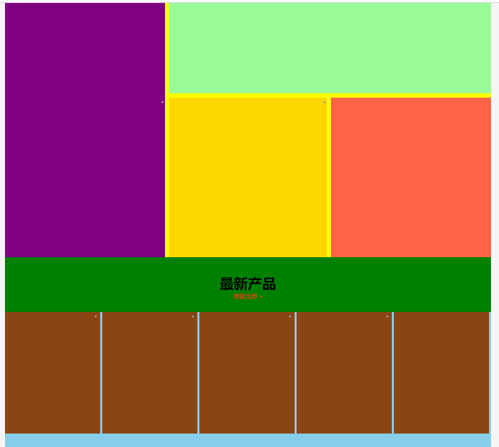
<!DOCTYPE html> <html lang="en"> <head> <meta charset="UTF-8"> <title>Title</title> <link rel="stylesheet" href="CSS/base.css"> <link rel="stylesheet" href="CSS/index.css"> </head> <body> <!--頂部區域--> <div class="top"> <div class="top_in"> <div class="top_left"> <h1><a href="#" title="努比亞"></a></h1><!--a標簽裡面的title屬性,就是用於當滑鼠放到a標簽上面的時候會顯示的文字--> </div> <div class="top_right"> <ul class="top_nav"> <li><a href="#">首頁</a></li> <li><a href="#">商城</a></li> <li><a href="#">產品</a></li> <li><a href="#">應用</a></li> <li><a href="#">服務</a></li> <li><a href="#">體驗店</a></li> <li><a href="#">社區</a></li> </ul> <ul class="top_login"> <!--這裡有一個註意點,我們想要使用的右浮動,所以三個li標簽應該倒敘寫,因為先寫的先浮動哦--> <li><a href="#">註冊</a></li> <li><a href="#">登錄</a></li> <li><a href="#"></a></li> </ul> </div> </div> </div> <!--廣告區域--> <div class="banner"> <div class="nav_out"> <div class="nav"> <ul> <li><a href="#"><img src="image/nav-phone1.png" alt=""></a></li> <li><a href="#"><img src="image/nav-phone1.png" alt=""></a></li> <li><a href="#"><img src="image/nav-phone1.png" alt=""></a></li> <li><a href="#"><img src="image/nav-phone1.png" alt=""></a></li> <li><a href="#"><img src="image/nav-phone1.png" alt=""></a></li> <li><a href="#"><img src="image/nav-phone1.png" alt=""></a></li> <li><a href="#"><img src="image/nav-phone1.png" alt=""></a></li> </ul> </div> </div> <div class="figure"> <img src="image/banner.png" alt=""> <ol> <li></li> <li></li> <li></li> <li></li> <li></li> </ol> </div> <div class="video"> <ul> <li> <img src="image/video1.png" alt=""> <div class="video_info"> <img src="" alt=""> <h3>Z11黑金版本</h3> <p>產品視頻</p> </div> </li> <li><img src="image/video2.png" alt=""></li> <li><img src="image/video3.png" alt=""></li> </ul> </div> </div> <!--內容區域--> <div class="content"> <dl> <dt> <h3>最新產品</h3> <p>查看全部 ></p> </dt> <dd> <ul class="content_phone"> <li></li> <li></li> <li></li> <li></li> <li></li> </ul> </dd> <dt> <h3>最新產品</h3> <p>查看全部 ></p> </dt> <dd> <ul class="content_accessories"> <li></li> <li></li> <li></li> <li></li> <li></li> </ul> </dd> </dl> </div> <!--底部區域--> <div class="footer"></div> </body> </html>
/*頂部區域*/
.top{
height:60px;
width:100%;/*也就是和父元素一樣寬,這裡使用百分比的形式,使得網頁擴大減小都不會變形*/
background-color: black;
}
.top .top_in{
width: 1200px;
margin:0 auto;
height:100%;
/*background-color: yellow;*/
}
.top .top_left{
float:left;
height:100%;
width:190px;
/*background-color: pink;*/
}
.top .top_left>h1{
width: 100%;
height: 100%;
}
.top .top_left>h1>a{
display: inline-block;
width: 100%;
height: 100%;
background:url("../image/nubia_logo.png");
background-size: 190px 60px;/*設置圖片大小正好適配div塊的大小*/
}
.top .top_right{
float:right;
height: 100%;
width: 800px;
/*background-color: pink;*/
}
.top .top_nav{
float:left;
width:550px;
height: 100%;
/*background-color: skyblue;*/
}
.top .top_nav>li{
float:left;
list-style: none;
}
.top .top_nav>li>a{
font-size:25px;
font-weight: bold;/*給文字加粗*/
line-height:60px;
color:white;/*文字的顏色,直接是color*/
margin-left:20px;/*這是給文字添加空隙*/
text-decoration:none;/*去掉文字的下劃線*/
}
/*.top .top_nav>li>a:hover{!*移動滑鼠上去變化顏色*!*/
/*color:#e82c07;*/
/*}*/
.top .top_login{
float:right;
width: 150px;
height: 100%;
/*background-color: skyblue;*/
}
.top .top_login>li{
list-style: none;
float:right;
margin-right:10px;
}
.top .top_login>li>a{
font-size:20px;
font-weight:bold;
line-height:60px;
color:white;
text-decoration:none;
}
.top ul>li>a:hover{/*移動滑鼠上去變化顏色*/
color:#e82c07;
/*這裡我們使用.top ,top_login>li>a:hover而使用了ul來替代top_login這個可以說是代碼的重構,我們希望
li標簽里的文字滑鼠懸浮都變色,這樣我們把父層級一改,可以省略代碼,在後續編程中這些都是隱形的小技巧
*/
}
.top .top_login>li:nth-child(3){
width: 30px;
height: 37px;
background:url("../image/nubia_person.png");
margin-top:10px;
}
/*廣告區域*/
.banner{
height: 800px;
width: 100%;
/*background-color: green;*/
}
/*內容區域*/
.content{
height: 1883px;
width: 100%;
/*background-color: blue;*/
}
.banner .nav_out{
background-color: white;
height: 157px;
width: 100%;
}
.banner .nav{
width: 1200px;
height: 157px;
/*margin:0 auto;*//*這裡我們想要居中這個模塊,但是我們把定位流變成了絕對定位,所以就不管用了*/
/*background:pink;*/
position:absolute;/*只所所以改成絕對定位流,就是想要讓這個盒子脫標,這樣就可以讓nav這個盒子懸浮在下個盒子上面*/
left:50%;/*通過這種方式來進行居中盒子,靠左邊的一邊,然後利用一半的寬度-600px進行回退*/
margin-left:-600px;
background:white;
}
.banner .nav>ul{
width:100%;
height:100%;
/*background:yellow;*/
padding-left: 75px;
padding-right:75px;
box-sizing:border-box;/*上面使用了內邊距,這裡是為了不讓大盒子變形*/
}
.banner .nav>ul>li{
width: 150px;
height:100%;
/*background:purple;*/
float:left;/*之所以變成浮動流,是因為li會獨占一行,這樣會占有七行,浮動流可以使它水平排版了*/
/*border:1px solid black;*/
box-sizing:border-box;/*為了就是不用因為邊框而使得盒子變大變小*/
list-style: none;
}
.banner .nav>ul>li:hover{
border-bottom:3px red solid;
box-sizing:border-box;
}
.banner .nac>ul>li image{
width:150px;
height:157px;
}
.banner .figure{
width: 100%;
height: 600px;
/*background:red;*/
overflow:hidden:/*隱藏圖片的滾動條*/
position:relative;
}
.banner .figure>img{
/*margin:0 auto;這個語法沒有效果,對其父元素使用text-align:center;也是沒有用的,因為圖片太大了,解決方式如下:*/
/*如果圖片的寬度大於了父元素的寬度,不可能使用margin:0 auto;或者text-align:center;來使圖片居中*/
/*如果圖片的寬度大於父元素的寬度,可以使用定位流,來使得圖片居中,但是定位流的弊端也是比較明顯*/
/*弊端:1.需要寫三行代碼;2.必須知道圖片的寬度;*/
/*還有一種方法:margin:0 -100%; 註意點:父元素必須設置text-align:center;*/
width:1200px;
position:absolute;
margin-left:540px;
/*如果圖片太長而多了一個滾動條,那麼可以在父元素的CSS代碼中添加overflow屬性*/
}
.banner .figure>ol{
width: 150px;
height: 20px;
/*background:red;*/
position:absolute;/*子絕父相*/
left:50%;
margin-left:-75px;
bottom:300px
}
.banner .figure>ol>li{
float:left;
width: 8px;
height: 8px;
background:red;
margin-left:15px;
border-radius:50%;
border:2px solid transparent;/*transparent代表的是透明色,當然你也可以用rgba來顯示透明色*/
transition: all 1s;
list-style: none;
}
.banner .figure>ol>li:hover{
border:2px solid black;
background: transparent;
transform:scale(2,2);/*放大兩倍*/
}
.banner .video{
width: 1200px;
height: 250px;
margin: 0 auto;
margin-top: 10px;
/*background:skyblue;*/
}
.banner .video>ul{
width: 100%;
height: 100%;
/*background:yellow;*/
/*display:flex;!*這是伸縮佈局*!*/
/*justify-content: space-between;!*這個語句代表著所有的li標簽能夠水平鋪開*!*/
}
.banner .video>ul>li{
width: 396px;
height: 250px;
background:black;
float:left;/*換成左漂浮,迅速就占領了黃色的全域,這是因為一個挨著一個排版了,原來是每一行進行排版*/
list-style:none;
margin-right:4px;/*這一行可以換成伸縮佈局來進行代替,方法如上一個標簽樣式*/
overflow:hidden;
position:relative;
}
.banner .video>ul>li>img{
width: 396px;
height: 250px;
}
.banner .video .video_info{
position:absolute;
width: 100%;
height: 155px;
bottom:0;
opacity:1;/*作用:設置元素的透明度 特點:子元素也是跟著透明*/
}
.banner .video .video_info>h3{
font-size: 16px;
color:black;
line-height:40px;
text-align: center;
}
.banner .video .video_info>p{
color:black;
}
.banner .video >ul>li:hover .video_info{
opacity:0.5;
}
.banner .video>ul>li:hover img{
opacity:0.5;/*這個就是添加蒙版*/
}
.banner .video>ul>li:hover .video_info>img{
animation: sport 2s .5s ease-in-out infinite;
}
@keyframes sport {
20% {
transform:scale(0.8);
}
40% {
transform:scale(1.2);
}
60% {
transform:scale(0.9);
}
80% {
transform:scale(1);
}
100% {
transform:scale(1);
}
}
.content>dl{
width: 1200px;
height: 100%;
background:green;
margin:0 auto;
}
.content>dl>dt{
text-align: center;
margin-top:40px;
margin-bottom:30px;
}
.content>dl>dt>h3{
font-size:35px;
color:black;
}
.content>dl>dt>p{
color:#e8340e;
}
.content .content_phone{
width: 1200px;
height: 1200px;
background:yellow;
}
.content .content_accessories{
width: 1200px;
height: 1200px;
background:skyblue;
display:flex;
justify-content: space-between;/*這個屬性就是自適應盒子*/
}
.content .content_phone>li{
float:left;
}
.content .content_phone>li:nth-child(1){
width: 1200px;
height: 395px;
background:pink;
margin-bottom:10px;
}
.content .content_phone>li:nth-child(2){
width: 395px;
height: 795px;
background:purple;
margin-right:10px;
}
.content .content_phone>li:nth-child(3){
width: 795px;
height: 390px;
background:palegreen;
margin-bottom:10px;
}
.content .content_phone>li:nth-child(4){
width: 390px;
height: 395px;
background:gold;
margin-right:10px;
}
.content .content_phone>li:nth-child(5){
width: 395px;
height: 395px;
background:tomato;
}
.content .content_accessories>li{
float:left;
width: 295px;
height: 300px;
background: saddlebrown ;
margin-right: 5px;
}
/*底部區域*/
.footer{
}
二、源碼:
1.項目:Nubia
地址:
https://github.com/ruigege66/HTML_learning/tree/master/Nubia
2.CSDN:https://blog.csdn.net/weixin_44630050
3.博客園:https://www.cnblogs.com/ruigege0000/
4.歡迎關註微信公眾號:傅里葉變換,個人賬號,僅用於技術交流,後臺回覆“禮包”獲取Java大數據學習視頻禮包