Blend 修改TreeViewItem樣式 1、用Blend for Visual Studio 2019 新建Wpf項目,拖動一個TreeView控制項到Grid上 2、在繪圖視窗選中TreeViewItem,右鍵編輯模版 編輯副本 3、繪製水平、垂直虛線( "參考博文" ) 在TreeViewI ...
Blend 修改TreeViewItem樣式
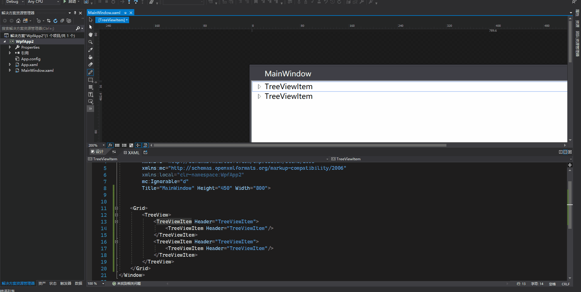
1、用Blend for Visual Studio 2019 新建Wpf項目,拖動一個TreeView控制項到Grid上
    <Grid>
        <TreeView>
            <TreeViewItem Header="TreeViewItem">
                <TreeViewItem Header="TreeViewItem"/>
            </TreeViewItem>
            <TreeViewItem Header="TreeViewItem">
                <TreeViewItem Header="TreeViewItem"/>
            </TreeViewItem>
        </TreeView>
    </Grid>
2、在繪圖視窗選中TreeViewItem,右鍵編輯模版->編輯副本
3、繪製水平、垂直虛線(參考博文)
在TreeViewItem ControlTemplate模板中增加
<!-- Connecting Lines -->
<!-- Horizontal line -->
<Rectangle x:Name="HorLn"
           Margin="10,0,0,0"
           Height="1"
           Stroke="#FF565656"
           SnapsToDevicePixels="True"
           StrokeDashCap="Square"
           StrokeDashOffset="1"/>

<!-- Vertical line -->
<Rectangle x:Name="VerLn"
           Width="1"
           Stroke="#FF565656"
           Margin="0,0,-2,0"
           Grid.RowSpan="2"
           SnapsToDevicePixels="true"
           Fill="White"
           StrokeDashCap="Square"
           StrokeDashArray="1,5"/>
對於當前層最後一個節點,不再畫它水平方向線以下的垂直線,這裡使用到轉換器完成
    class TreeViewLineConverter : IValueConverter
    {
        public object Convert(object value, Type targetType, object parameter, System.Globalization.CultureInfo culture)
        {
            var item = value as TreeViewItem;
            ItemsControl ic = ItemsControl.ItemsControlFromItemContainer(item);
            return ic.ItemContainerGenerator.IndexFromContainer(item) == ic.Items.Count - 1;
        }

        public object ConvertBack(object value, Type targetType, object parameter, System.Globalization.CultureInfo culture)
        {
            return false;
        }
    }
觸發器需增加代碼
                            <!-- 當前層最後一個元素不畫下方垂直線 -->
                            <DataTrigger Binding="{Binding RelativeSource={RelativeSource Self}, Converter={StaticResource LineConverter}}" Value="true">
                                <Setter TargetName="VerLn" Property="Height" Value="15"/>
                                <Setter TargetName="VerLn" Property="VerticalAlignment" Value="Top"/>
                            </DataTrigger>
                            <!-- Root第一個元素不顯示上方垂直線 -->
                            <Trigger Property="TabIndex" Value="1">
                                <Setter TargetName="VerLn" Property="Margin" Value="0,12,1,0"/>
                                <Setter TargetName="VerLn" Property="Height" Value="Auto"/>
                            </Trigger>
完整樣式代碼
<Style x:Key="TreeViewItemFocusVisual">
<Setter Property="Control.Template">
<Setter.Value>
<ControlTemplate>
<Rectangle/>
</ControlTemplate>
</Setter.Value>
</Setter>
</Style>
<SolidColorBrush x:Key="TreeViewItem.TreeArrow.Static.Checked.Fill" Color="#FF595959"/>
<SolidColorBrush x:Key="TreeViewItem.TreeArrow.Static.Checked.Stroke" Color="#FF262626"/>
<SolidColorBrush x:Key="TreeViewItem.TreeArrow.MouseOver.Stroke" Color="#FF27C7F7"/>
<SolidColorBrush x:Key="TreeViewItem.TreeArrow.MouseOver.Fill" Color="#FFCCEEFB"/>
<SolidColorBrush x:Key="TreeViewItem.TreeArrow.MouseOver.Checked.Stroke" Color="#FF1CC4F7"/>
<SolidColorBrush x:Key="TreeViewItem.TreeArrow.MouseOver.Checked.Fill" Color="#FF82DFFB"/>
<PathGeometry x:Key="TreeArrow" Figures="M0,0 L0,6 L6,0 z"/>
<SolidColorBrush x:Key="TreeViewItem.TreeArrow.Static.Fill" Color="#FFFFFFFF"/>
<SolidColorBrush x:Key="TreeViewItem.TreeArrow.Static.Stroke" Color="#FF818181"/>
<Style x:Key="ExpandCollapseToggleStyle" TargetType="{x:Type ToggleButton}">
<Setter Property="Focusable" Value="False"/>
<Setter Property="Width" Value="16"/>
<Setter Property="Height" Value="16"/>
<Setter Property="Template">
<Setter.Value>
<ControlTemplate TargetType="{x:Type ToggleButton}">
<Border Background="Transparent" Height="16" Padding="5,5,5,5" Width="16">
<Path x:Name="ExpandPath" Data="{StaticResource TreeArrow}" Fill="{StaticResource TreeViewItem.TreeArrow.Static.Fill}" Stroke="{StaticResource TreeViewItem.TreeArrow.Static.Stroke}">
<Path.RenderTransform>
<RotateTransform Angle="135" CenterY="3" CenterX="3"/>
</Path.RenderTransform>
</Path>
</Border>
<ControlTemplate.Triggers>
<Trigger Property="IsChecked" Value="True">
<Setter Property="RenderTransform" TargetName="ExpandPath">
<Setter.Value>
<RotateTransform Angle="180" CenterY="3" CenterX="3"/>
</Setter.Value>
</Setter>
<Setter Property="Fill" TargetName="ExpandPath" Value="{StaticResource TreeViewItem.TreeArrow.Static.Checked.Fill}"/>
<Setter Property="Stroke" TargetName="ExpandPath" Value="{StaticResource TreeViewItem.TreeArrow.Static.Checked.Stroke}"/>
</Trigger>
<Trigger Property="IsMouseOver" Value="True">
<Setter Property="Stroke" TargetName="ExpandPath" Value="{StaticResource TreeViewItem.TreeArrow.MouseOver.Stroke}"/>
<Setter Property="Fill" TargetName="ExpandPath" Value="{StaticResource TreeViewItem.TreeArrow.MouseOver.Fill}"/>
</Trigger>
<MultiTrigger>
<MultiTrigger.Conditions>
<Condition Property="IsMouseOver" Value="True"/>
<Condition Property="IsChecked" Value="True"/>
</MultiTrigger.Conditions>
<Setter Property="Stroke" TargetName="ExpandPath" Value="{StaticResource TreeViewItem.TreeArrow.MouseOver.Checked.Stroke}"/>
<Setter Property="Fill" TargetName="ExpandPath" Value="{StaticResource TreeViewItem.TreeArrow.MouseOver.Checked.Fill}"/>
</MultiTrigger>
</ControlTemplate.Triggers>
</ControlTemplate>
</Setter.Value>
</Setter>
</Style>
<local:TreeViewLineConverter x:Key="LineConverter"/>
<Style TargetType="{x:Type TreeViewItem}">
<Setter Property="Background" Value="Transparent"/>
<Setter Property="HorizontalContentAlignment" Value="{Binding HorizontalContentAlignment, RelativeSource={RelativeSource AncestorType={x:Type ItemsControl}}}"/>
<Setter Property="VerticalContentAlignment" Value="{Binding VerticalContentAlignment, RelativeSource={RelativeSource AncestorType={x:Type ItemsControl}}}"/>
<Setter Property="Padding" Value="1,0,0,0"/>
<Setter Property="Foreground" Value="{DynamicResource {x:Static SystemColors.ControlTextBrushKey}}"/>
<Setter Property="FocusVisualStyle" Value="{StaticResource TreeViewItemFocusVisual}"/>
<Setter Property="Template">
<Setter.Value>
<ControlTemplate TargetType="{x:Type TreeViewItem}">
<Grid>
<Grid.ColumnDefinitions>
<ColumnDefinition MinWidth="19" Width="Auto"/>
<ColumnDefinition Width="Auto"/>
<ColumnDefinition Width="*"/>
</Grid.ColumnDefinitions>
<Grid.RowDefinitions>
<RowDefinition Height="Auto"/>
<RowDefinition/>
</Grid.RowDefinitions>
<!--Connecting Lines-->
<!--Horizontal line-->
<Rectangle x:Name="HorLn" Margin="10,0,0,0" Height="1" Stroke="#FF565656" SnapsToDevicePixels="True" StrokeDashCap="Square" StrokeDashOffset="1"/>
<!--Vertical line-->
<Rectangle x:Name="VerLn" Width="1" Stroke="#FF565656" Margin="0,0,-2,0" Grid.RowSpan="2" SnapsToDevicePixels="true" Fill="White" StrokeDashCap="Square" StrokeDashArray="1,5"/>
<ToggleButton x:Name="Expander" ClickMode="Press" IsChecked="{Binding IsExpanded, RelativeSource={RelativeSource TemplatedParent}}" Style="{StaticResource ExpandCollapseToggleStyle}"/>
<Border x:Name="Bd" BorderBrush="{TemplateBinding BorderBrush}" BorderThickness="{TemplateBinding BorderThickness}" Background="{TemplateBinding Background}" Grid.Column="1" Padding="{TemplateBinding Padding}" SnapsToDevicePixels="true">
<ContentPresenter x:Name="PART_Header" ContentSource="Header" HorizontalAlignment="{TemplateBinding HorizontalContentAlignment}" SnapsToDevicePixels="{TemplateBinding SnapsToDevicePixels}"/>
</Border>
<ItemsPresenter x:Name="ItemsHost" Grid.ColumnSpan="2" Grid.Column="1" Grid.Row="1"/>
</Grid>
<ControlTemplate.Triggers>
<Trigger Property="IsExpanded" Value="false">
<Setter Property="Visibility" TargetName="ItemsHost" Value="Collapsed"/>
</Trigger>
<Trigger Property="HasItems" Value="false">
<Setter Property="Visibility" TargetName="Expander" Value="Hidden"/>
</Trigger>
<Trigger Property="IsSelected" Value="true">
<Setter Property="Background" TargetName="Bd" Value="{DynamicResource {x:Static SystemColors.HighlightBrushKey}}"/>
<Setter Property="Foreground" Value="{DynamicResource {x:Static SystemColors.HighlightTextBrushKey}}"/>
</Trigger>
<MultiTrigger>
<MultiTrigger.Conditions>
<Condition Property="IsSelected" Value="true"/>
<Condition Property="IsSelectionActive" Value="false"/>
</MultiTrigger.Conditions>
<Setter Property="Background" TargetName="Bd" Value="{DynamicResource {x:Static SystemColors.InactiveSelectionHighlightBrushKey}}"/>
<Setter Property="Foreground" Value="{DynamicResource {x:Static SystemColors.InactiveSelectionHighlightTextBrushKey}}"/>
</MultiTrigger>
<Trigger Property="IsEnabled" Value="false">
<Setter Property="Foreground" Value="{DynamicResource {x:Static SystemColors.GrayTextBrushKey}}"/>
</Trigger>
<!-- 當前層最後一個元素不畫下方垂直線 -->
<DataTrigger Binding="{Binding RelativeSource={RelativeSource Self}, Converter={StaticResource LineConverter}}" Value="true">
<Setter TargetName="VerLn" Property="Height" Value="15"/>
<Setter TargetName="VerLn" Property="VerticalAlignment" Value="Top"/>
</DataTrigger>
<!-- Root第一個元素不顯示上方垂直線 -->
<Trigger Property="TabIndex" Value="1">
<Setter TargetName="VerLn" Property="Margin" Value="0,12,1,0"/>
<Setter TargetName="VerLn" Property="Height" Value="Auto"/>
</Trigger>
</ControlTemplate.Triggers>
</ControlTemplate>
</Setter.Value>
</Setter>
<Style.Triggers>
<Trigger Property="VirtualizingPanel.IsVirtualizing" Value="true">
<Setter Property="ItemsPanel">
<Setter.Value>
<ItemsPanelTemplate>
<VirtualizingStackPanel/>
</ItemsPanelTemplate>
</Setter.Value>
</Setter>
</Trigger>
</Style.Triggers>
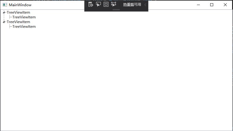
</Style>效果圖如下
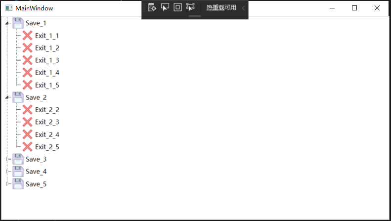
4、TreeViewItem顯示圖片以及名稱
        <TreeView ItemsSource="{Binding Tools}">
            <TreeView.Resources>
                <local:UriToImageSourceConverter x:Key="UriToImageSource"/>
            </TreeView.Resources>
            <TreeView.ItemTemplate>
                <HierarchicalDataTemplate ItemsSource="{Binding Nodes}">
                    <DockPanel>
                        <Image Source="{Binding PicPath, Converter={StaticResource UriToImageSource}}" Width="25" Height="25"/>
                        <TextBlock Text="{Binding Name}" FontSize="13" VerticalAlignment="Center" Margin="3,0,0,0"/>
                    </DockPanel>
                </HierarchicalDataTemplate>
            </TreeView.ItemTemplate>
        </TreeView>
Tools是數據集合,節點集合Nodes。PicPath保存圖片名稱,使用UriToImageSourceConverter轉換器轉換成BitmapImage類型顯示。
    class UriToImageSourceConverter : IValueConverter
    {
        public object Convert(object value, Type targetType, object parameter, System.Globalization.CultureInfo culture)
        {
            string path = (string)value;
            if (string.IsNullOrEmpty(path))
            {
                path = "pack://application:,,,/WpfApp2;component/position.ico";//預設圖片
            }
            return new BitmapImage(new Uri(path, UriKind.Absolute));
        }

        public object ConvertBack(object value, Type targetType, object parameter, System.Globalization.CultureInfo culture)
        {
            return false;
        }
    }
效果圖如下
完整代碼
<Window x:Class="WpfApp2.MainWindow"
        xmlns="http://schemas.microsoft.com/winfx/2006/xaml/presentation"
        xmlns:x="http://schemas.microsoft.com/winfx/2006/xaml"
        xmlns:d="http://schemas.microsoft.com/expression/blend/2008"
        xmlns:mc="http://schemas.openxmlformats.org/markup-compatibility/2006"
        xmlns:local="clr-namespace:WpfApp2"
        mc:Ignorable="d"
        Title="MainWindow" Height="450" Width="800">


    <Window.Resources>
        <Style x:Key="TreeViewItemFocusVisual">
            <Setter Property="Control.Template">
                <Setter.Value>
                    <ControlTemplate>
                        <Rectangle/>
                    </ControlTemplate>
                </Setter.Value>
            </Setter>
        </Style>
        <SolidColorBrush x:Key="TreeViewItem.TreeArrow.Static.Checked.Fill" Color="#FF595959"/>
        <SolidColorBrush x:Key="TreeViewItem.TreeArrow.Static.Checked.Stroke" Color="#FF262626"/>
        <SolidColorBrush x:Key="TreeViewItem.TreeArrow.MouseOver.Stroke" Color="#FF27C7F7"/>
        <SolidColorBrush x:Key="TreeViewItem.TreeArrow.MouseOver.Fill" Color="#FFCCEEFB"/>
        <SolidColorBrush x:Key="TreeViewItem.TreeArrow.MouseOver.Checked.Stroke" Color="#FF1CC4F7"/>
        <SolidColorBrush x:Key="TreeViewItem.TreeArrow.MouseOver.Checked.Fill" Color="#FF82DFFB"/>
        <PathGeometry x:Key="TreeArrow" Figures="M0,0 L0,6 L6,0 z"/>
        <SolidColorBrush x:Key="TreeViewItem.TreeArrow.Static.Fill" Color="#FFFFFFFF"/>
        <SolidColorBrush x:Key="TreeViewItem.TreeArrow.Static.Stroke" Color="#FF818181"/>
        <Style x:Key="ExpandCollapseToggleStyle" TargetType="{x:Type ToggleButton}">
            <Setter Property="Focusable" Value="False"/>
            <Setter Property="Width" Value="16"/>
            <Setter Property="Height" Value="16"/>
            <Setter Property="Template">
                <Setter.Value>
                    <ControlTemplate TargetType="{x:Type ToggleButton}">
                        <Border Background="Transparent" Height="16" Padding="5,5,5,5" Width="16">
                            <Path x:Name="ExpandPath" Data="{StaticResource TreeArrow}" Fill="{StaticResource TreeViewItem.TreeArrow.Static.Fill}" Stroke="{StaticResource TreeViewItem.TreeArrow.Static.Stroke}">
                                <Path.RenderTransform>
                                    <RotateTransform Angle="135" CenterY="3" CenterX="3"/>
                                </Path.RenderTransform>
                            </Path>
                        </Border>
                        <ControlTemplate.Triggers>
                            <Trigger Property="IsChecked" Value="True">
                                <Setter Property="RenderTransform" TargetName="ExpandPath">
                                    <Setter.Value>
                                        <RotateTransform Angle="180" CenterY="3" CenterX="3"/>
                                    </Setter.Value>
                                </Setter>
                                <Setter Property="Fill" TargetName="ExpandPath" Value="{StaticResource TreeViewItem.TreeArrow.Static.Checked.Fill}"/>
                                <Setter Property="Stroke" TargetName="ExpandPath" Value="{StaticResource TreeViewItem.TreeArrow.Static.Checked.Stroke}"/>
                            </Trigger>
                            <Trigger Property="IsMouseOver" Value="True">
                                <Setter Property="Stroke" TargetName="ExpandPath" Value="{StaticResource TreeViewItem.TreeArrow.MouseOver.Stroke}"/>
                                <Setter Property="Fill" TargetName="ExpandPath" Value="{StaticResource TreeViewItem.TreeArrow.MouseOver.Fill}"/>
                            </Trigger>
                            <MultiTrigger>
                                <MultiTrigger.Conditions>
                                    <Condition Property="IsMouseOver" Value="True"/>
                                    <Condition Property="IsChecked" Value="True"/>
                                </MultiTrigger.Conditions>
                                <Setter Property="Stroke" TargetName="ExpandPath" Value="{StaticResource TreeViewItem.TreeArrow.MouseOver.Checked.Stroke}"/>
                                <Setter Property="Fill" TargetName="ExpandPath" Value="{StaticResource TreeViewItem.TreeArrow.MouseOver.Checked.Fill}"/>
                            </MultiTrigger>
                        </ControlTemplate.Triggers>
                    </ControlTemplate>
                </Setter.Value>
            </Setter>
        </Style>

        <local:TreeViewLineConverter x:Key="LineConverter"/>
        <Style TargetType="{x:Type TreeViewItem}">
            <Setter Property="Background" Value="Transparent"/>
            <Setter Property="HorizontalContentAlignment" Value="{Binding HorizontalContentAlignment, RelativeSource={RelativeSource AncestorType={x:Type ItemsControl}}}"/>
            <Setter Property="VerticalContentAlignment" Value="{Binding VerticalContentAlignment, RelativeSource={RelativeSource AncestorType={x:Type ItemsControl}}}"/>
            <Setter Property="Padding" Value="1,0,0,0"/>
            <Setter Property="Foreground" Value="{DynamicResource {x:Static SystemColors.ControlTextBrushKey}}"/>
            <Setter Property="FocusVisualStyle" Value="{StaticResource TreeViewItemFocusVisual}"/>
            <Setter Property="Template">
                <Setter.Value>
                    <ControlTemplate TargetType="{x:Type TreeViewItem}">
                        <Grid>
                            <Grid.ColumnDefinitions>
                                <ColumnDefinition MinWidth="19" Width="Auto"/>
                                <ColumnDefinition Width="Auto"/>
                                <ColumnDefinition Width="*"/>
                            </Grid.ColumnDefinitions>
                            <Grid.RowDefinitions>
                                <RowDefinition Height="Auto"/>
                                <RowDefinition/>
                            </Grid.RowDefinitions>

                             <!--Connecting Lines-->
                             <!--Horizontal line-->
                            <Rectangle x:Name="HorLn" Margin="10,0,0,0" Height="1" Stroke="#FF565656" SnapsToDevicePixels="True" StrokeDashCap="Square" StrokeDashOffset="1"/>
                             <!--Vertical line-->
                            <Rectangle x:Name="VerLn" Width="1" Stroke="#FF565656" Margin="0,0,-2,0" Grid.RowSpan="2" SnapsToDevicePixels="true" Fill="White" StrokeDashCap="Square" StrokeDashArray="1,5"/>

                            <ToggleButton x:Name="Expander" ClickMode="Press" IsChecked="{Binding IsExpanded, RelativeSource={RelativeSource TemplatedParent}}" Style="{StaticResource ExpandCollapseToggleStyle}"/>
                            <Border x:Name="Bd" BorderBrush="{TemplateBinding BorderBrush}" BorderThickness="{TemplateBinding BorderThickness}" Background="{TemplateBinding Background}" Grid.Column="1" Padding="{TemplateBinding Padding}" SnapsToDevicePixels="true">
                                <ContentPresenter x:Name="PART_Header" ContentSource="Header" HorizontalAlignment="{TemplateBinding HorizontalContentAlignment}" SnapsToDevicePixels="{TemplateBinding SnapsToDevicePixels}"/>
                            </Border>
                            <ItemsPresenter x:Name="ItemsHost" Grid.ColumnSpan="2" Grid.Column="1" Grid.Row="1"/>
                        </Grid>
                        <ControlTemplate.Triggers>
                            <Trigger Property="IsExpanded" Value="false">
                                <Setter Property="Visibility" TargetName="ItemsHost" Value="Collapsed"/>
                            </Trigger>
                            <Trigger Property="HasItems" Value="false">
                                <Setter Property="Visibility" TargetName="Expander" Value="Hidden"/>
                            </Trigger>
                            <Trigger Property="IsSelected" Value="true">
                                <Setter Property="Background" TargetName="Bd" Value="{DynamicResource {x:Static SystemColors.HighlightBrushKey}}"/>
                                <Setter Property="Foreground" Value="{DynamicResource {x:Static SystemColors.HighlightTextBrushKey}}"/>
                            </Trigger>
                            <MultiTrigger>
                                <MultiTrigger.Conditions>
                                    <Condition Property="IsSelected" Value="true"/>
                                    <Condition Property="IsSelectionActive" Value="false"/>
                                </MultiTrigger.Conditions>
                                <Setter Property="Background" TargetName="Bd" Value="{DynamicResource {x:Static SystemColors.InactiveSelectionHighlightBrushKey}}"/>
                                <Setter Property="Foreground" Value="{DynamicResource {x:Static SystemColors.InactiveSelectionHighlightTextBrushKey}}"/>
                            </MultiTrigger>
                            <Trigger Property="IsEnabled" Value="false">
                                <Setter Property="Foreground" Value="{DynamicResource {x:Static SystemColors.GrayTextBrushKey}}"/>
                            </Trigger>

                            <!-- 當前層最後一個元素不畫下方垂直線 -->
                            <DataTrigger Binding="{Binding RelativeSource={RelativeSource Self}, Converter={StaticResource LineConverter}}" Value="true">
                                <Setter TargetName="VerLn" Property="Height" Value="15"/>
                                <Setter TargetName="VerLn" Property="VerticalAlignment" Value="Top"/>
                            </DataTrigger>
                            <!-- Root第一個元素不顯示上方垂直線 -->
                            <Trigger Property="TabIndex" Value="1">
                                <Setter TargetName="VerLn" Property="Margin" Value="0,12,1,0"/>
                                <Setter TargetName="VerLn" Property="Height" Value="Auto"/>
                            </Trigger>
                        </ControlTemplate.Triggers>
                    </ControlTemplate>
                </Setter.Value>
            </Setter>
            <Style.Triggers>
                <Trigger Property="VirtualizingPanel.IsVirtualizing" Value="true">
                    <Setter Property="ItemsPanel">
                        <Setter.Value>
                            <ItemsPanelTemplate>
                                <VirtualizingStackPanel/>
                            </ItemsPanelTemplate>
                        </Setter.Value>
                    </Setter>
                </Trigger>
            </Style.Triggers>
        </Style>
    </Window.Resources>


    <Grid>
        <TreeView x:Name="tree" ItemsSource="{Binding Tools}">
            <TreeView.Resources>
                <local:UriToImageSourceConverter x:Key="UriToImageSource"/>
            </TreeView.Resources>
            <TreeView.ItemTemplate>
                <HierarchicalDataTemplate ItemsSource="{Binding Nodes}">
                    <DockPanel>
                        <Image Source="{Binding PicPath, Converter={StaticResource UriToImageSource}}" Width="25" Height="25"/>
                        <TextBlock Text="{Binding Name}" FontSize="13" VerticalAlignment="Center" Margin="3,0,0,0"/>
                    </DockPanel>
                </HierarchicalDataTemplate>
            </TreeView.ItemTemplate>
        </TreeView>
    </Grid>
</Window>
using System;
using System.Collections.Generic;
using System.Linq;
using System.Text;
using System.Threading.Tasks;
using System.Windows;
using System.Windows.Controls;
using System.Windows.Data;
using System.Windows.Documents;
using System.Windows.Input;
using System.Windows.Media;
using System.Windows.Media.Imaging;
using System.Windows.Navigation;
using System.Windows.Shapes;

namespace WpfApp2
{
    /// <summary>
    /// MainWindow.xaml 的交互邏輯
    /// </summary>
    public partial class MainWindow : Window
    {
        public MainWindow()
        {
            InitializeComponent();


            Tools = new List<NodeX>();

            for (int i = 0; i < 5; i++)
            {
                Tools.Add(new NodeX()
                {
                    Name = $"Save_{i + 1}",
                    PicPath = "pack://application:,,,/WpfApp2;component/Save.png",
                });

                for (int j = i; j < 5; j++)
                {
                    if (Tools[i].Nodes == null)
                    {
                        Tools[i].Nodes = new List<NodeX>();
                    }
                    Tools[i].Nodes.Add(new NodeX()
                    {
                        Name = $"Exit_{i + 1}_{j + 1}",
                        PicPath = "pack://application:,,,/WpfApp2;component/Exit.png",
                    });
                }
            }

            tree.ItemsSource = Tools;
        }


        public List<NodeX> Tools { get; set; }

    }

    class TreeViewLineConverter : IValueConverter
    {
        public object Convert(object value, Type targetType, object parameter, System.Globalization.CultureInfo culture)
        {
            var item = value as TreeViewItem;
            ItemsControl ic = ItemsControl.ItemsControlFromItemContainer(item);
            return ic.ItemContainerGenerator.IndexFromContainer(item) == ic.Items.Count - 1;
        }

        public object ConvertBack(object value, Type targetType, object parameter, System.Globalization.CultureInfo culture)
        {
            return false;
        }
    }

    class UriToImageSourceConverter : IValueConverter
    {
        public object Convert(object value, Type targetType, object parameter, System.Globalization.CultureInfo culture)
        {
            string path = (string)value;
            if (string.IsNullOrEmpty(path))
            {
                path = "pack://application:,,,/WpfApp2;component/position.ico";
            }
            return new BitmapImage(new Uri(path, UriKind.Absolute));
        }

        public object ConvertBack(object value, Type targetType, object parameter, System.Globalization.CultureInfo culture)
        {
            return false;
        }
    }


   public class NodeX
    {

        #region Property

        /// <summary>顯示內容</summary>
        public string Name { get; set; }

        /// <summary>顯示圖片路徑</summary>
        public string PicPath { get; set; }

        /// <summary>子節點,預設null</summary>
        public IList<NodeX> Nodes { get; set; }

        #endregion

    }

}